Display
The display attribute defines the layout of the HTML element. It indicates whether the element is inline or a block. It is used to control the structure of the HTML element. Every HTML element has a default value for the attribute.
Block-level Elements
Block-level elements start on a new line. Examples of block-level elements:
<div><h1> - <h6><p><form><header><footer><section>
Inline Elements
Inline elements only take up as much width as necessary and do not start on a new line. Examples of inline elements:
<span><a><img>DhiWise includes five different values for the display CSS styling:
Block
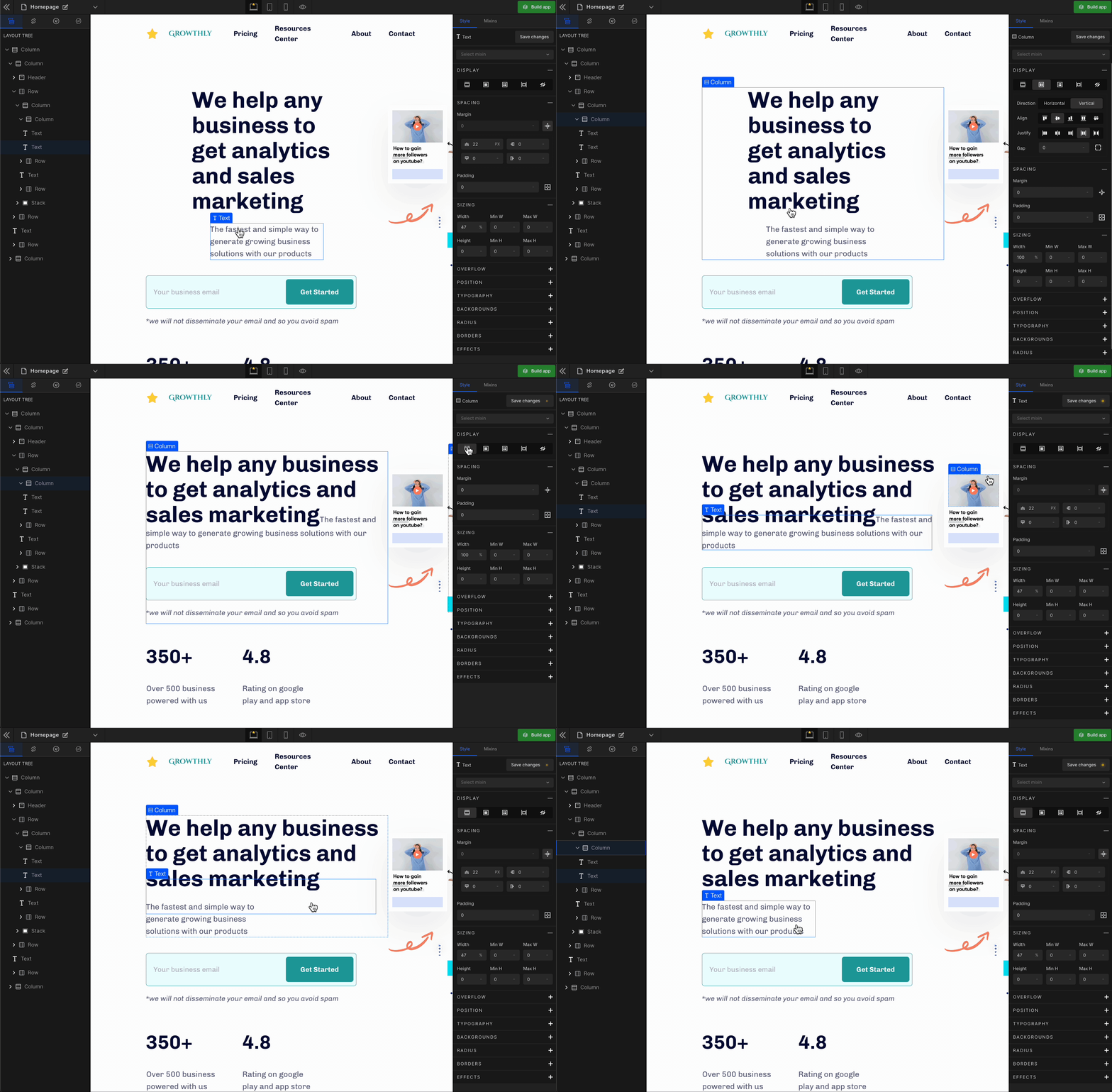
It displays the HTML element as a block starting on a new line. To display the element as a block, click on the element. It will be highlighted, and select “Block” from the Display CSS styling on the right panel.
Flex
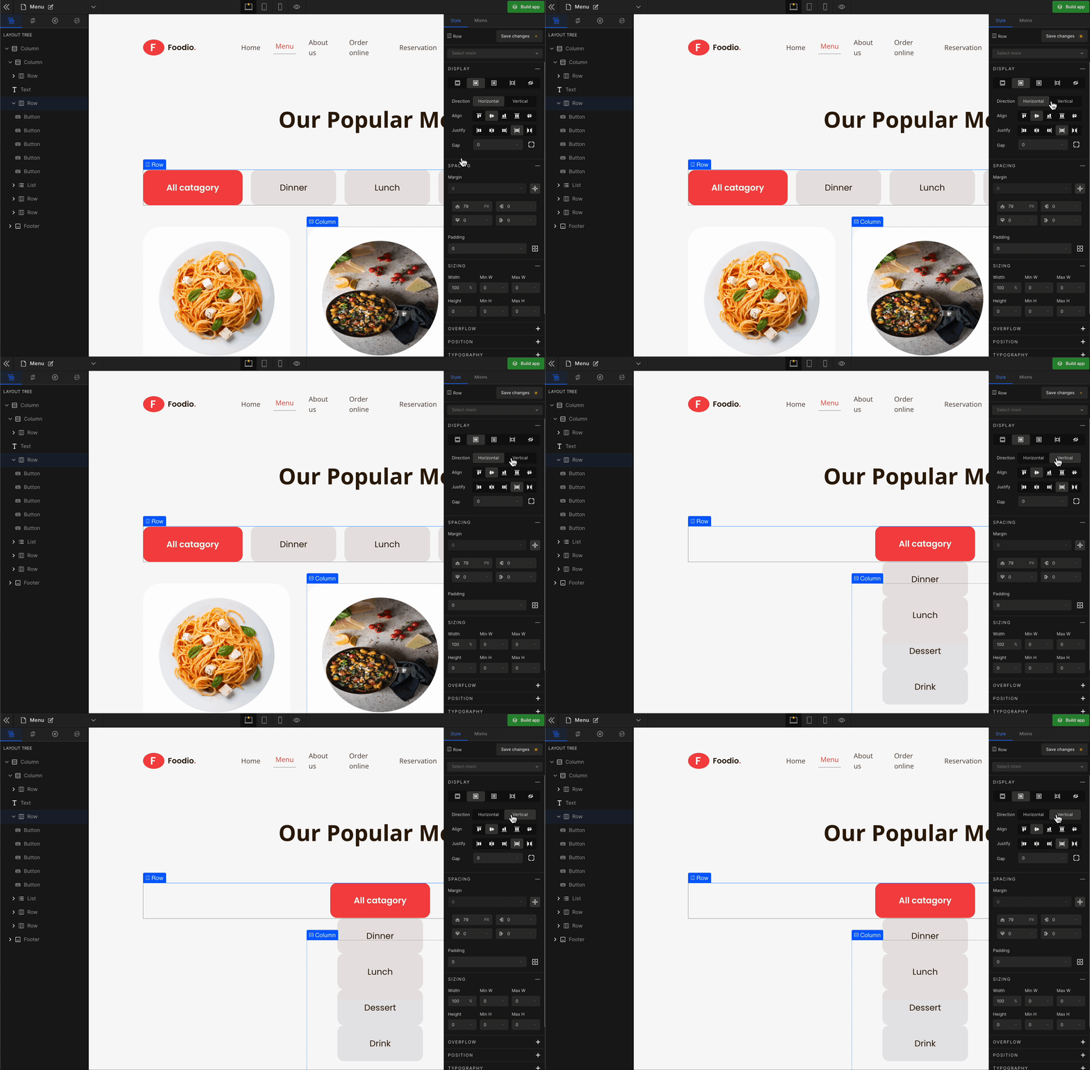
It displays the HTML element as a block-level flex container. Therefore, all the child elements inside that element will be displayed side by side by default.
To display the element as a Flex, click on the element. It will be highlighted, and select “Flex” from the Display CSS styling on the right panel.
When you click on Flex, more custom options related to Flex CSS styling will be visible.
1. Direction
Horizontal
It represents a
flex-row.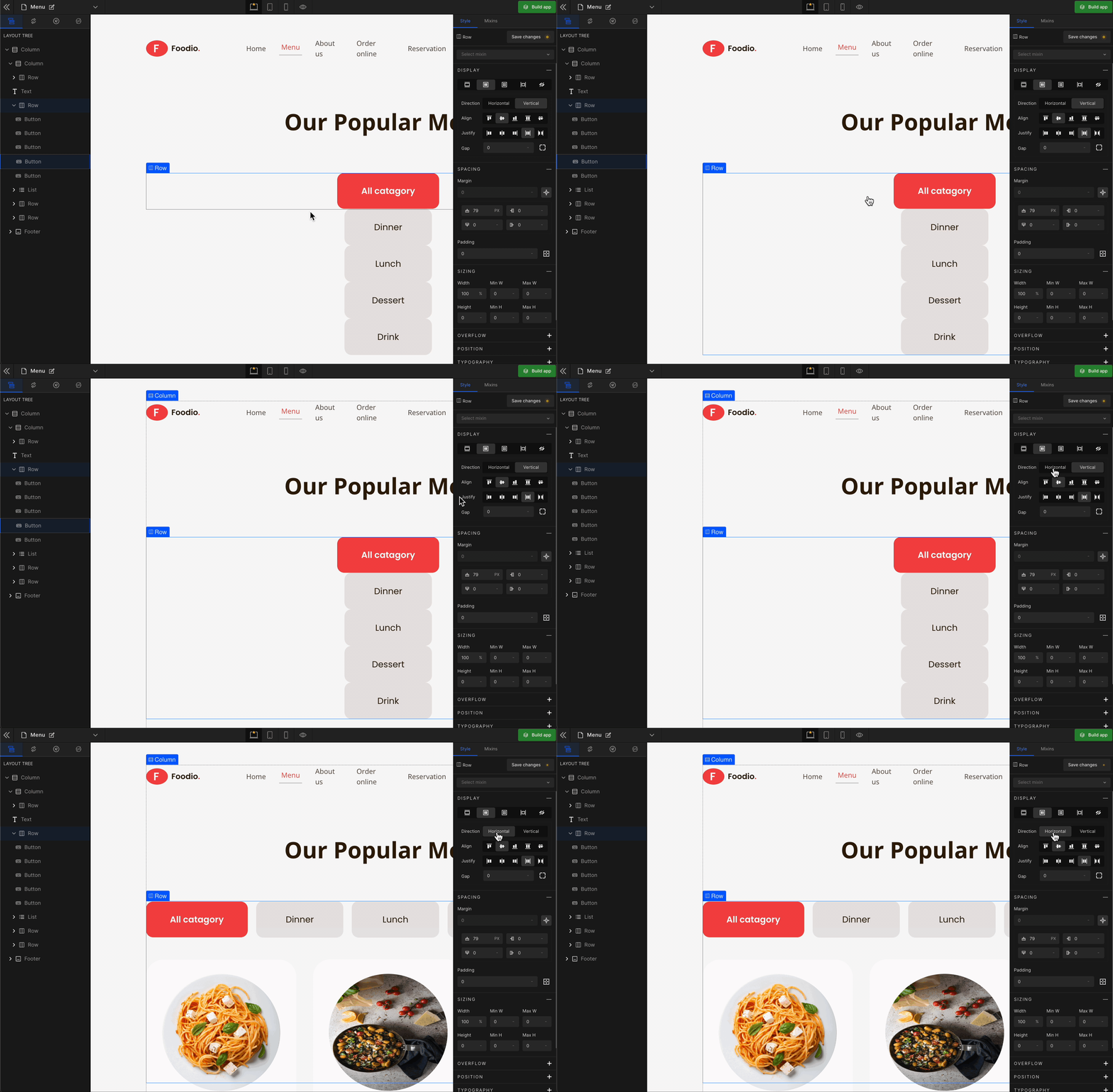
Vertical
It represents a
flex-column.
2. Align
It represents align-items.
Align Start
It represents
flex-start. It aligns with the flex items at the top of the container.
Align Center
It represents the
center. It aligns the flex items in the middle of the container.
Align End
It represents
flex-end. It aligns the flex items at the bottom of the container.
Stretch
It represents
stretch. It stretches the flex items to fill the container (this is the default).
Baseline
It represents the
baseline. It aligns the flex items, such as their baselines aligns.
3. Justify
It represents justify-content.
Justify Start
It represents
flex-start. It displays the flex lines at the start of the container.
Justify Center
It represents the
center. It displays the flex lines in the middle of the container.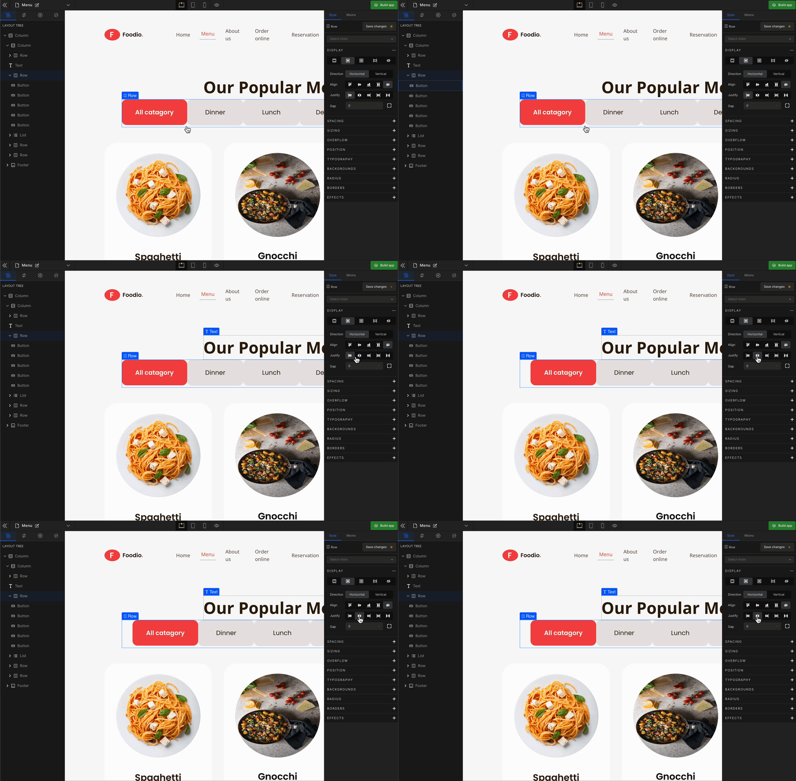
Justify End
It represents
flex-end. It displays the flex lines at the end of the container.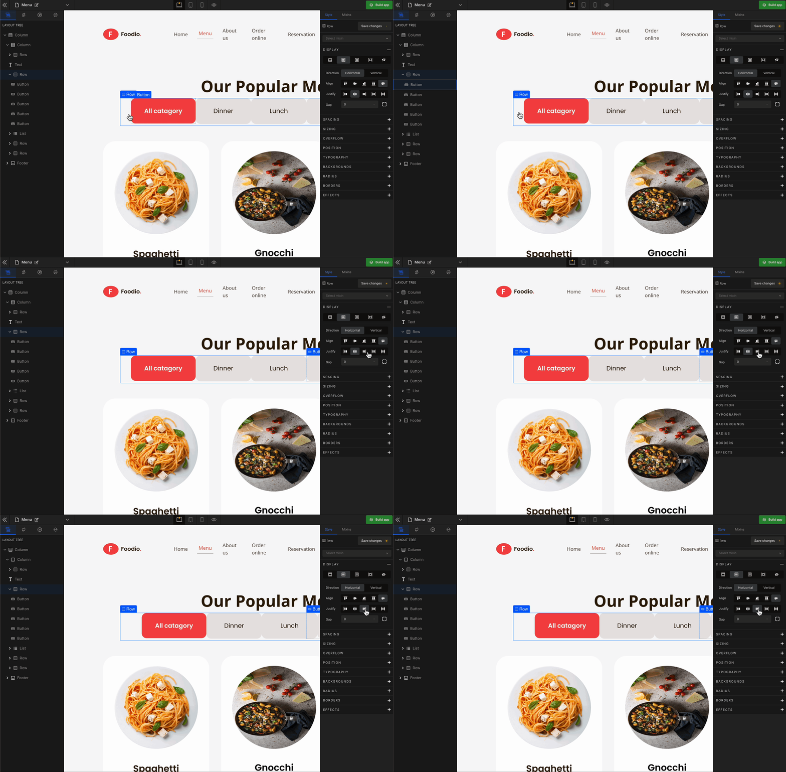
Justify Space Between
It represents
space-between. It displays the flex lines with equal space between them.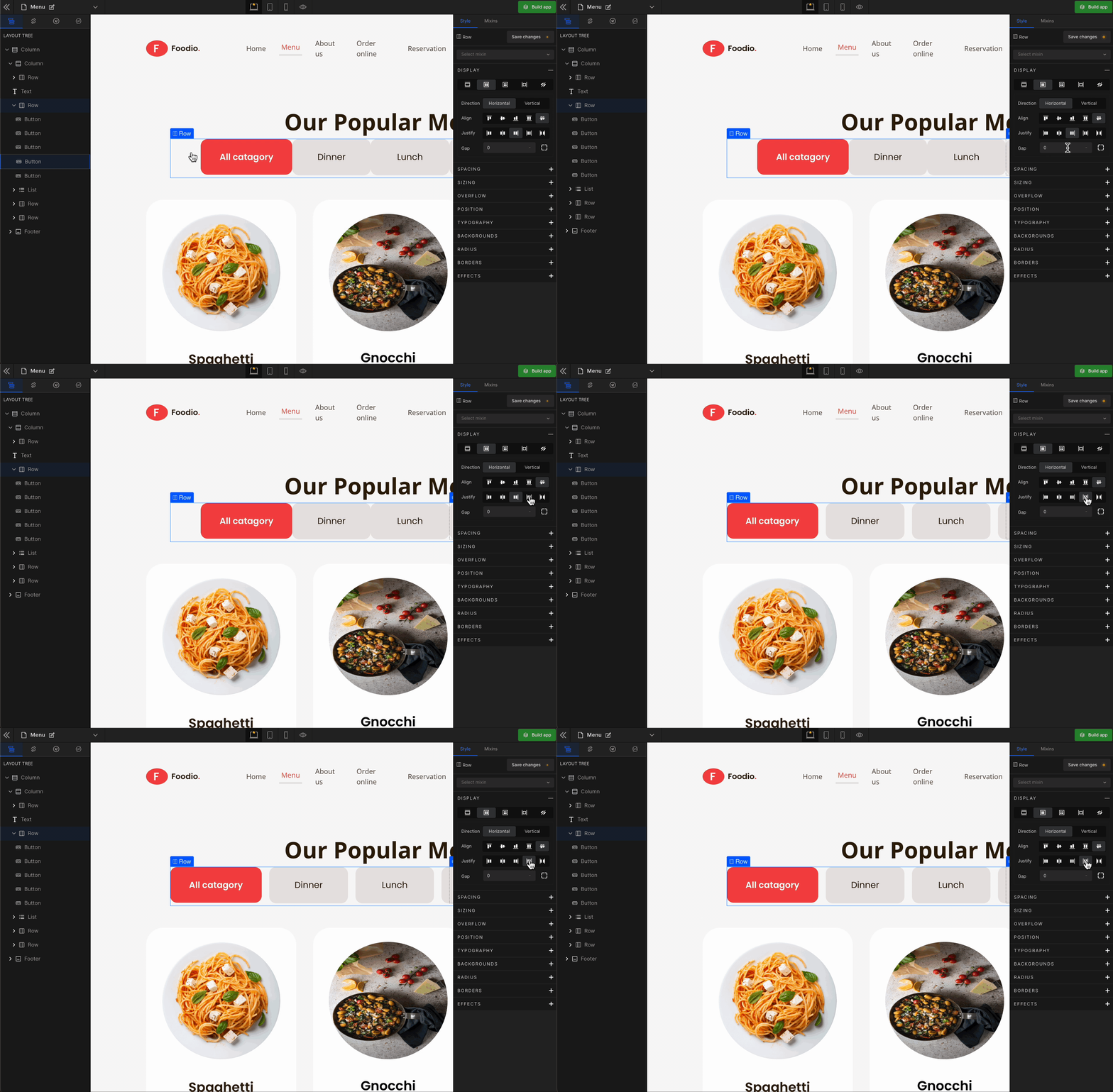
Justify Space Evenly
It represents
space-evenly. It displays justified items with an equal amount of space around each item.
4. Gap
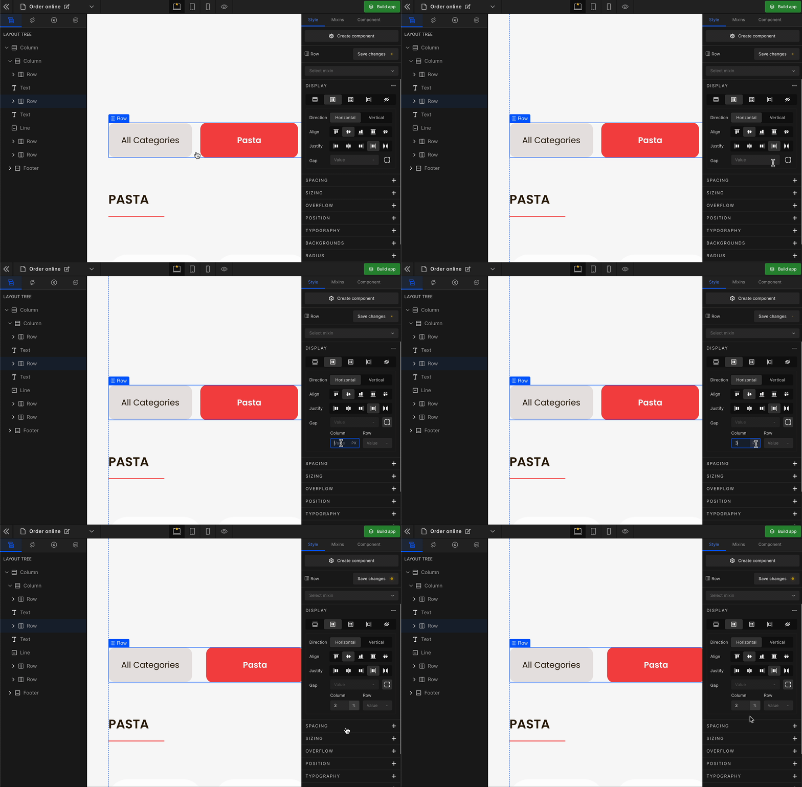
Column
It represents the gap/space between columns of the Flex Box.
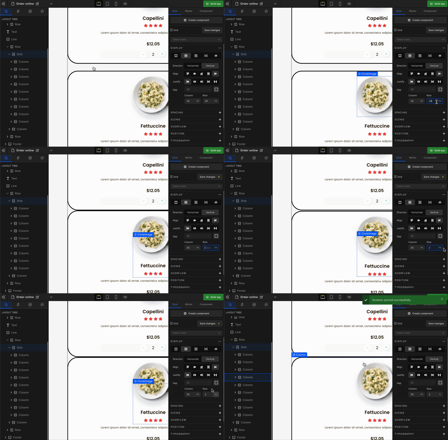
Row
It represents the gap/space between rows of the Flex Box.
Equally
It represents the equal gap between the rows and the columns of the Flex Box.
To apply, click on the expand button and enter the value.
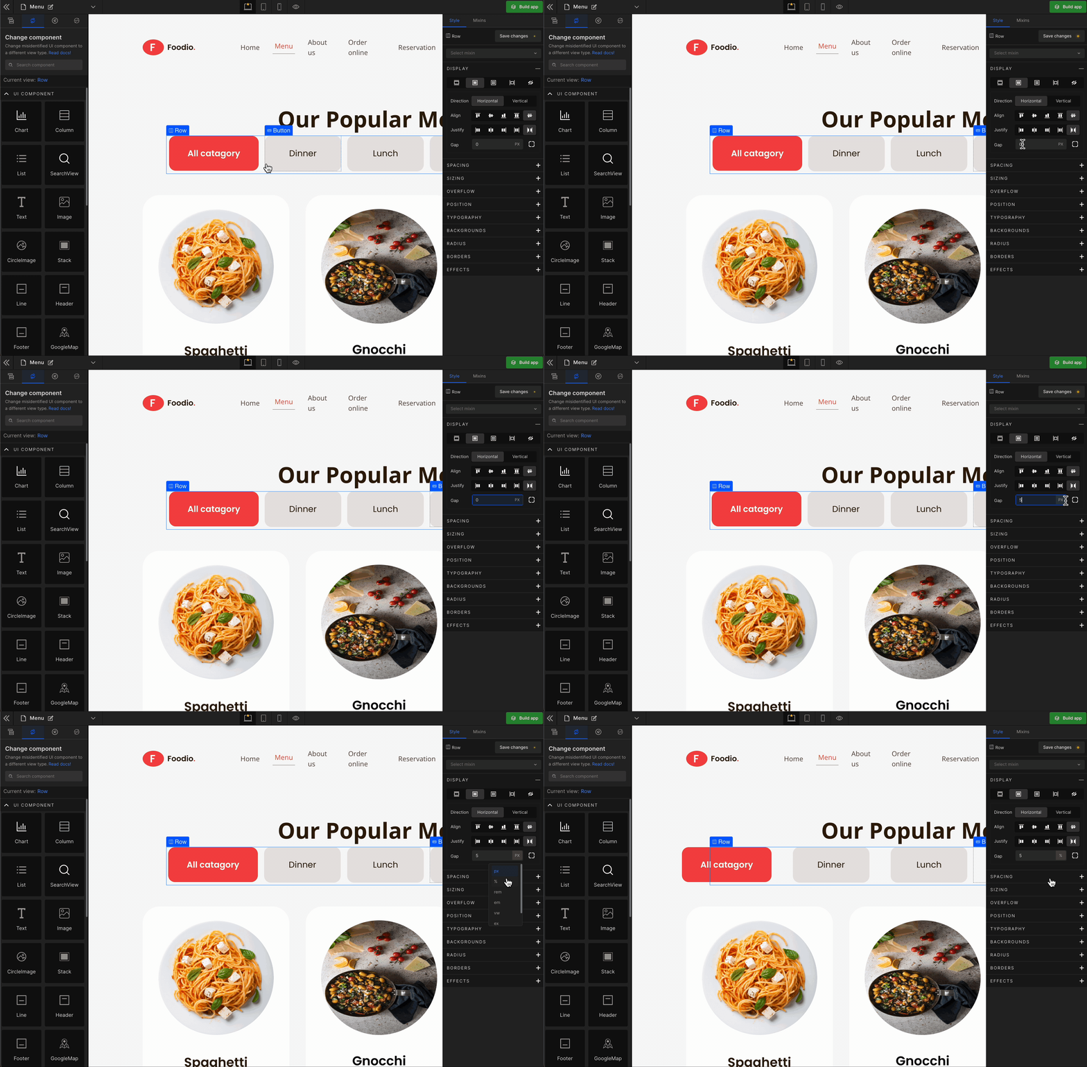
Check the list of Supported Units.
The Justify and Align settings apply to the children of the element you have selected respective to the direction of the Flex.
Grid
It displays the HTML element as a block-level grid container.
To display the element as a Grid, click on the element. It will be highlighted, and select “Grid” from the Display CSS styling on the right panel.
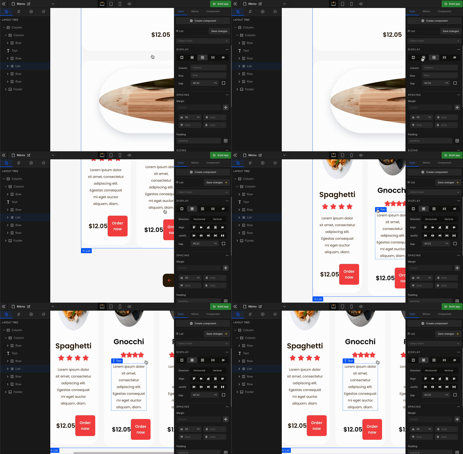
When you click on Grid, more custom options related to Grid CSS styling will be visible.
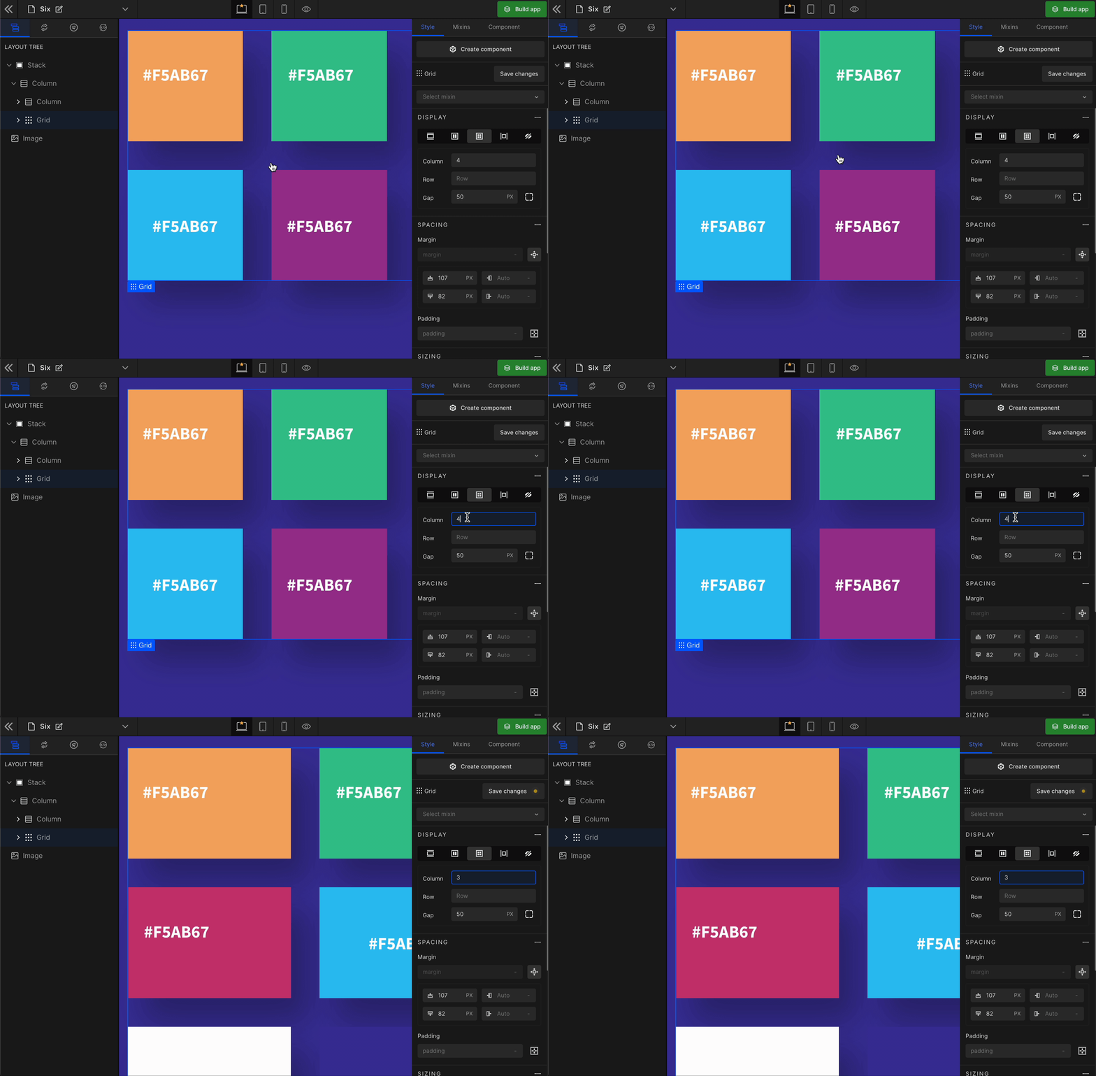
1. Column
It represents the number of columns of the Grid.
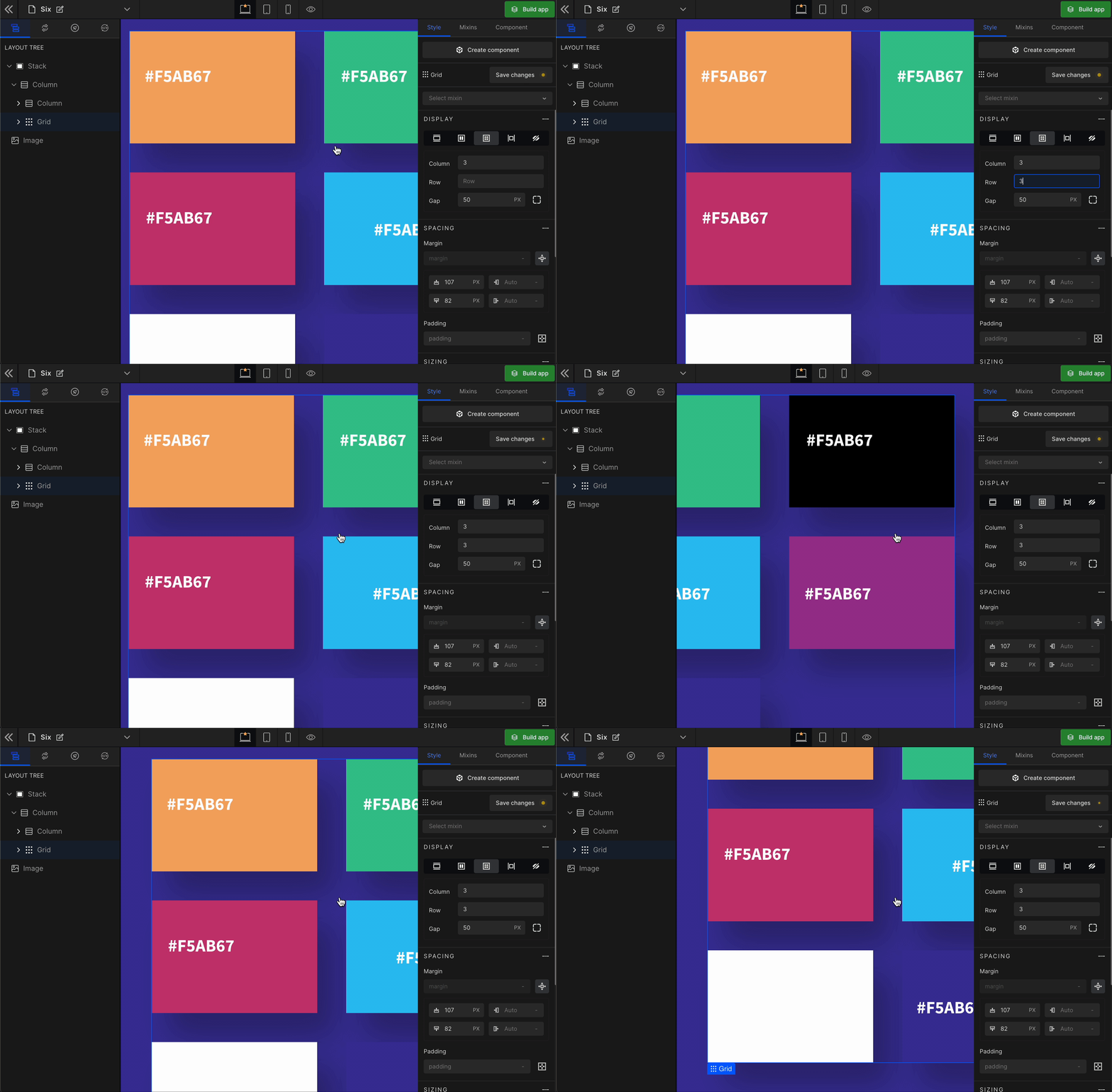
2. Row
It represents the number of rows of the Grid.
3. Gap
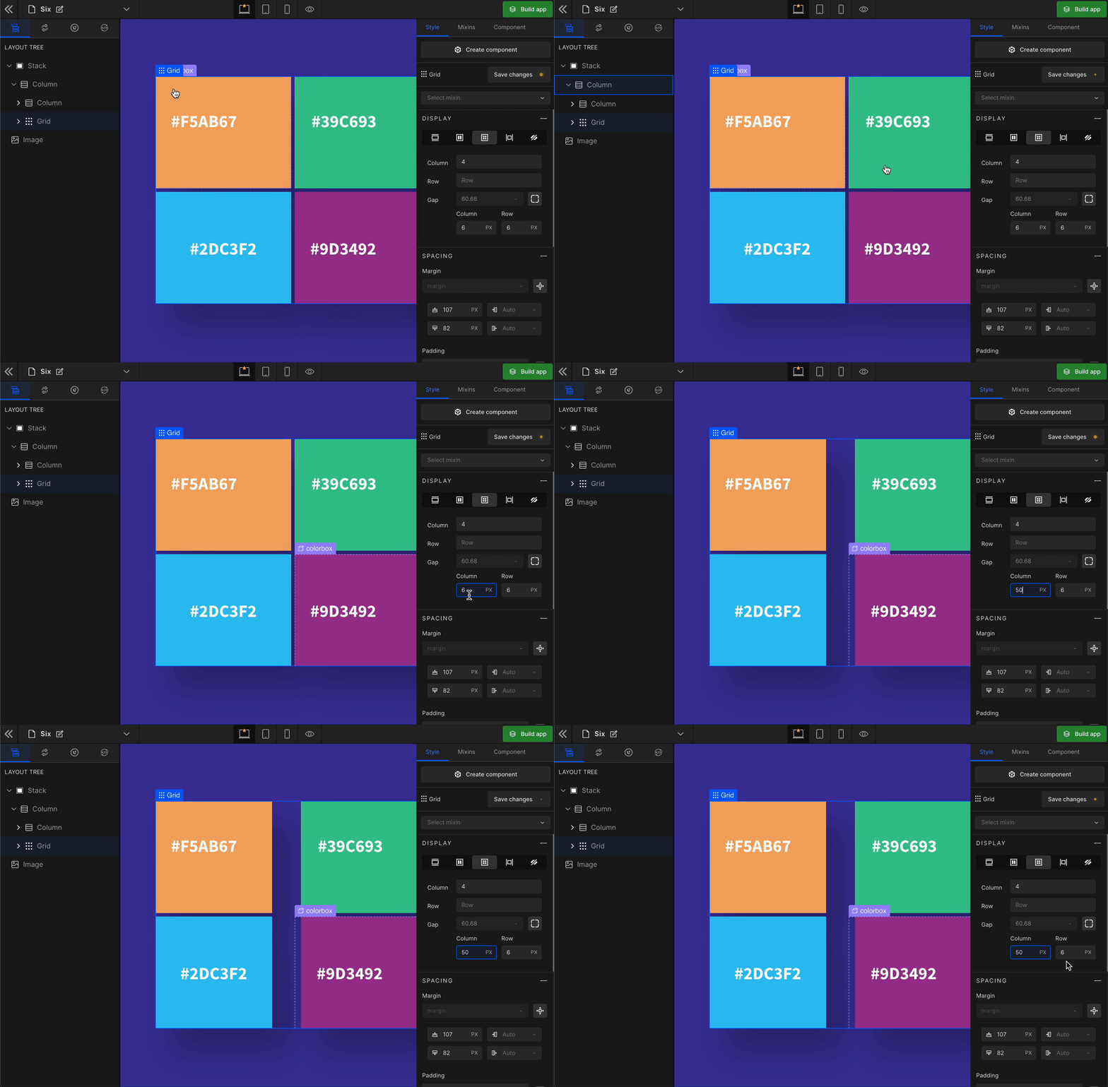
Column
It represents the gap/space between columns of the Grid.
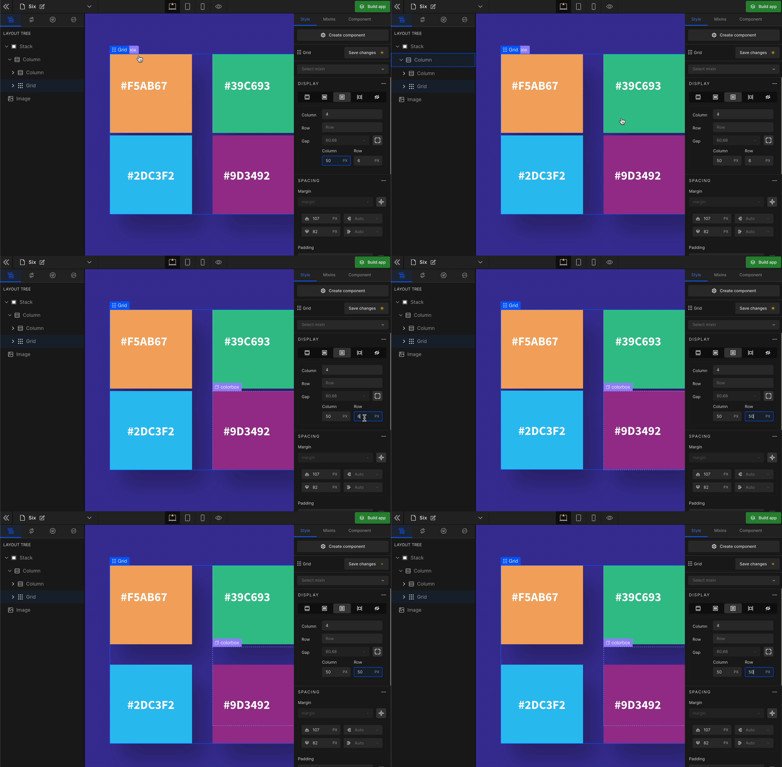
Row
It represents the gap/space between rows of the Grid.
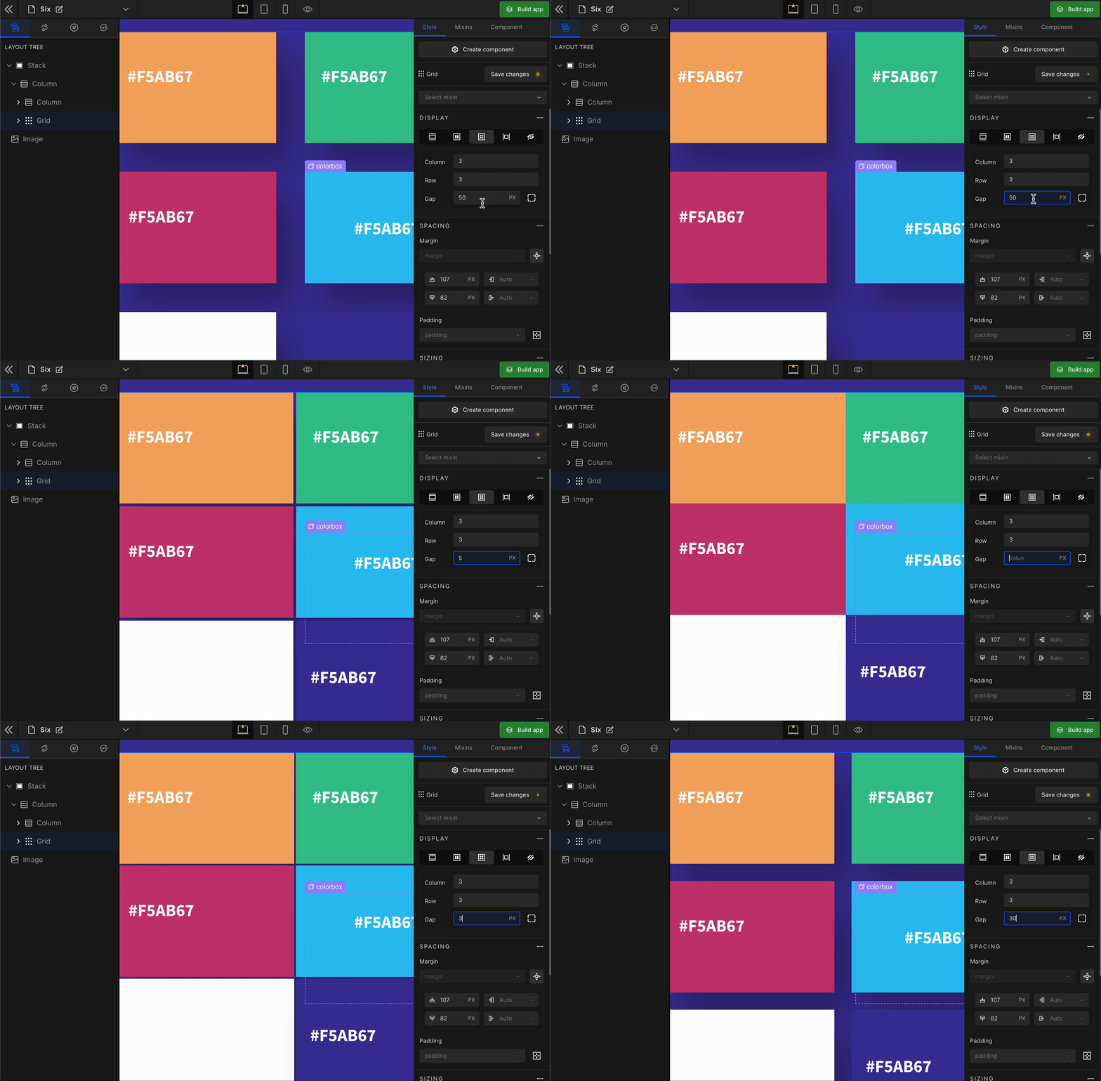
Equally
It represents the equal gap between the rows and the columns of the Grid.
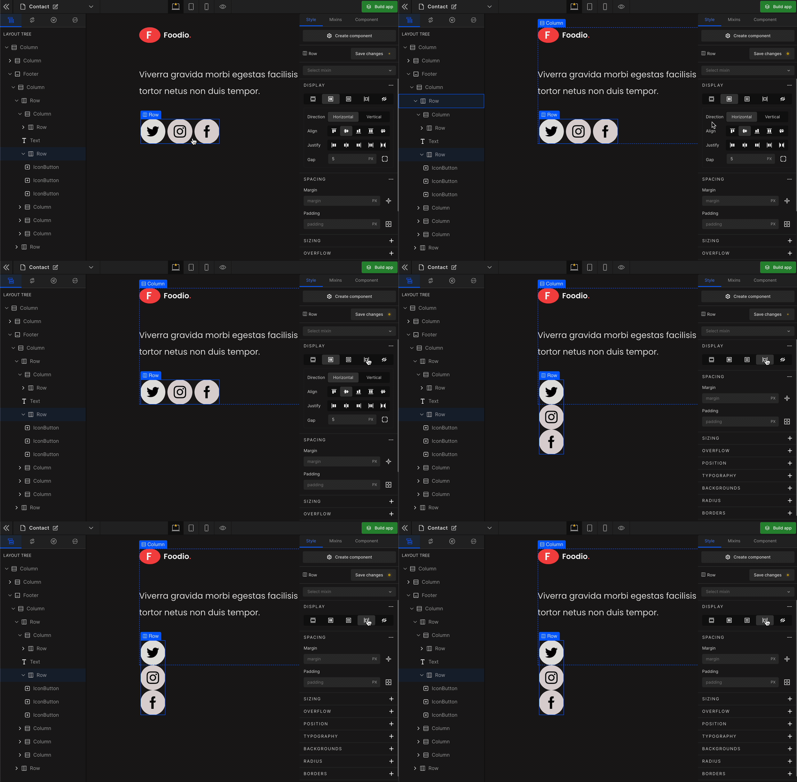
Inline
It displays the HTML element as an inline element with no effect of any height or width.
To display the element as an Inline, click on the element. It will be highlighted, and select “Inline” from the Display CSS styling on the right panel.
None
It controls the visibility of an HTML element. It differs from visibility: hidden. It will remove the element from the DOM.
To remove any element, select it from the preview area, and click on “None” from the Display styling on the right panel.
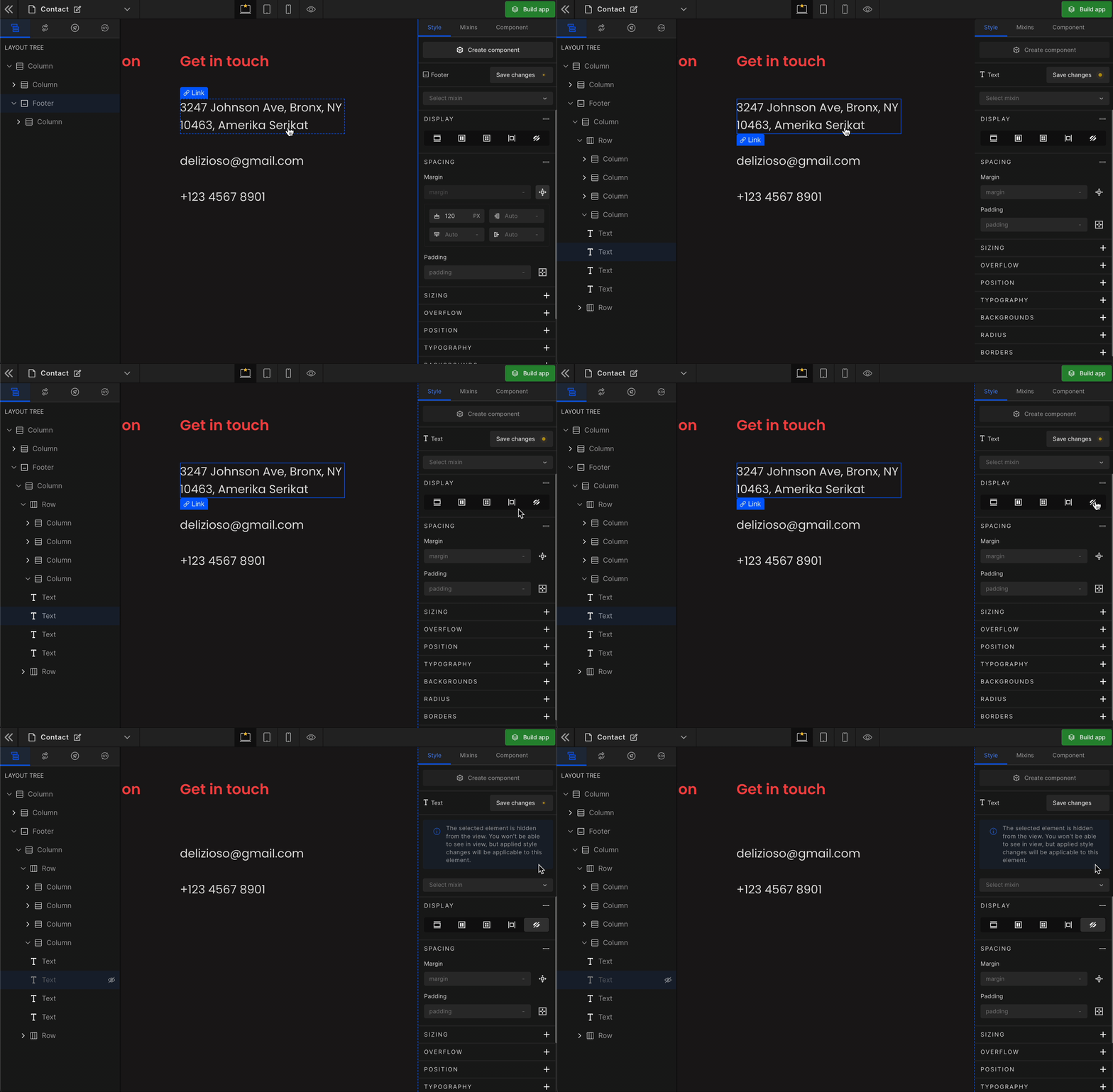
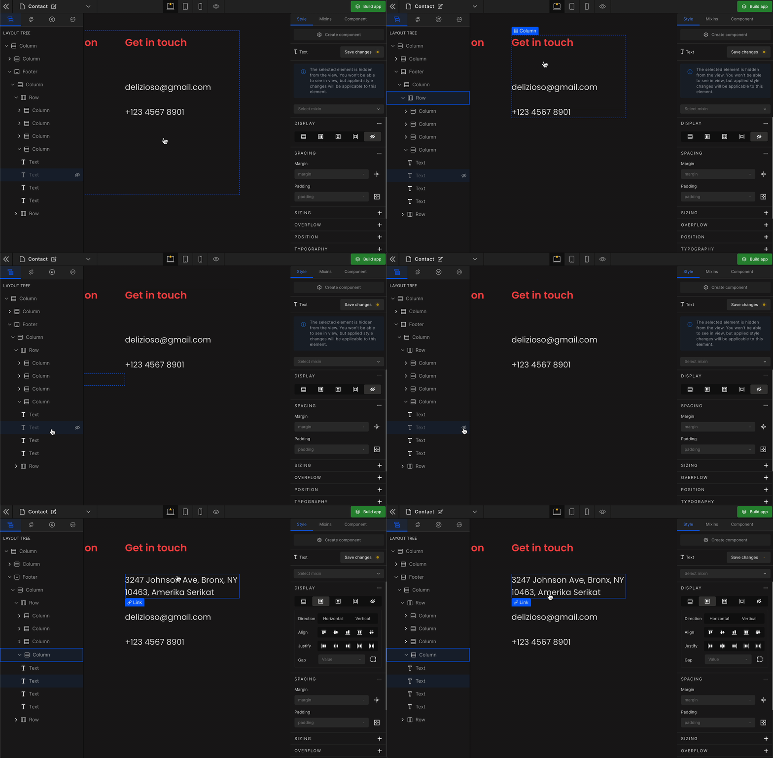
How to get the hidden element back
Got a question? Ask here.