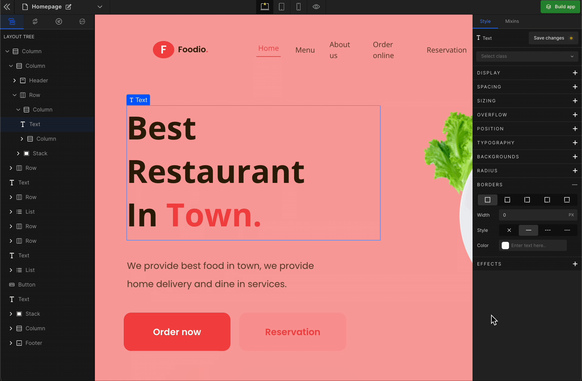
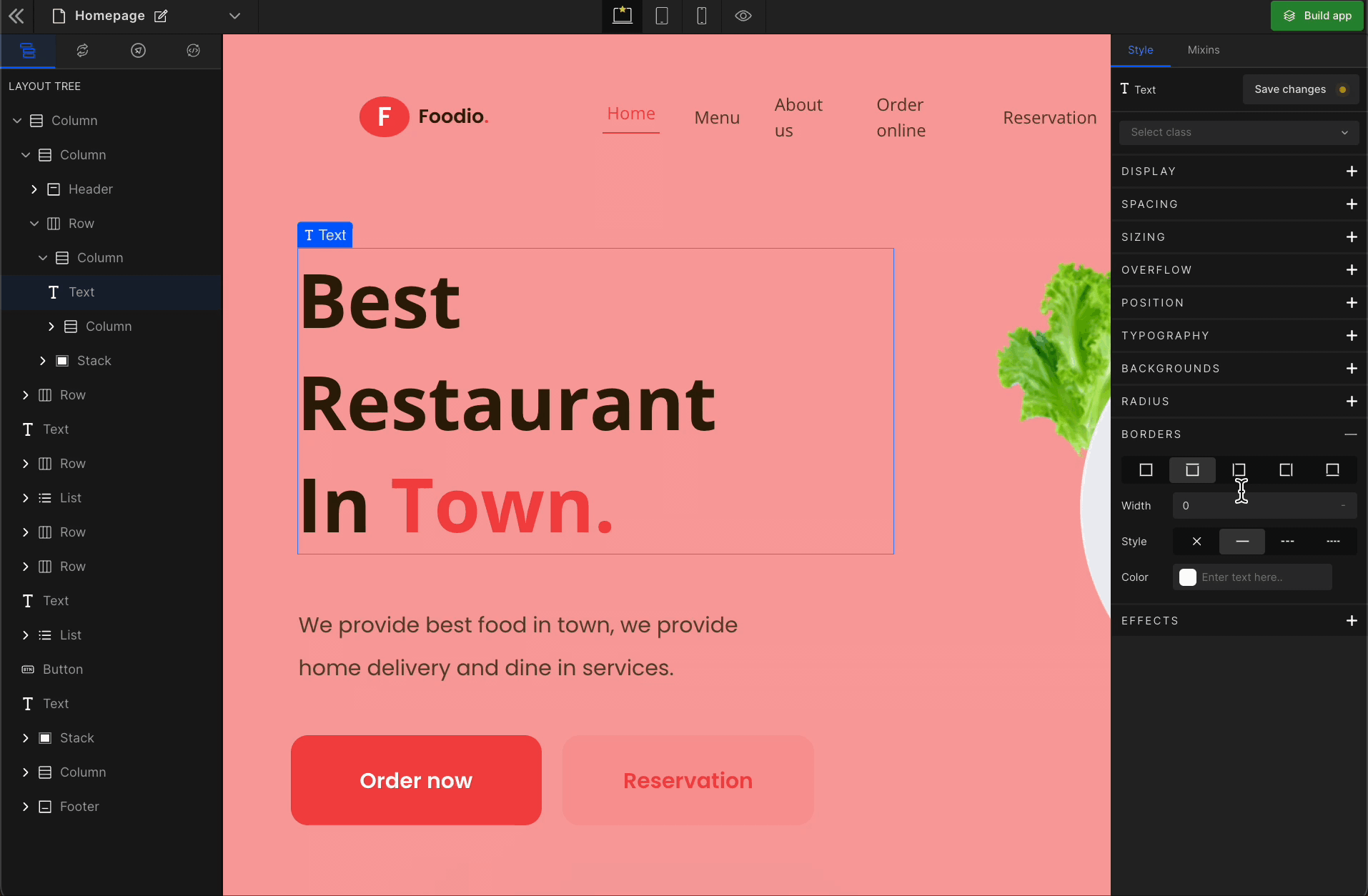
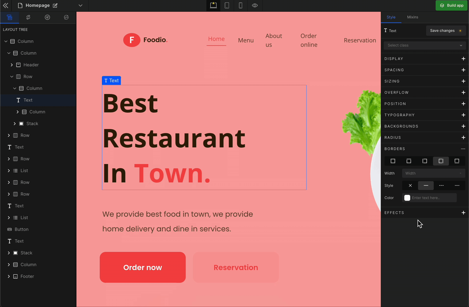
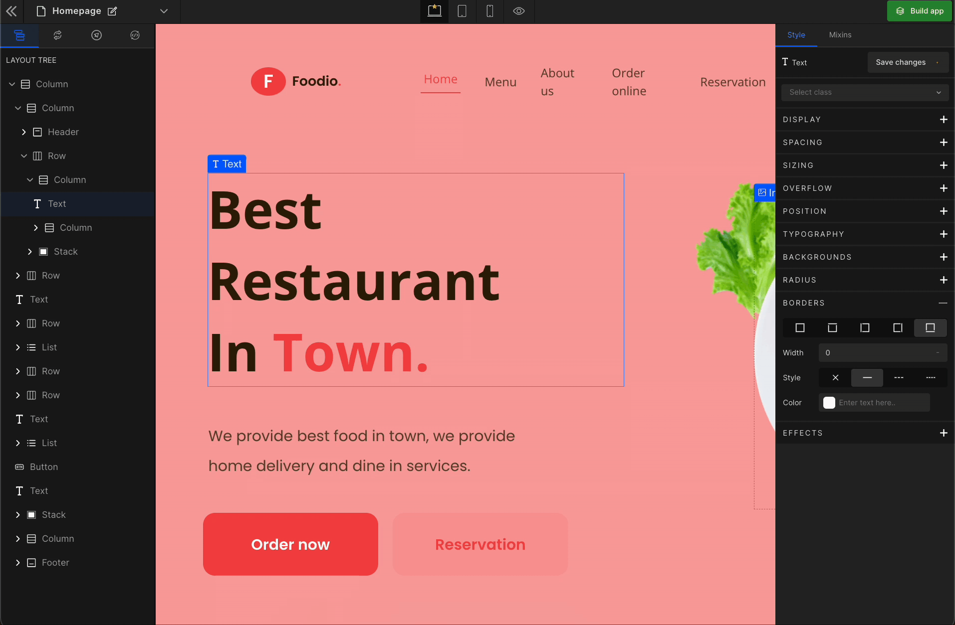
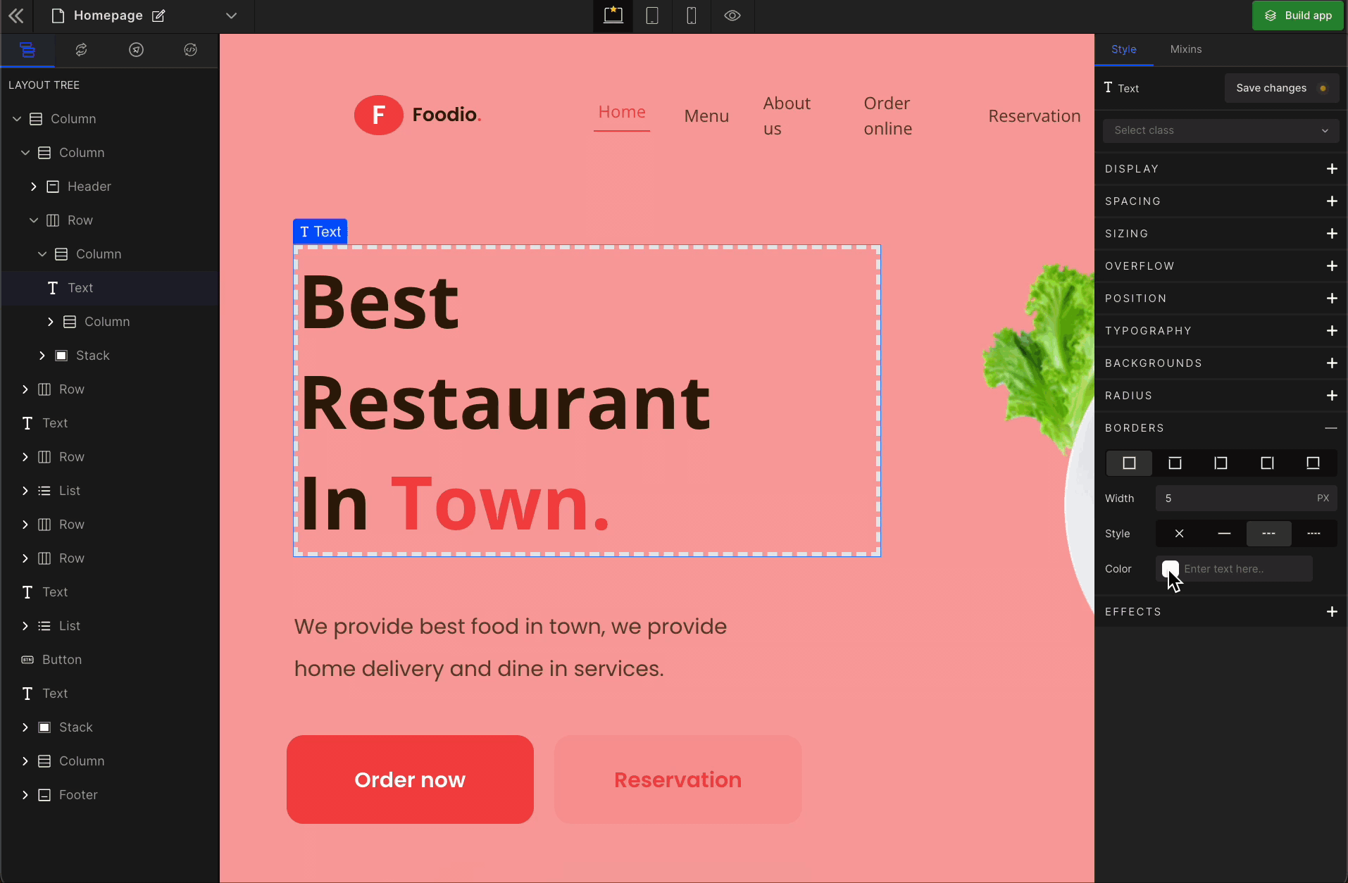
Borders
The border decorates the boundary of the selected element. There are five types to do this. You can apply border with these options:
1. All
It applies the border to all the sides of the selected element’s boundary.
2. Top
It applies the border to the top of the selected element’s boundary.

3. Left
It applies the border to the left of the selected element’s boundary.
4. Right
It applies the border to the right of the selected element’s boundary.

5. Bottom
It applies the border to the bottom of the selected element’s boundary.
Width
Sets the width of the boundary.
Check the list of Supported Units.
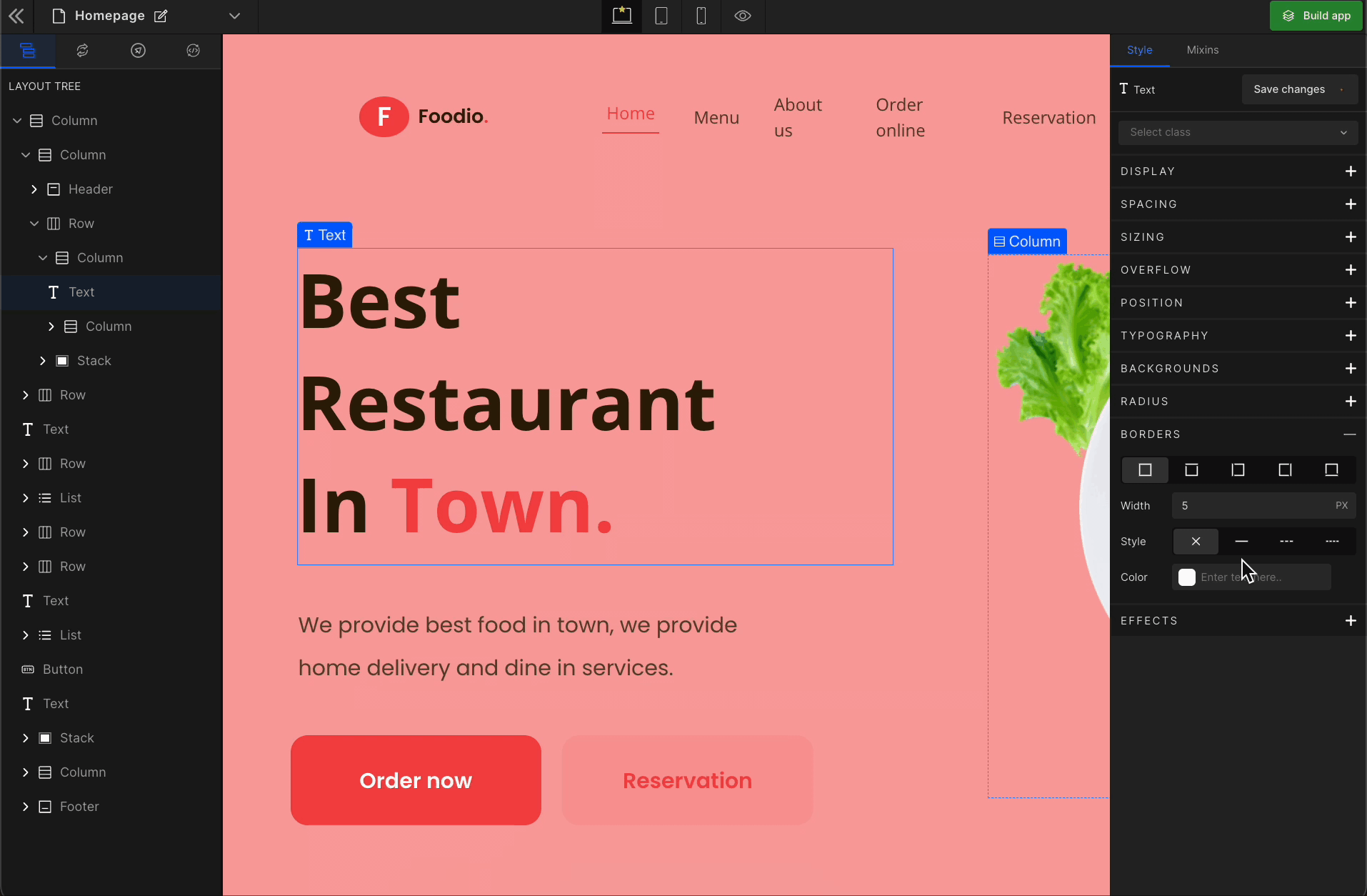
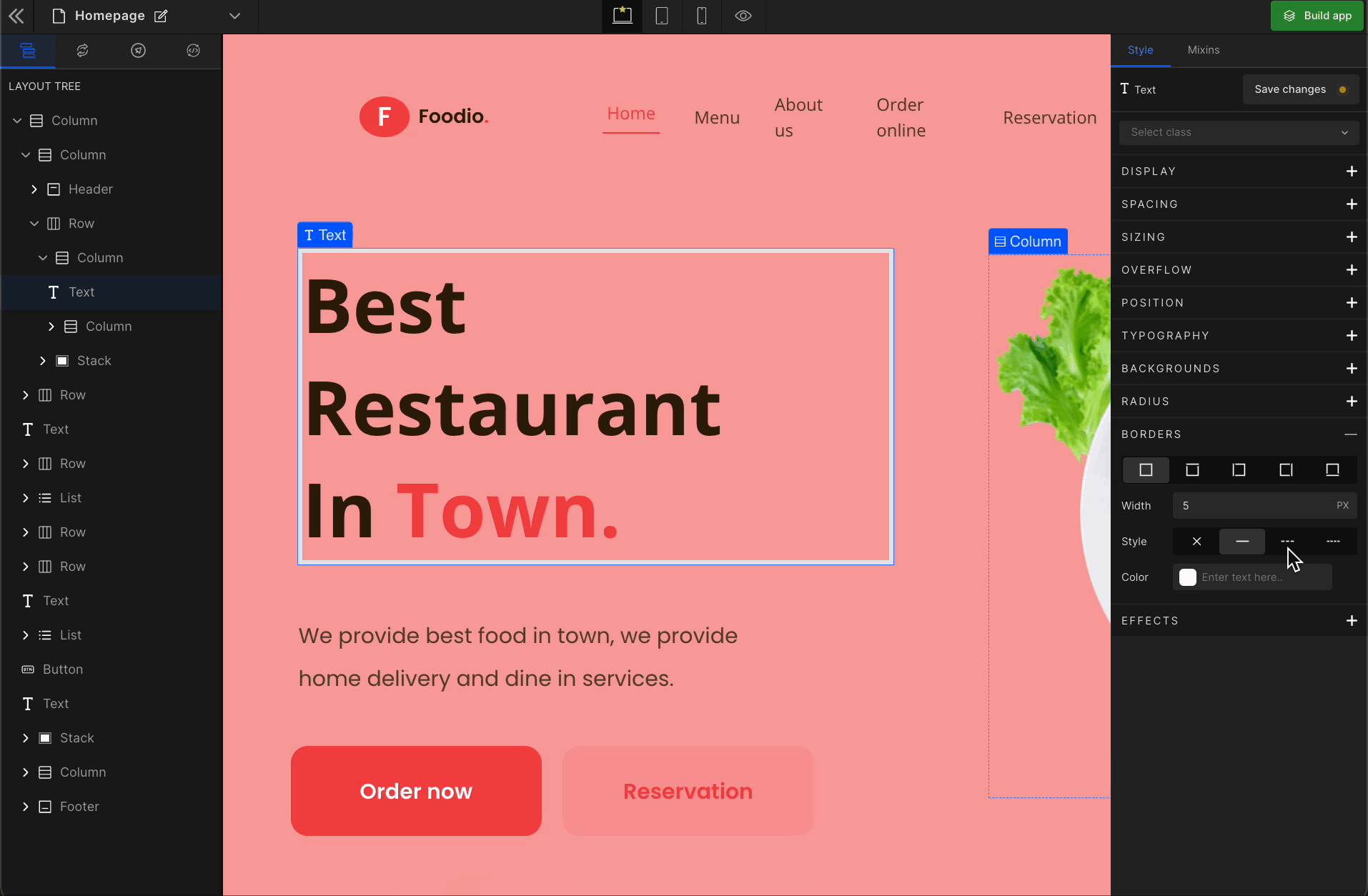
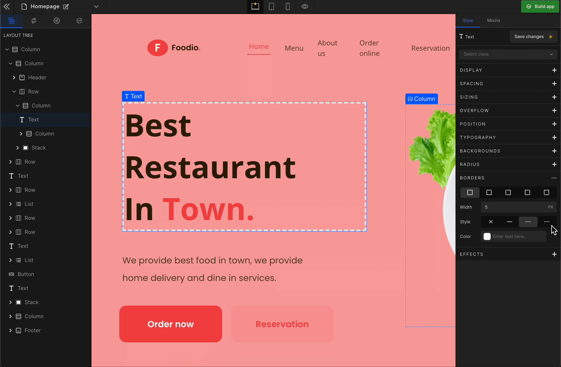
Style
Sets the border style of the boundary.
Types of Styles
None
Resets to default.
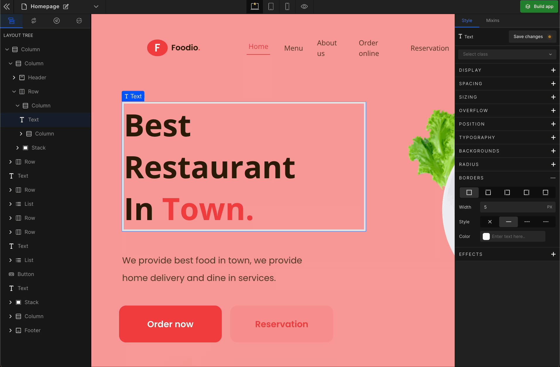
Solid
Draws a linear line for the applied boundary option for the selected element.
Dashed
Draws the linear sequence of dashes for the applied boundary option for the selected element.
Dotted
Draws the linear sequence of dots for the applied boundary option for the selected element.
Color
Defines the color of the border style for the selected element’s boundary.
You can pick primary colors, enter the HEX code or apply RGBA colors to your element for the background.
Got a question? Ask here.