Custom Components
The words; "Custom component" and "Change component" are no longer present. The features have been renamed and combined with the "Component" feature. This ensures that all existing features remain in place. Custom component is now renamed to "Create new component" and "Change component" is renamed to "Convert to existing component".
To learn more, visit the Component page.
Writing all your HTML parts on one page creates chaos in modularising the code. As front-end developers, we often focus on creating common UI parts then can be used repeatedly.
If you’re familiar with Thinking in React, we often break the UI into a common hierarchy. That helps us conveniently handle each UI. In addition, this approach allows us to achieve the single responsibility principle in the codebase.
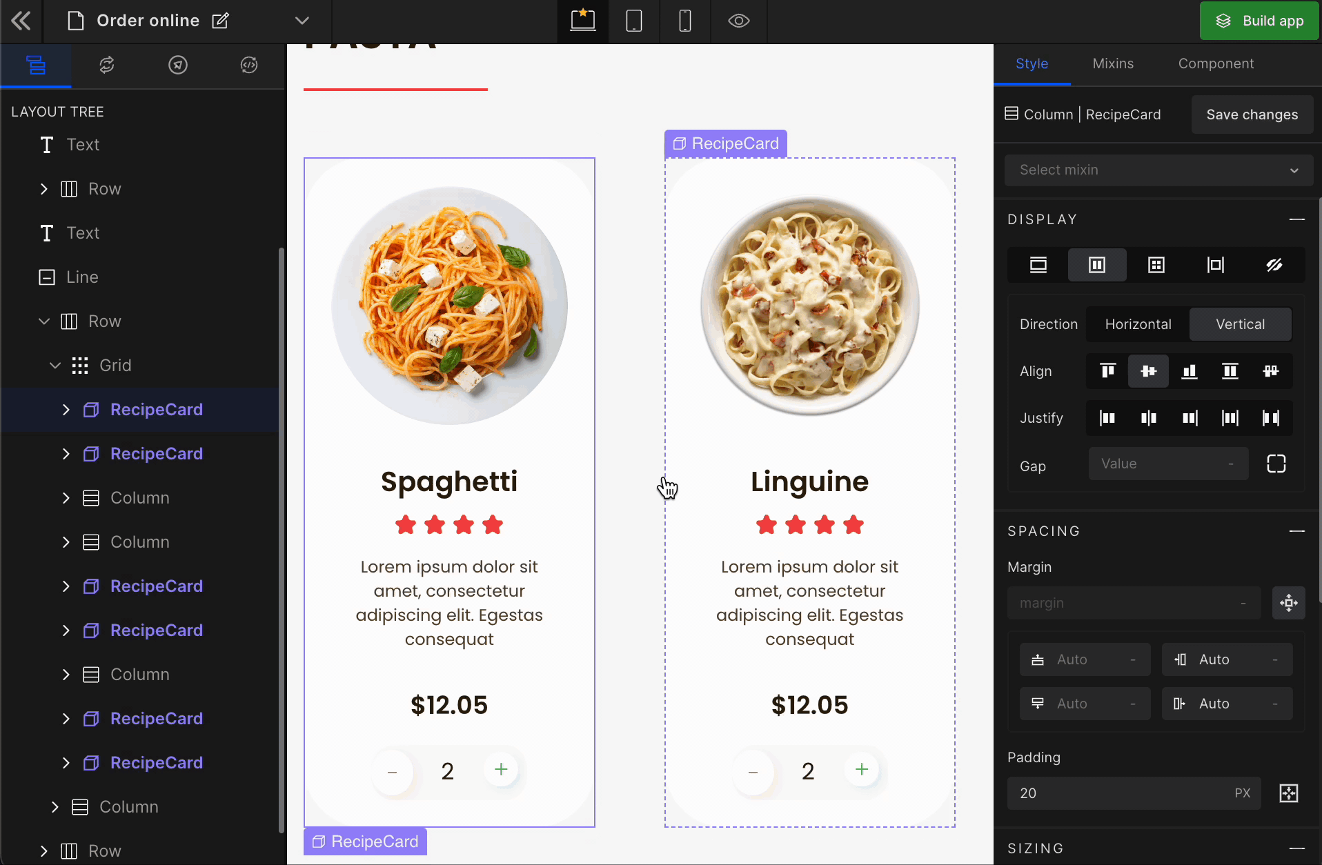
Using DhiWise, you can define your UI part as a custom component with a few simple steps visually. On top of that, it also allows us to define the props, which can be set dynamically from the parent.
How to create custom components
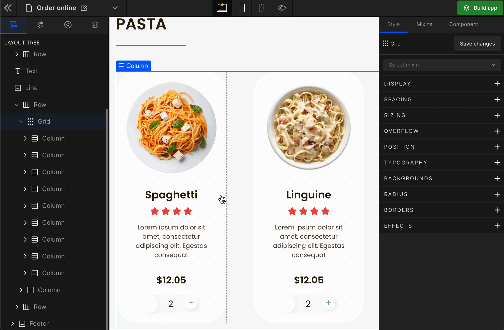
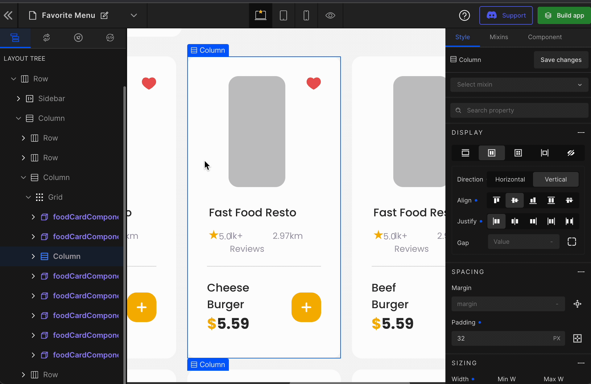
Step 1: Right click on the UI part from the canvas and select “Create Component”
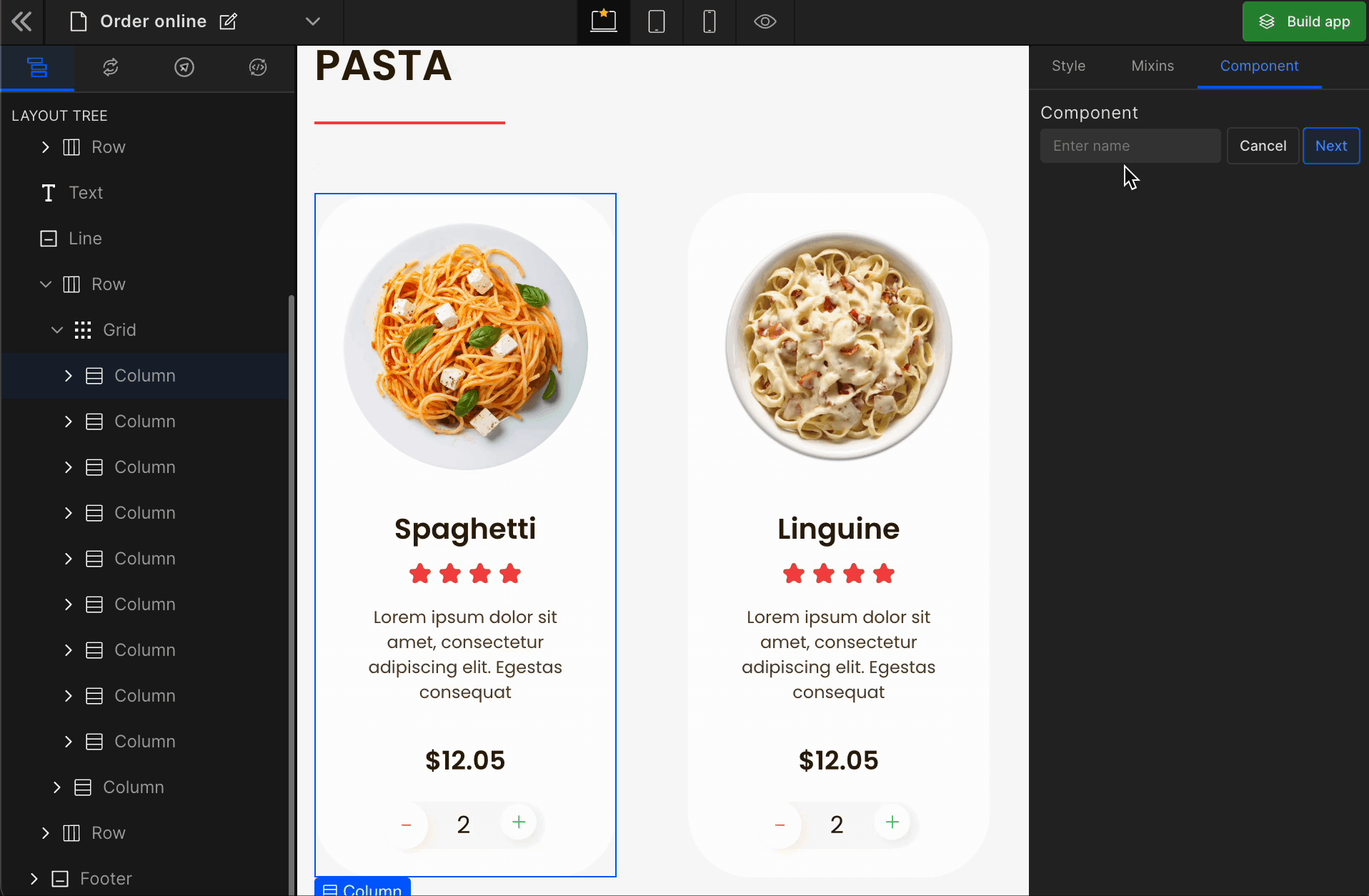
Step 2: Define the name of the shared component
We define the name of a custom component in React the same way we need to define the name over here.
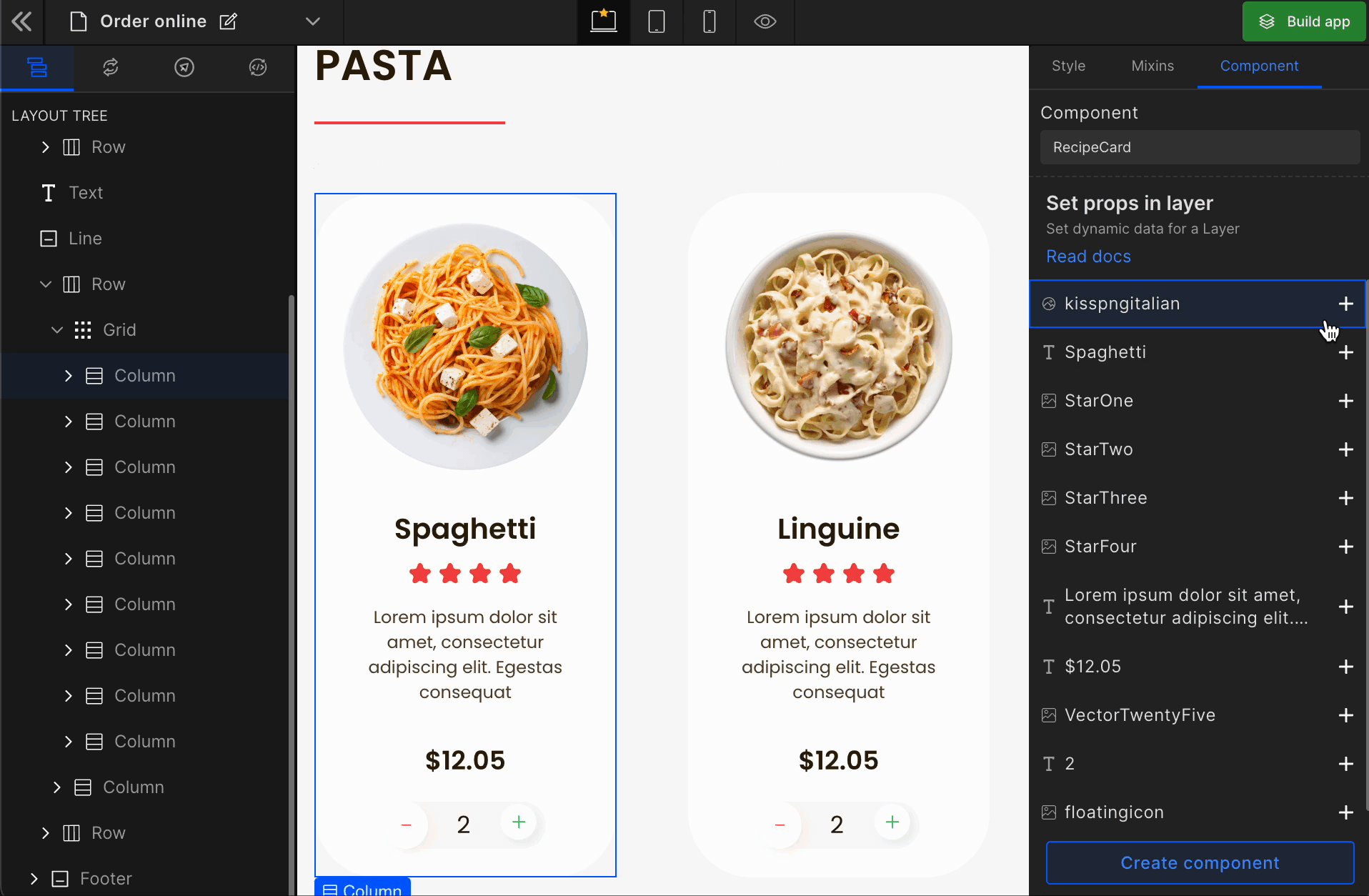
Step 3: Set props in the layer
DhiWise will automatically identify all the props based on text and images in the UI part and ask you to define them as a prop for the shared component, which can be passed from the parent component.
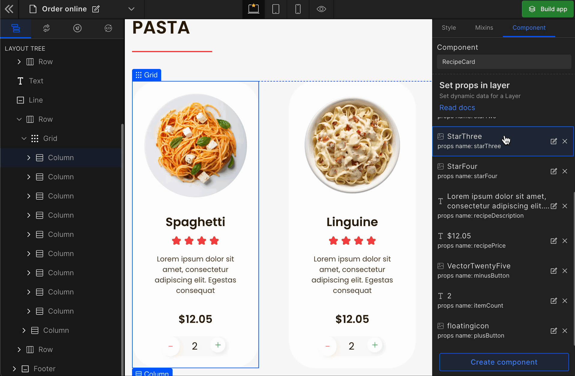
Step 4: Define all the props and click on Create Component button
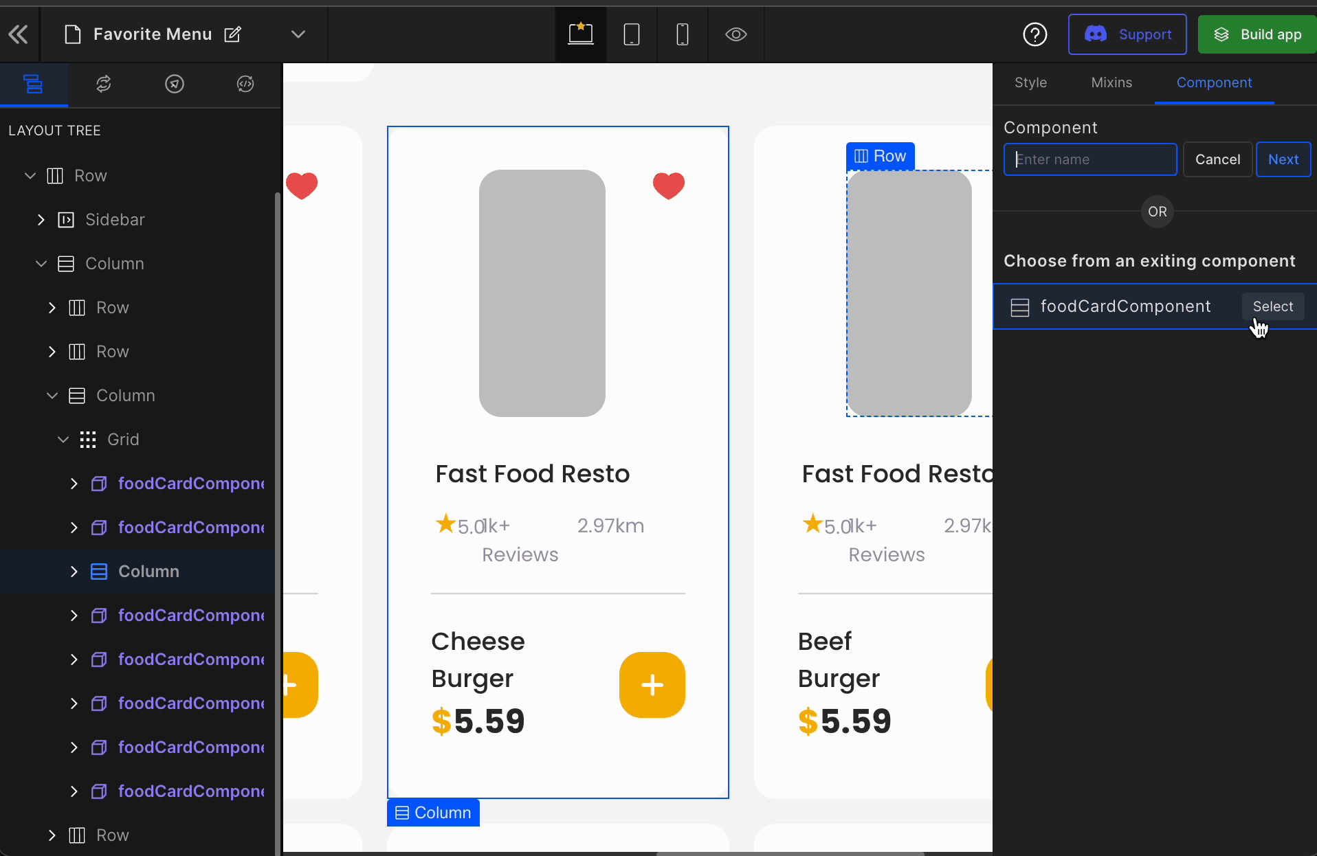
Step 5: Choose similar tag-matched components
Once you define a single view to be a custom component, DhiWise intelligently brings all the tag-matched components and internally, it will replace all those HTML repetitions into a custom component, including the dynamic prop values.
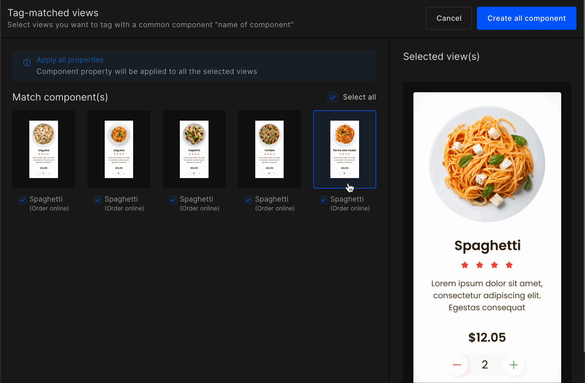
This works only when you have similar components in the same page.
Step 6: Get all the similar views converted into a custom component
You can observe the custom component in the layer tree and the canvas and side panel, which you can update anytime.
Remove Custom Components
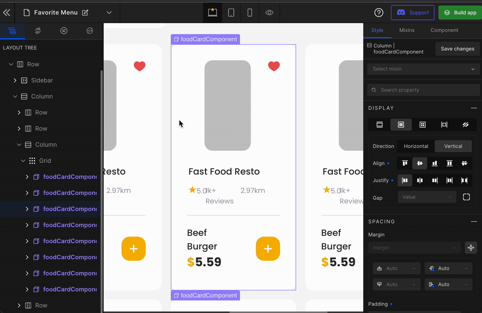
Components let you split the UI into independent, reusable pieces, and think about each piece in isolation. For the same, DhiWise provides the feature of Custom Components. Custom components are created once and can be used multiple times in different business contexts.
DhiWise makes the usage of these Custom Components handier with respect to the changing requirements. Using DhiWise, you can add and remove components from the Custom Component.
How to remove a component from Custom Components
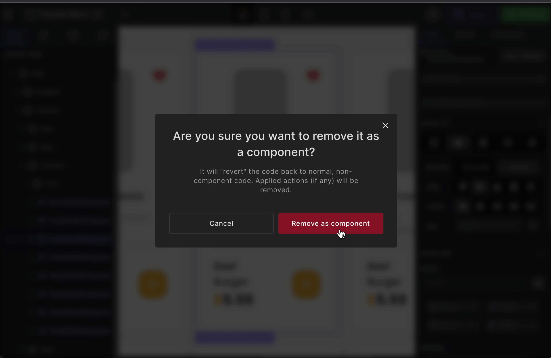
Step 1: Right-click on the component that’s a part of a Custom Component on the canvas and select “Custom Component → Remove as component”.
Step 2: Select “Remove as component” to ensure removing that component.
Effects on code:
Removing a component means removing a component from the Custom Component. On removing a component from the Custom Component, you get a standalone piece of code from DhiWise for that particular component.
Only the component that’s removed from the Custom Component will be removed while the other selected components will still be a part of the Custom Component.
For example,
<FoodComponent
        className="bg-white_A700 flex flex-col items-center justify-start"
        restroName="Fast Food Resto"
        foodName="Fish Burger"
      />
      <div className="bg-white_A700 flex flex-col items-center justify-start">
        <Img
          src="images/img_love.svg"
          className="sm:h-[10px] md:h-[13px] h-[24px] max-w-[100%]"
          alt="Love One"
        />
        <Text
          className="font-medium ml-[3px] text-bluegray_900 text-left w-[auto]"
          as="h5"
          variant="h5"
        >
          Fast Food Resto
        </Text>
        <Button className="items-center justify-center ">
          <Img
            src="images/img_button.svg"
            className="flex items-center justify-center"
            alt="button Two"
          />
        </Button>
      </div>

      <FoodComponent
        className="bg-white_A700 flex flex-col items-center justify-start"
        restroName="Fast Food Resto"
        foodName="Cheese Burger"
      />
Choose and map from existing components
The goal of developing custom components is to maximize the reusability of existing code and eliminate duplicate code. DhiWise lets you create as many custom components as you like and change any of them at any moment, including props.
Once you've developed the necessary component on one page, you may need to reuse it on other pages. In general, we do not create a custom component for the same UI across several pages. This leads to the "Write Everything Twice" idea. It decreases code readability and causes issues in large-scale systems.
To address this, we offer functionality that allows you to select and map an existing custom component that meets all of the requirements and contributes to the "Don't Repeat Yourself" technique.
How to map a UI to an existing Custom Component
Step 1: Right-click on the UI part from the canvas and select “Create Component → Create Custom Component”.
Step 2: Select an existing Custom Component and set the required props. Click on the “Create Component” button to add the component to a Custom Component.
Common Actions in Custom Components
While creating a React application, we often use custom components. These custom components are often used for purposes like UI or actions.
For the UI part, you can refer to creating custom components.
Now, setting up an action into a custom component is available. This will allow you to reduce the time for manually assigning the same action to each part of custom components.
E.g. You want to assign back navigation to a button of a custom component. Similarly, you want the same for all the buttons of all such custom components.
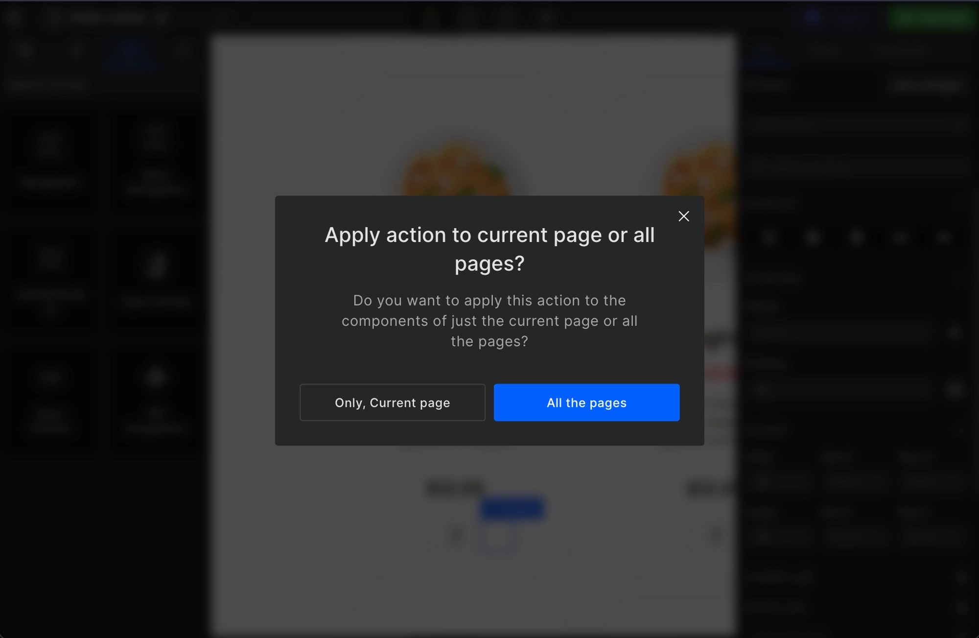
To make this process easy, except for the API Integration, you can assign a similar action to all those occurrences. For this, you will get two options:
- Only current page: It will apply to all the custom components of the current page only.
- All the pages: It will apply to all the custom components of all the pages of the application.
How to set up common actions for custom components
All the steps to assign a common action to all the custom components is the same and similar to the normal action setup.
Step 1:
Right-click on the element.
Step 2:
Select Create action.
Step 3:
Choose an action.
Except API Integration, you can assign action as a common action to all the components.
Step 4:
It will show you a popup as below. Choose any of your choices and proceed.
Got a question? Ask here.