Storybook Integration
Storybook creates an interface where you can visualise your React app’s components easily and play with them by modifying its properties and making changes for better design.The supported components for Storybook are: Input, Radio, Button (LeftIconButton, RightIconButton), CheckBox, SelectArea and TextArea.
Step 1:
Create a React app using DhiWise.Step 2:
Once your app is setup, click on Build App.
Step 3:
A dialog box will appear for Storybook Setup, there are two options:
- With storybook: Code generator with Storybook
- Without storybook: Code generator without Storybook
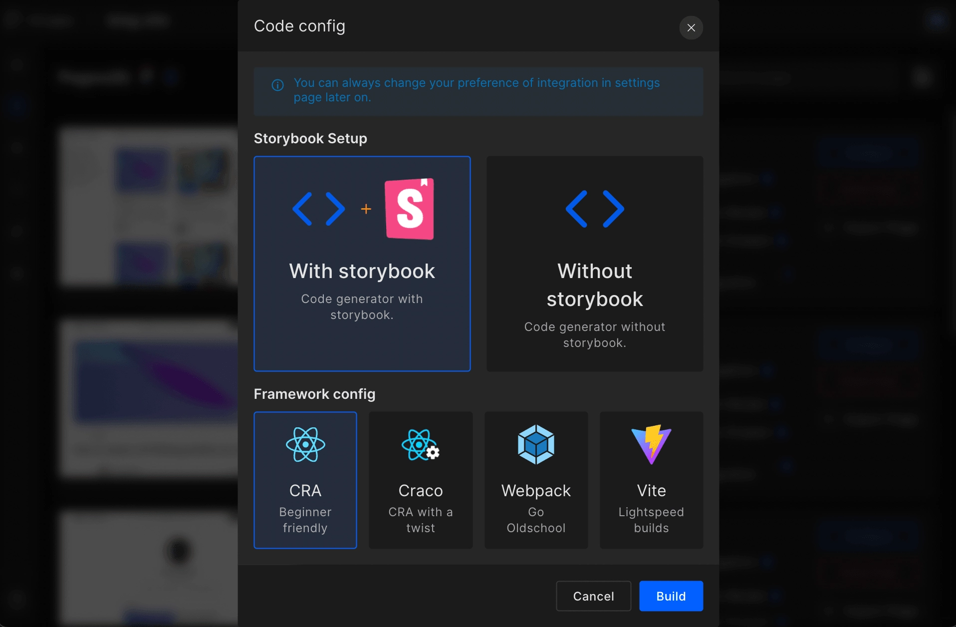
Step 4:
Click on With storybook to integrate Storybook into your application. Once you click there, your project will start to build.
Step 5:
Once your application is built, download your code.
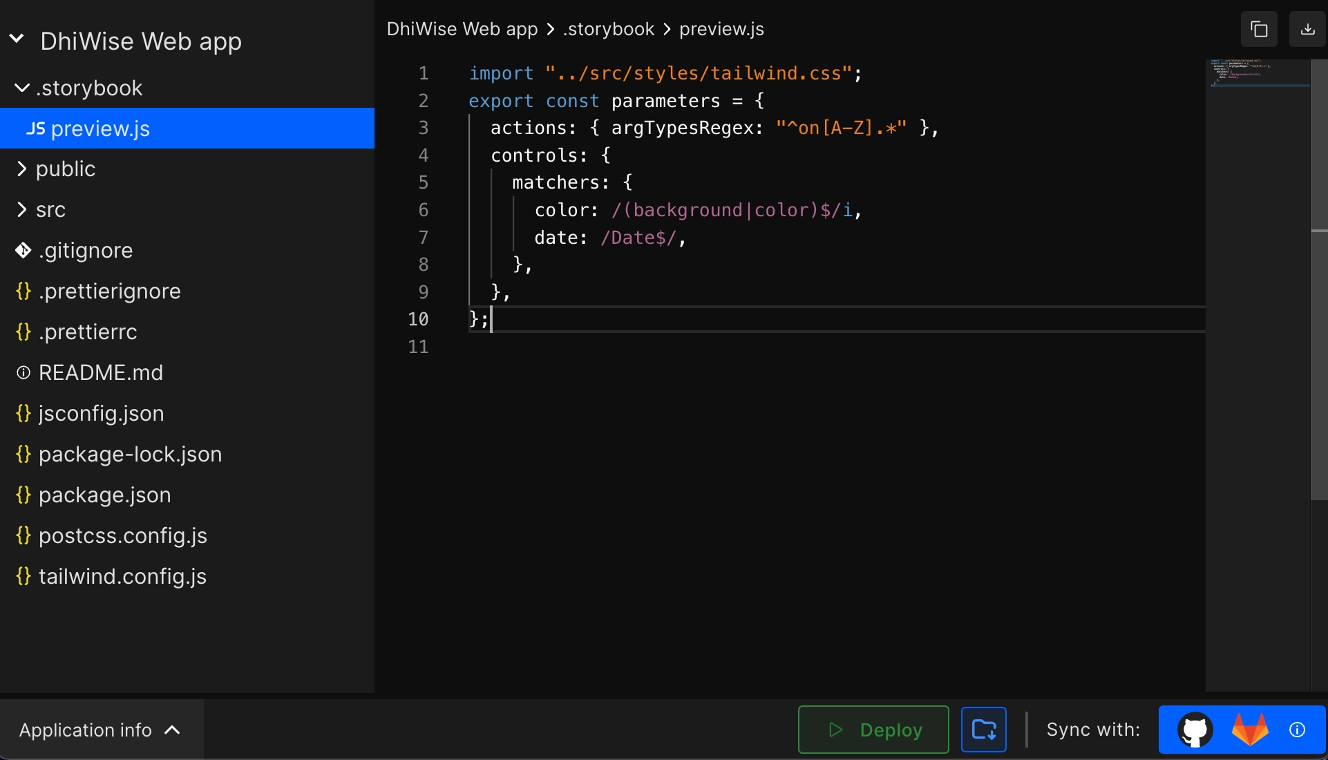
Step 6:
To install and initialize dependencies, run the below command:
npx storybook init
Step 7:
To run Storybook use the following command:
npm run storybook
Step 8:
As you run your code,
Here you can see a list of common components of your application.
Easily configure the Actions, Controls, and Interactions on a button, and also modify them from Canvas area.
You can see in detail the properties description from Docs area.
At this stage, you have successfully integrated Storybook into your React app.
Got a question? Ask here.