Components
Writing all your HTML parts on one page creates chaos in modularising the code. As front-end developers, we often focus on creating common UI parts that can be used repeatedly.
If you’re familiar with Thinking in React, we often break the UI into a common hierarchy. That helps us conveniently handle each UI. In addition, this approach allows us to achieve the single responsibility principle in the codebase.
DhiWise auto-identifies screen components and generates a complete code for the same. Generally, it auto-detects the components, but sometimes due to design changes, it may not able to identify them.
To get the missing component identified, you can map it with any existing component or can create new component at your own.
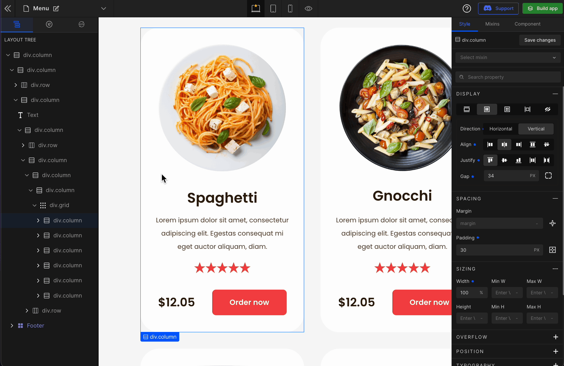
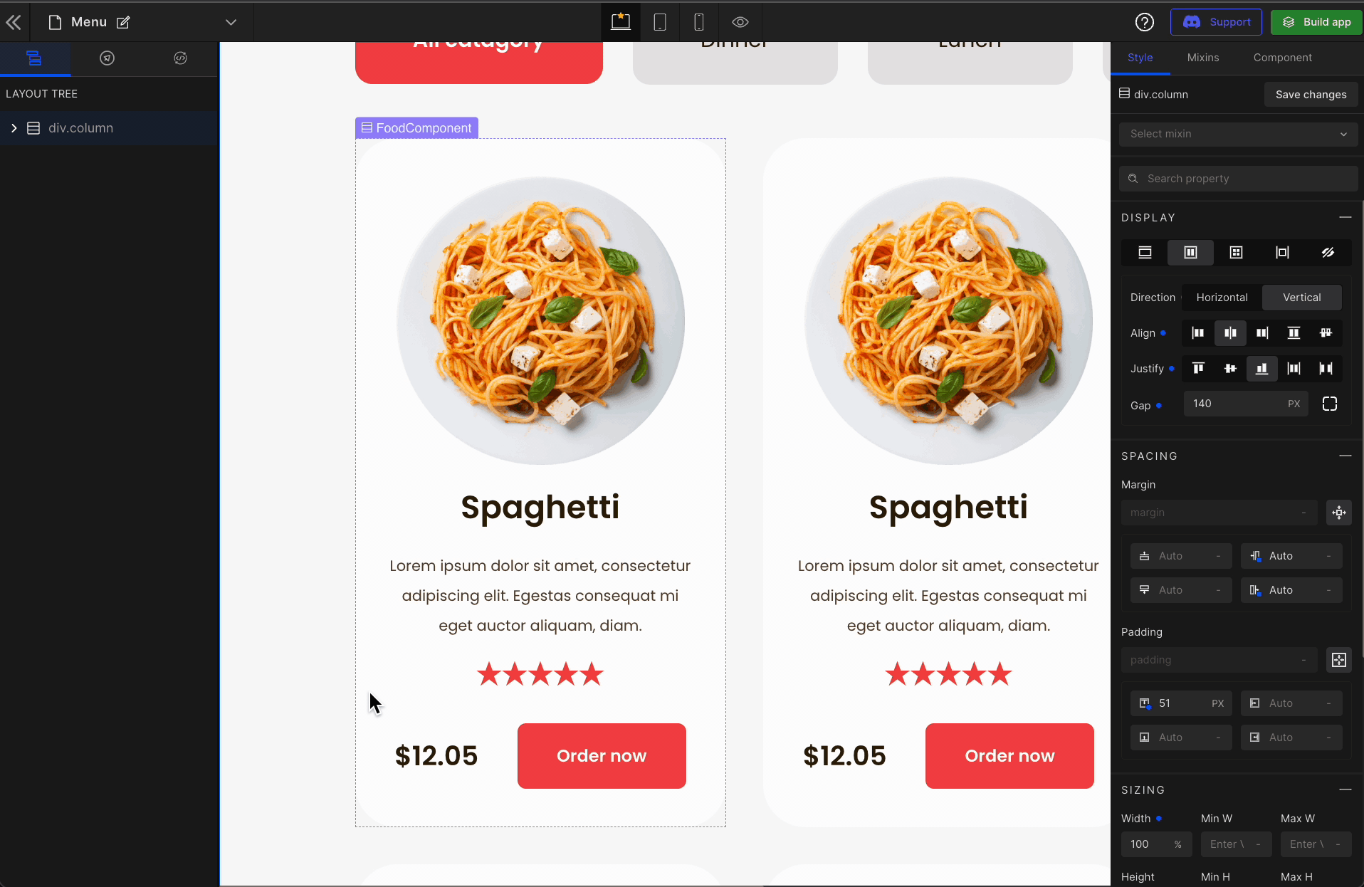
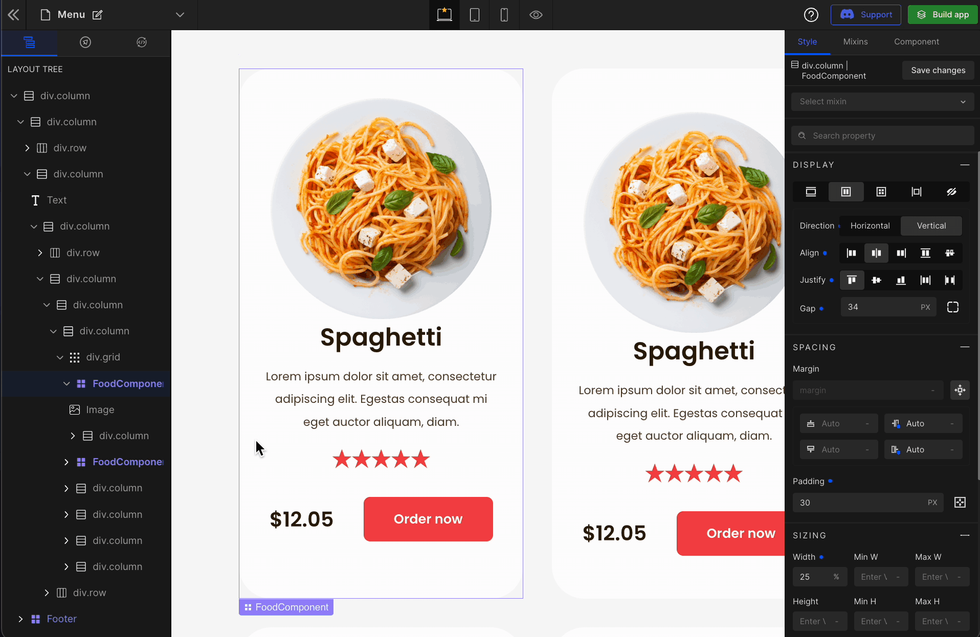
Using DhiWise, you can define your UI part as a component with a few simple steps visually. On top of that, it also allows us to define the props, which can be set dynamically from the parent.
Create a new component
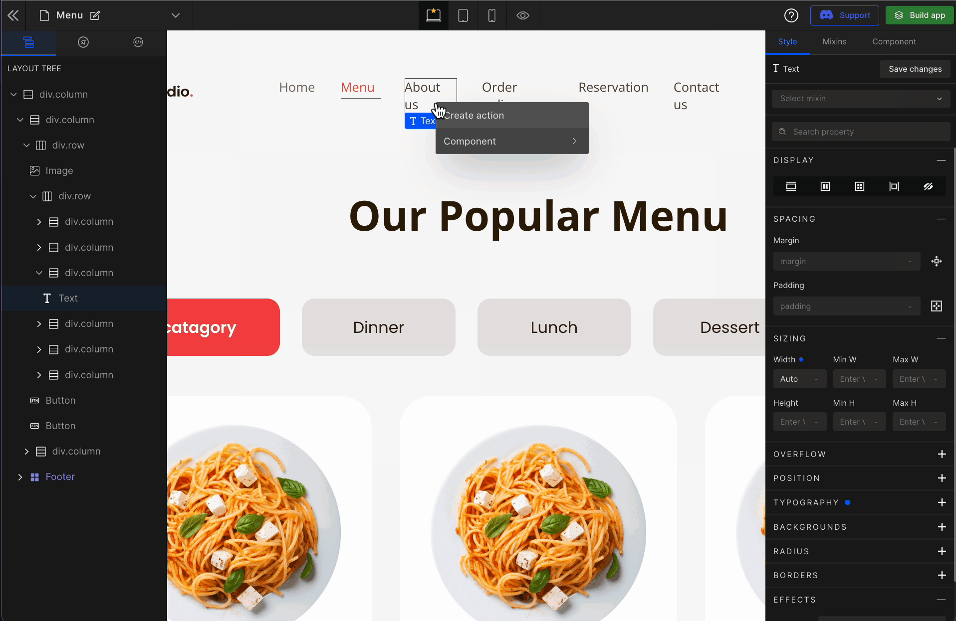
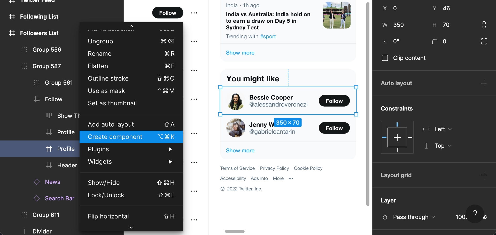
1: Select the UI part
Right-click on the UI part, hover over Component and select Create new component.
2: Define the name of the component
Just as we define the name of a component in React; the same way we need to define the name here.
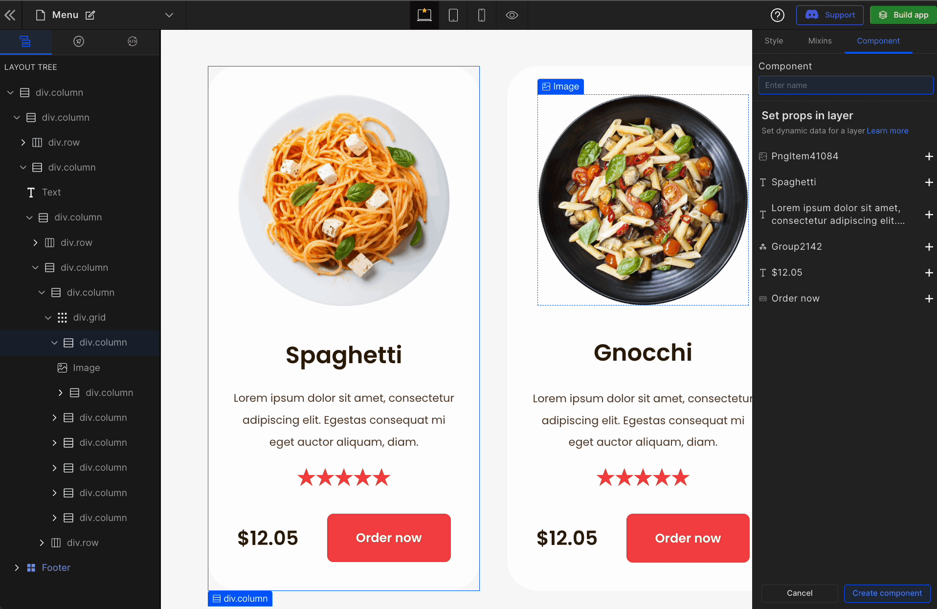
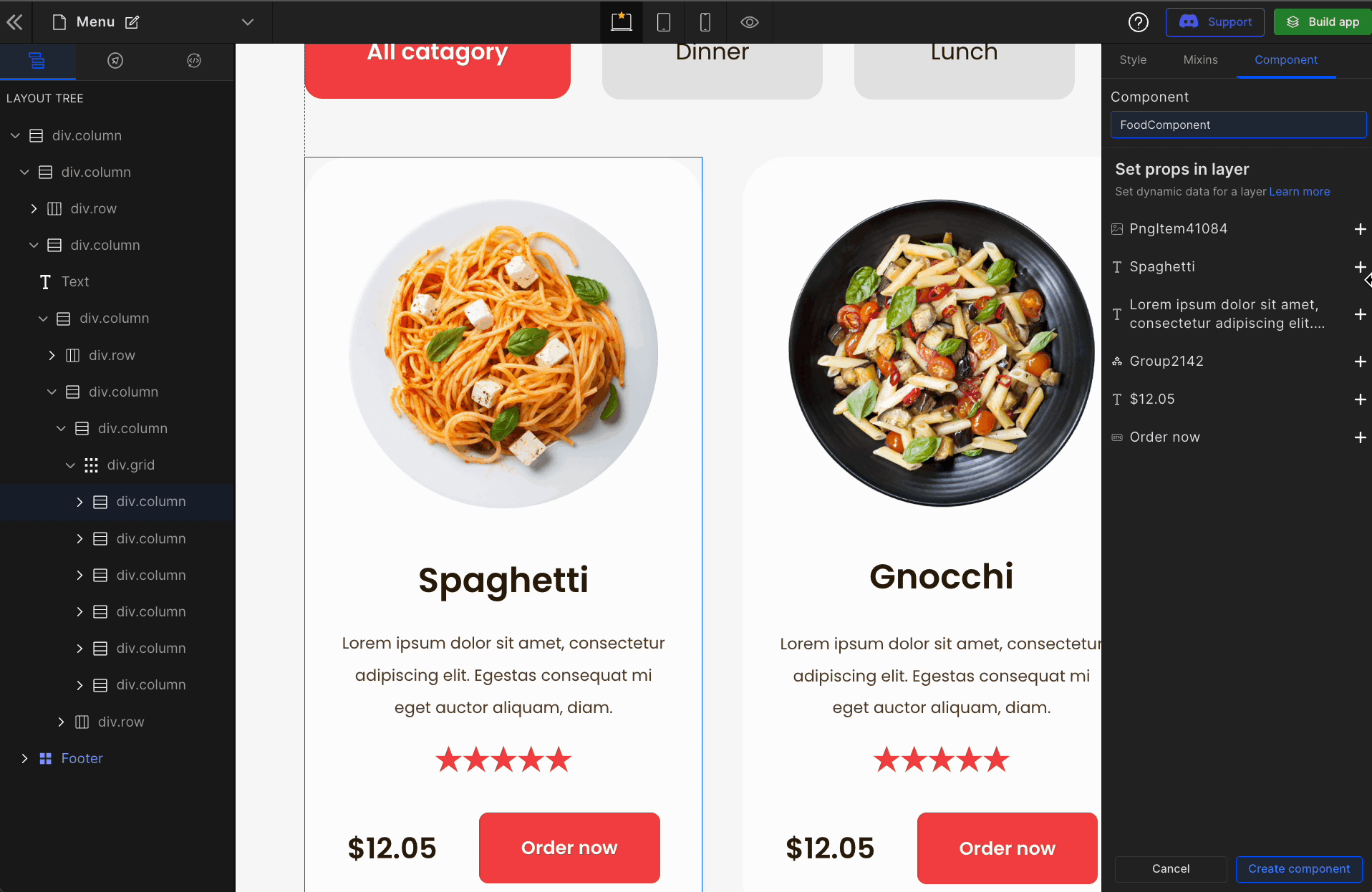
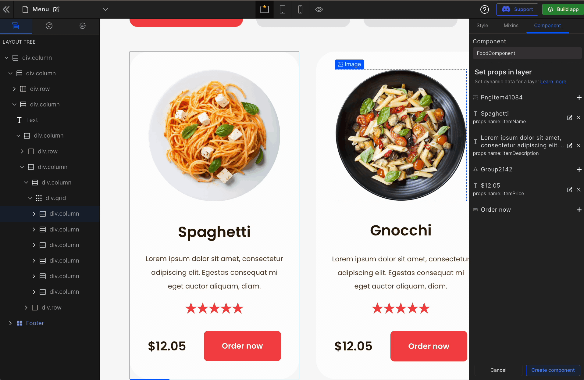
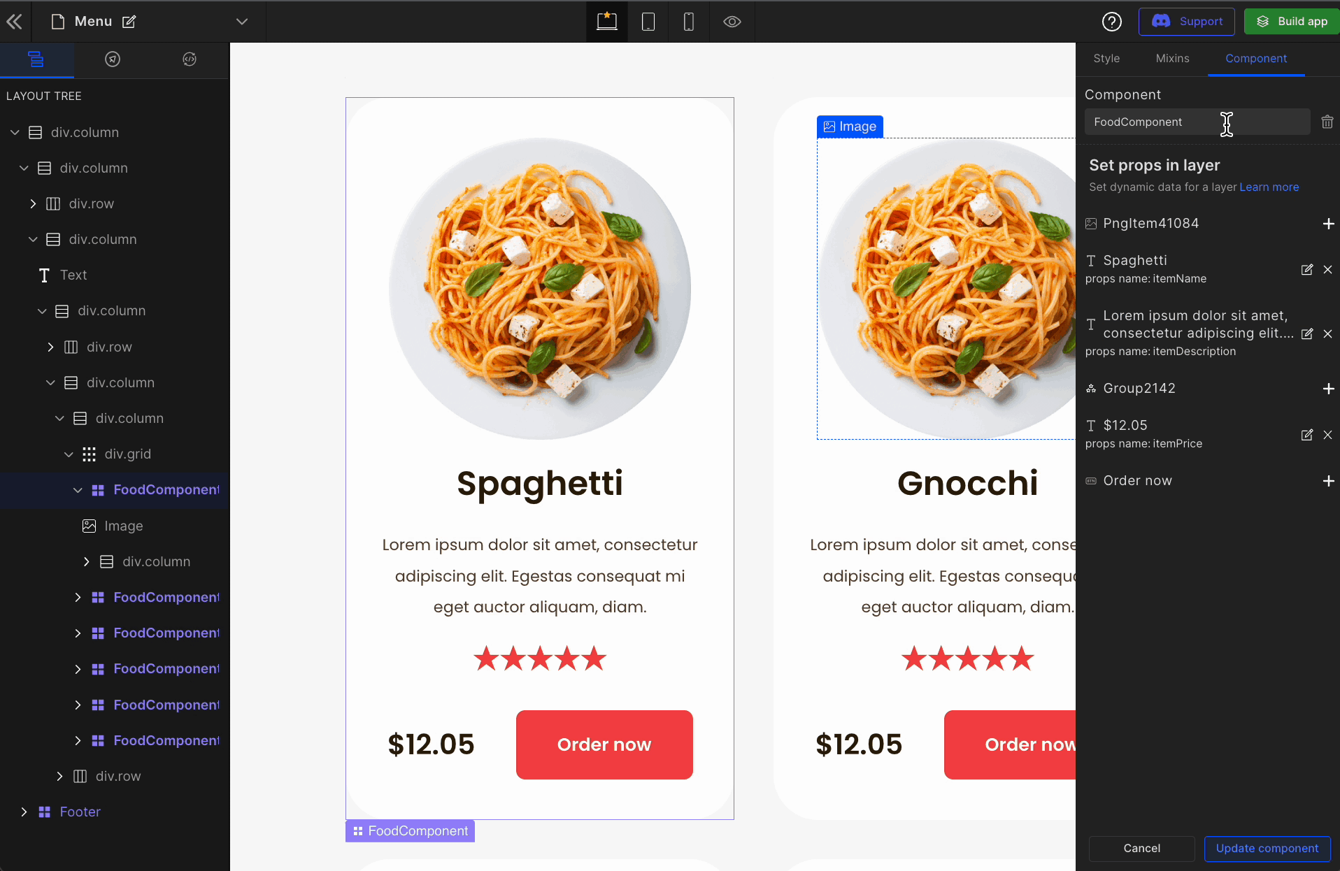
3: Set props in the layer
DhiWise will automatically identify all the props based on text and images in the UI part and ask you to define prop name for the component to generate source code with better readability when you build the app.
4: Finish creating a component
Define all the props and click on Create Component to create a component.
Once you define a single view to be a component, DhiWise intelligently brings all the tag-matched components and internally, it will replace all those HTML repetitions into a component, including the dynamic prop values. This lets you select similar tag-matched components that you wish to convert.
5: Check all the similar views converted into a component
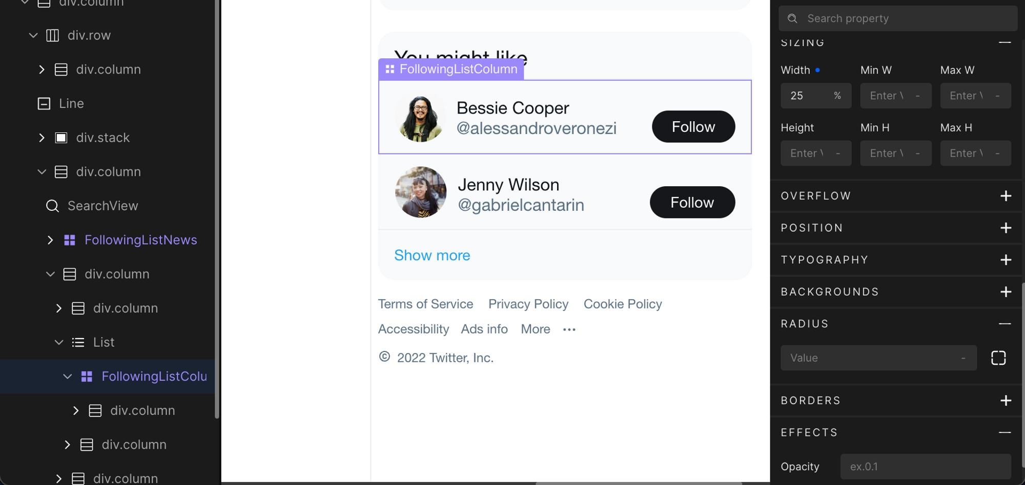
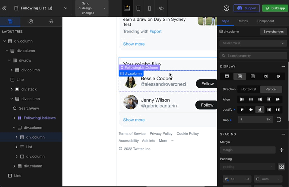
You can observe the component in the layer tree, the UI and the side panel, which you can update anytime. It will be highlighted as Violet color.
Choose and map from the existing components
- The goal of developing components is to maximize the reusability of existing code and eliminate duplicate code. DhiWise lets you create as many components as you like and change any of them at any moment, including props.
- Once you've developed the necessary component on one page, you may need to reuse it on other pages. In general, we do not create a component for the same UI across several pages. This leads to the "Write Everything Twice" idea. It decreases code readability and causes issues in large-scale systems.
- To address this, we offer functionality that allows you to select and map an existing component that meets all of the requirements and contributes to the "Don't Repeat Yourself" technique.
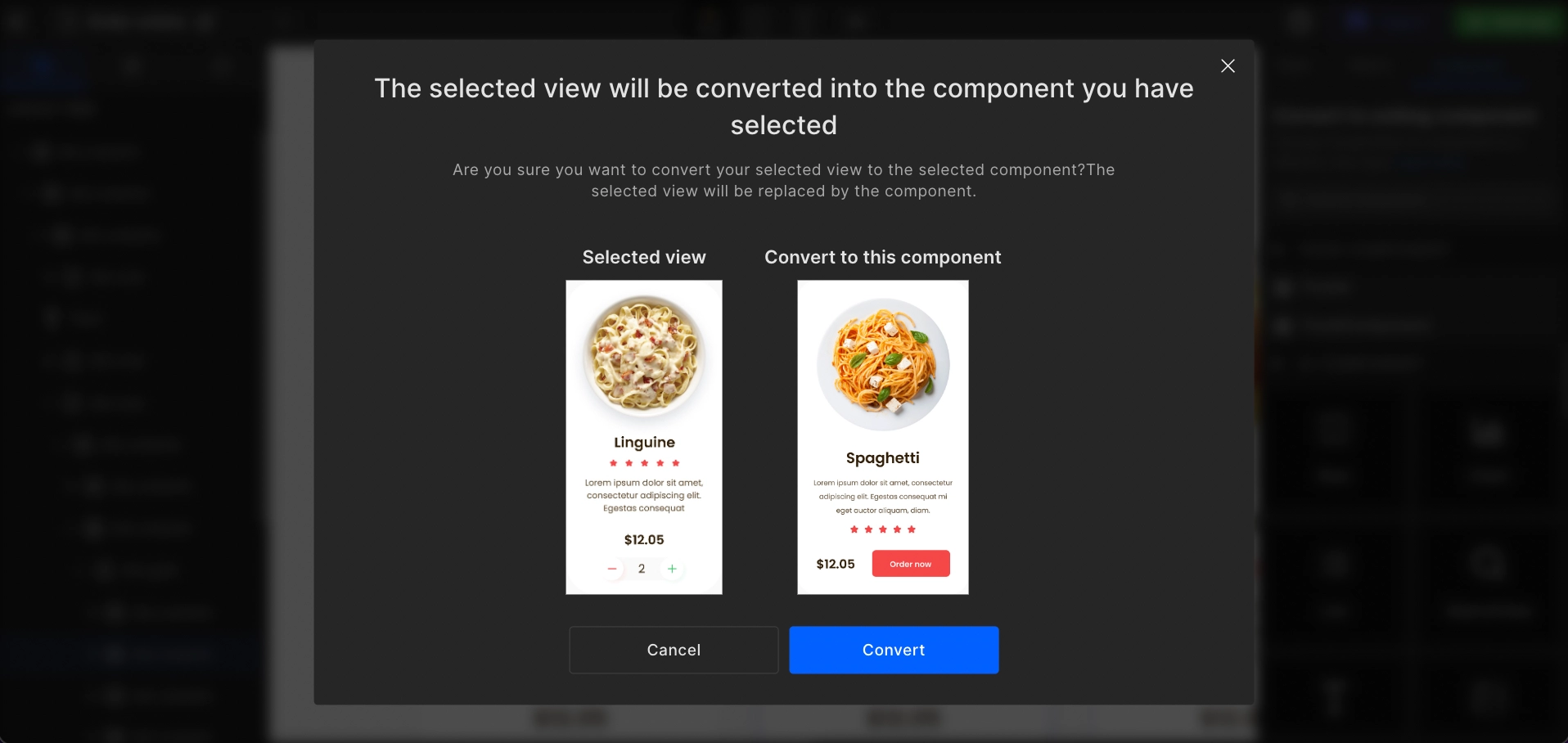
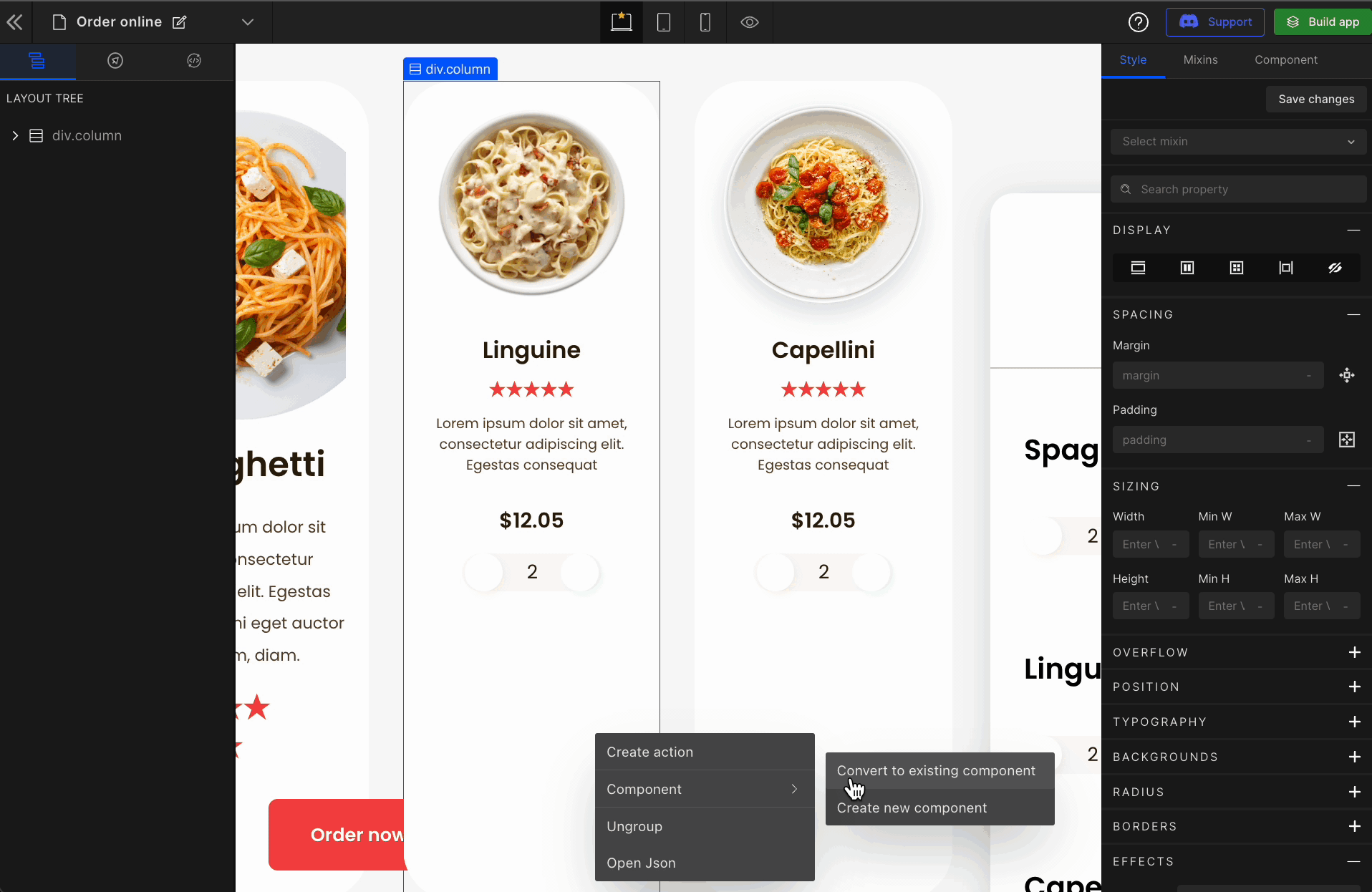
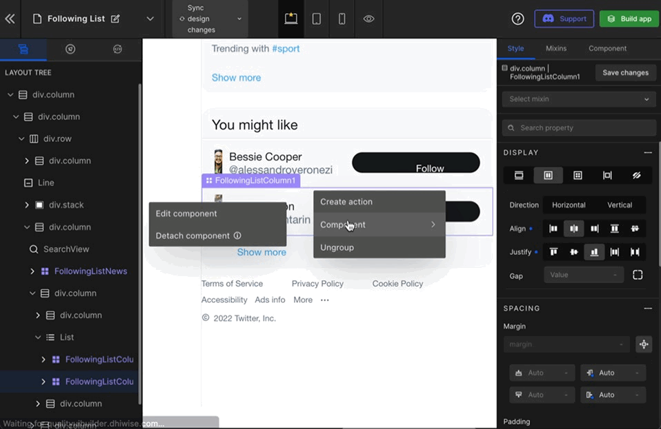
1: Convert to existing component
Right-click on the component, hover over Component and select Convert to existing component.
2: Select your component
Component selection here provides you the flexibility to select a component that’s created by you as well as the UI components supported by DhiWise.
To convert your component to an existing DhiWise-supported component, select the component to which you want to convert.
To convert your component to your created existing component, select your component. This will show you what your current and existing components look like and seek your confirmation to proceed further.
-8ded54cbf79fd23fc0dff527f6296c9b.gif)
Editing a component is only possible when it is a complete (100%) match. If the component is converted to an existing component which is not a complete match, then you will be unable to modify the component name or properties.
DhiWise will ask for confirmation before you convert to an existing component which is not a 100% match.
View Components
Components that are created can be viewed while converting them to existing components that is one can even view the components that they’ve created.
1: Select the Component
Right-click on the component, hover over Component, and select Convert to existing component
2: Click 👁 to view
To View a component, click 👁 button on the component. This opens up the component view and lists the created actions.
Edit your component
Many times, you may require to edit the component name or prop name. You can edit them any time from DhiWise. This saves a lot of time renaming components and their prop all over the application source code.
1: Select the Component
Right-click on the component, hover over Component, and select Edit component.
2: Update the Component
Make the required changes and click on Update component to finish editing.
Detaching Components
DhiWise helps you convert UI parts into React components, increasing code readability, reusability and modularity.
To understand the detach component, we must first know about the UI parts.
What is the UI part?
The UI part is an HTML & TailwindCSS code DhiWise generates for web pages.
Detaching a component means removing that particular piece of code instance as a React component and putting it back as a UI part. Doing so will eliminate the readability, reusability and modularity of that code.
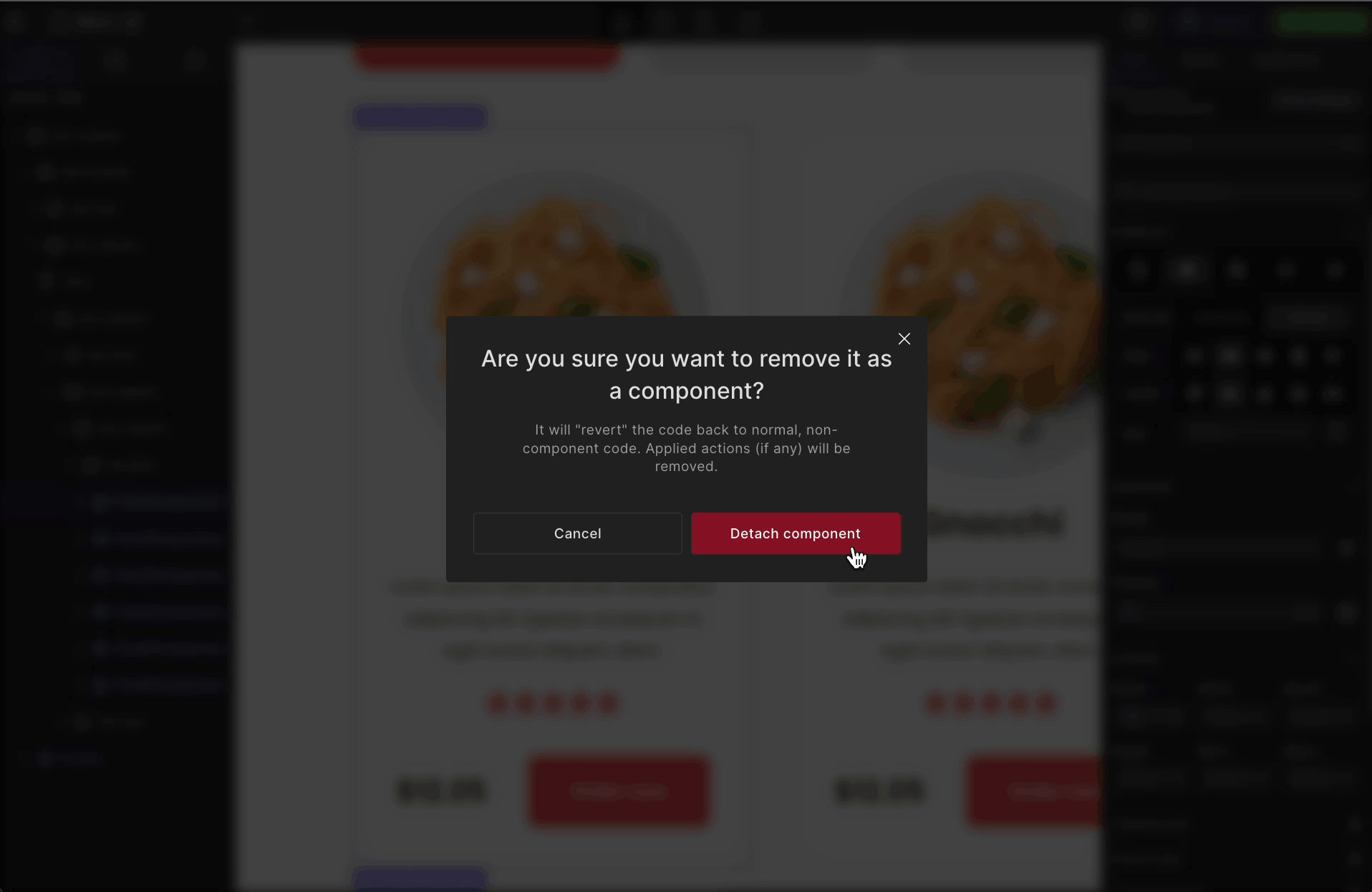
1: Select the Component
Right-click on the component to be detached from the UI, hover over Component and select Detach component
2: Select “Detach component” to ensure removing that component
Effects of detaching on code
Detaching a component means removing it as a component and not completely deleting it from the source code or UI. On detaching a component, you get a standalone piece of code and in other words “JSX” code from DhiWise for that particular component.
Only the detached component will not be a component any longer, keeping other components as it is.
For example,
<div className="justify-center min-h-[auto] w-[100%]">
  <div className="items-center justify-center p-[30px] w-[100%]">
    <Img
      src="images/img_pngitem5290903.webp"
      className="h-[270px] md:h-[auto] mt-[6px] object-cover w-[270px]"
      alt="PngItem5290903"
    />
    <div className="flex flex-col items-center justify-end mb-[6px] w-[100%]">
      <div className="flex flex-col gap-[23px] items-center justify-start w-[100%]">
        <Text
          className="font-semibold text-gray_900 text-left w-[auto]"
          as="h6"
          variant="h6"
        >
          Spaghetti
        </Text>
        <Text
          className="leading-[200.00%] not-italic text-center text-gray_800 w-[100%]"
          variant="body7"
        >
          Lorem ipsum dolor sit amet, consectetur adipiscing elit. Egestas
          consequat mi eget auctor aliquam, diam.{" "}
        </Text>
      </div>
      <div className="flex items-center justify-center mt-[14px] rounded-[1.76px] w-[49%]">
        <RatingBar
          className=""
          value={5}
          starCount={5}
          activeColor="#f54748"
          size={24}
        ></RatingBar>
      </div>
      <div className="flex flex-row gap-[34px] items-center justify-between w-[95%]">
        <Text
          className="font-semibold text-gray_900 text-left w-[auto]"
          variant="body1"
        >
          $12.05
        </Text>
        <Button
          className="text-center text-white_A700 w-[auto]"
          onClick={() => navigate("/checkout")}
        >
          Order now
        </Button>
      </div>
    </div>
  </div>
  <FoodComponent className="bg-white_A700 flex flex-1 flex-col items-center justify-center p-[30px] sm:px-[20px] rounded-[40px] w-[100%]" />
  <FoodComponent className="bg-white_A700 flex flex-1 flex-col items-center justify-center p-[30px] sm:px-[20px] rounded-[40px] w-[100%]" />
</div>;
Common Actions in Components
While creating a React application, we often use components. These components are often used for purposes like UI or actions.
For the UI part, you can refer to creating components.
Now, setting up an action into a component is available. This will allow you to reduce the time for manually assigning the same action to each part of the components.
E.g. You want to assign back navigation to a button of a component. Similarly, you want the same for all the buttons of all such components.
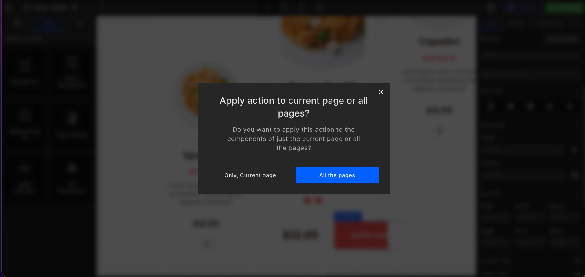
To make this process easy, except for the API Integration, you can assign a similar action to all those occurrences. For this, you will get two options:
- Only current page: It will apply to all the components of the current page only.
- All the pages: It will apply to all the components of all the pages of the application.
Set up common actions for components
All the steps to assign a common action to all the components is the same and similar to the normal action setup.
Step 1:
Right-click on the element/component.
Step 2:
Select Create action.
Step 3:
Choose an action.
Step 4:
It will show you a popup as below. Choose any of your choices and proceed.
Figma Component to React Components
Figma Components are reusable design elements in Figma that enable designers to generate a master version of a design element that can then be used to create instances of the component. Because these instances are linked to the master component, any changes to the master component have an impact on all of the instances. Figma Components aid design teams by ensuring design uniformity and making it easy to upgrade and maintain a design system.
DhiWise automatically converts those components into a React Component when you create a React app, importing your Figma design into DhiWise.
Effect on Code
If you have some elements of the UI, which are not part of every similar component you tag in Figma, DhiWise will consider those data optional. In the generated code that part will render conditionally.
Get React component automatically
Open your Figma design, and select the design you want to convert. Right-click on the element, and click
Create component.Or, Press
Option ⌥ + Command ⌘ + Kfor Macintosh orAlt + Ctrl + Kfor Windows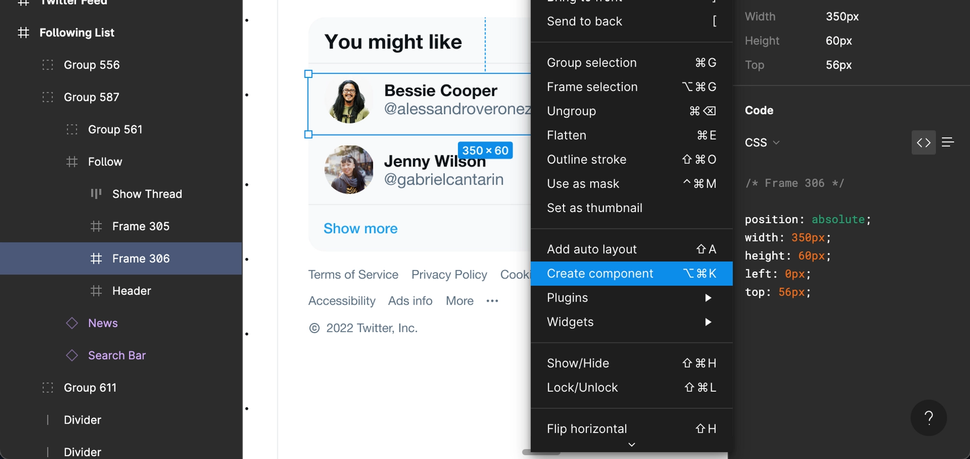
Or, as an alternative, you can perform the same in the Layers view.
Your component will look something like this. The
Violethighlight indicates the component.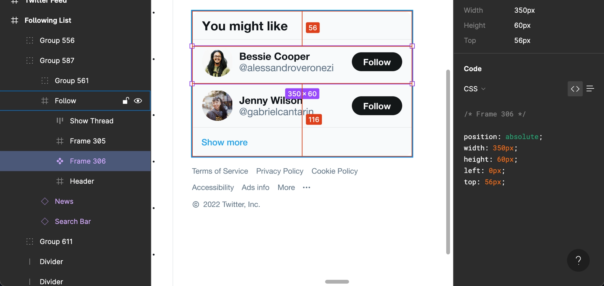
Once you’re done with this. Go to DhiWise and Create a React app using your Figma design.
In DhiWise, you can find your Figma components with the same color indicating the React components.
View all your components
Open your application and you will see the following screen. Select the
Componentstabs.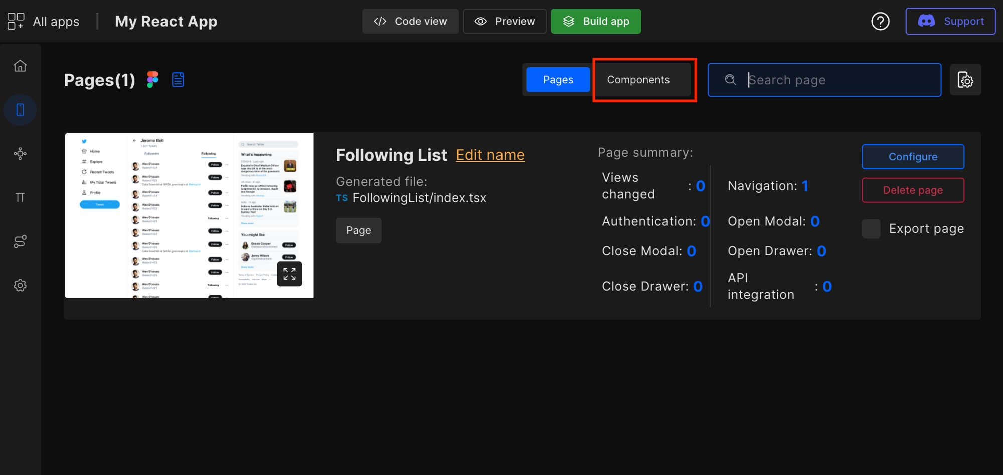
You will get this screen where you can see all the components auto-identified by DhiWise based on your Figma design and Figma components that you had created manually in the Figma file.
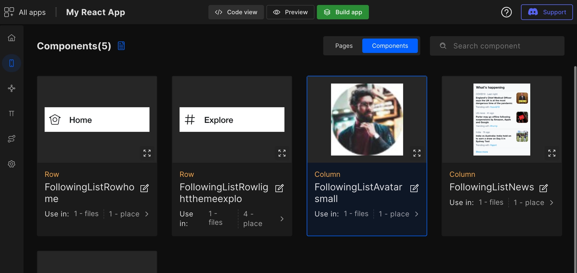
You can observe the number of times and a number of files the components are used in.
Customize auto-identified components
With this feature, you can edit the component name as well as props which are passed from the parent component to the child component.
Right-click on the component and select Component -> Edit component.
You can edit prop name and component name which will reflect on the generated code after building the app.
Detach an auto-identified Figma component
Right-click on the component and select Component → Detach component.
Effect on code
Detaching a component states dismantling it as a component without removing it entirely from the source code or UI. When you detach a component, you obtain a standalone piece of code, or "JSX" code, from DhiWise for that specific component.
Only the detached component will no longer be a component, leaving the other components unchanged.
Got a question? Ask here.