Responsiveness and Design Configuration
Once you create a React web application on Figma, you can start working on your app's pages. You can customize your application UI with Smart Editor, where you can easily edit and modify all UI changes while having a real-time design preview. This helps you make UI more adaptive and accurate by providing you with all your necessities right here while you create your application.
The media queries generated by DhiWise supports below devices. Learn more
| Device | px | CSS |
|---|---|---|
| Mobile | 200px to 767px | @media (min-width: 200px) and (max-width: 767px) { ... } |
| Tablet | 768px to 991px | @media (min-width: 768px) and (max-width: 991px) { ... } |
| Desktop | >991px | It is the default for React apps. |
Key capabilities
| Name | Description |
|---|---|
| Real-time design preview | Real-time design rendering eliminates the need to rebuild the project again and again. Instead, the changes you make are reflected instantly on the selected device. |
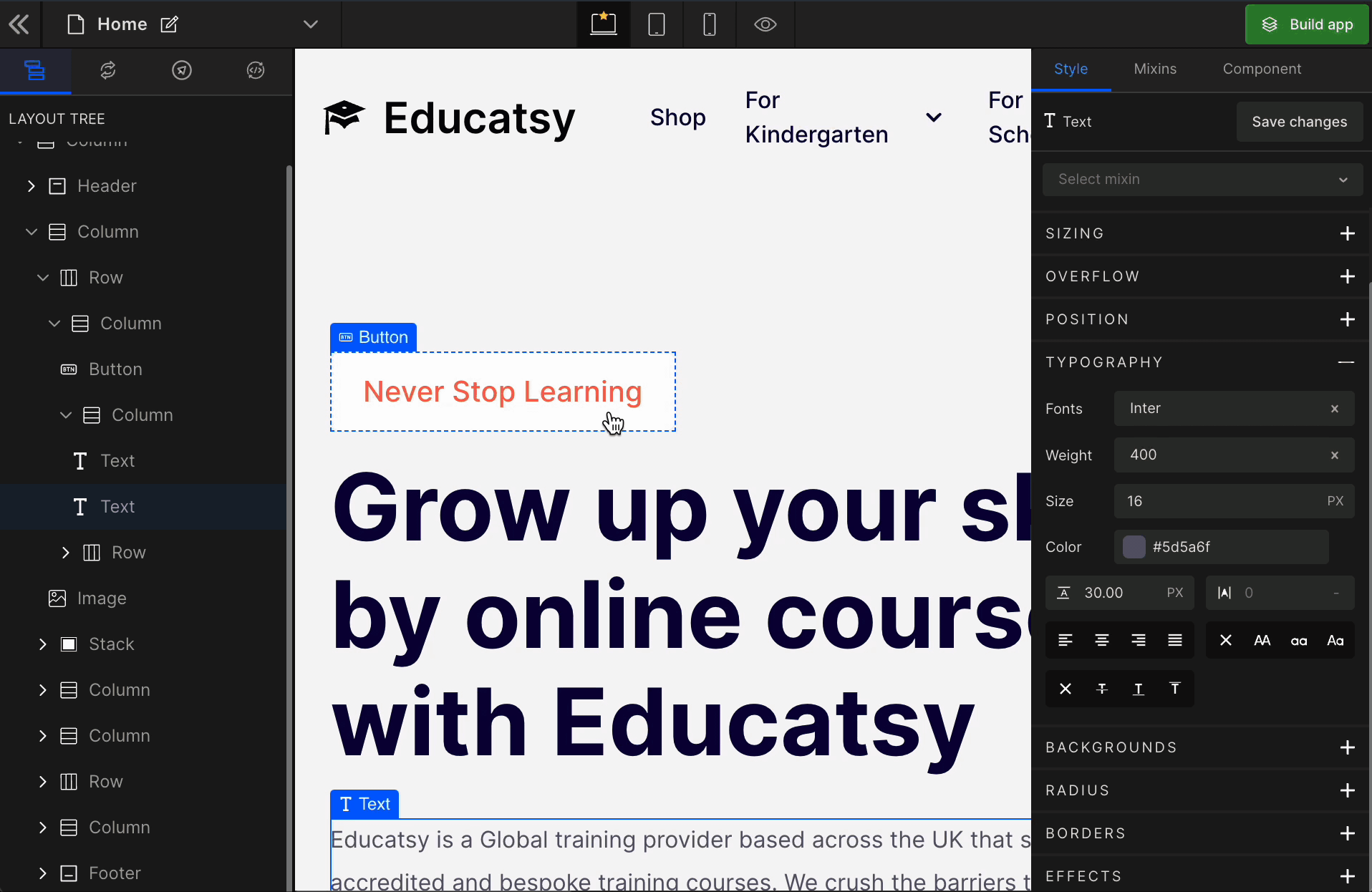
| CSS Stylings | With Smart Editor, you can paint any part of your web page just like that. There are ten types of CSS stylings with in-detail customization to design a pixel-perfect UI right in your browser to get TailwindCSS code for your React web app. |
| Change Device | To develop a responsive web app that can run on Desktop, Tablet, and Mobile with utmost precision, the Smart Editor, gives an easy switch between all these three devices to develop design faster and more accurately. |
| Choose and map from the existing components | In some cases, you might need to modify the component; in such cases, you can easily do it from the Editor without returning to Figma. The Convert to existing component property allows you to convert your component to an existing component from the Editor itself in no time. |
| Group, Ungroup, and Delete Components | Select the components, right-click on the selection or use the associated keyboard shortcut to group components together or ungroup them from the Smart Editor. |
| Easy Screen Navigation while development | Smart Editor offers you a quick way to navigate between the screens of your application without going back to the screen list. |
Applying changes
All the design preferences for the Desktop will be applied to Tablet and Mobile. Likewise, all the changes for the Tablet will be applied to the Mobile.
It means the changes in the larger devices will be applied to the smaller devices. However, any custom changes you make for a smaller device won’t apply to the larger ones.
For example, Mobile changes will not be reflected on the Tablet or Desktop.
Even after applying changes to Mobile, if you use changes on the Desktop, those changes will not overwrite Mobile changes. It will keep your changes untouched.


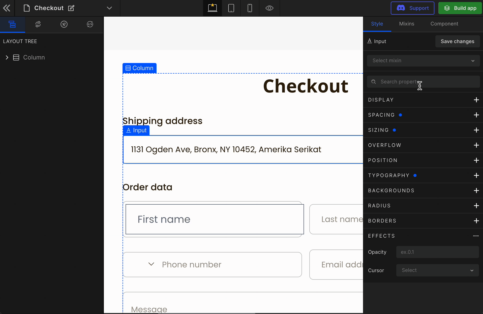
Immediate Parent Selection
When we design the Figma files, we often layer some hidden parts or have an overlapping layer. These layers help designers to make a UI part look perfect on screen.
From a developer’s view, it is a div that might be a parent that impacts the UI in terms of layout, like row/column or aligning with siblings or children.

DhiWise has a “Layer View” that gives the layers hierarchy. On top of that, to make it more accessible and precise, we have an immediate parent selection feature where you can easily navigate to the parent.
How to make immediate parent selections?
Select the view on the canvas area, and hover on the element type. It will bring all the immediate parents of the selected child.
Hover over the parent, and it will outline that parent with a dotted blue border.
CSS Highlight
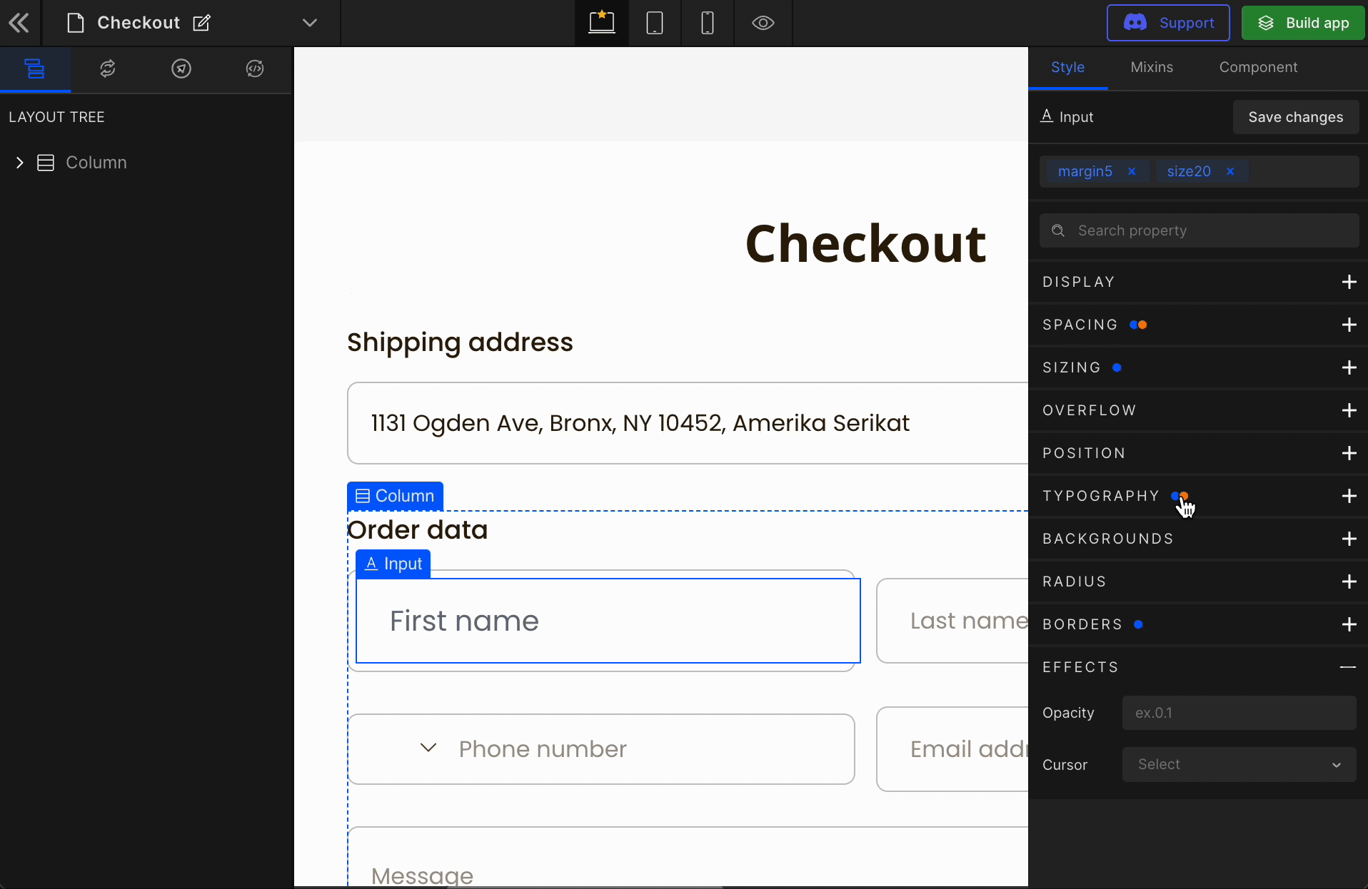
Now, you can easily differentiate whether any CSS has been applied from DhiWise or mixins.
In the Smart Editor, some elements might have CSS given by DhiWise generated code or by you manually using the CSS stylings option or some elements might have CSS given by Mixins.
To identify each separately we have added a highlight indicator which will give you a hint will a specific color to that CSS attribute when you select the element. We have two options here:
- DhiWise CSS: It is identified as a
Bluedot. - Mixin CSS: It is identified as an
Orangedot.
Inspect Element
Before adding in CSS or modifying the CSS of any particular element, you might need to inspect and see the current stylings of that element.
To make it accessible, we have this “Inspect Element” feature that allows you to do that without any extra effort.
To Inspect an element, use the option key for Mac or Alt key for Windows to see the margin, padding, and dimensions of the currently hovered component.
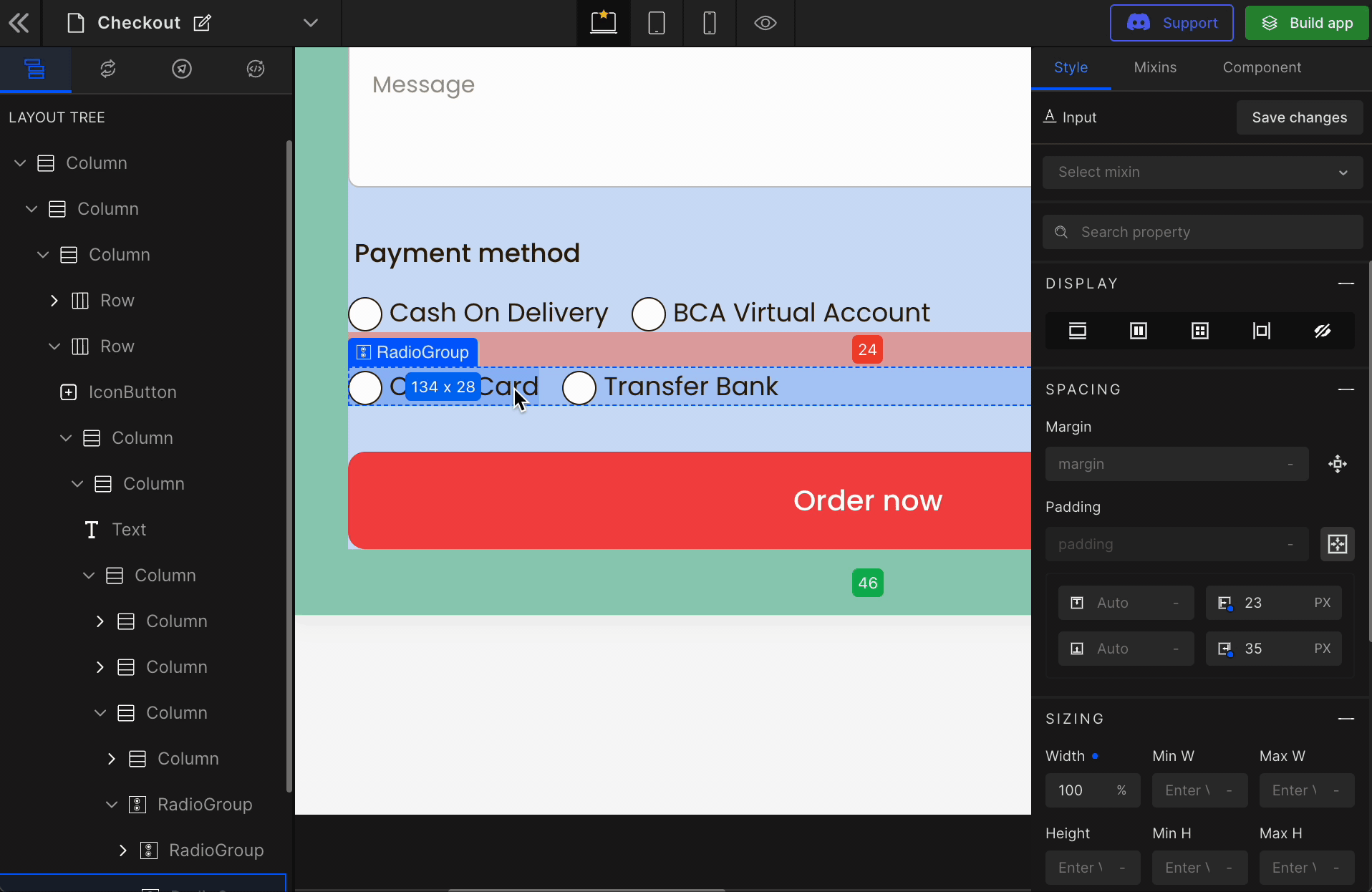
Indications:
- Padding: It is shown in
Greencolors. - Margin: It is shown in
Redcolors. - Dimensions: It is shown in
width * heightformat.
All measurements are in px.
Search CSS Properties
To access and manipulate CSS attributes faster, now you can search attributes and tweak with UI easier.
Got a question? Ask here.