Change View Components
DhiWise auto-identifies all your screen view components and generates a complete code for the same. Generally, it auto-detects the components, but sometimes due to design changes, it may not able to identify them.
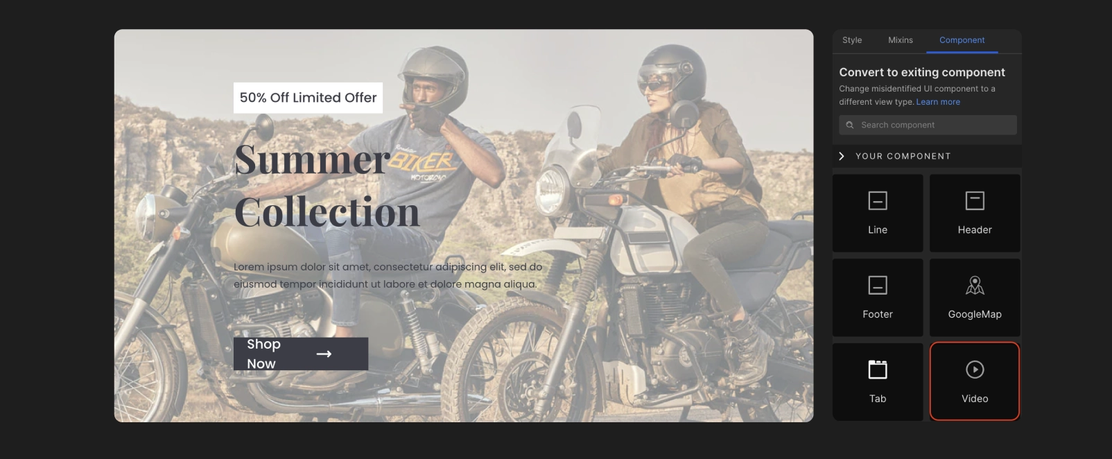
To get the missing component identified, you can change the view of the misidentified component to the correct one in DhiWise.
To get identify your components directly from Figma, you can also refer below;
Refer to the design guidelines or component-specific guidelines which should be followed while screen designing in Figma.
Tag a specific component in Figma and get it auto-identified in DhiWise.
Components like Calendar, Map and other similar complex components cannot be identified, so DhiWise offers functionality to change the view of that component and get your design identified properly. Below are such supported views:
To know more about how to change the view of a component: For Flutter learn here, and for React learn here.
AutoCompleteTextField
AutoCompleteTextField are similar to TextField, just they have additional functionality of autofill.
If your application screen design has AutoCompleteTextField it would be identified as TextField, but to make it work like an AutoCompleteTextField you can easily change the view to AutoCompleteTextField.
This component is only supported for Flutter.
Calendar
A calendar is a complex design component, which cannot be identified easily, so to have a calendar simply change its view to Calendar.

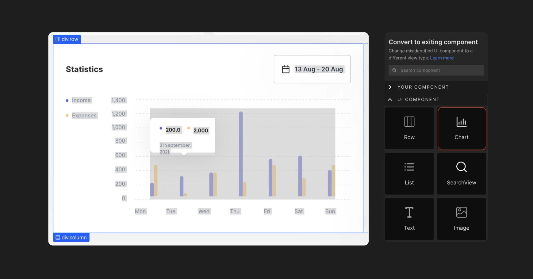
Chart
If your web pages have charts in the application design, change the component to Chart. Learn more.
This component is only supported for React.
GoogleMap
If your application design has a Google map, it would be identified as an Image probably, so to correct it according to your design, change the view to Map.

Image Magnifier
Change the magnifier icon to Image magnifier for your web pages, to have a real image magnifier in your application design.
This component is only supported for React.
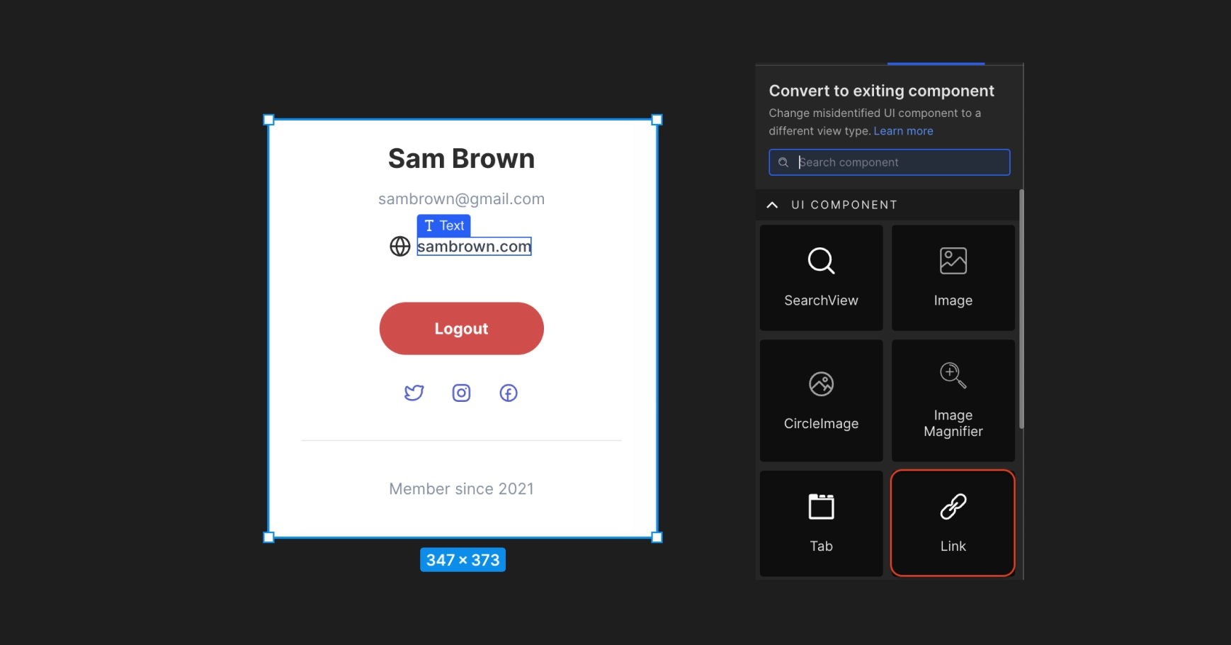
Link
Convert the texts of your web pages to Link, and provide the URLs to make them function as a link. Learn more.
This component is only supported for React.
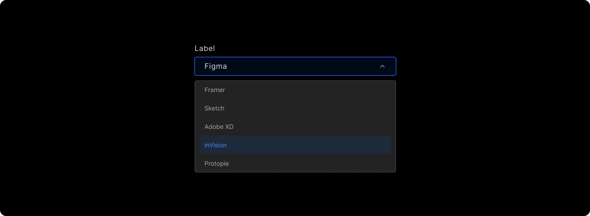
Searchable Dropdown
To convert the dropdown into a searchable picker for an item, convert it to a Searchable Dropdown.
This component is only supported for React.
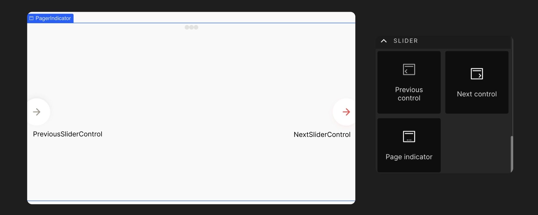
Slider
Sliders allow users to make selections from a range of values.
Convert the components to Slider, and also change the icons for the Previous and Next control to slide the pages front and back. Also, you can change the component to Pager indicator. Learn more.
This component is only supported for React.
Video Player
Change the component to a Video Player.
This component is only supported for React.
Got a question? Ask here.