Tagging components in Figma
DhiWise auto-identifies all your screen view components and generates a complete code for the same. Generally, it auto-detects the components, but sometimes due to design changes, it may not able to identify them.
To get the component identified in Figma, you can do the following things;
Refer to the Design Guidelines or Component specific guidelines which should be followed while screen designing in Figma.
Tag a specific component in Figma and get it auto-identified in DhiWise.
Change the view of the misidentified component to the correct one in DhiWise. For Flutter learn here, and for React learn here.
Tagging components in Figma helps in auto-identifying components in the screen design easily when they are not auto-identified. Tag a component if it seems to be complex or you want to get it correctly identified in DhiWise.
Before tagging a component, follow the below guides to set a tag on a component:
Guidelines to follow before tagging
In Figma design, the components which are placed in screen design must be placed in a proper Group. To learn about the grouping guidelines follow the Group components and layers guidelines.
Proper grouping and layering of design elements will help in tagging a component easily, which will accurately help in identifying the component in DhiWise.
Follow the below guidelines to learn how to tag a component in Figma:
How to set a tag in Figma
In your app’s Figma file, go to the screen in which you want to set a tag on the component.
Select the Group or Frame of that particular component from the left sidebar of the Figma panel in the Layers section, and set a tag on it by renaming it.
Don't provide a Tag name by yourself! Set the Tag name as mentioned in each component.
Follow the below name format for giving the component a Tag;
Format:
{Group or Frame name} + ":" + {Tag}
Example: Group1:Button
Group or Frame name: The name which is given in the Figma design.
Tag: Tag added to the component from the list of available Tag names attached to a specific component.
Follow the supported components below to learn how to set a tag on each of them.
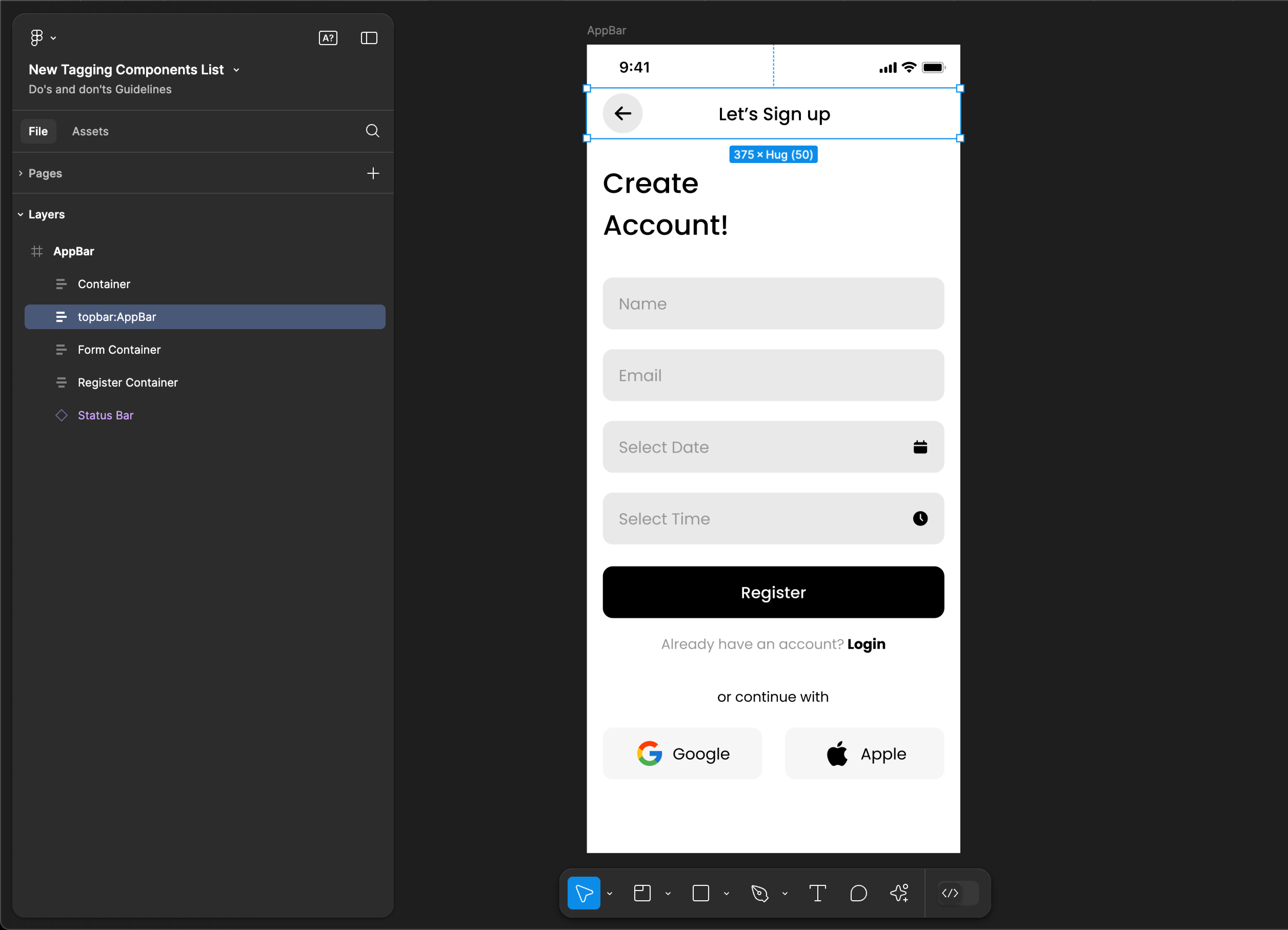
AppBar
AppBar tagging is not supported for web applications.
Tag name: AppBar
Format: {Group or Frame name} + “:" + AppBar
Example: topbar:AppBar
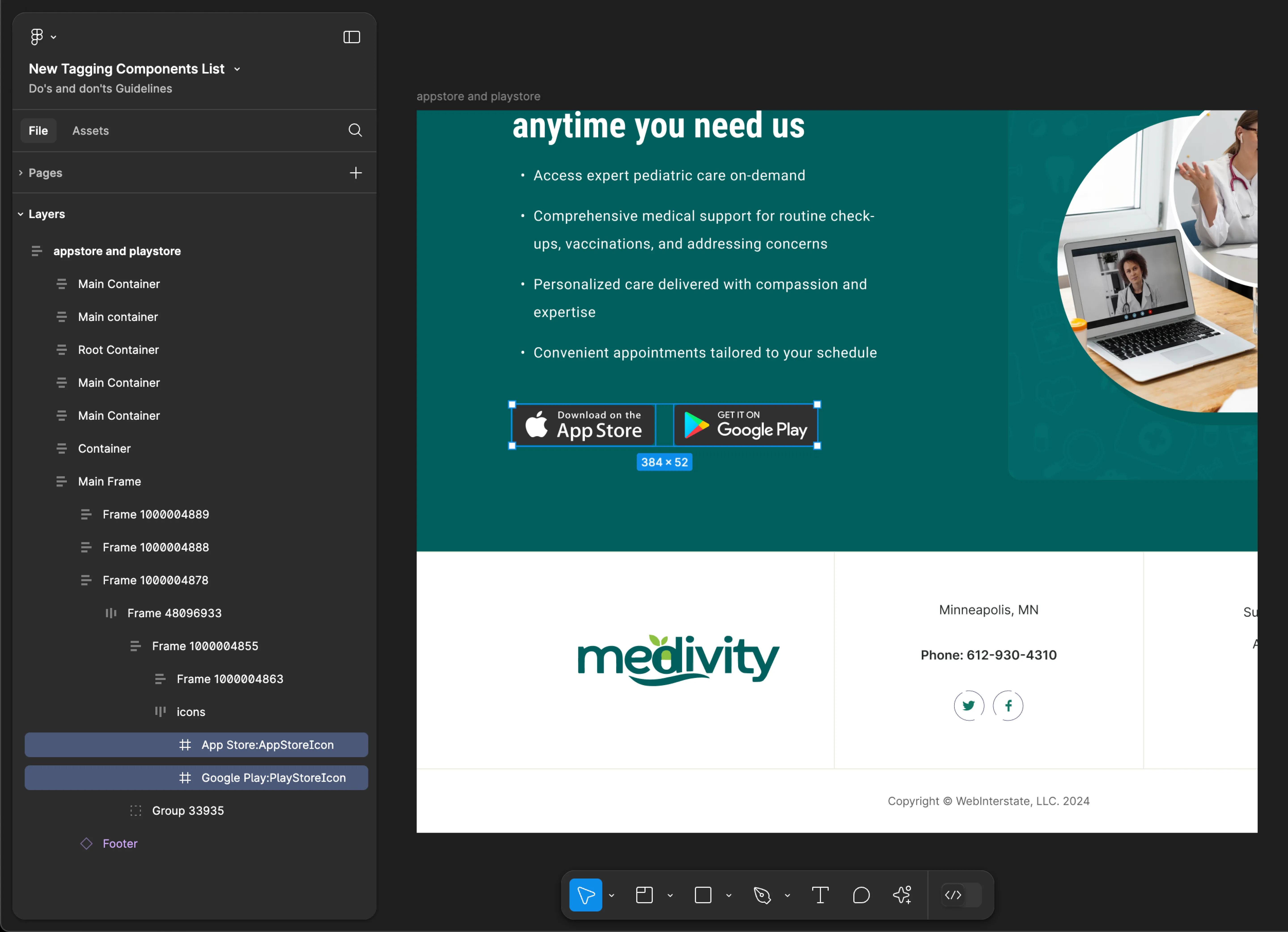
AppStoreIcon
- Mobile
- Web
Tag name: AppStoreIcon
Format: {Group or Frame name} + “:" + AppStoreIcon
Example: App Store:AppStoreIcon
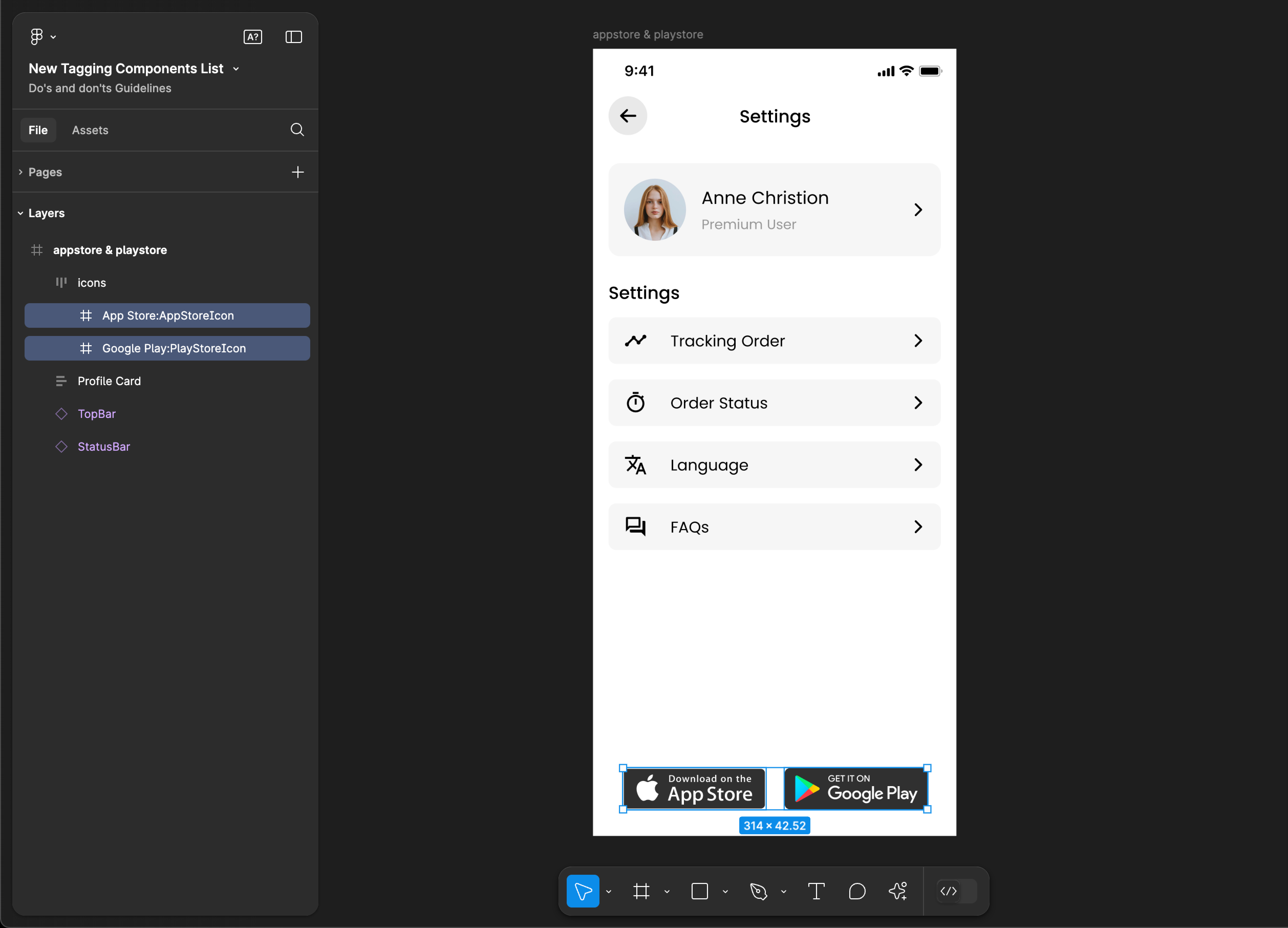
Tag name: AppStoreIcon
Format: {Group or Frame name} + “:" + AppStoreIcon
Example: App Store:AppStoreIcon
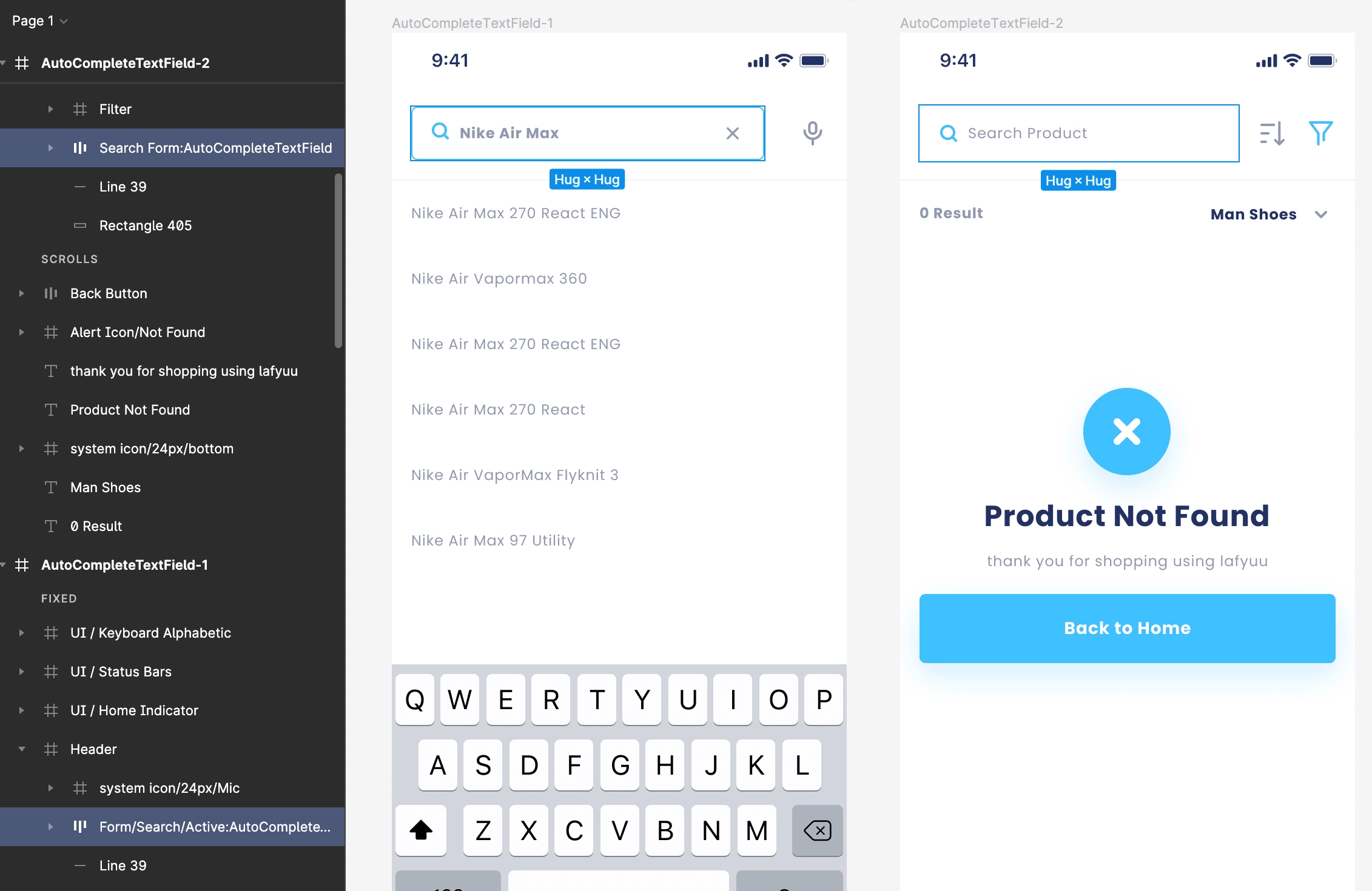
AutoCompleteTextField
AutoCompleteTextField tagging is not supported for web applications.
Tag name: AutoCompleteTextField
Format: {Group or Frame name} + “:" + AutoCompleteTextField
Example: Search Form:AutoCompleteTextField
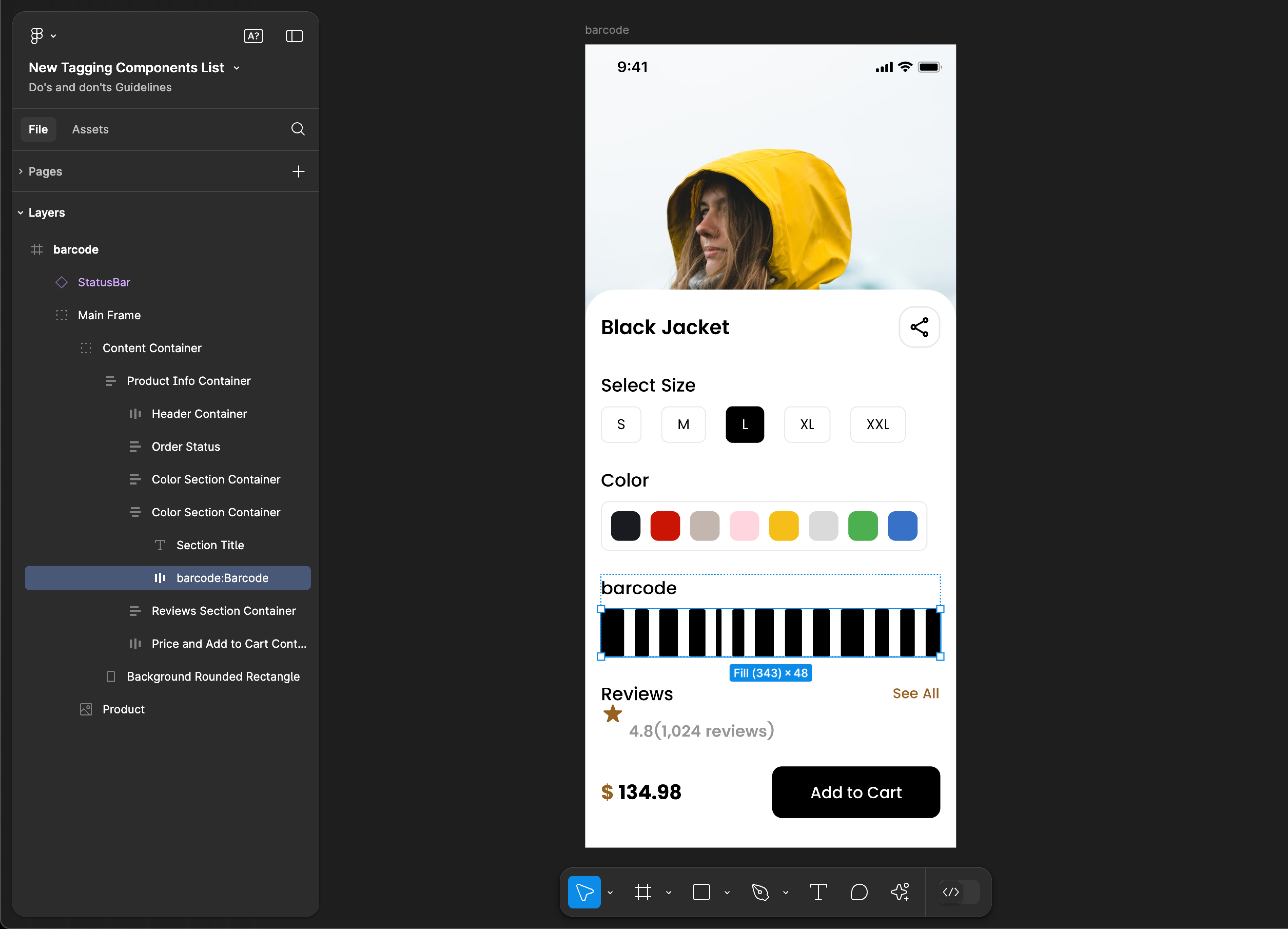
Barcode
Barcode tagging is not supported for web applications.
Tag name: Barcode
Format: {Group or Frame name} + “:" + Barcode
Example: barcode:Barcode
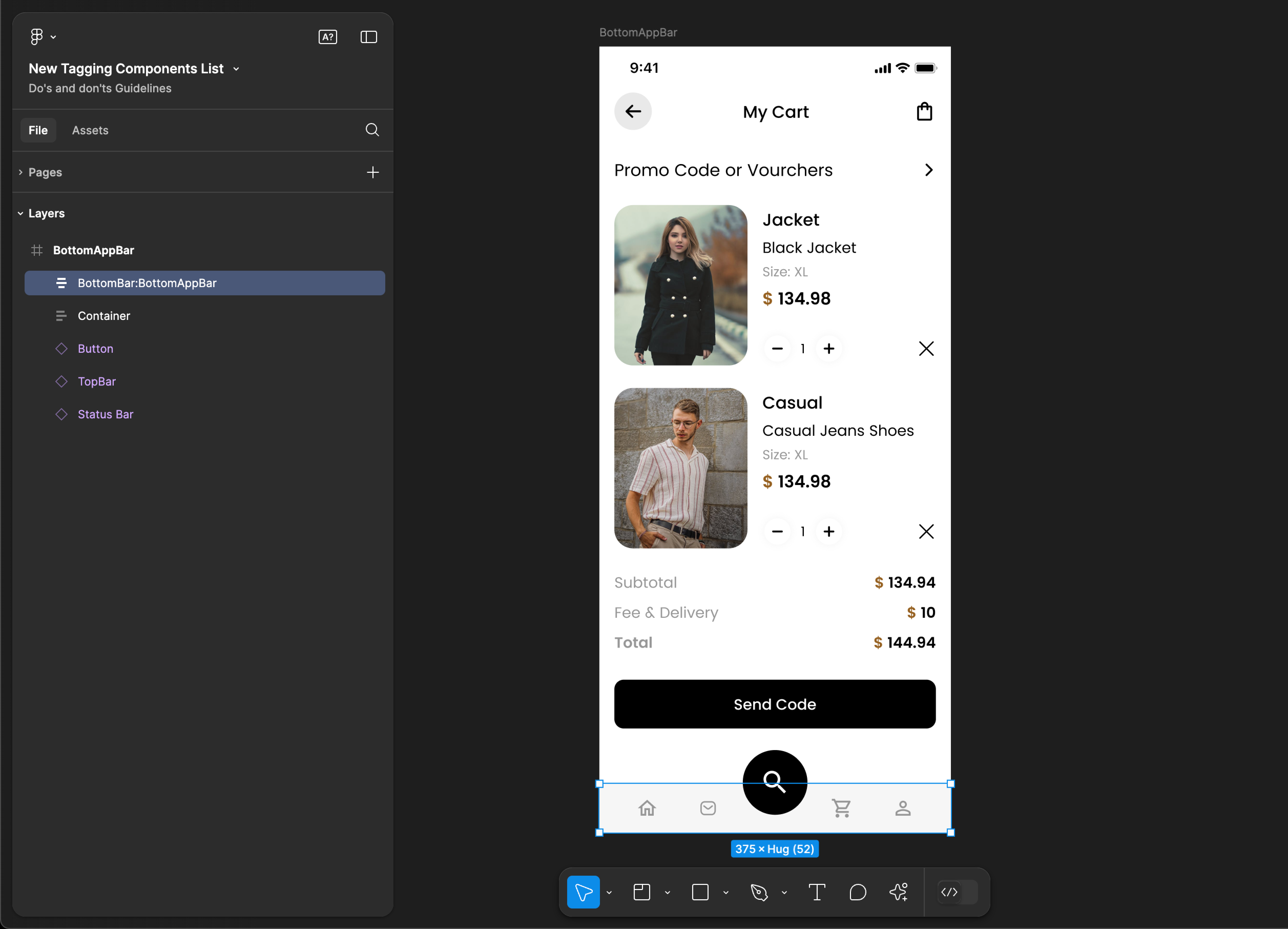
BottomAppBar
BottomAppBar tagging is not supported for web applications.
Tag name: BottomAppBar
Format: {Group or Frame name} + “:" + BottomAppBar
Example: BottomBar:BottomAppBar
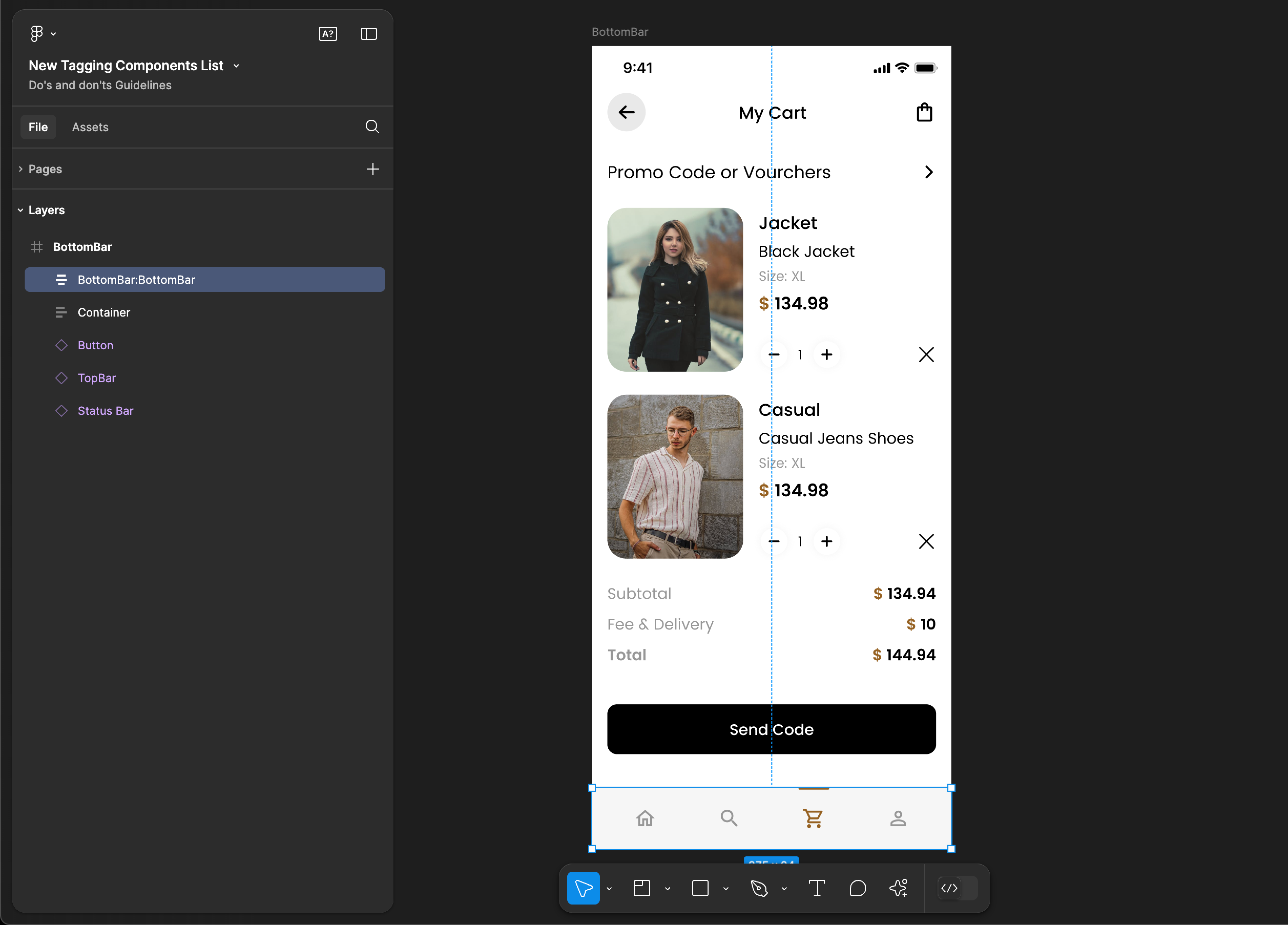
BottomBar
BottomBar tagging is not supported for web applications.
Tag name: BottomBar
Format: {Group or Frame name} + “:" + BottomBar
Example: BottomBar:BottomBar
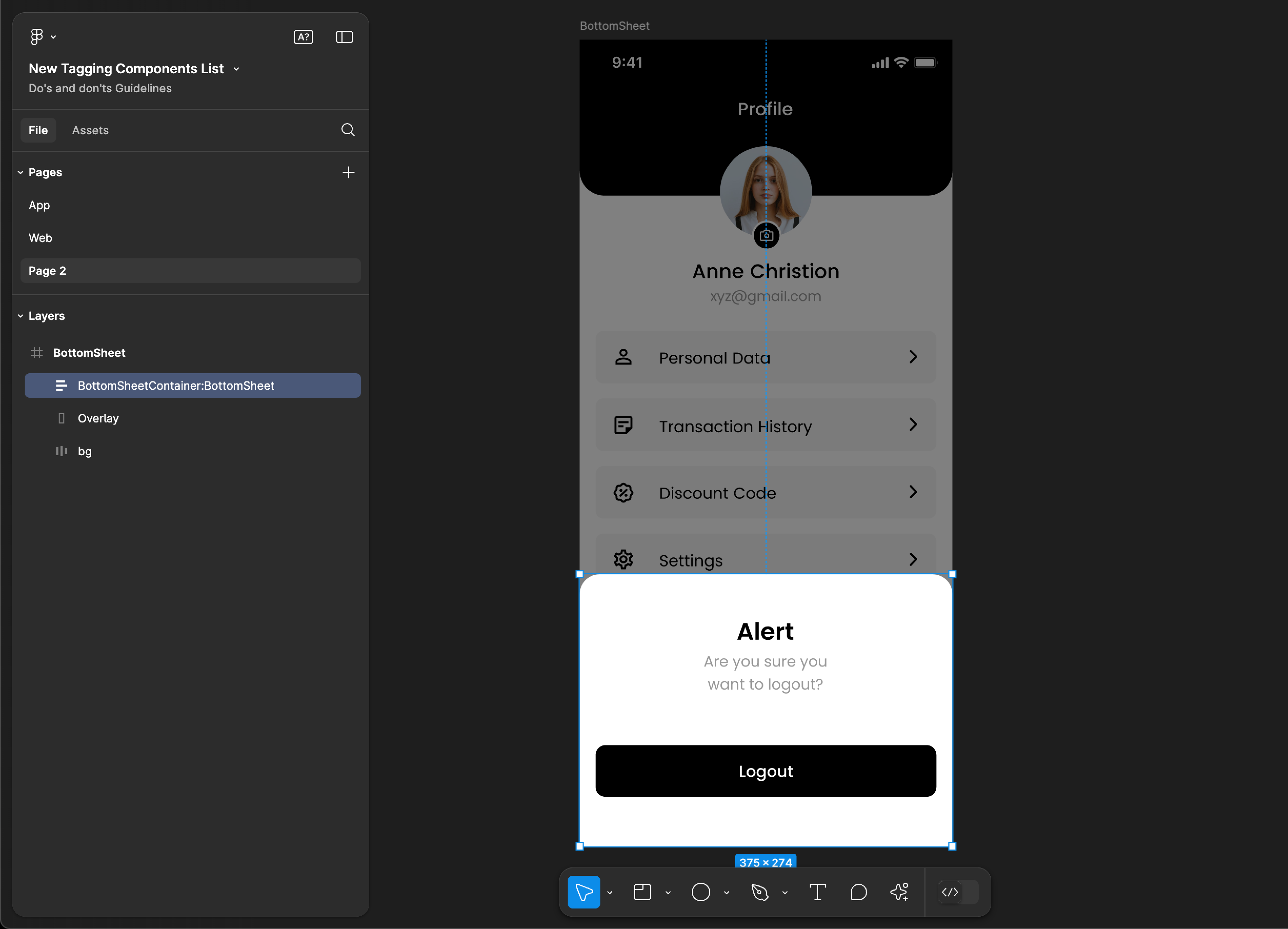
BottomSheet
BottomSheet tagging is not supported for web applications.
Tag name: BottomSheet
Format: {Group or Frame name} + “:" + BottomSheet
Example: BottomSheetContainer:BottomSheet
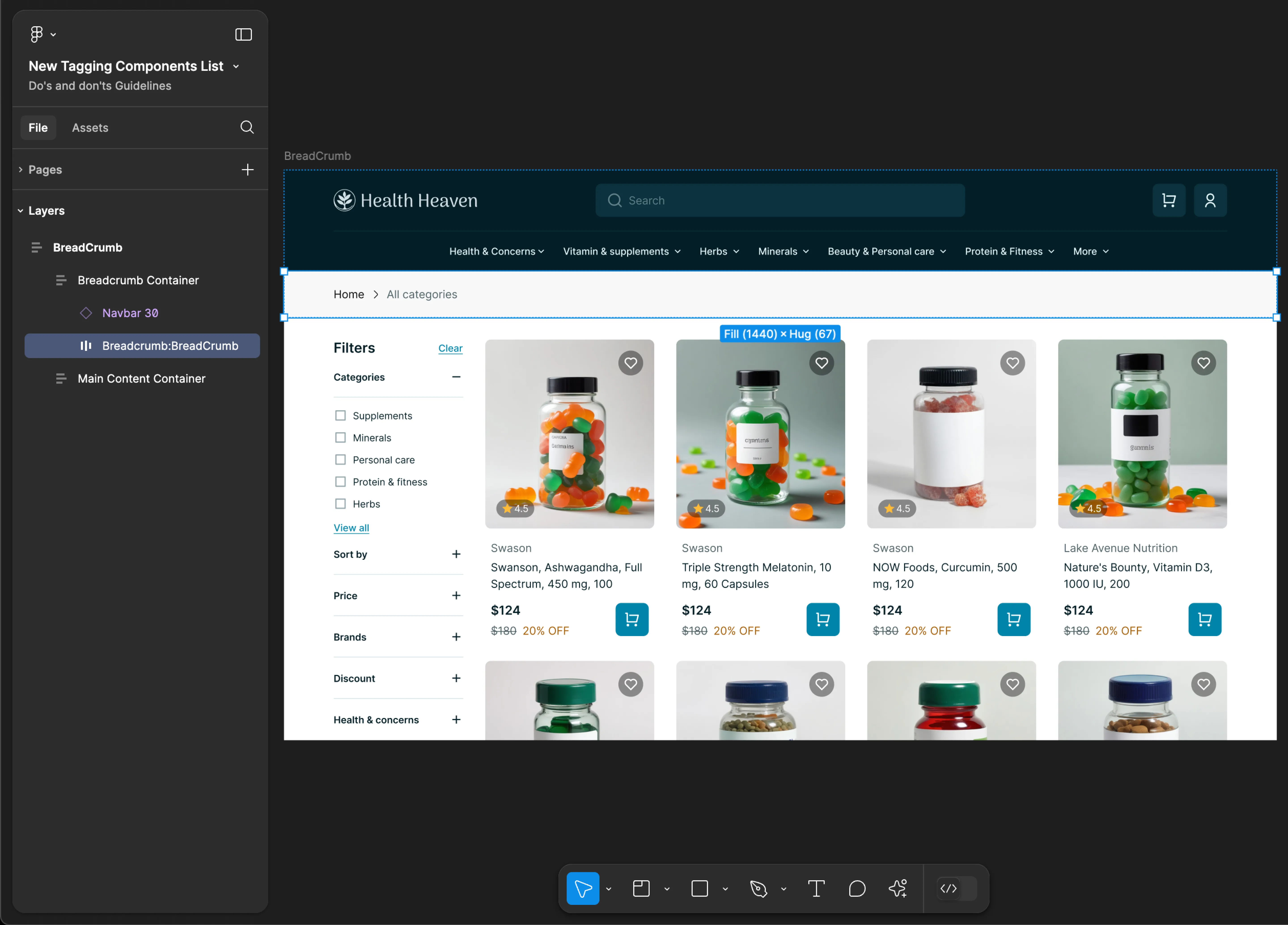
BreadCrumb
BreadCrumb tagging is not supported for mobile applications.
Tag name: BreadCrumb
Format: {Group or Frame name} + “:" + BreadCrumb
Example: Breadcrumb:BreadCrumb
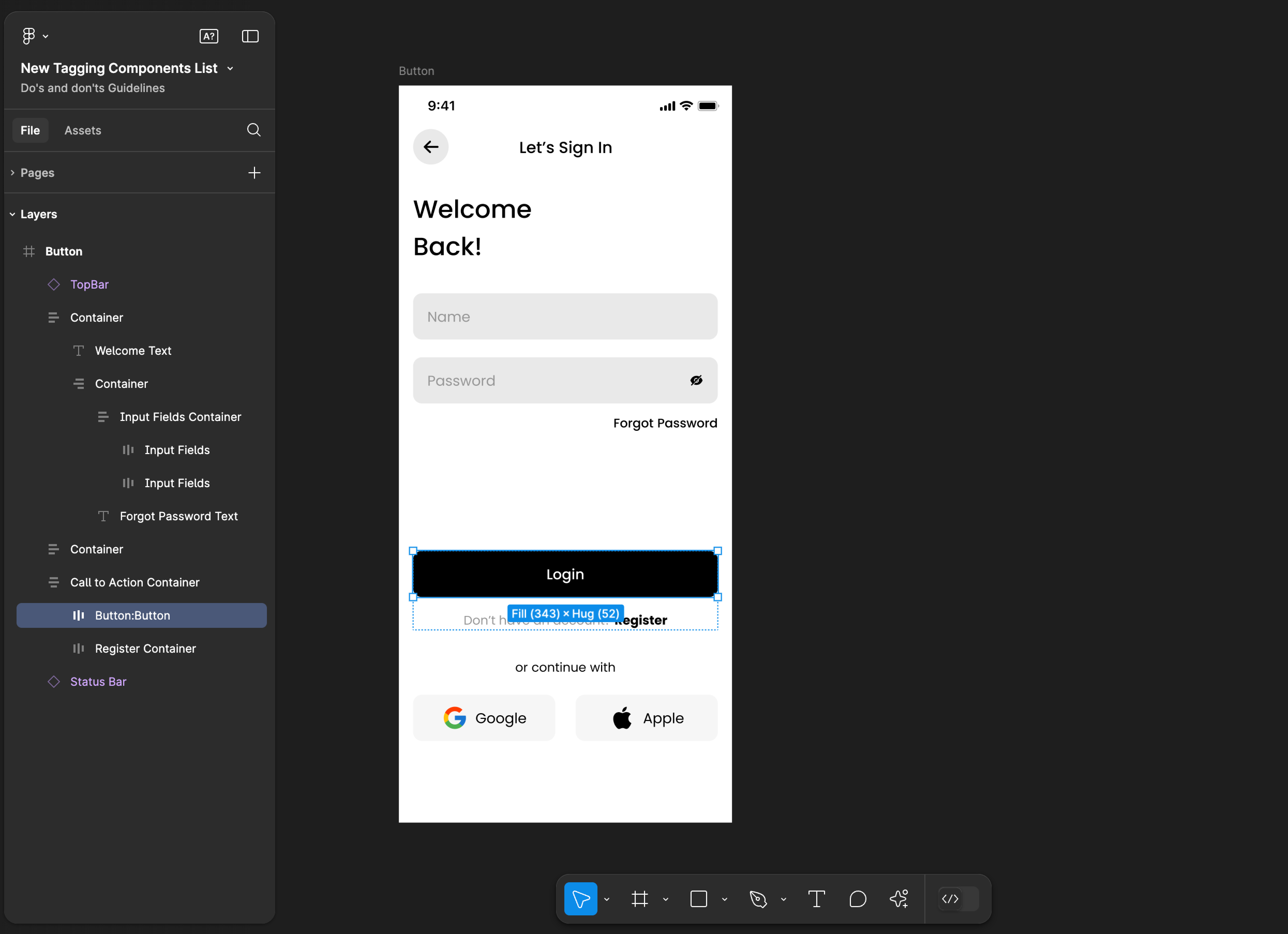
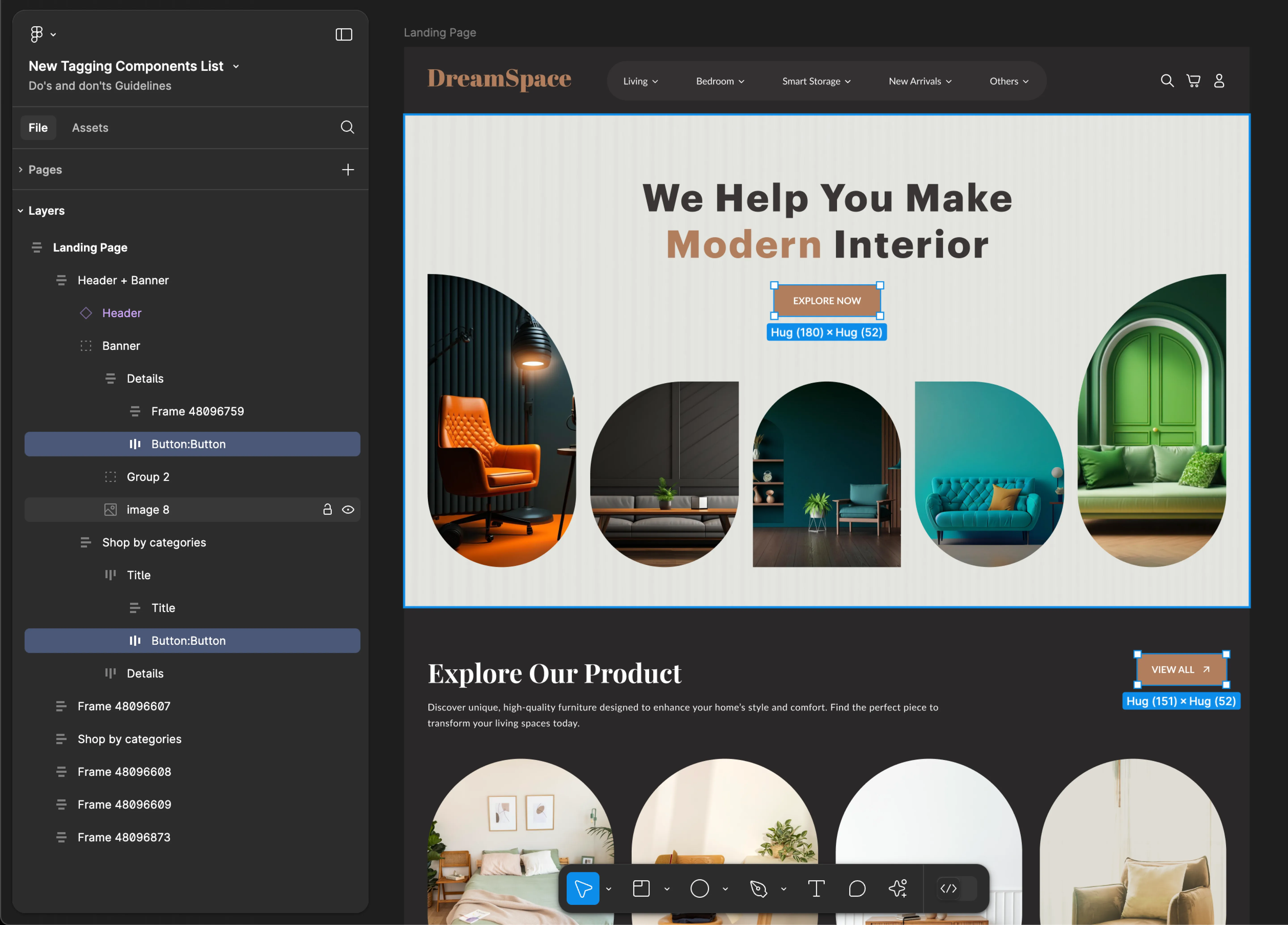
Button
- Mobile
- Web
Tag name: Button
Format: {Group or Frame name} + “:” + Button
Example: Button:Button
Tag name: Button
Format: {Group or Frame name} + “:” + Button
Example: Button:Button
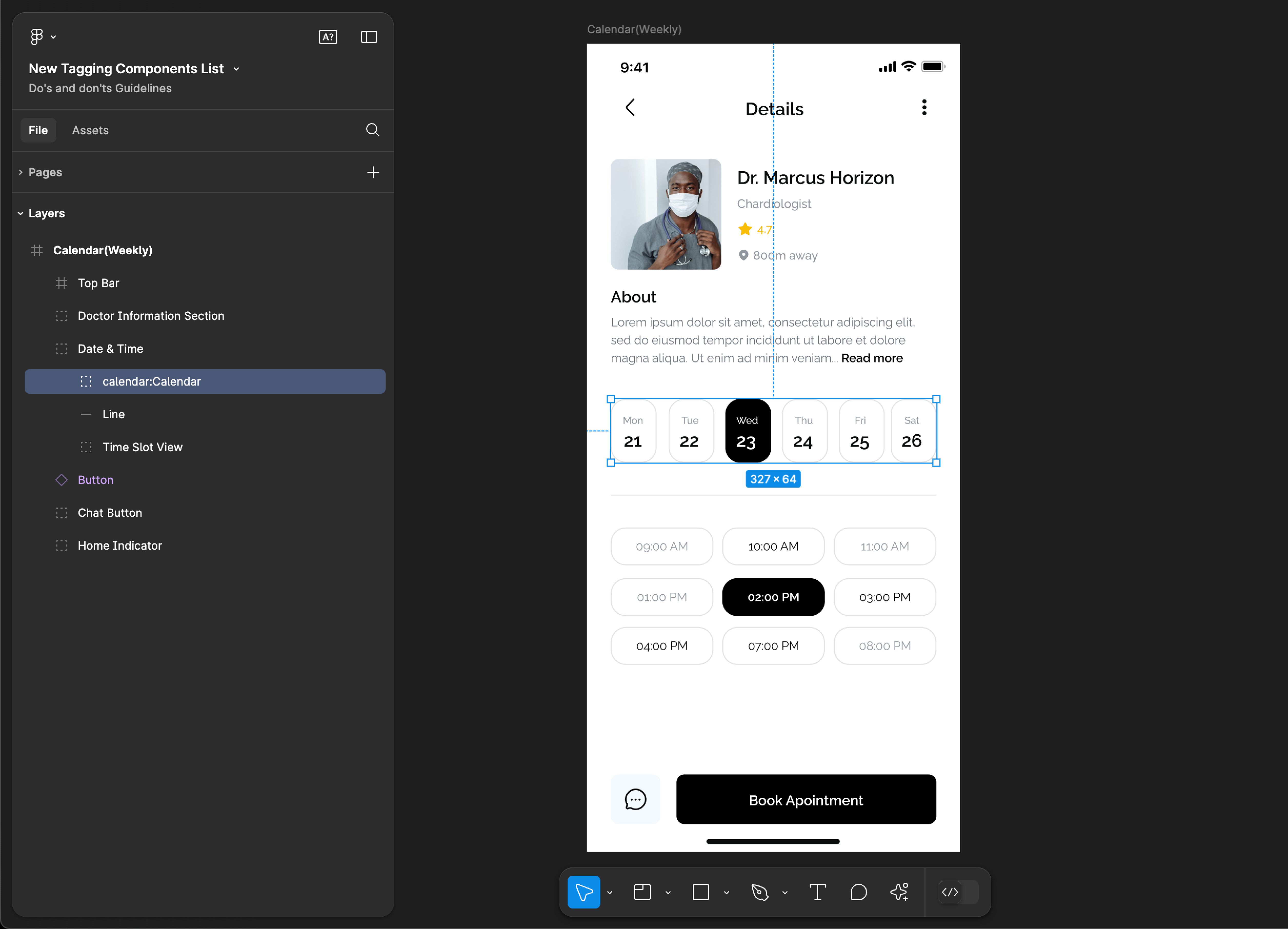
Calendar
Calendar tagging is not supported for web applications.
Tag name: Calendar
Format: {Group or Frame name} + “:" + Calendar
Example: calendar:Calendar
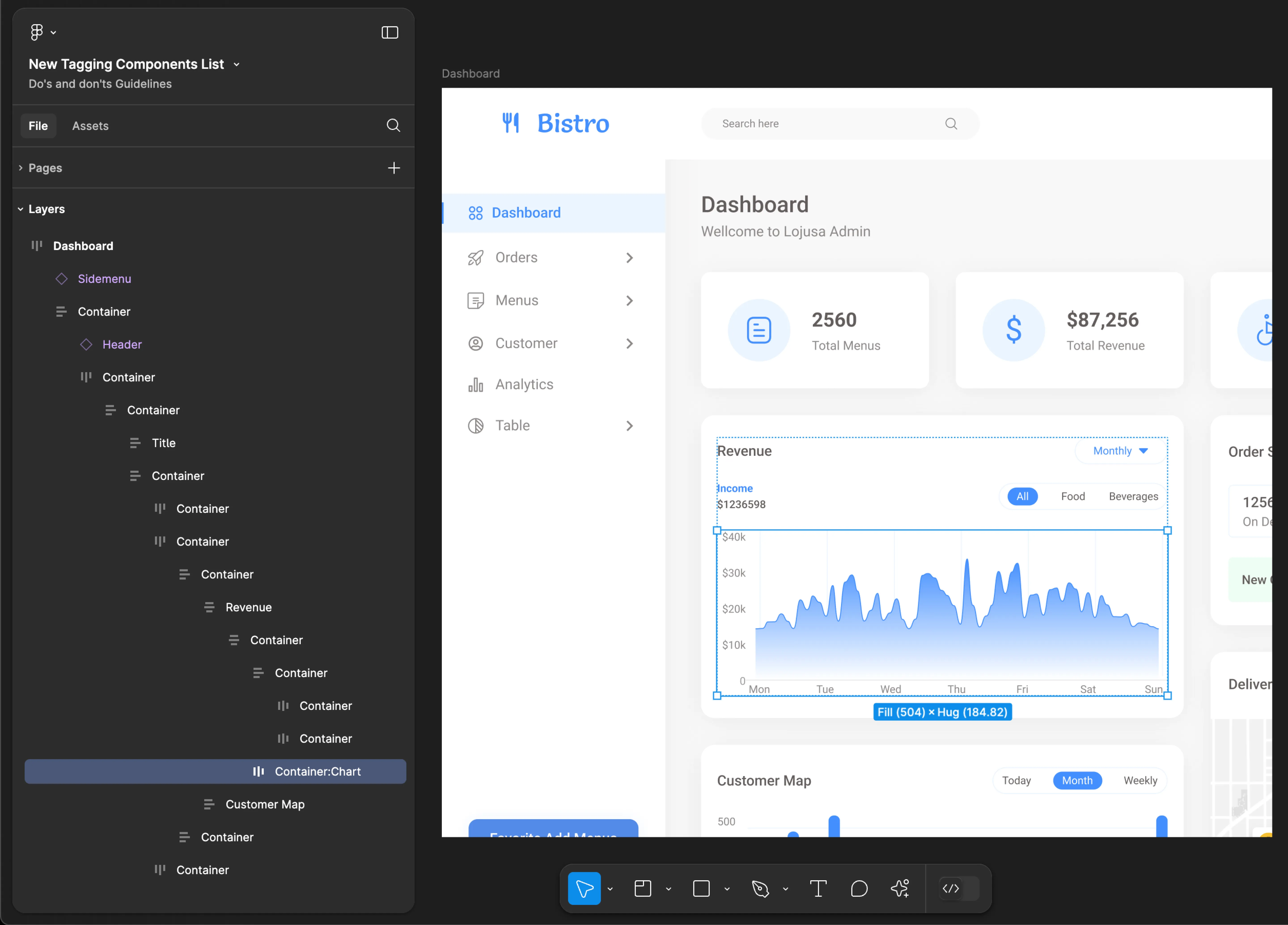
Chart
Chart tagging is not supported for mobile applications.
Tag name: Chart
Format: {Group or Frame name} + “:" + Chart
Example: Container:Chart
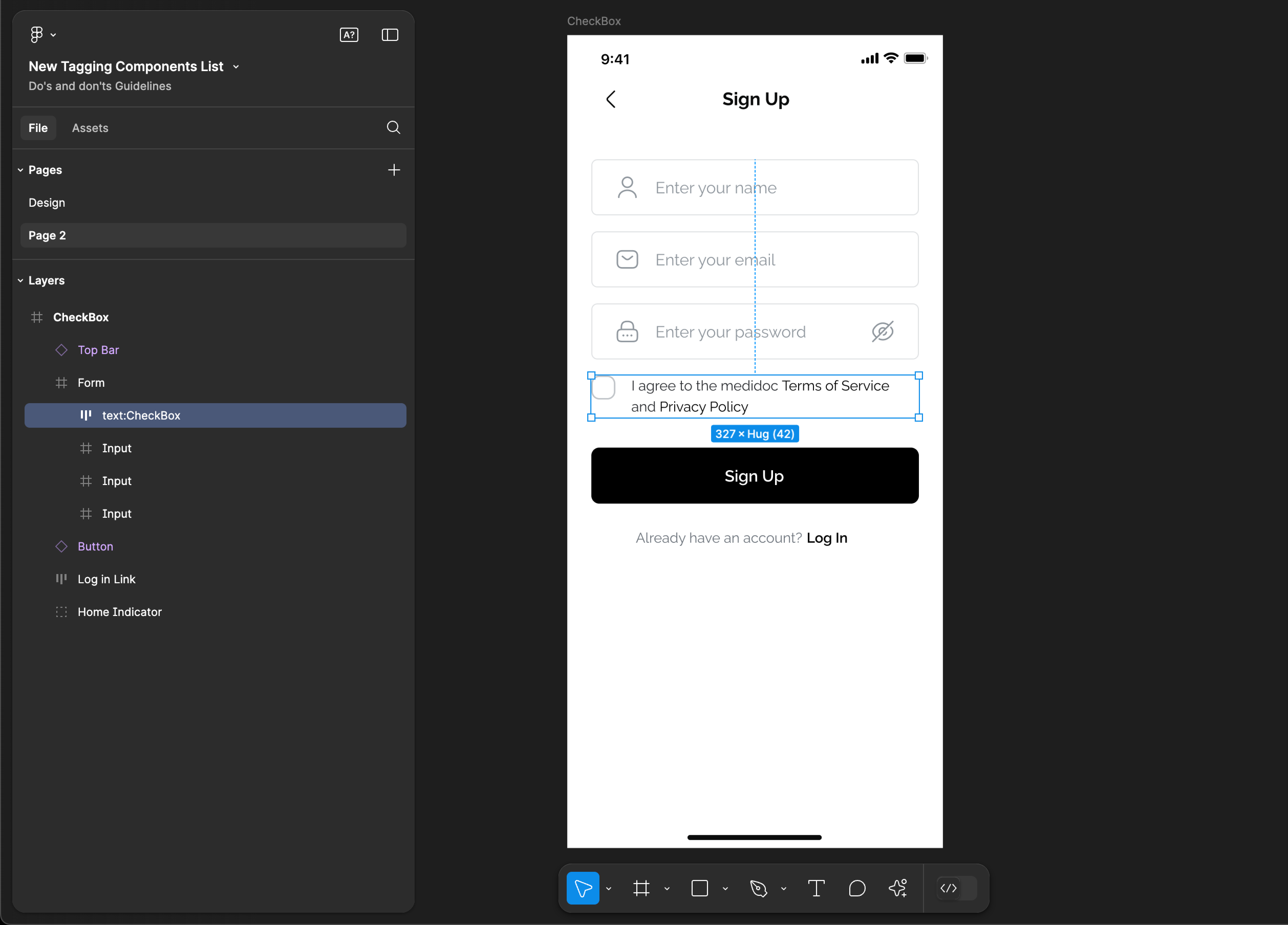
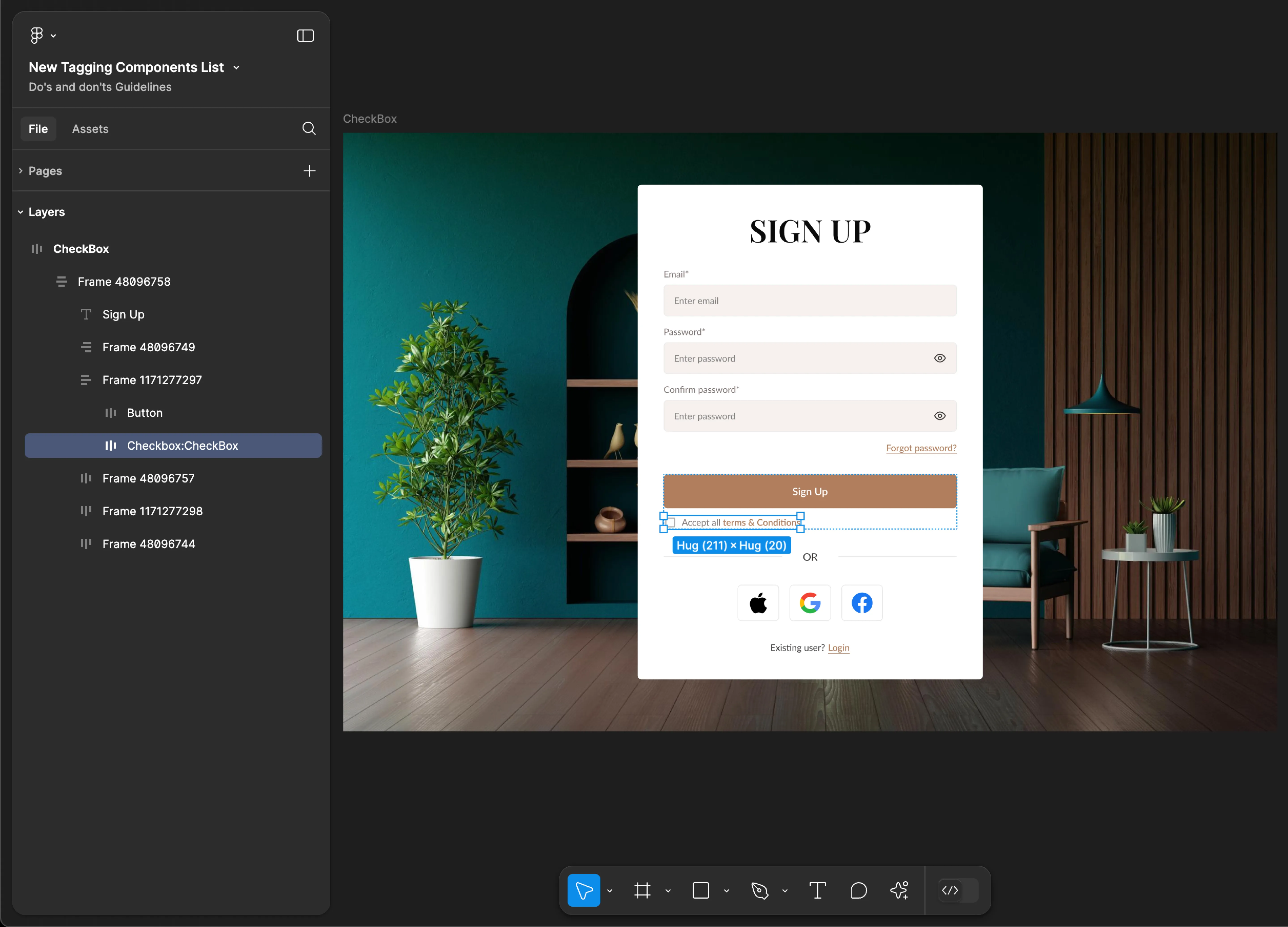
CheckBox
- Mobile
- Web
Tag name: CheckBox
Format: {Group or Frame name} + “:" + CheckBox
Example: text:CheckBox
Tag name: CheckBox
Format: {Group or Frame name} + “:" + CheckBox
Example: CheckBox:CheckBox
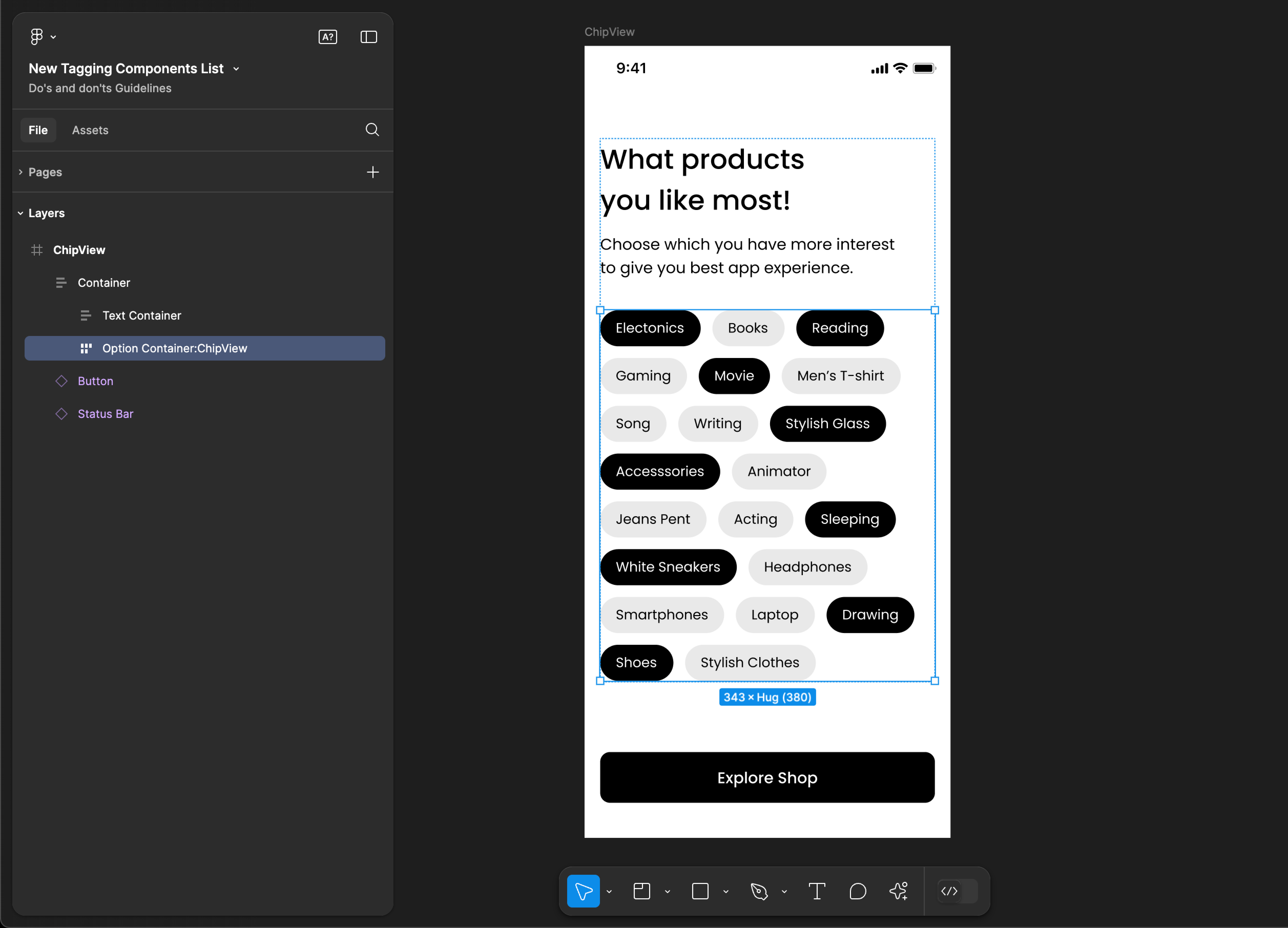
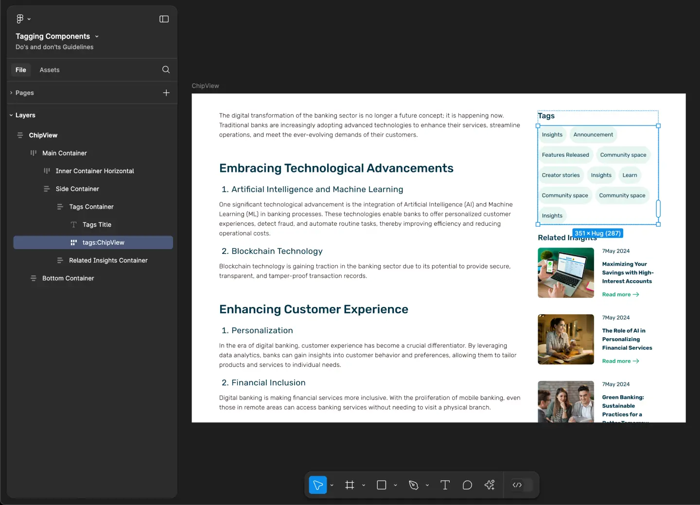
ChipView
- Mobile
- Web
Tag name: ChipView
Format: {Group or Frame name} + “:" + ChipView
Example: Option Container:ChipView
Tag name: ChipView
Format: {Group or Frame name} + “:" + ChipView
Example: tags:ChipView
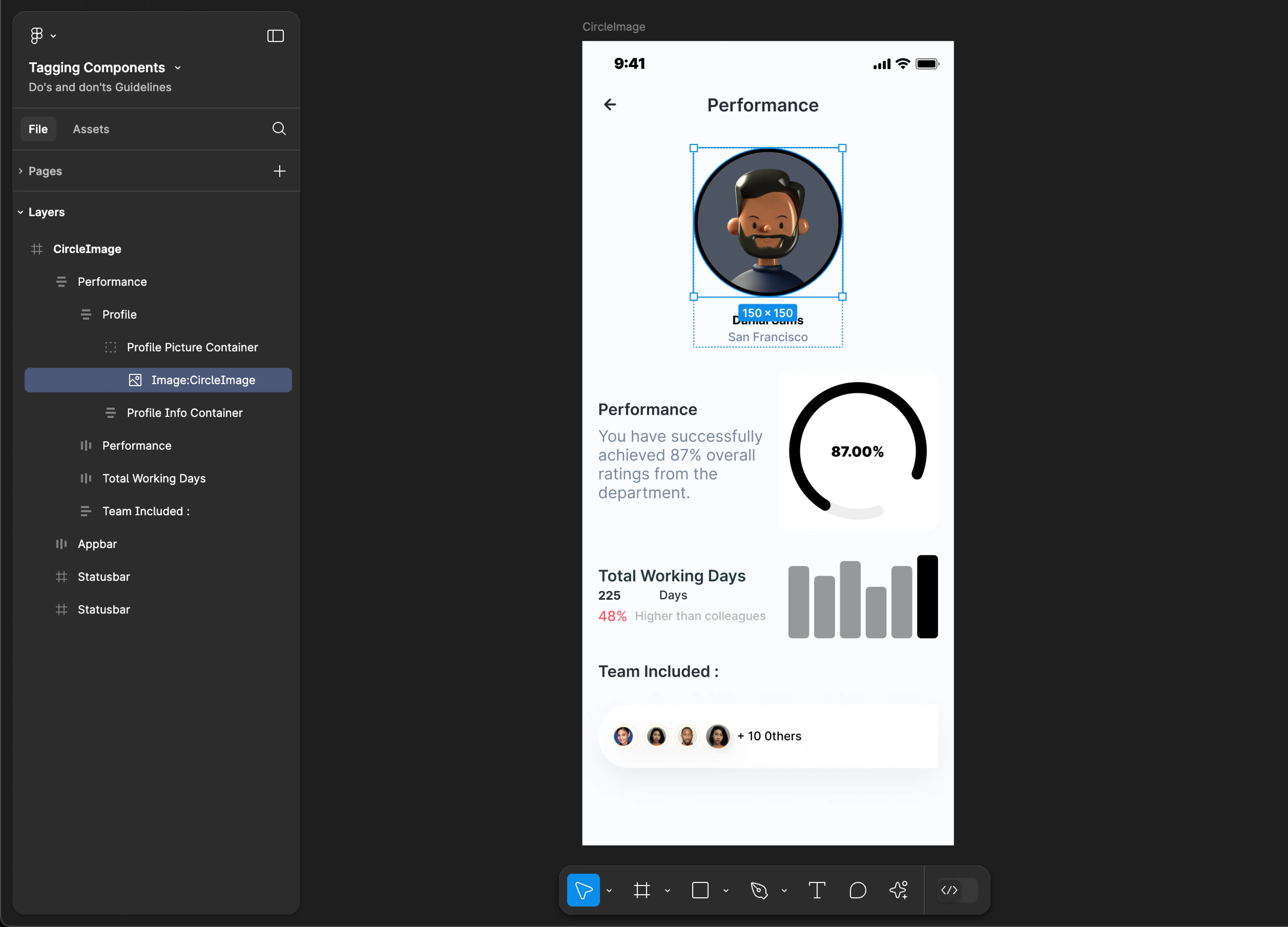
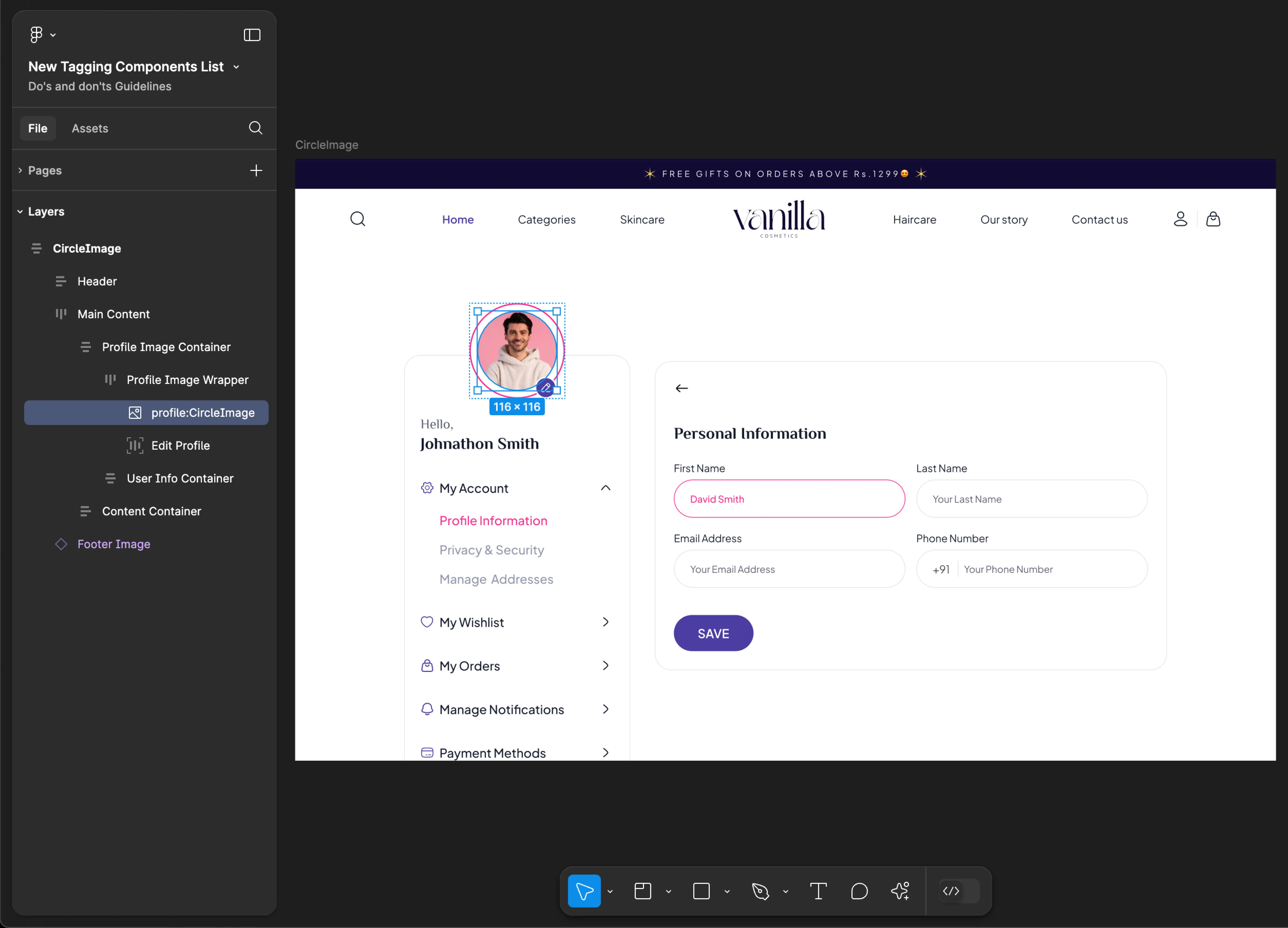
CircleImage
- Mobile
- Web
Tag name: CircleImage
Format: {Group or Frame name} + “:" + CircleImage
Example: Image:CircleImage
Tag name: CircleImage
Format: {Group or Frame name} + “:" + CircleImage
Example: profile:CircleImage
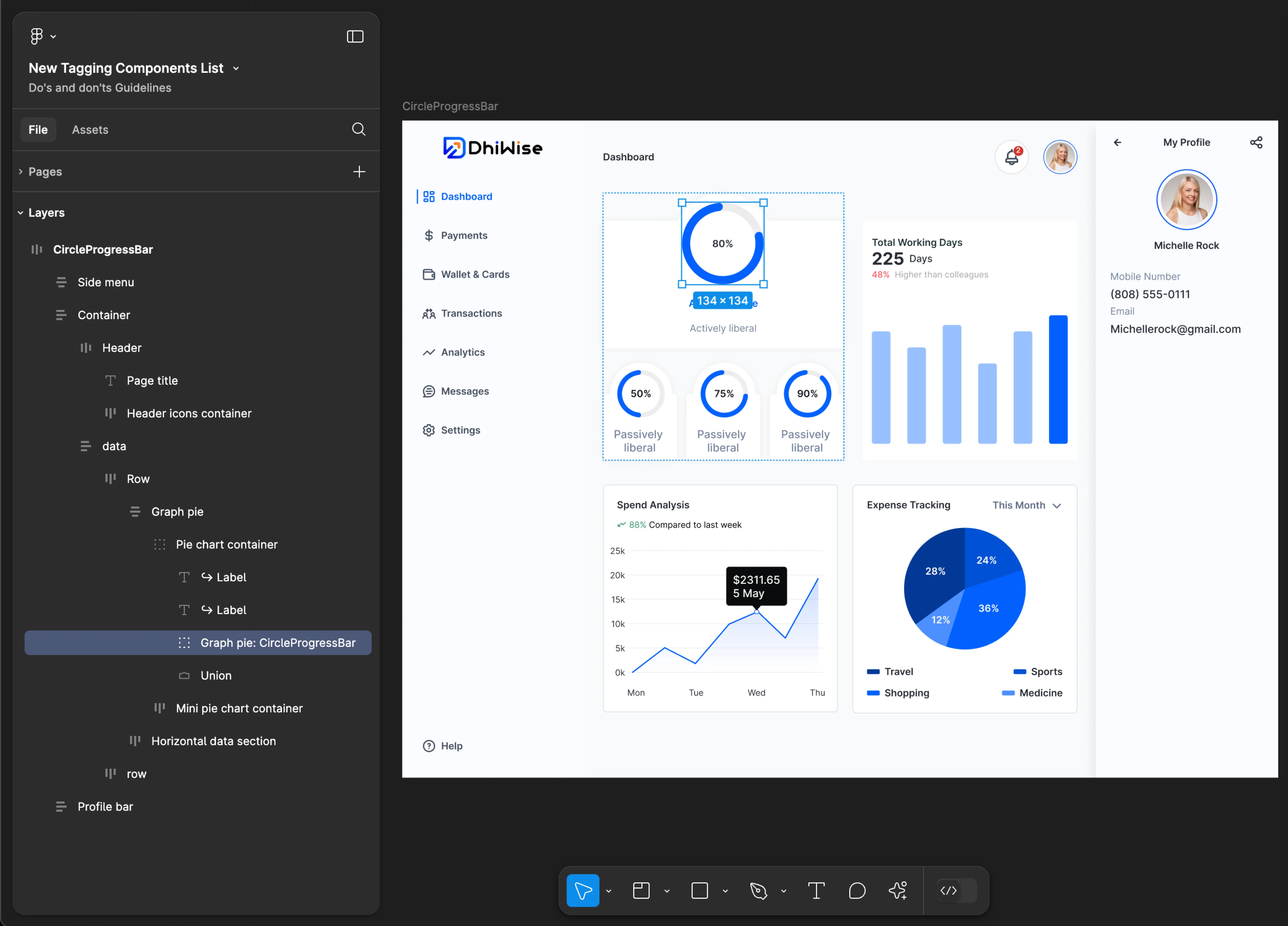
CircleProgressBar
- Mobile
- Web
Tag name: CircleProgressBar
Format: {Group or Frame name} + “:" + CircleProgressBar
Example: Performance Chart:CircleProgressBar
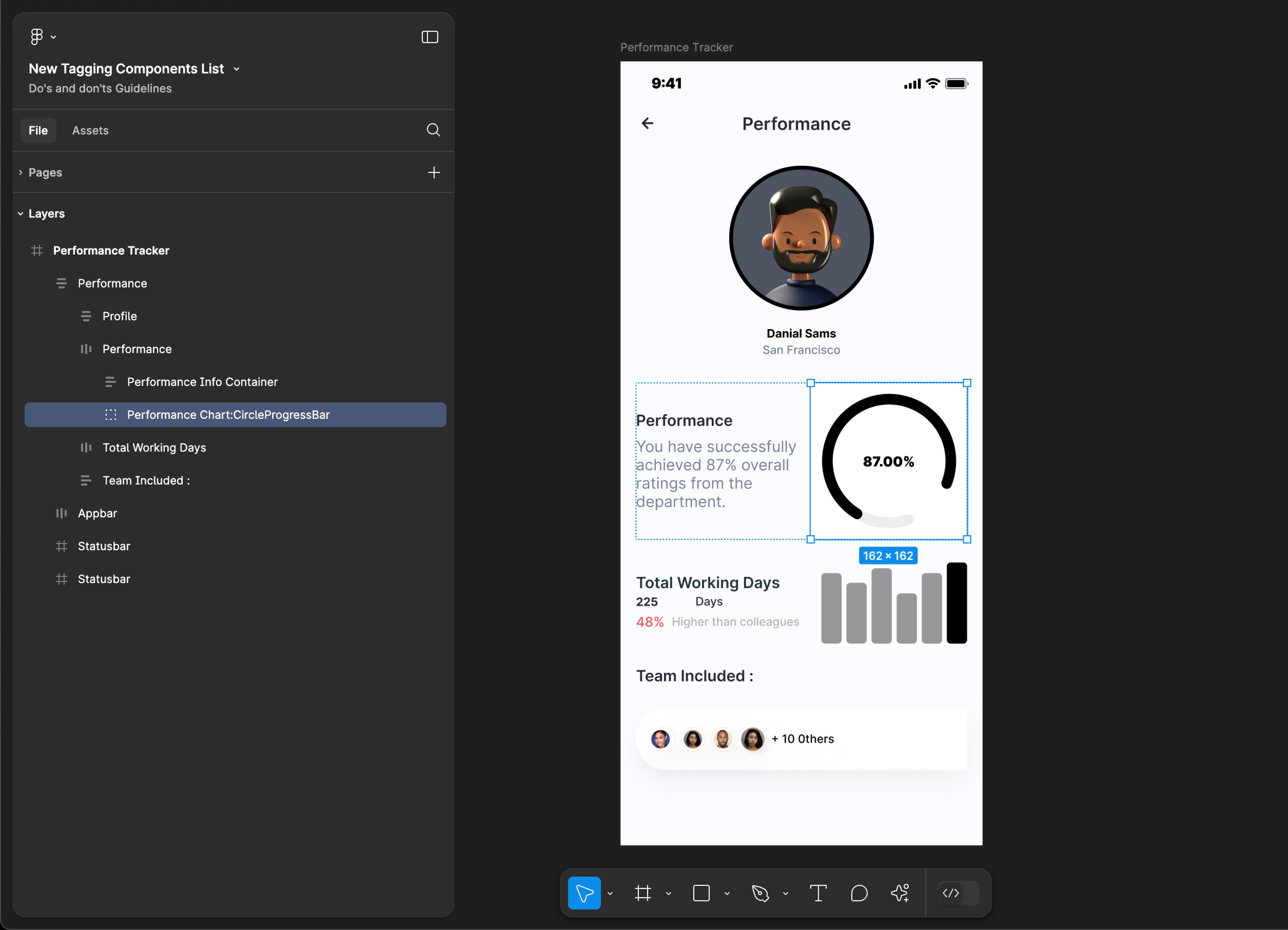
Tag name: CircleProgressBar
Format: {Group or Frame name} + “:" + CircleProgressBar
Example: Graph pie:CircleProgressBar
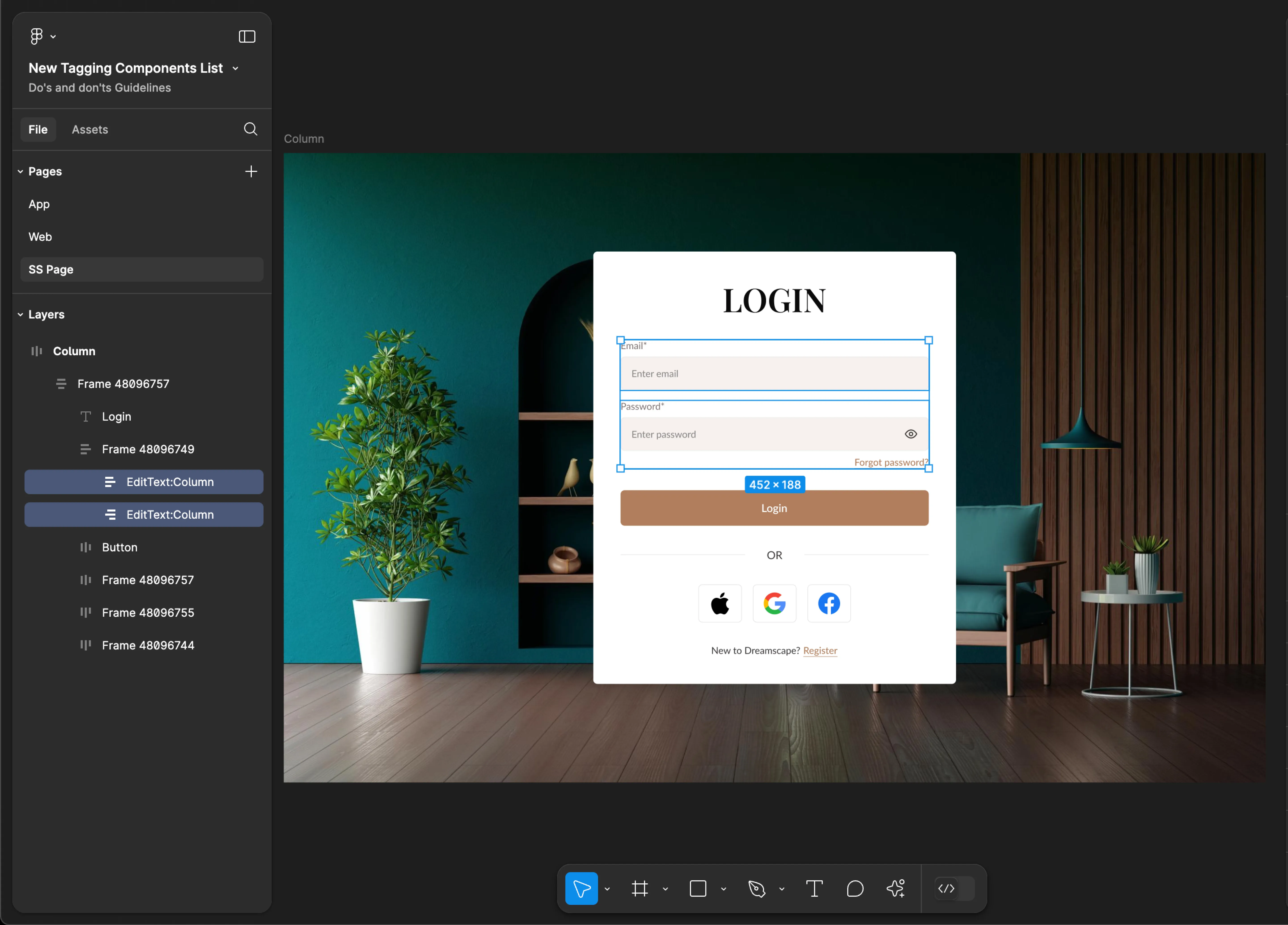
Column
- Mobile
- Web
Tag name: Column
Format: {Group or Frame name} + “:" + Column
Example: Input Fields:Column
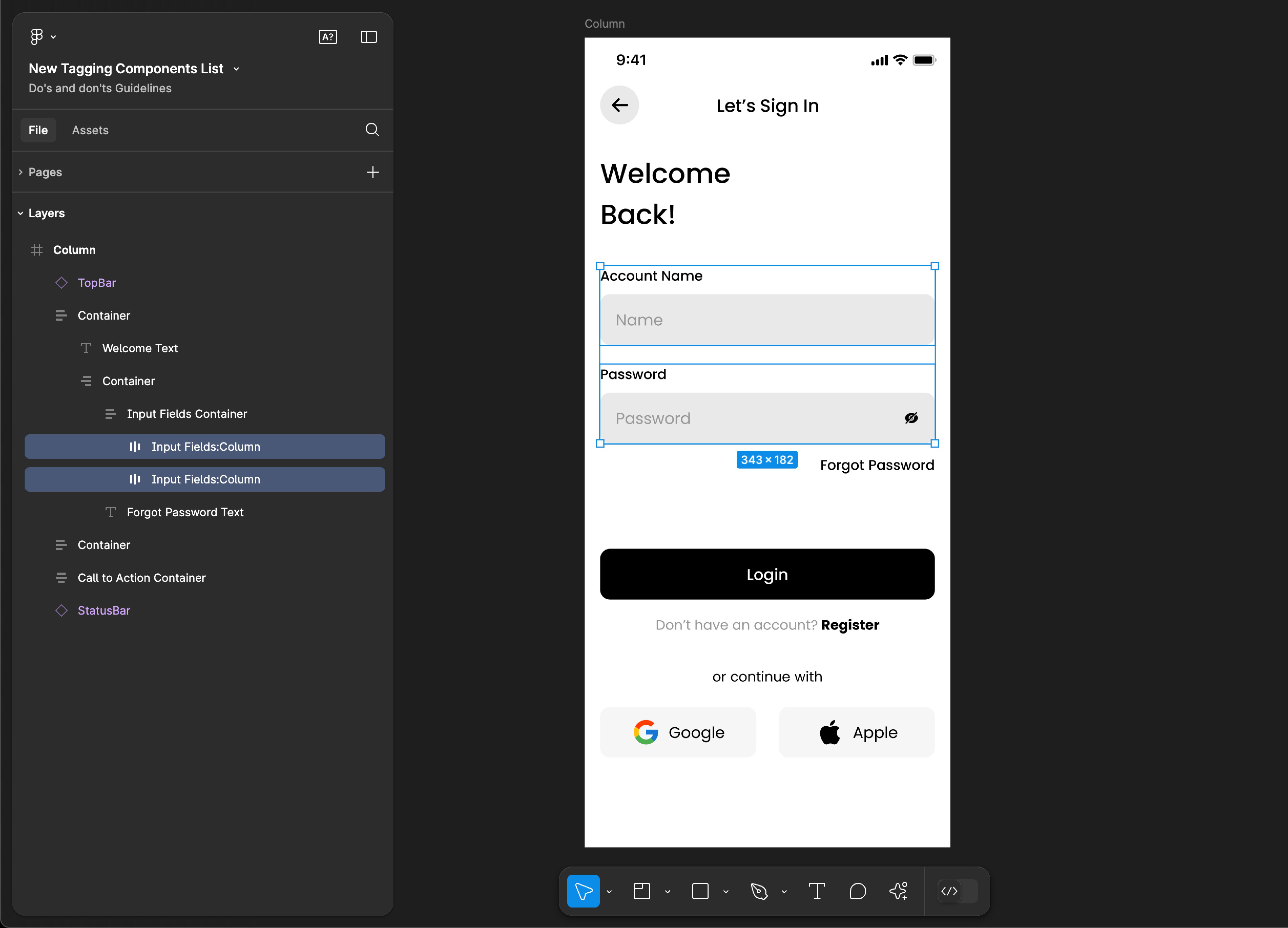
Tag name: Column
Format: {Group or Frame name} + “:" + Column
Example: EditText:Column
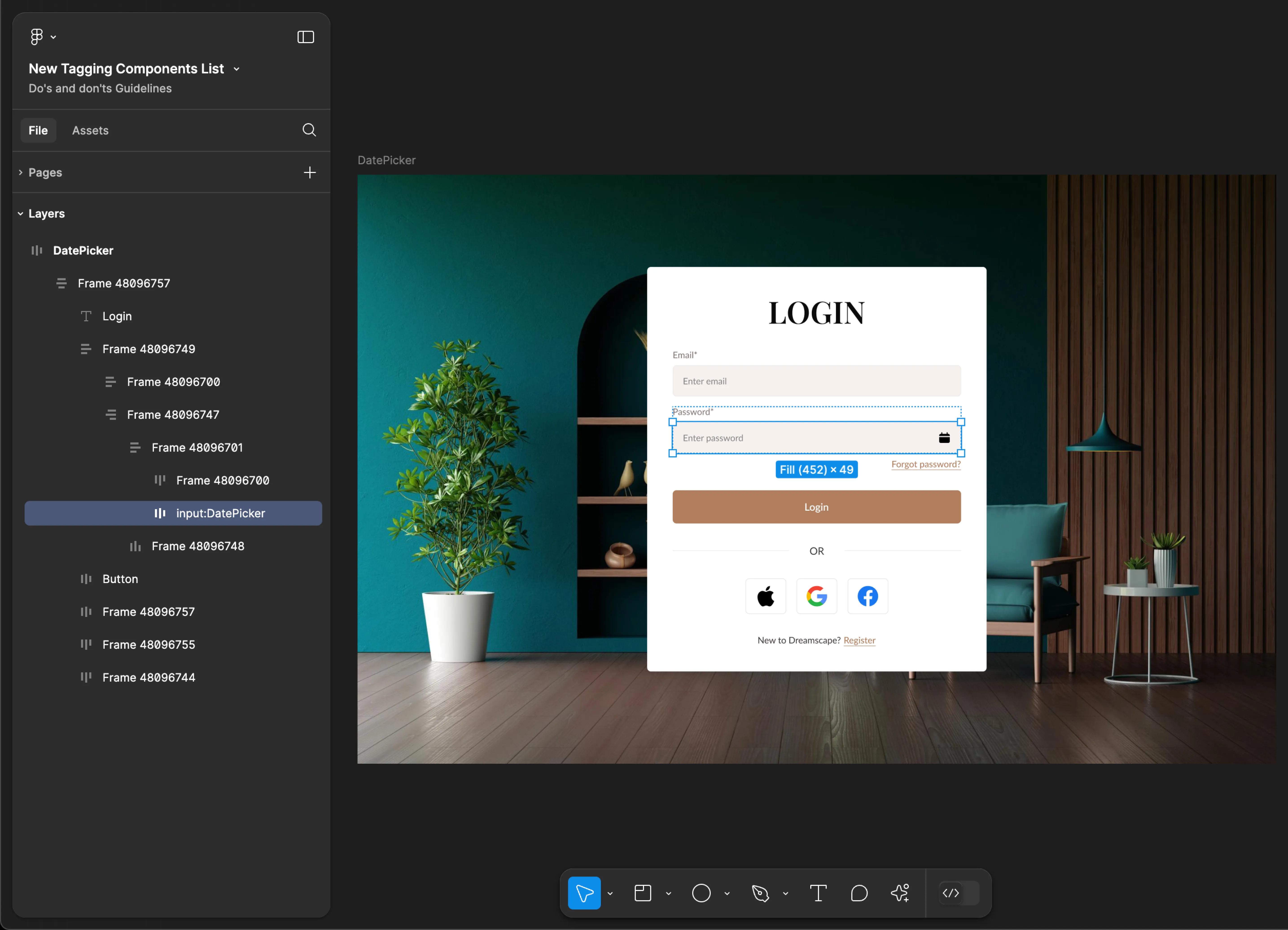
DatePicker
- Mobile
- Web
Tag name: DatePicker
Format: {Group or Frame name} + “:" + DatePicker
Example: Input Fields:DatePicker
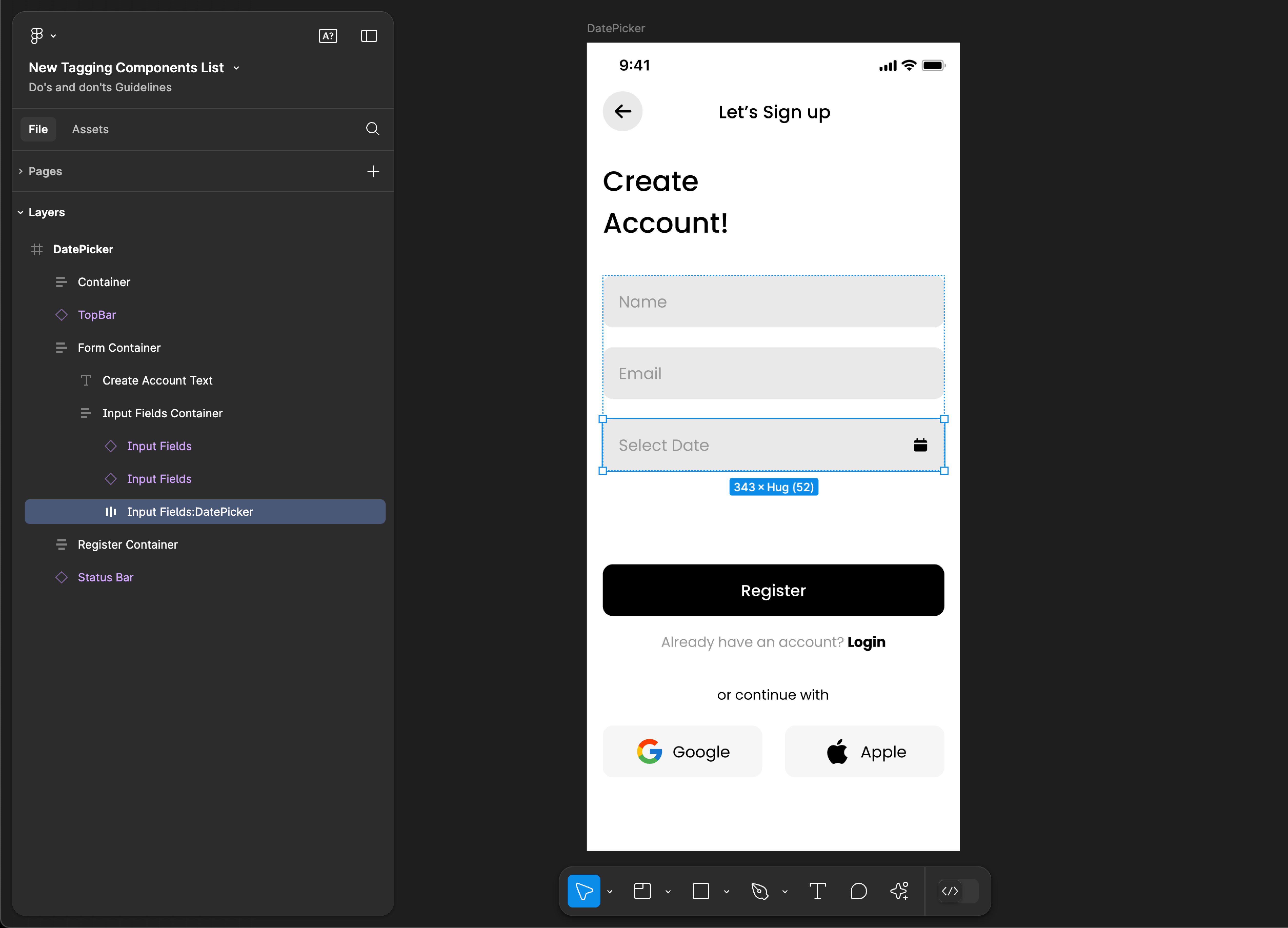
Tag name: DatePicker
Format: {Group or Frame name} + “:" + DatePicker
Example: input:DatePicker
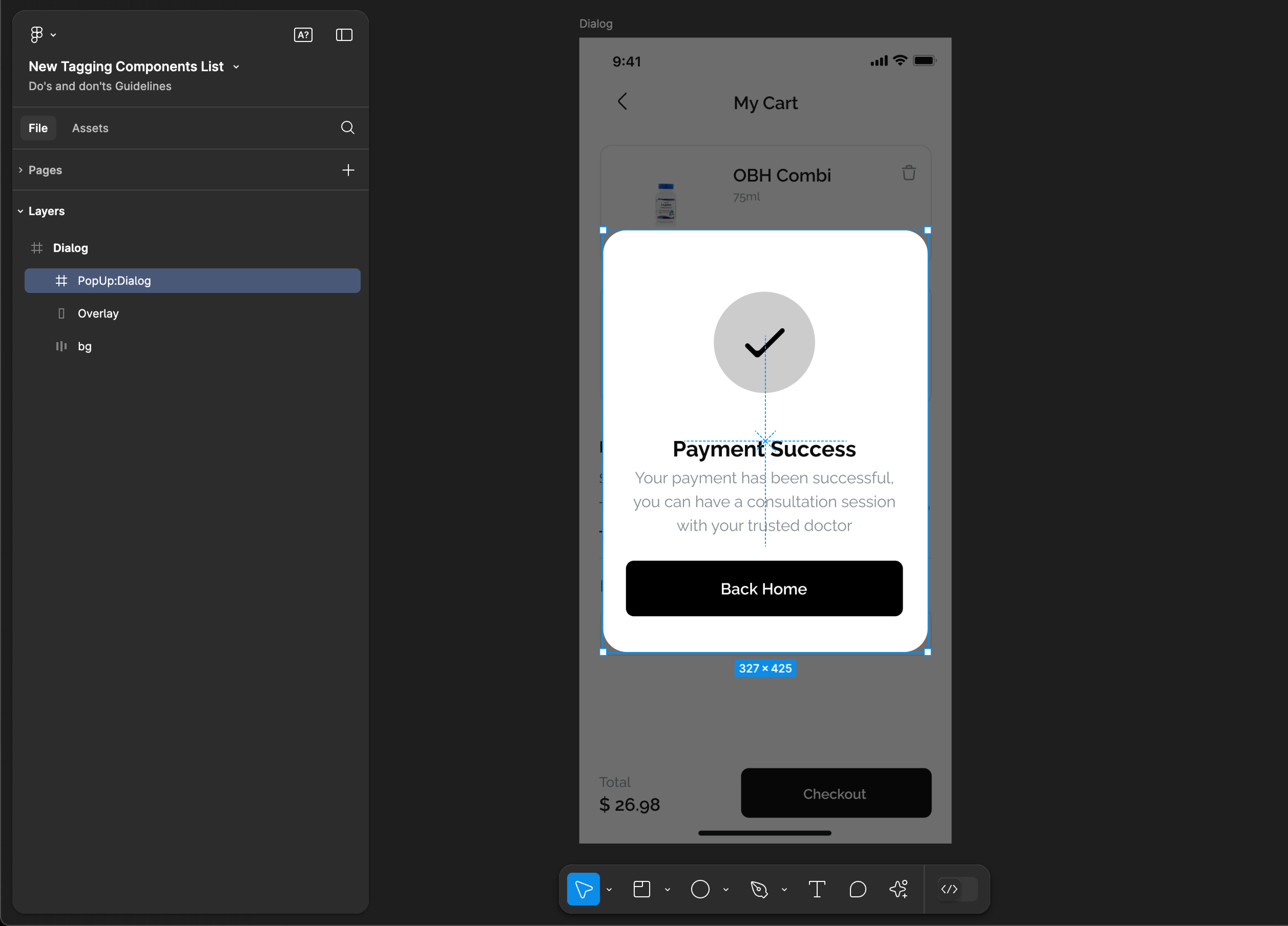
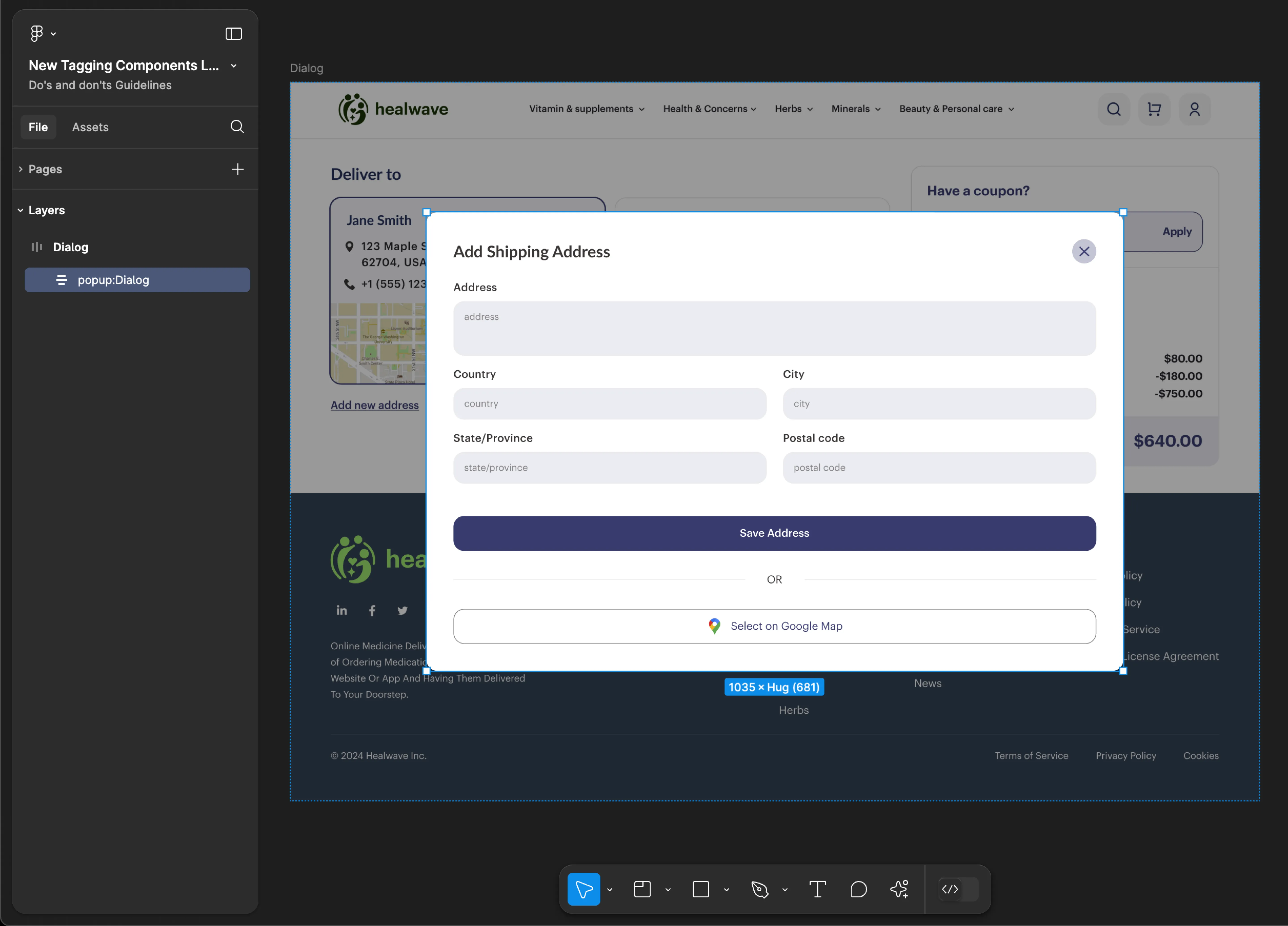
Dialog
- Mobile
- Web
Tag name: Dialog
Format: {Group or Frame name} + “:" + Dialog
Example: PopUp:Dialog
Tag name: Dialog
Format: {Group or Frame name} + “:" + Dialog
Example: popup:Dialog
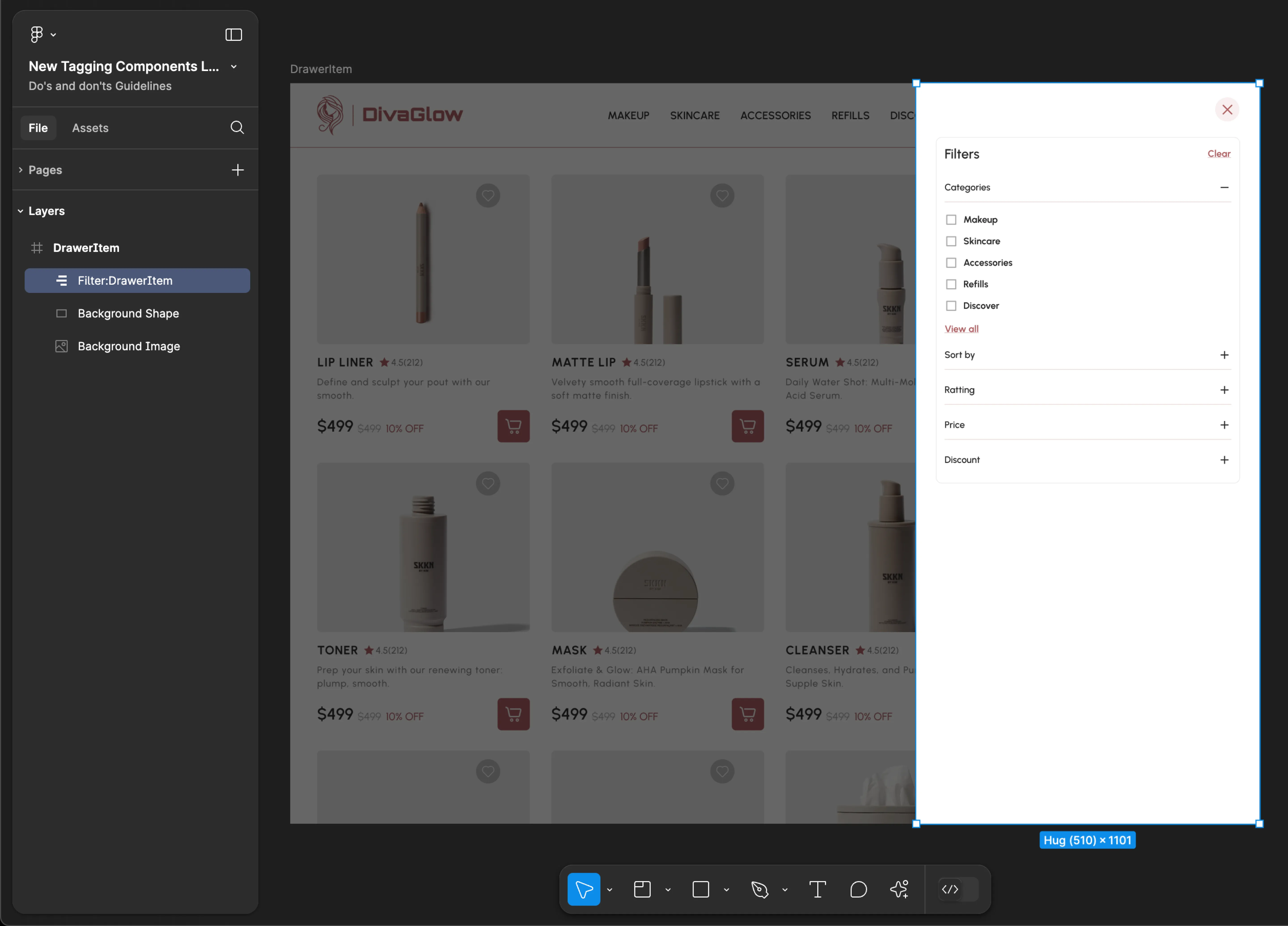
DrawerItem
- Mobile
- Web
Tag name: DrawerItem
Format: {Group or Frame name} + “:" + DrawerItem
Example: Filter Container:DrawerItem
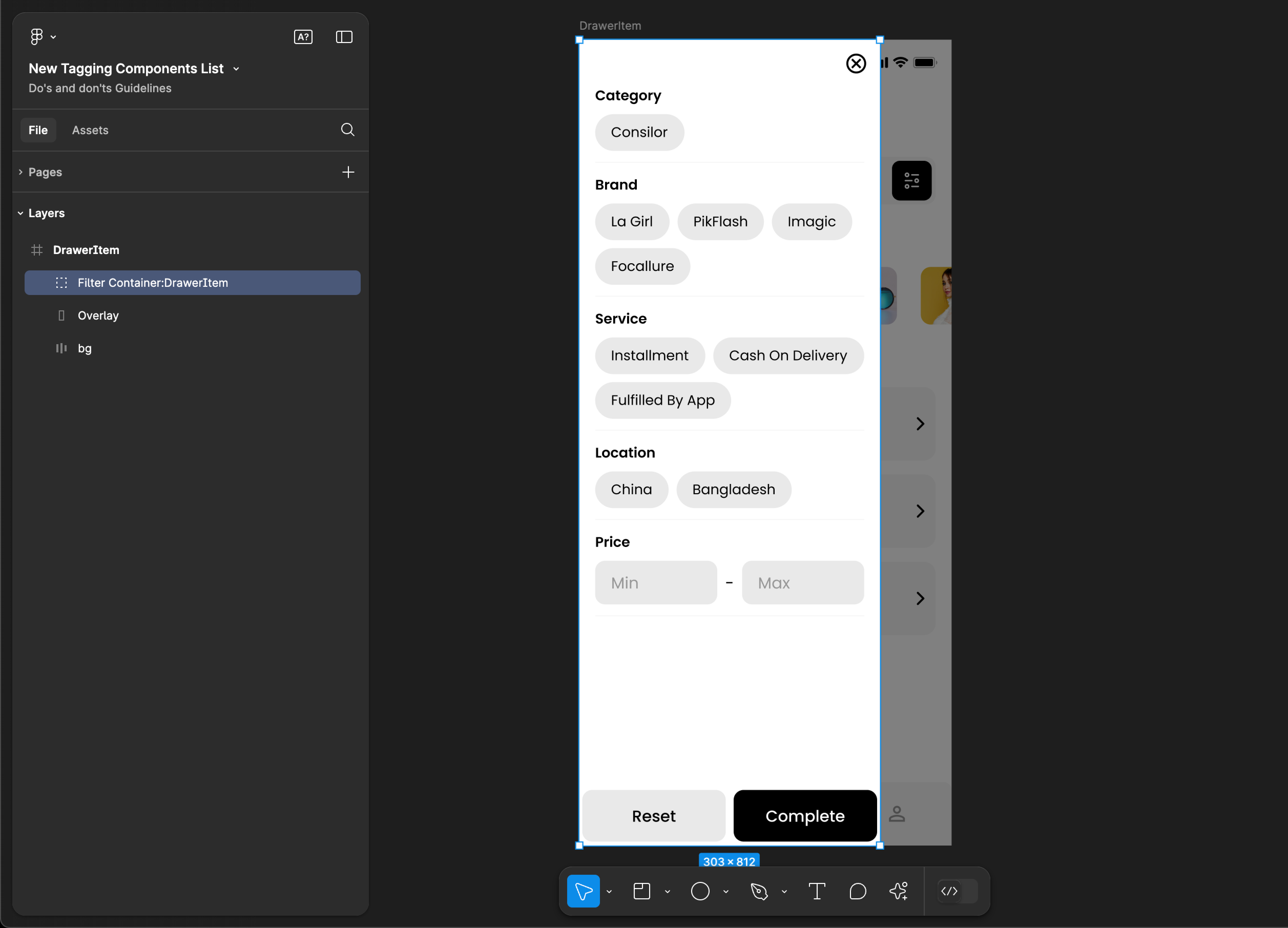
Tag name: DrawerItem
Format: {Group or Frame name} + “:" + DrawerItem
Example: Filter:DrawerItem
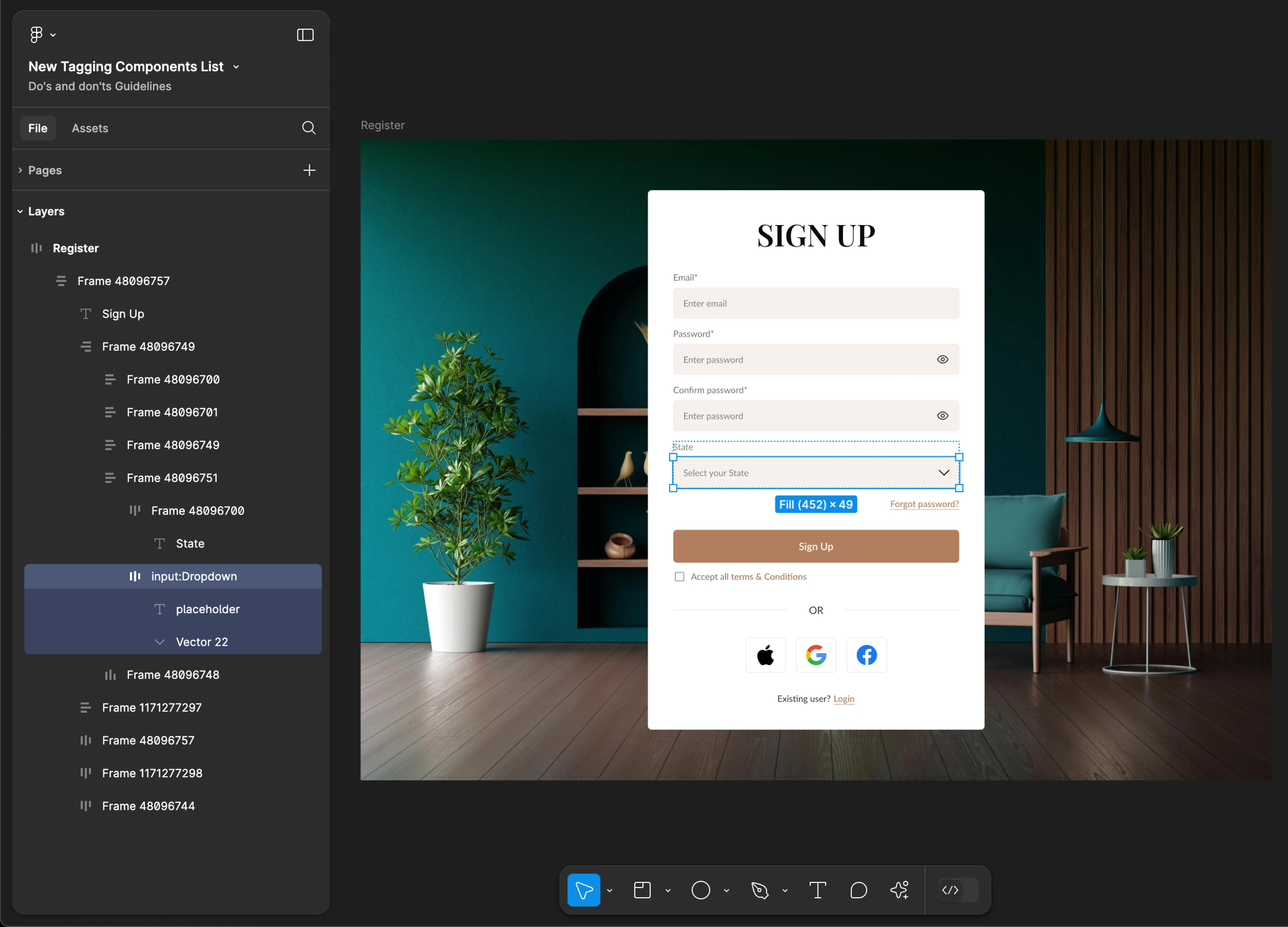
Dropdown
- Mobile
- Web
Tag name: Dropdown
Format: {Group or Frame name} + “:" + Dropdown
Example: Input Fields:Dropdown
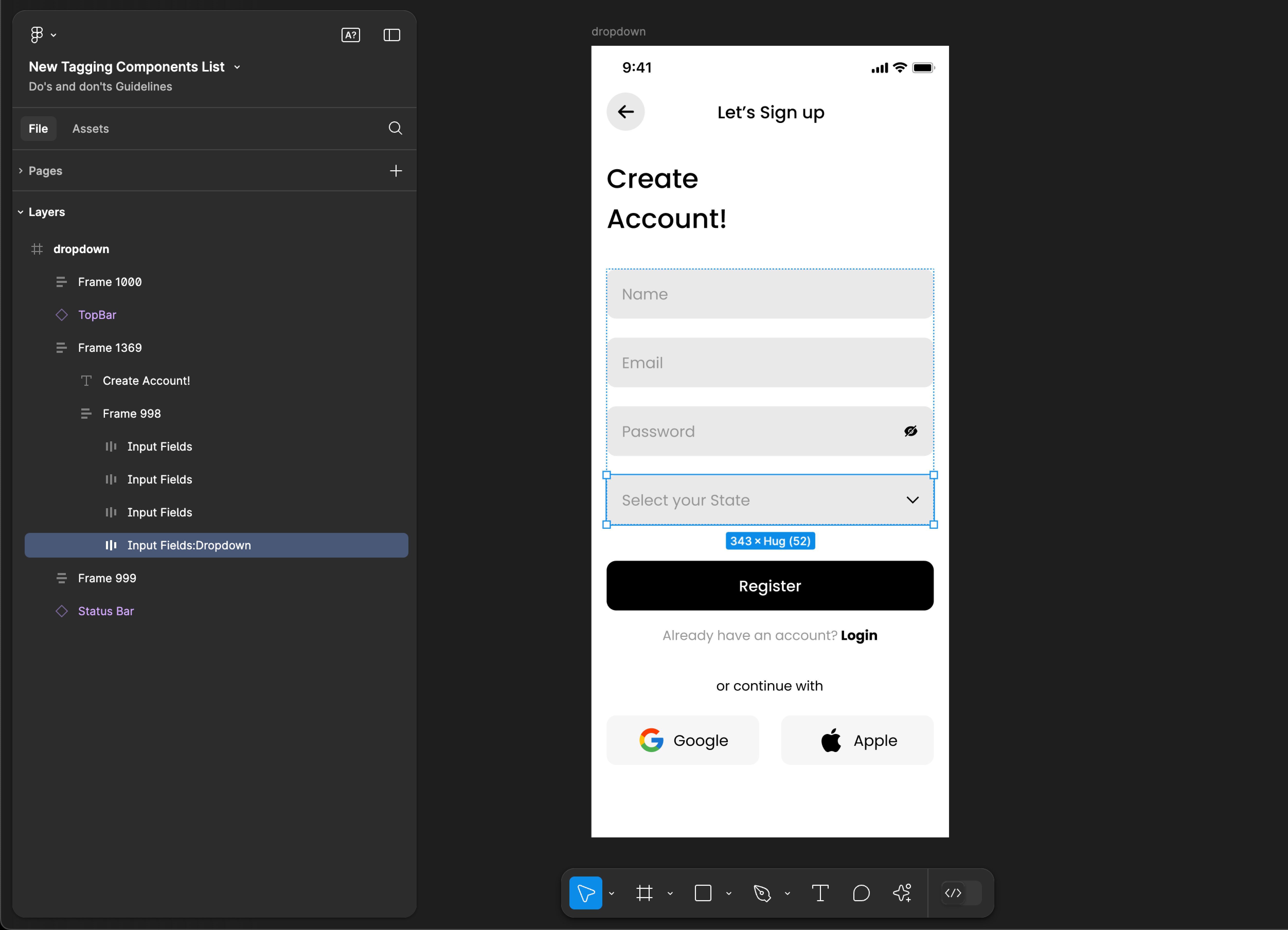
Tag name: Dropdown
Format: {Group or Frame name} + “:" + Dropdown
Example: input:Dropdown
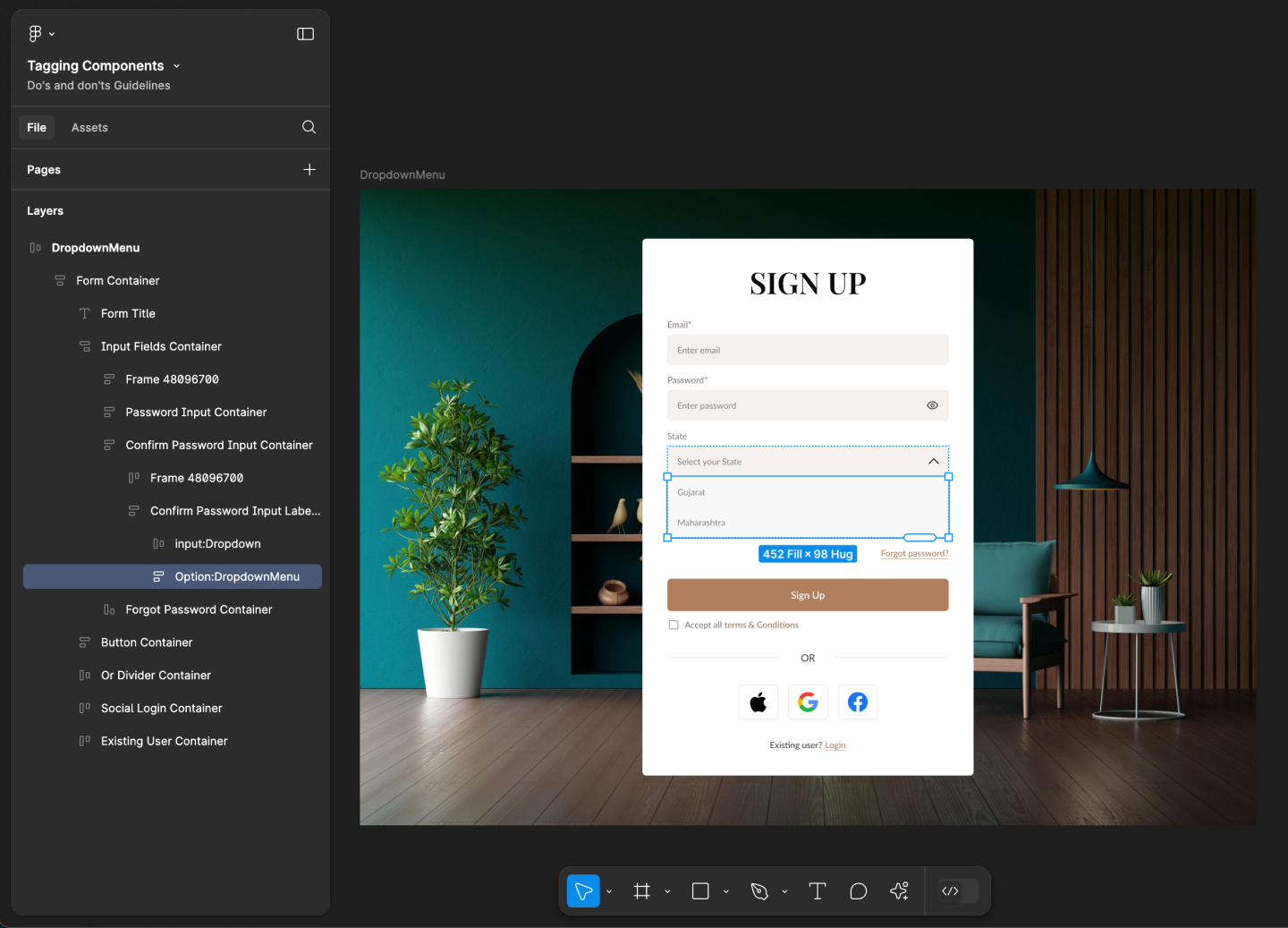
DropdownMenu
- Mobile
- Web
Tag name: DropdownMenu
Format: {Group or Frame name} + “:" + DropdownMenu
Example: Input Fields:DropdownMenu
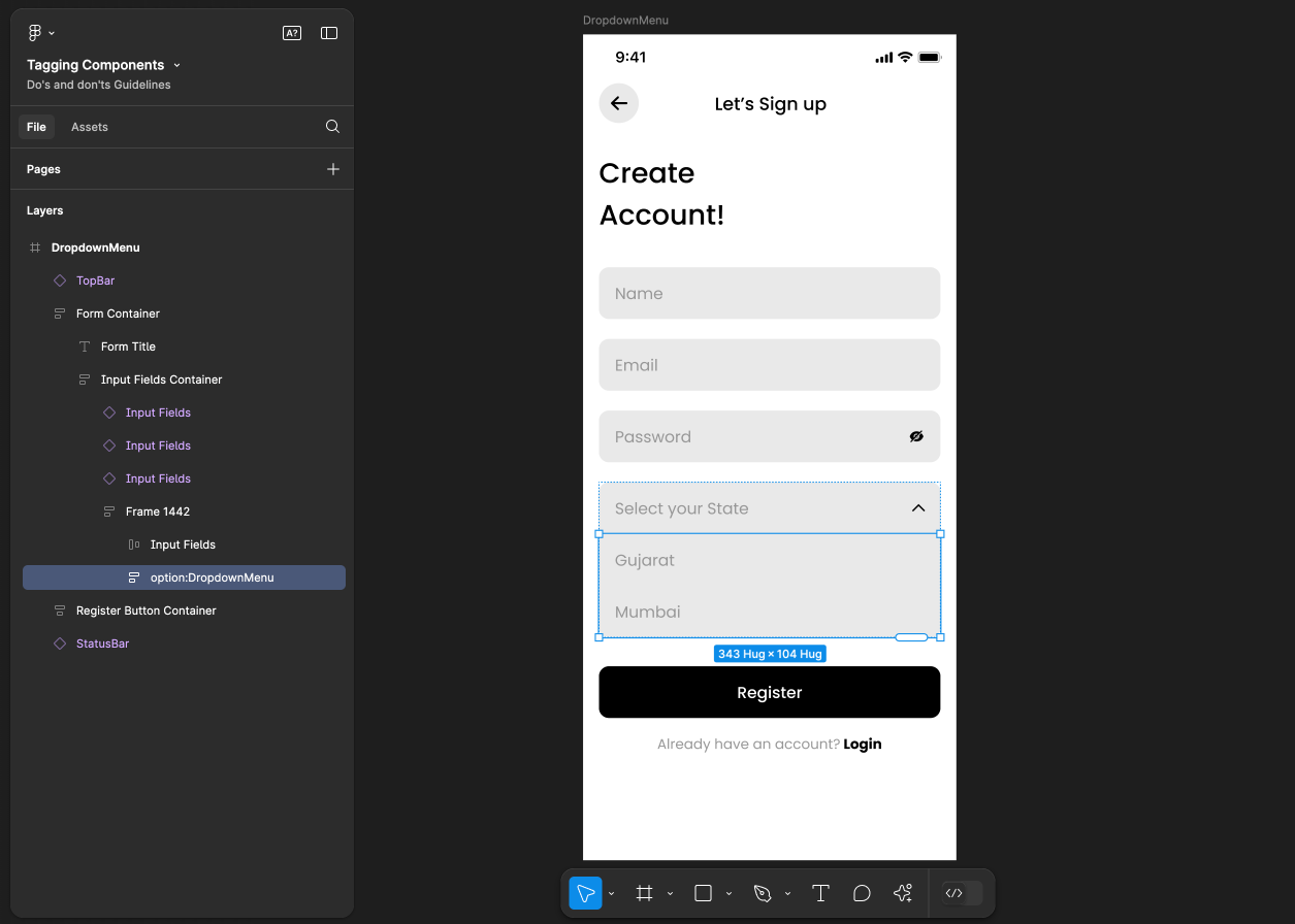
Tag name: DropdownMenu
Format: {Group or Frame name} + “:" + DropdownMenu
Example: input:DropdownMenu
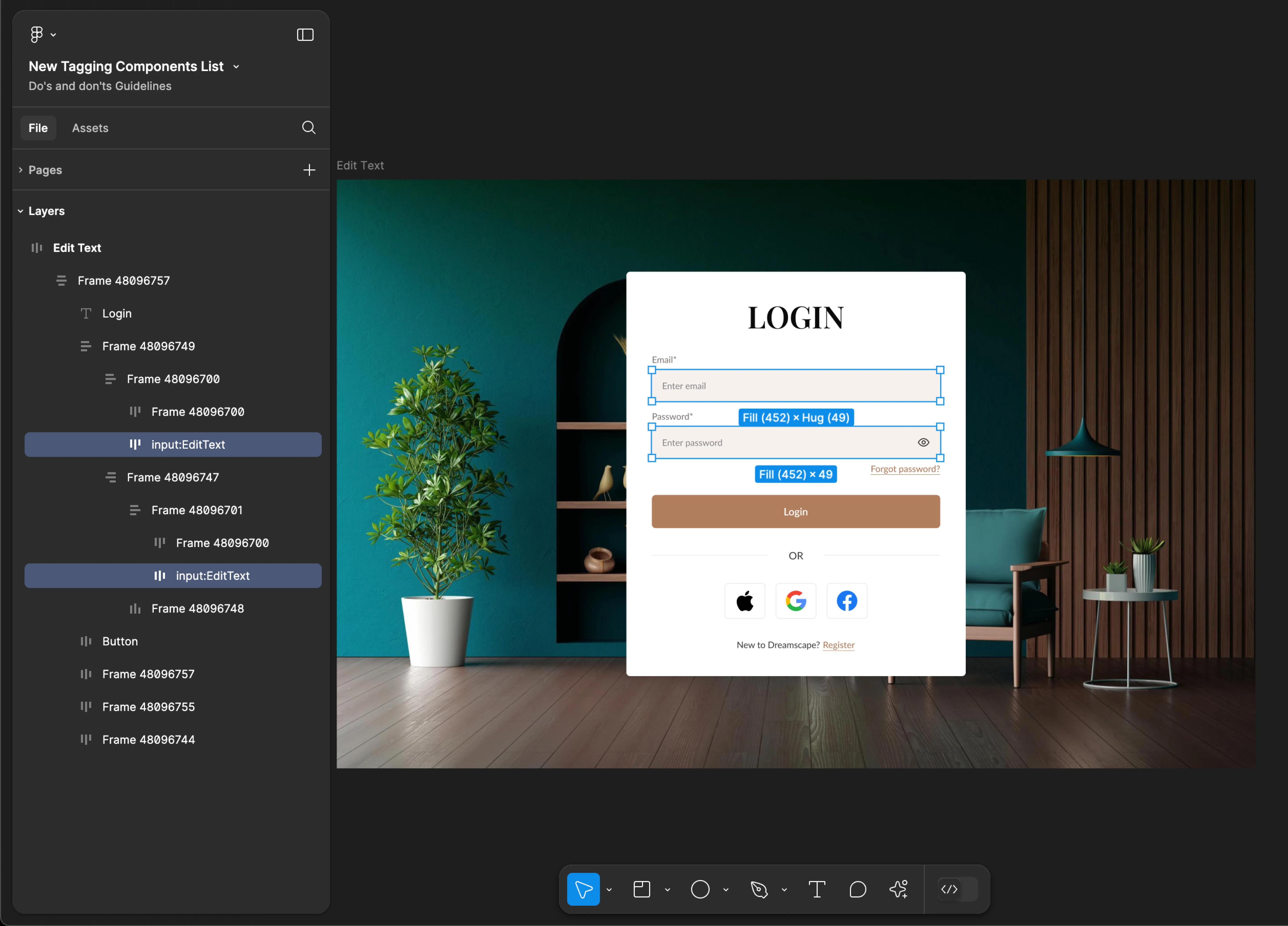
EditText
- Mobile
- Web
Tag name: EditText
Format: {Group or Frame name} + “:" + EditText
Example: Input Fields:EditText
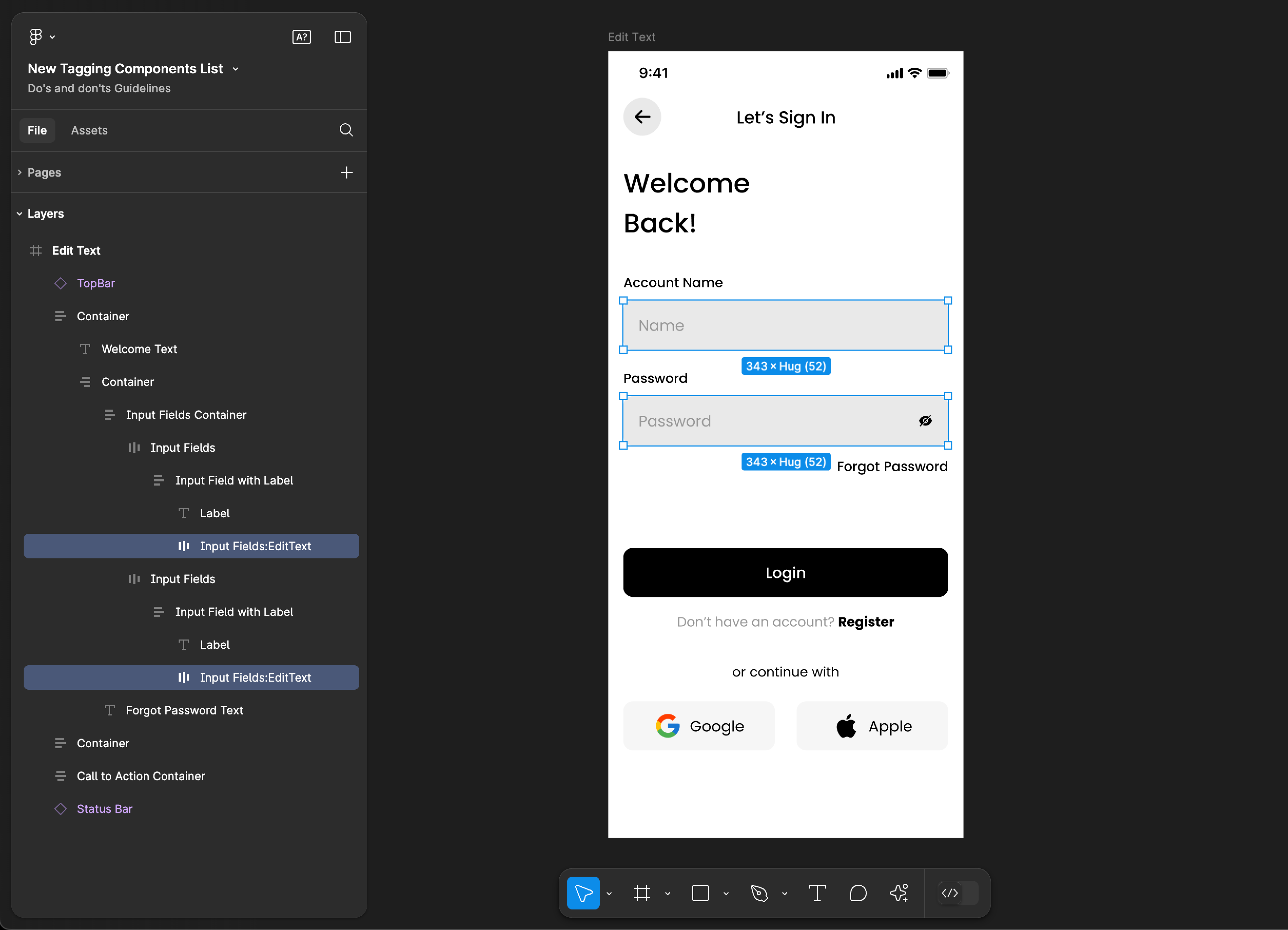
Tag name: EditText
Format: {Group or Frame name} + “:" + EditText
Example: input:EditText
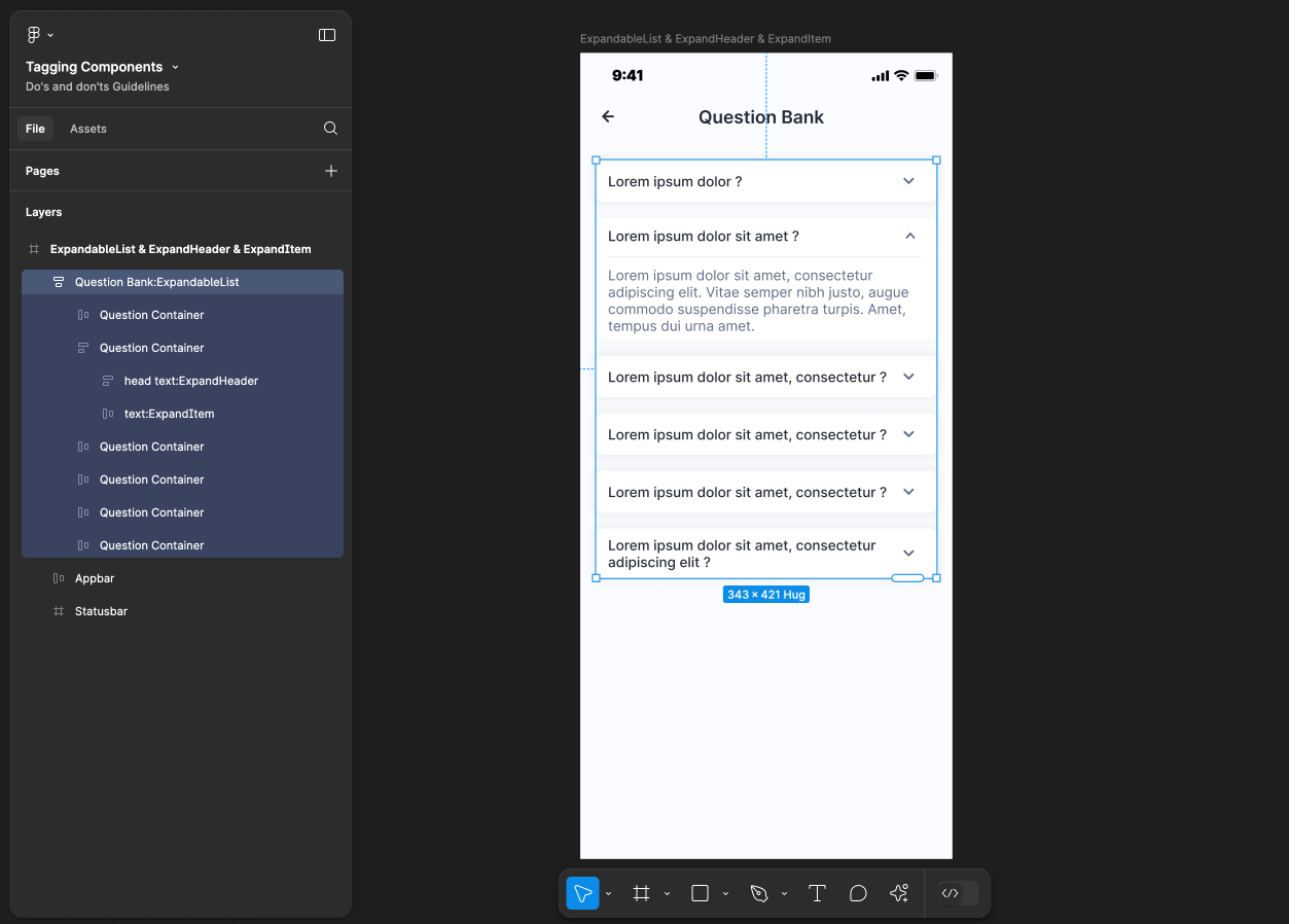
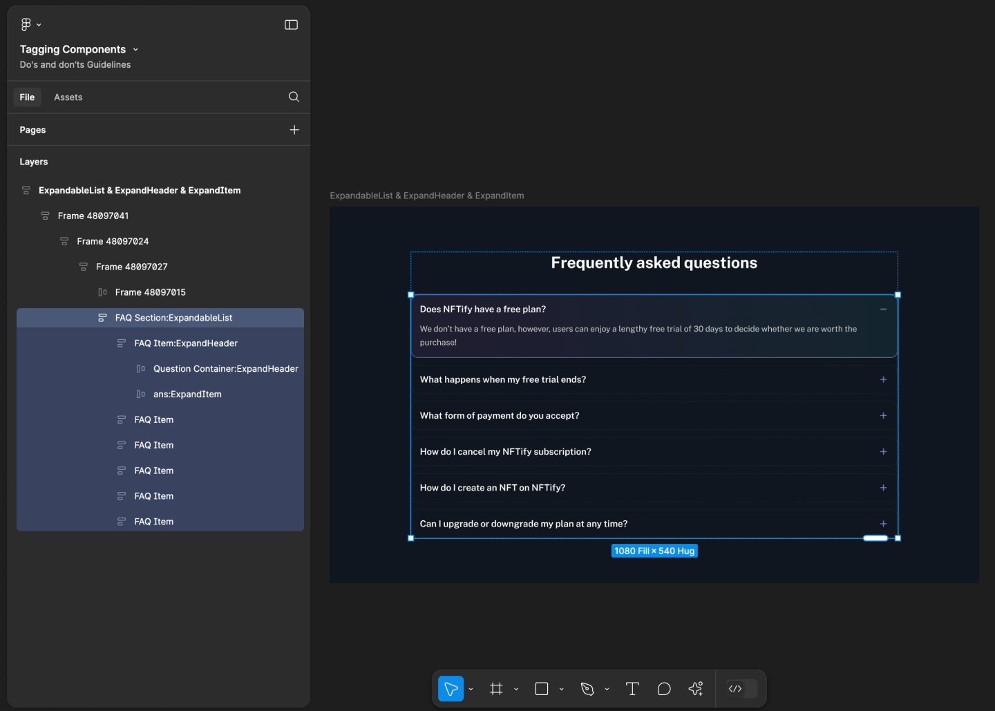
ExpandableList, ExpandHeader & ExpandItem
Use ExpandableList, ExpandHeader & ExpandItem tags together for accurate component identification. Using only one of these tags may result in inaccuracies and incomplete component recognition.
- Mobile
- Web
Tag name: ExpandableList
Format: {Group or Frame name} + “:" + ExpandableList
Example: FAQ Section:ExpandableList
Tag name: ExpandHeader & ExpandItem
Format:
{Group or Frame name} + “:" + ExpandHeader
{Group or Frame name} + “:" + ExpandItem
Example:
Question Container:ExpandHeader
text:ExpandItem
Tag name: ExpandableList
Format: {Group or Frame name} + “:" + ExpandableList
Example: FAQ Section:ExpandableList
Tag name: ExpandHeader & ExpandItem
Format:
{Group or Frame name} + “:" + ExpandHeader
{Group or Frame name} + “:" + ExpandItem
Example:
FAQ Item:ExpandHeader
ans:ExpandItem
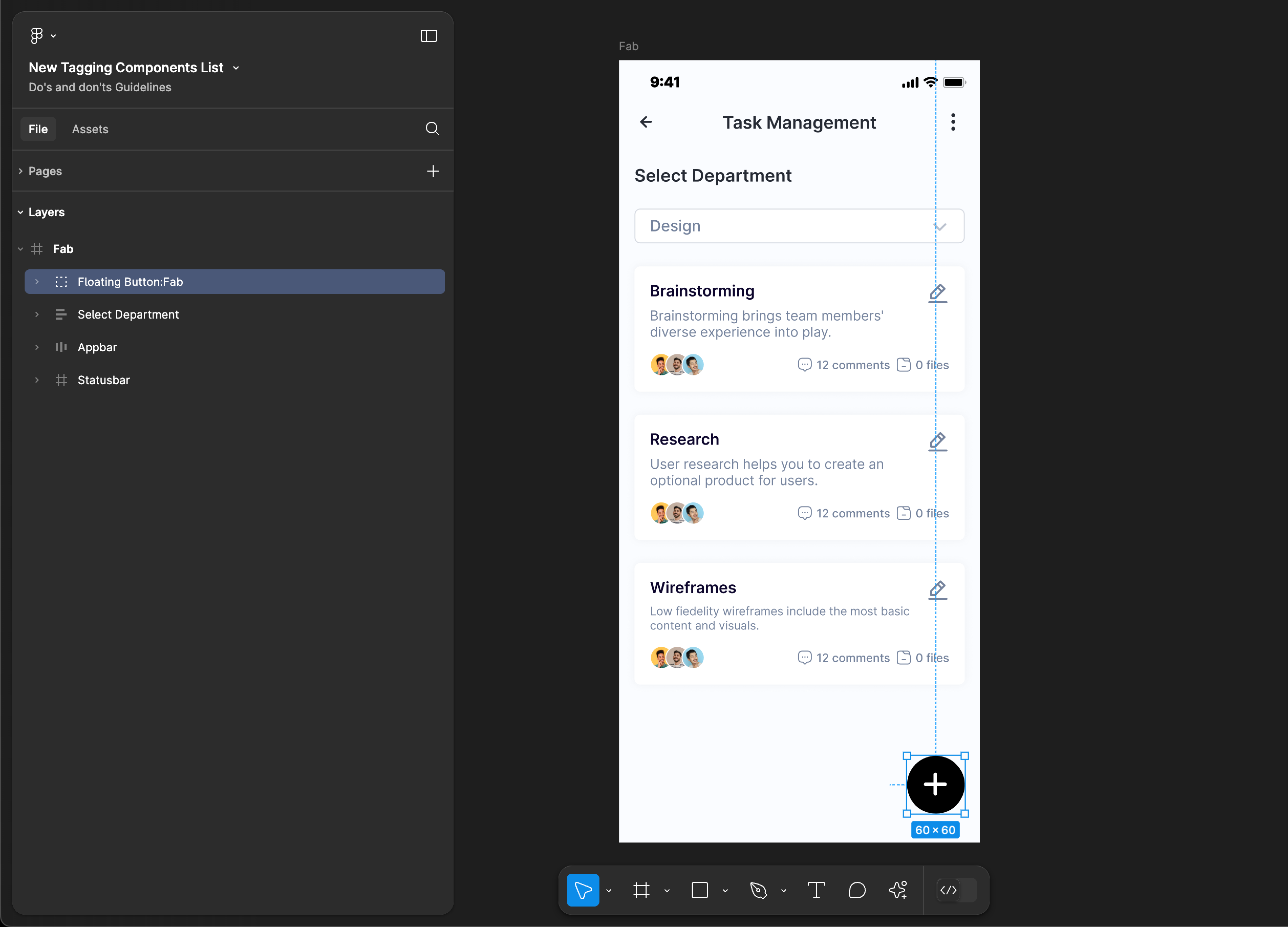
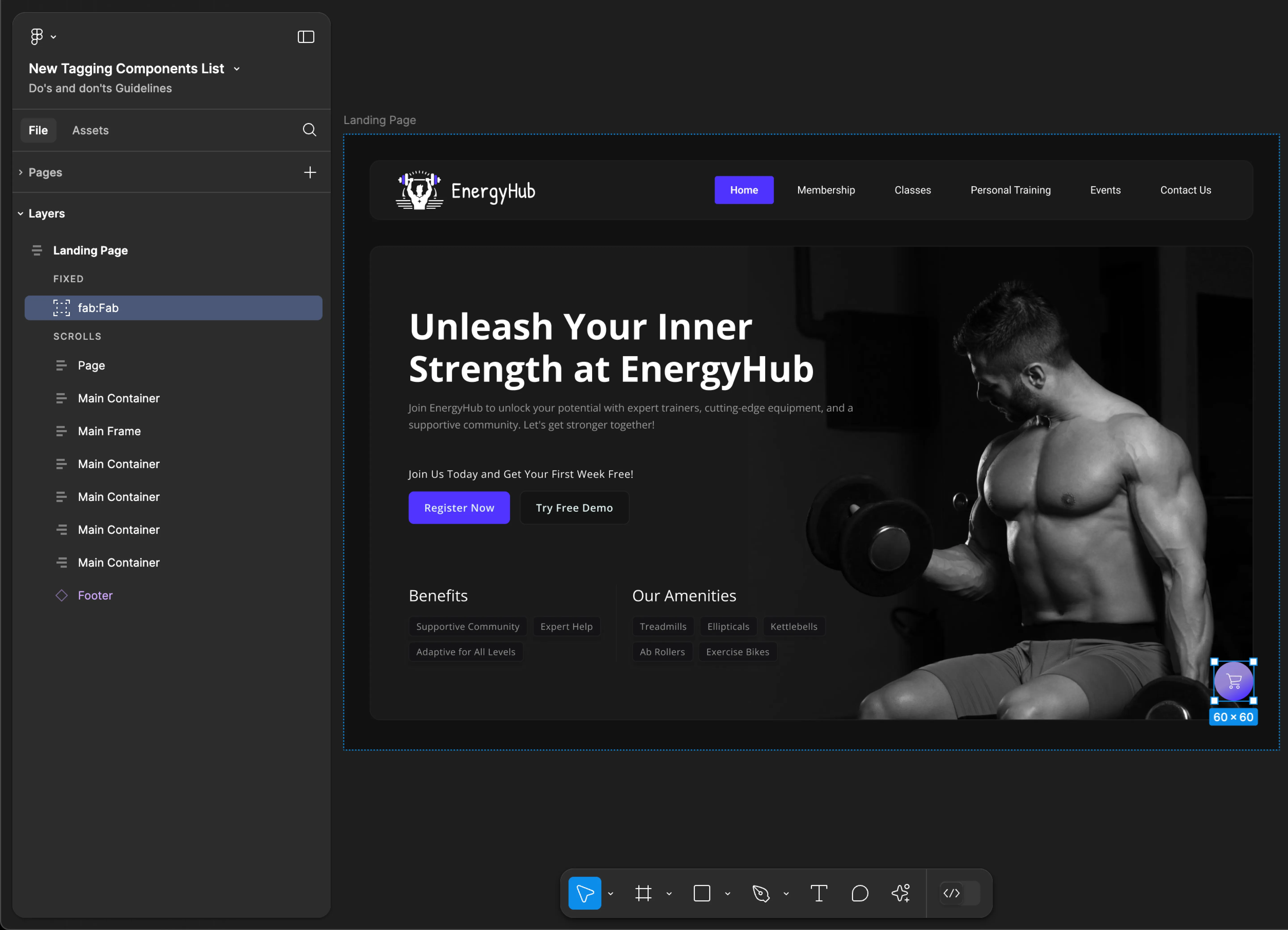
Fab
- Mobile
- Web
Tag name: Fab
Format: {Group or Frame name} + “:" + Fab
Example: Floating Button:Fab
Tag name: Fab
Format: {Group or Frame name} + “:" + Fab
Example: fab:Fab
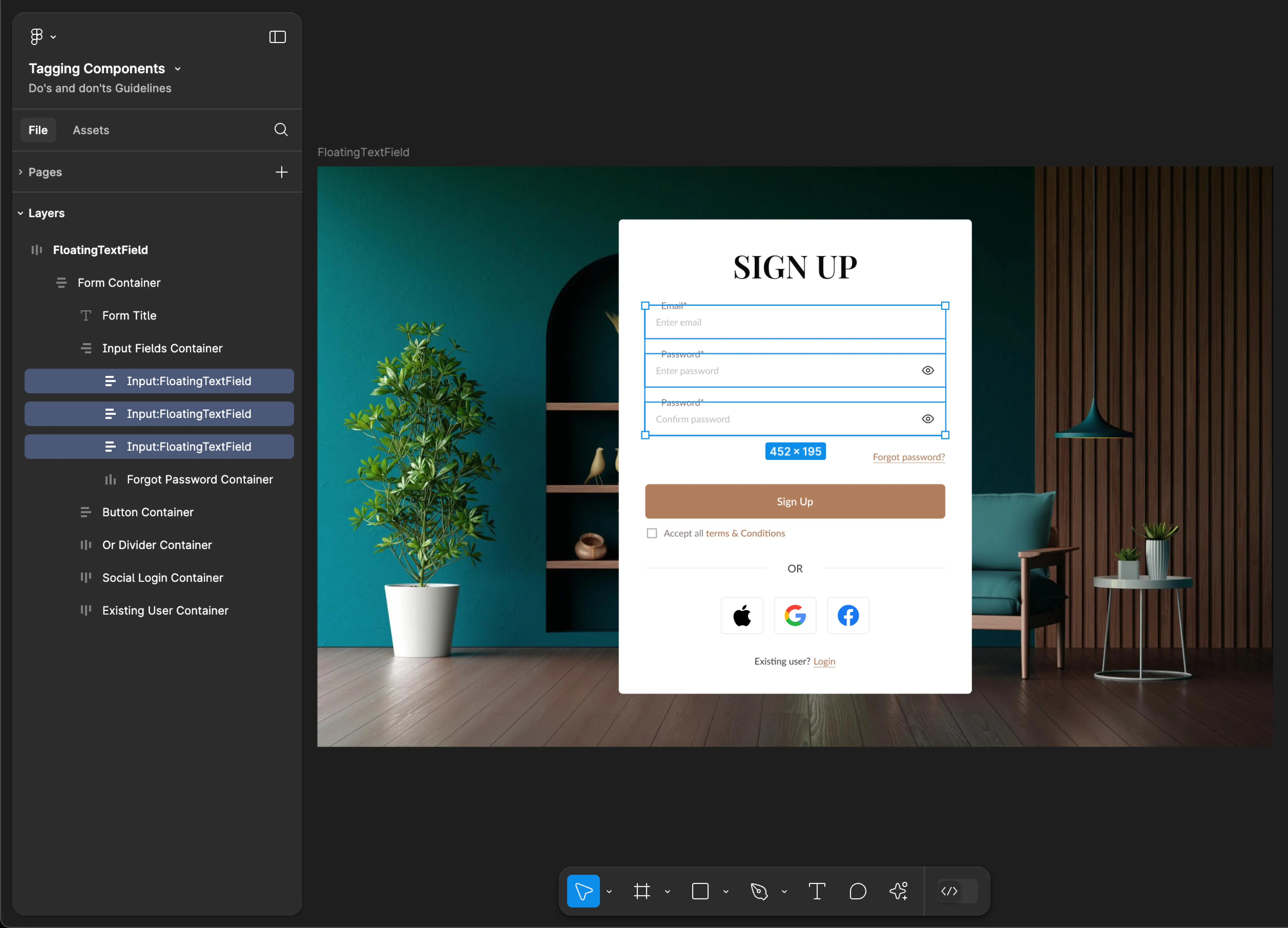
FloatingTextField
- Mobile
- Web
Tag name: FloatingTextField
Format: {Group or Frame name} + “:" + FloatingTextField
Example: input:FloatingTextField
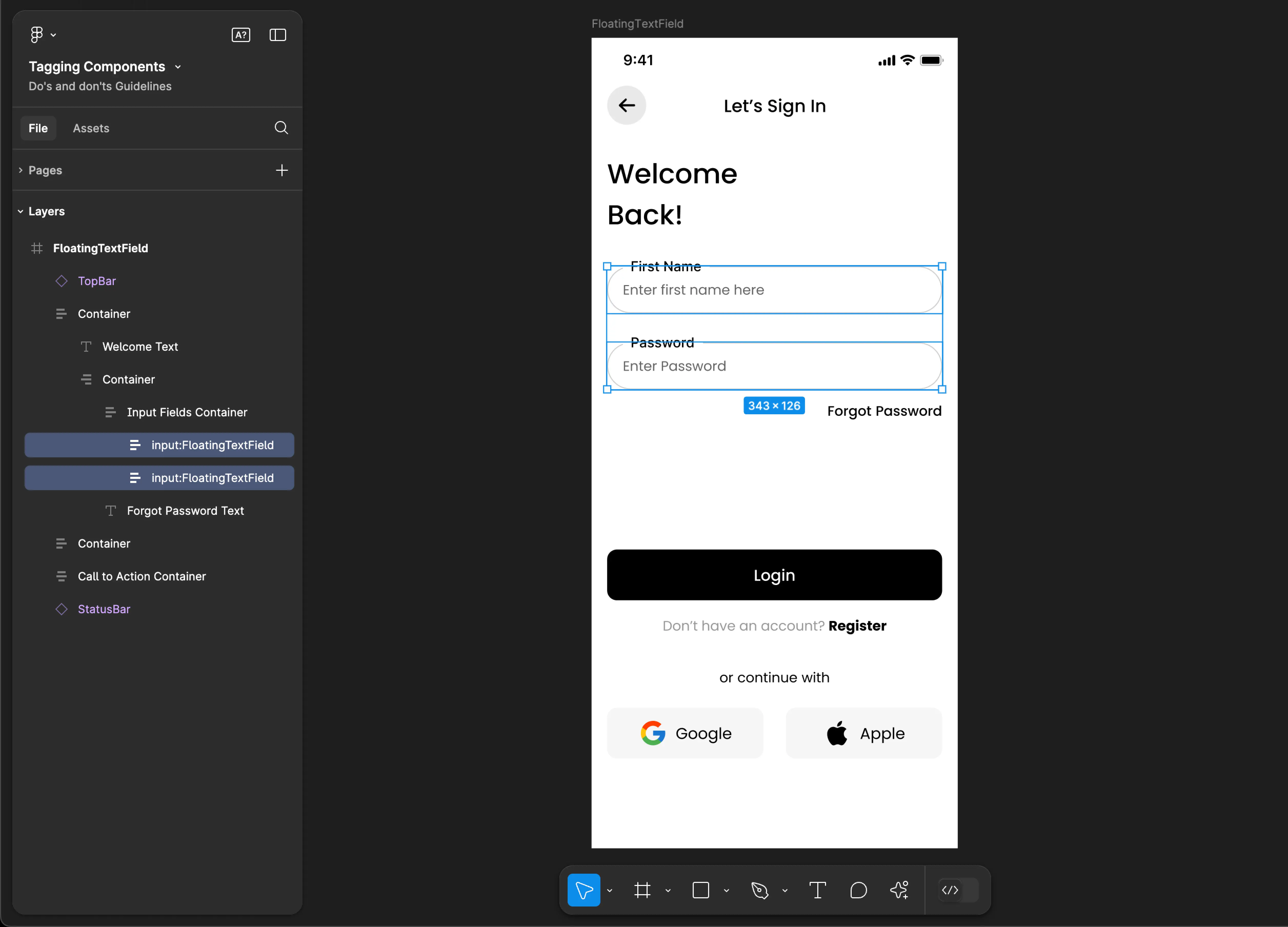
Tag name: FloatingTextField
Format: {Group or Frame name} + “:" + FloatingTextField
Example: Input:FloatingTextField
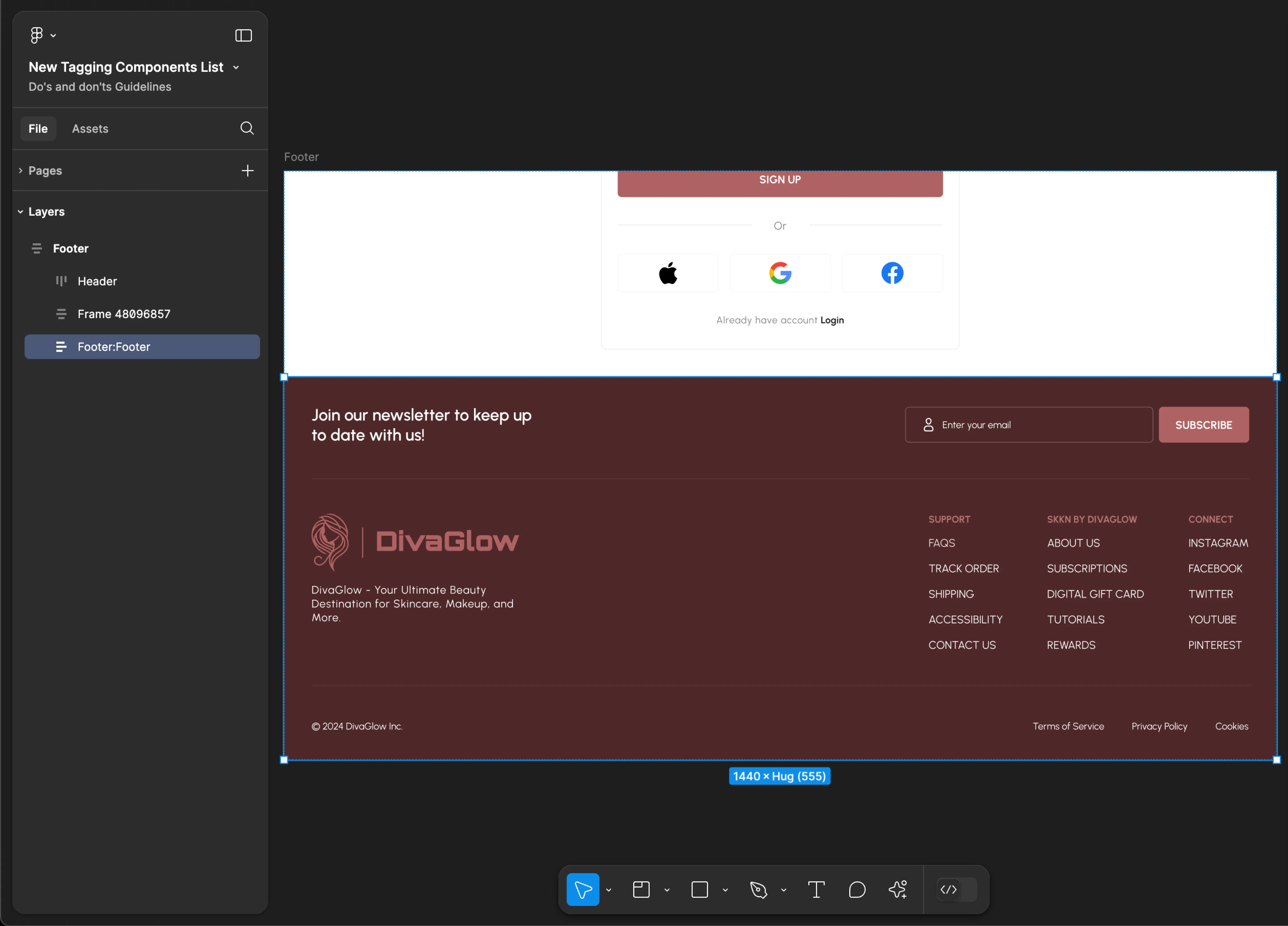
Footer
Footer tagging is not supported for mobile applications.
Tag name: Footer
Format: {Group or Frame name} + “:" + Footer
Example: Footer:Footer
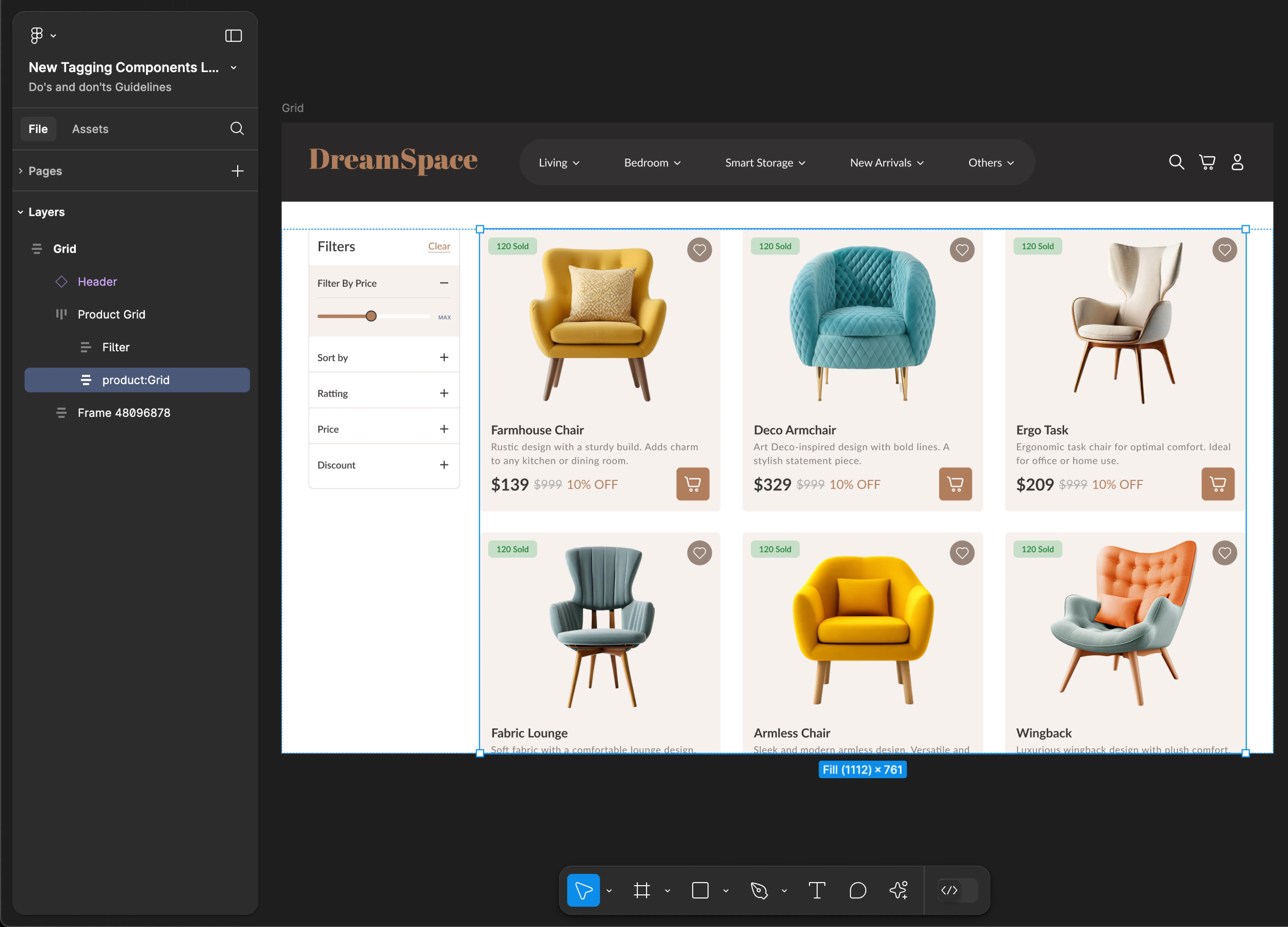
Grid
- Mobile
- Web
Tag name: Grid
Format: {Group or Frame name} + “:" + Grid
Example: Container:Grid
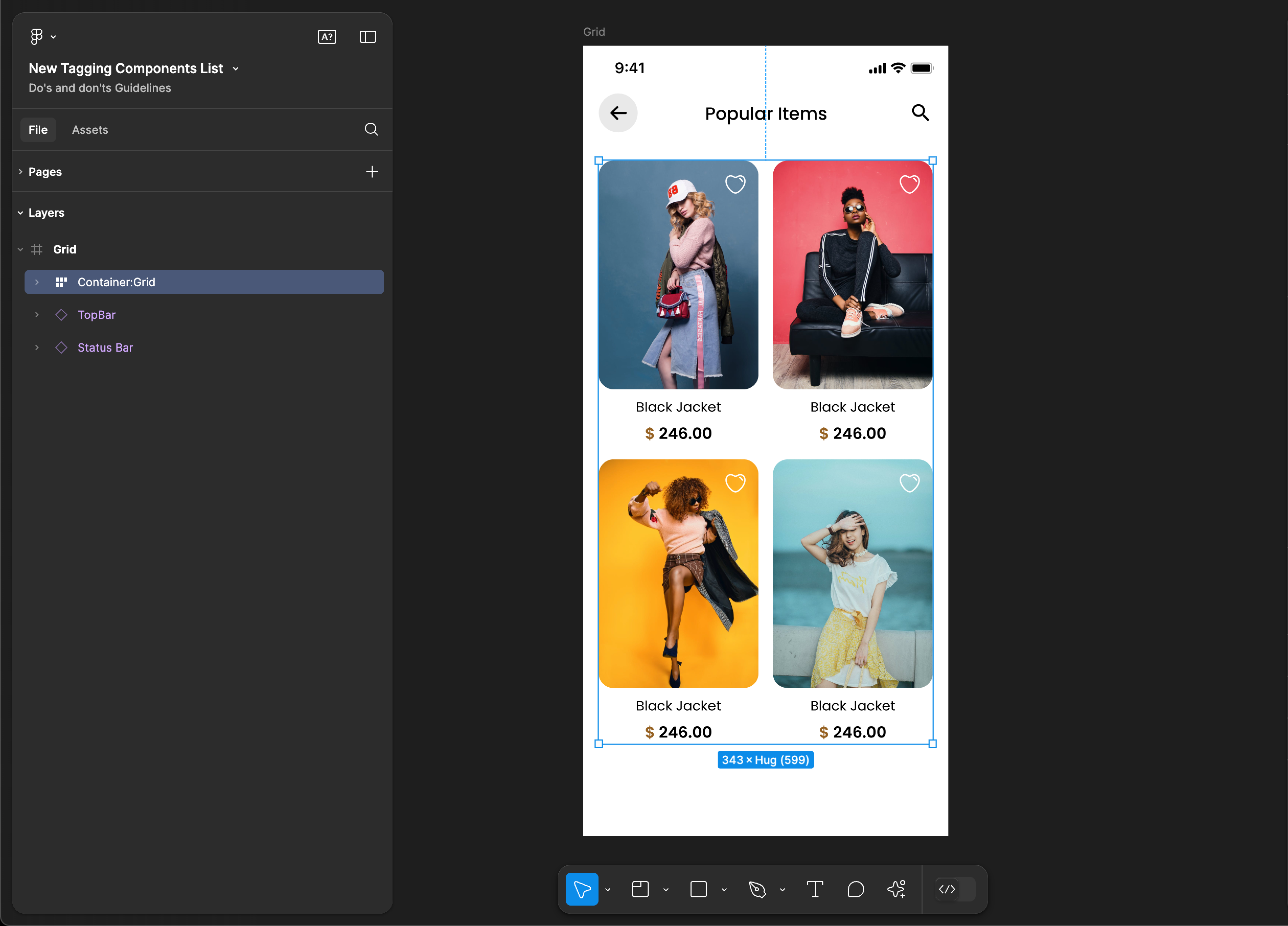
Tag name: Grid
Format: {Group or Frame name} + “:" + Grid
Example: product:Grid
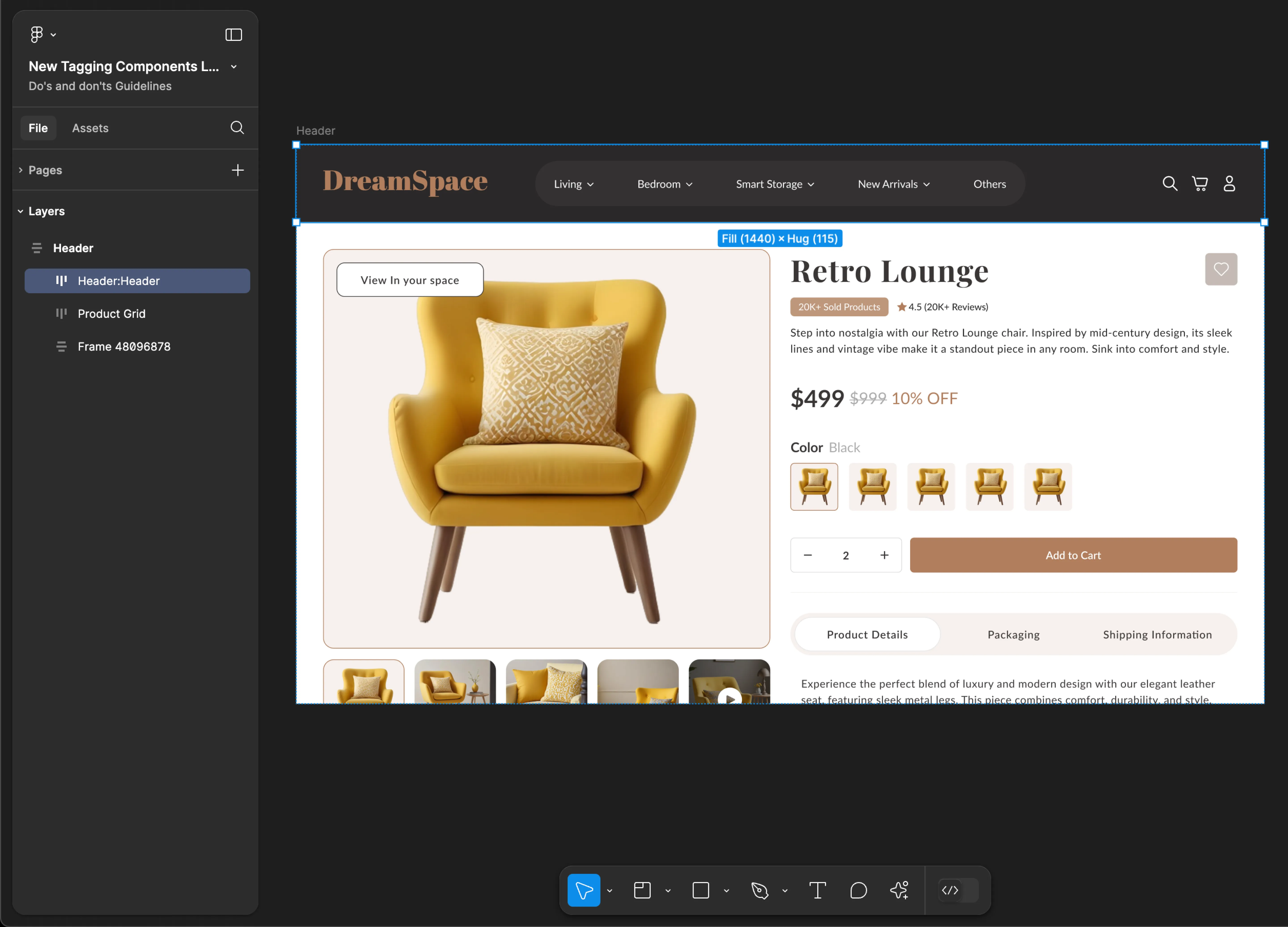
Header
Header tagging is not supported for mobile applications.
Use Header, HeaderMenu, MenuItem & SubMenu tags together for accurate component identification. Using only one of these tags may result in inaccuracies and incomplete component recognition.
Tag name: Header
Format: {Group or Frame name} + “:" + Header
Example: Header:Header
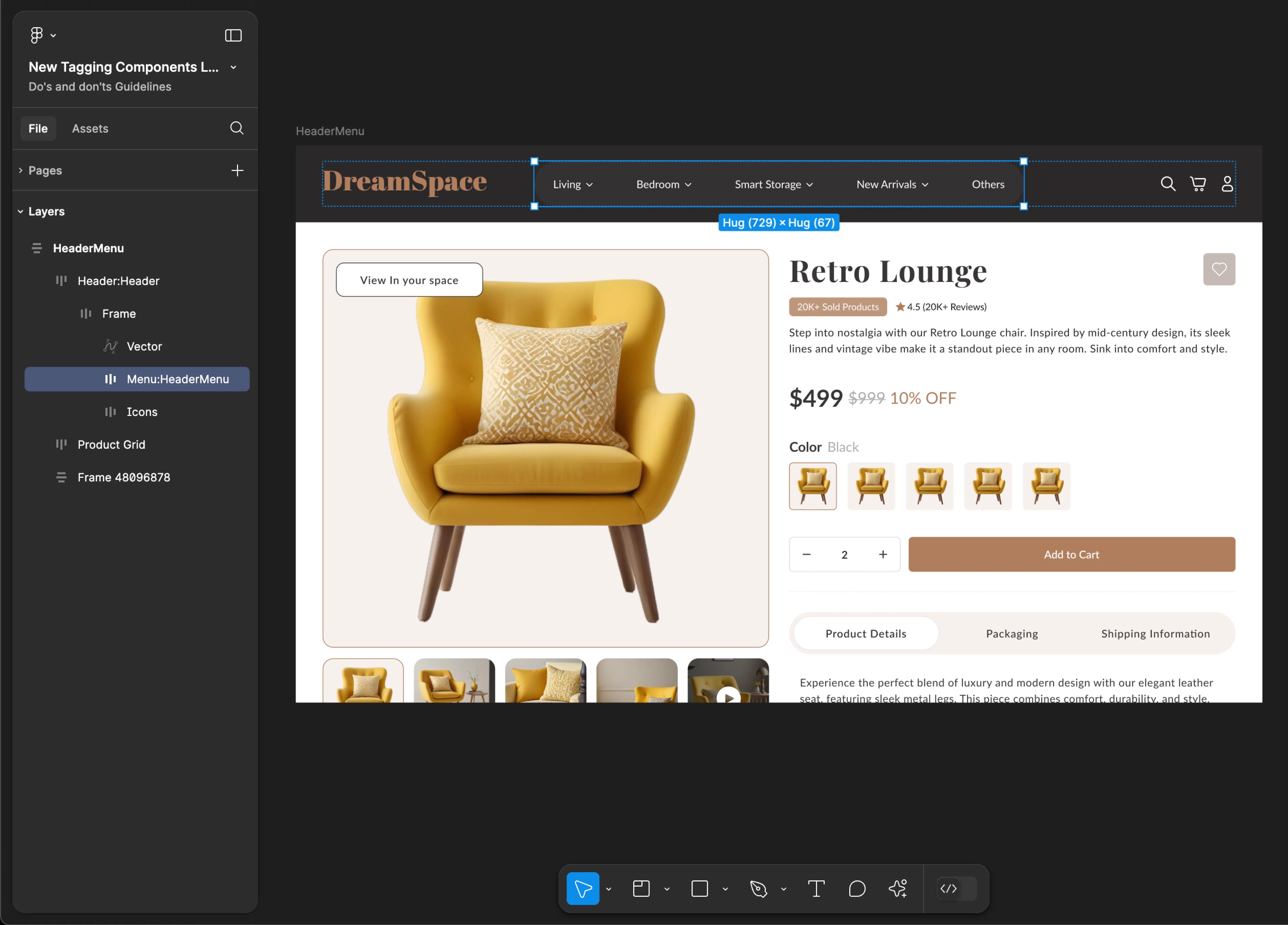
HeaderMenu
HeaderMenu tagging is not supported for mobile applications.
Use Header, HeaderMenu, MenuItem & SubMenu tags together for accurate component identification. Using only one of these tags may result in inaccuracies and incomplete component recognition.
Tag name: HeaderMenu
Format: {Group or Frame name} + “:" + HeaderMenu
Example: Menu:HeaderMenu
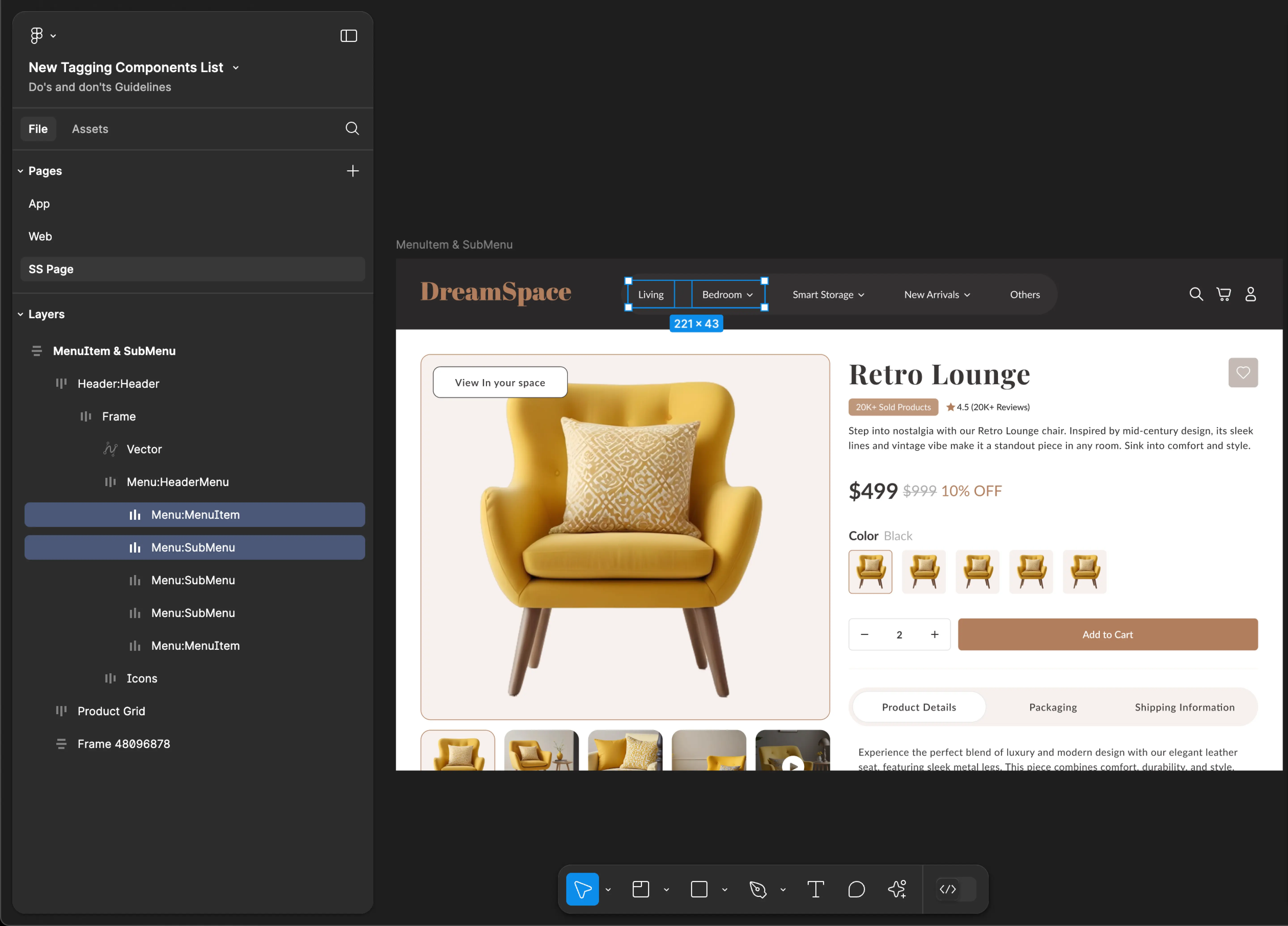
Header MenuItem & SubMenu
Header MenuItem & SubMenu tagging is not supported for mobile applications.
Use Header, HeaderMenu, MenuItem & SubMenu tags together for accurate component identification. Using only one of these tags may result in inaccuracies and incomplete component recognition.
Tag name: MenuItem & SubMenu
Format:
{Group or Frame name} + “:" + MenuItem
{Group or Frame name} + “:" + SubMenu
Example:
Menu:MenuItem
Menu:SubMenu
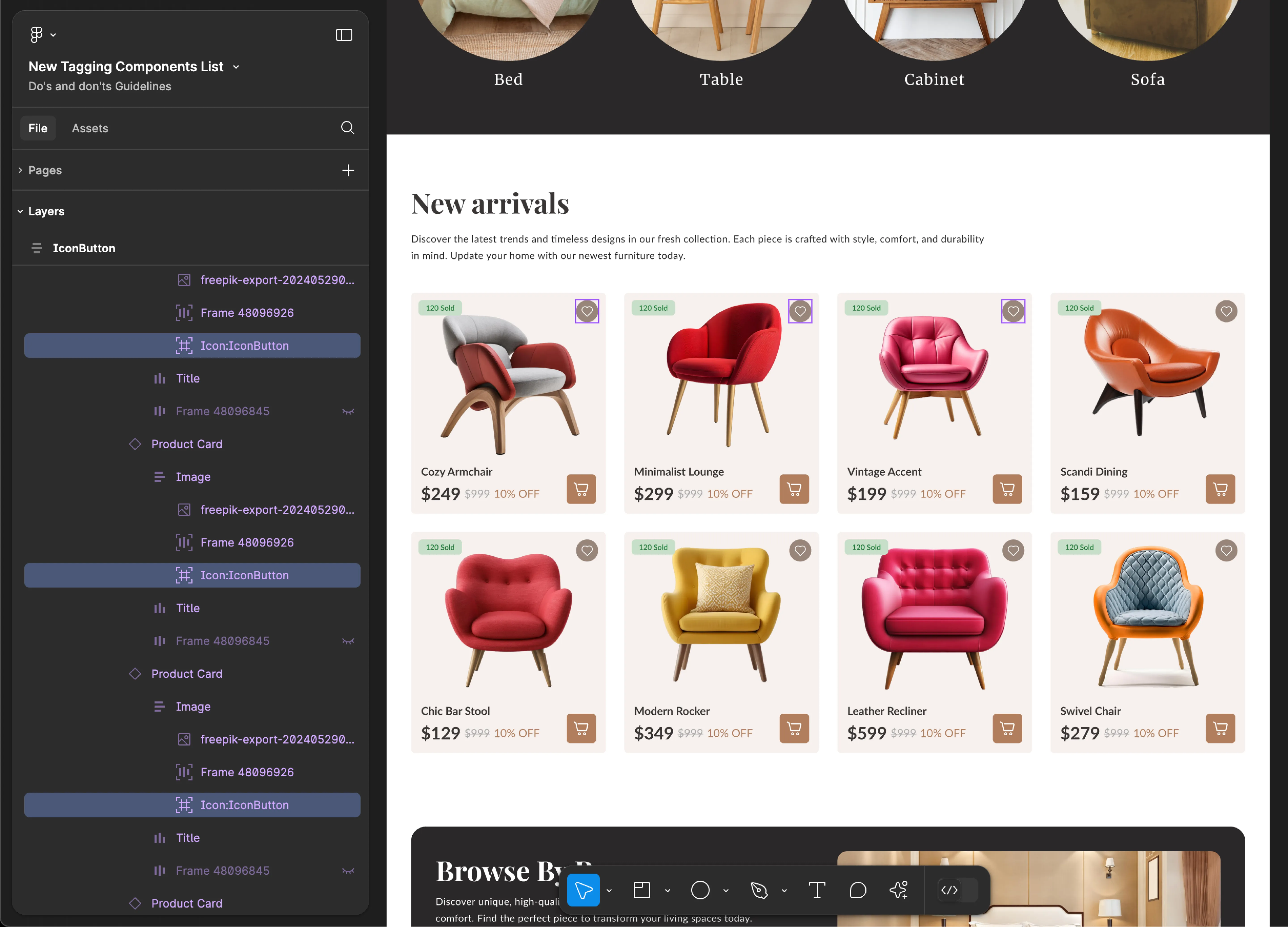
IconButton
- Mobile
- Web
Tag name: IconButton
Format: {Group or Frame name} + “:" + IconButton
Example: Icon:IconButton
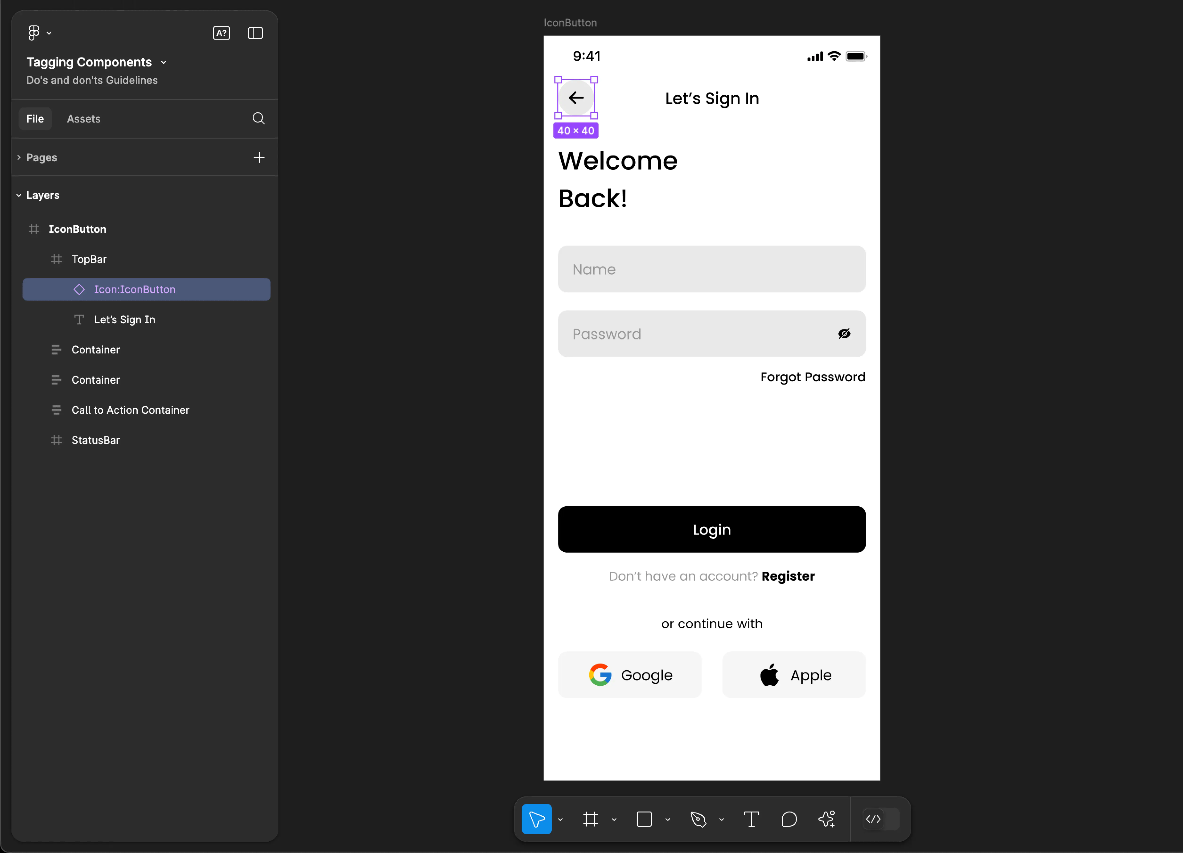
Tag name: IconButton
Format: {Group or Frame name} + “:" + IconButton
Example: Icon:IconButton
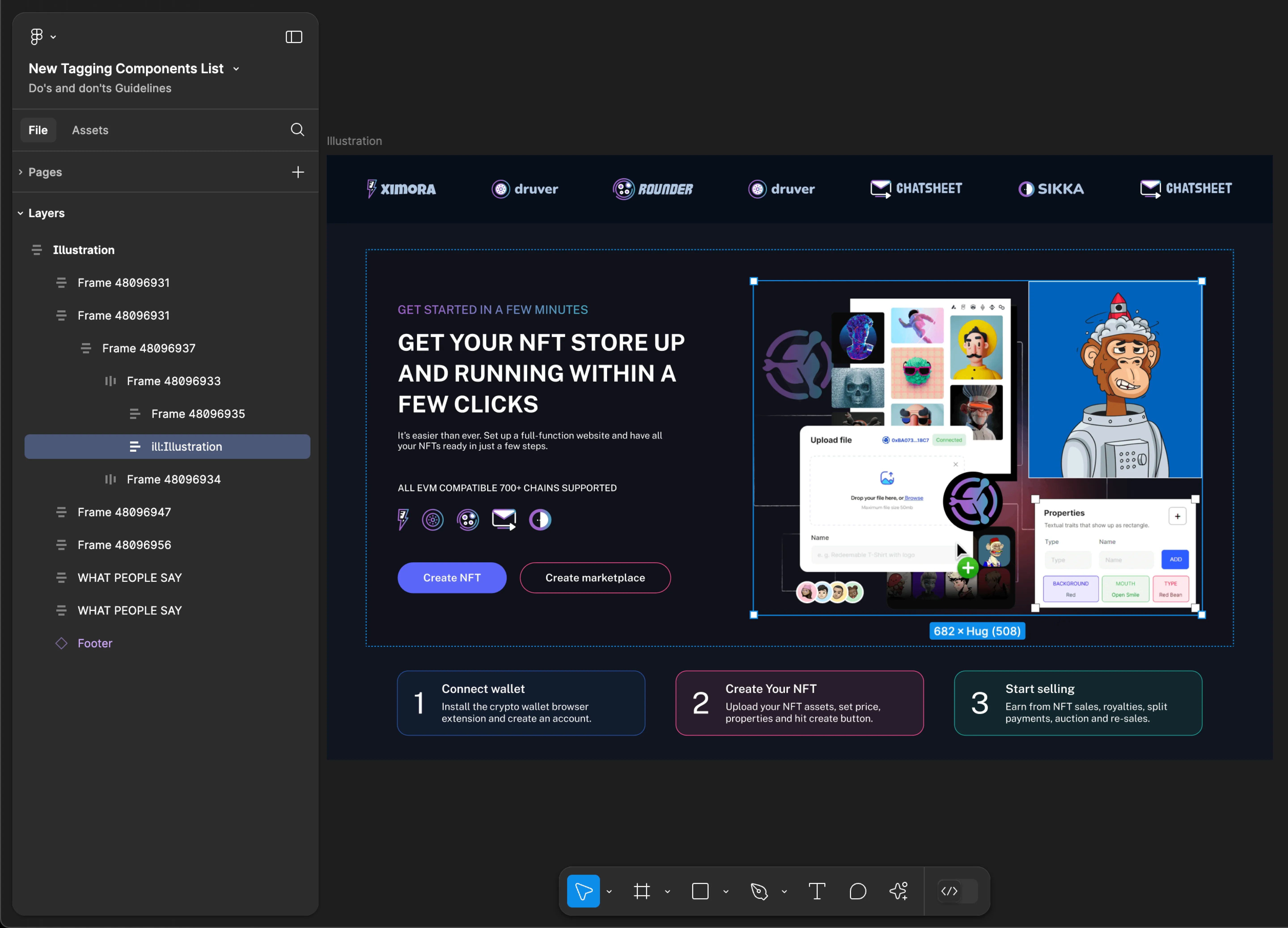
Illustration
- Mobile
- Web
Tag name: Illustration
Format: {Group or Frame name} + “:" + Illustration
Example: Icon:Illustration
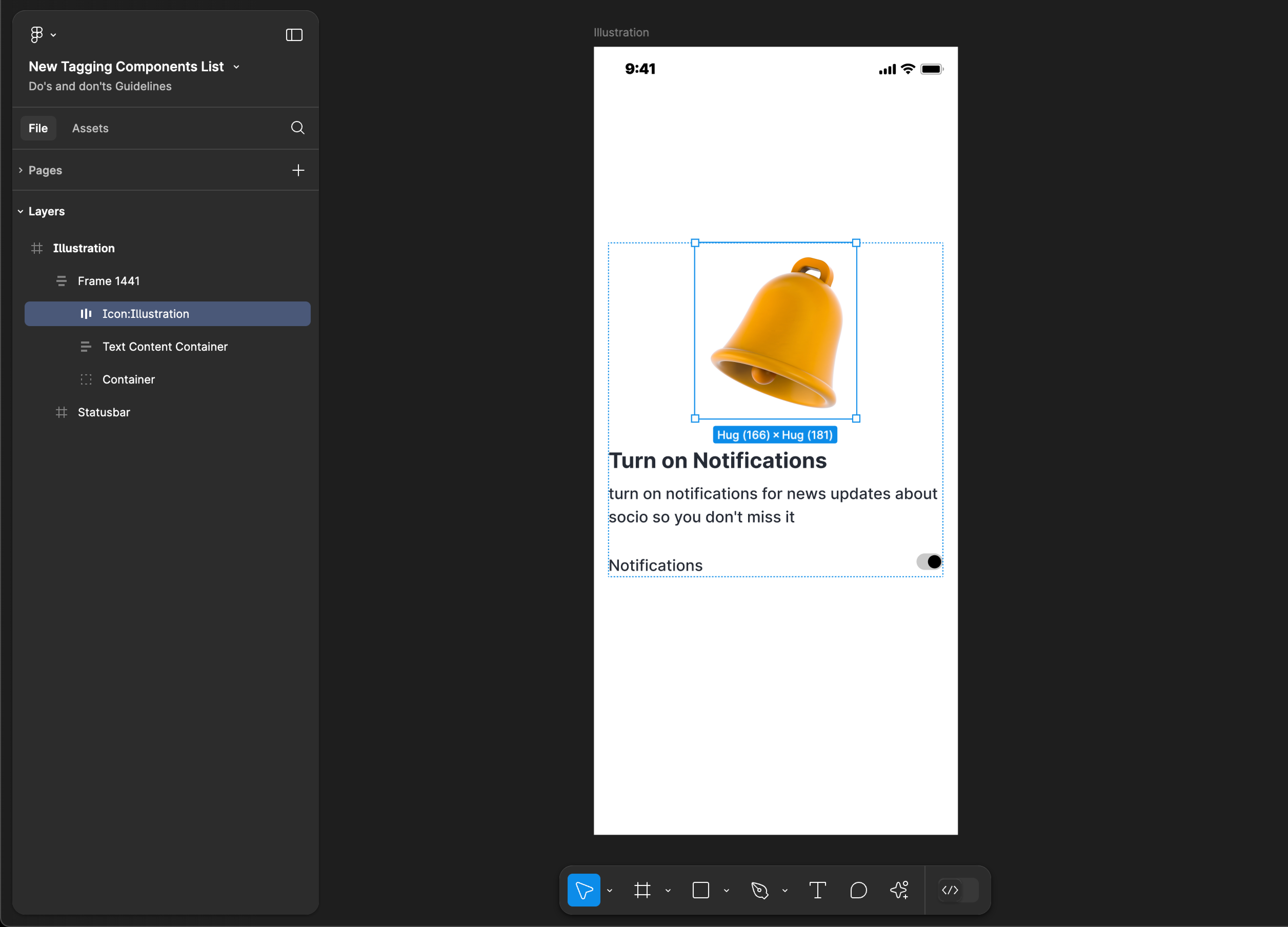
Tag name: Illustration
Format: {Group or Frame name} + “:" + Illustration
Example: ill:Illustration
Image
- Mobile
- Web
Tag name: Image
Format: {Group or Frame name} + “:" + Image
Example: Image:Image
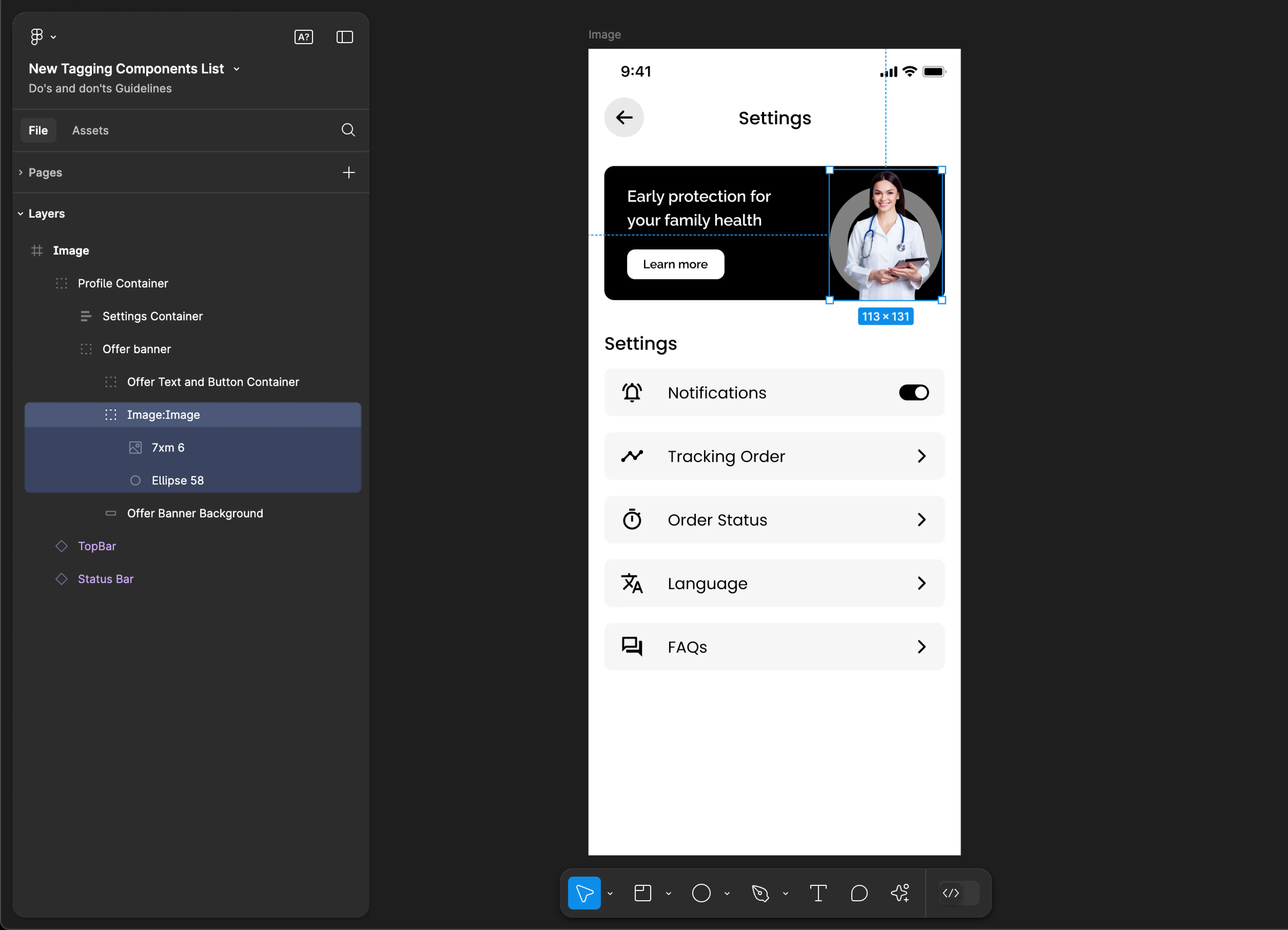
Tag name: Image
Format: {Group or Frame name} + “:" + Image
Example: Container:Image

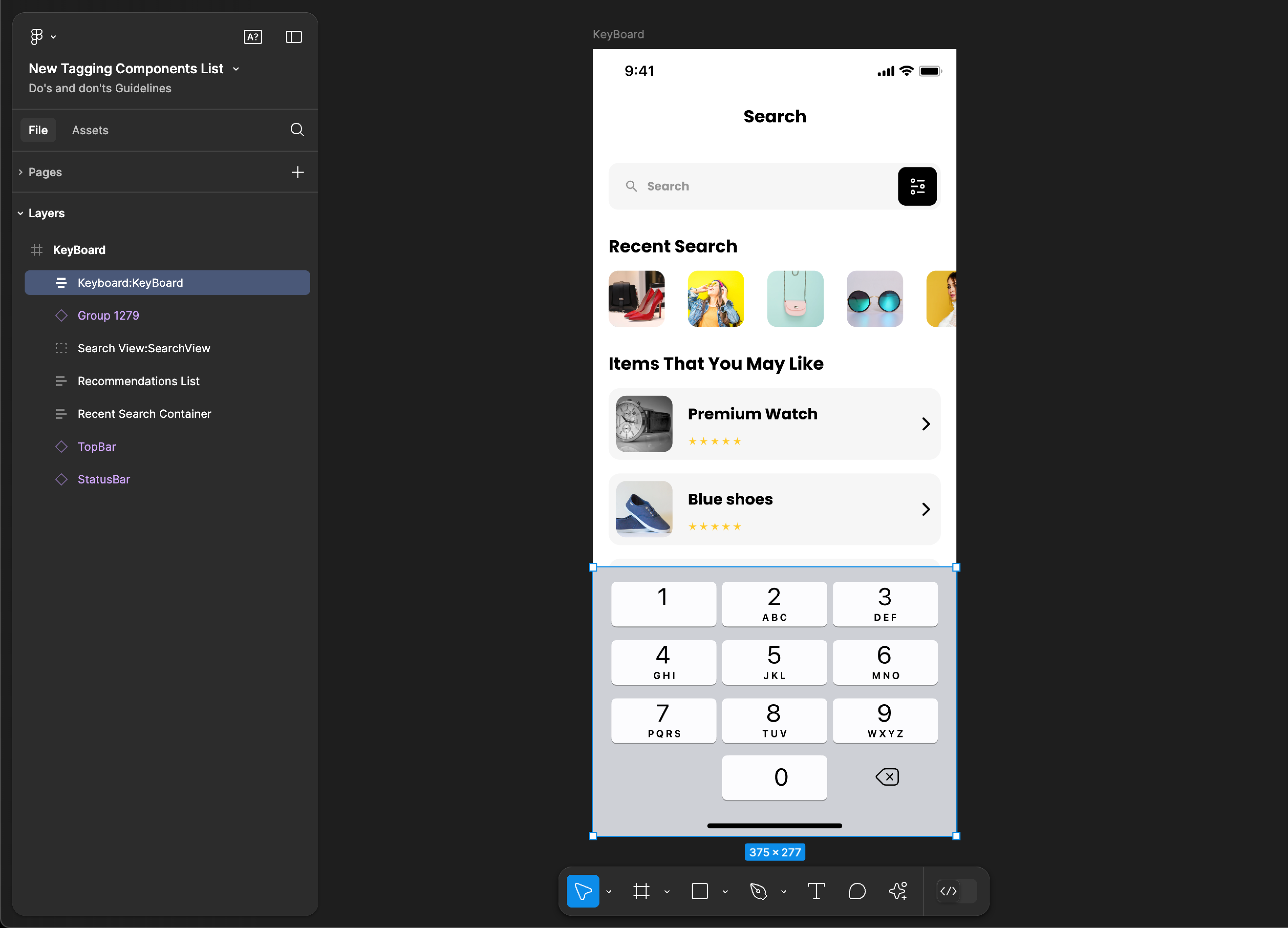
KeyBoard
KeyBoard tagging is not supported for web applications.
Tag name: KeyBoard
Format: {Group or Frame name} + “:" + KeyBoard
Example: Keyboard:KeyBoard
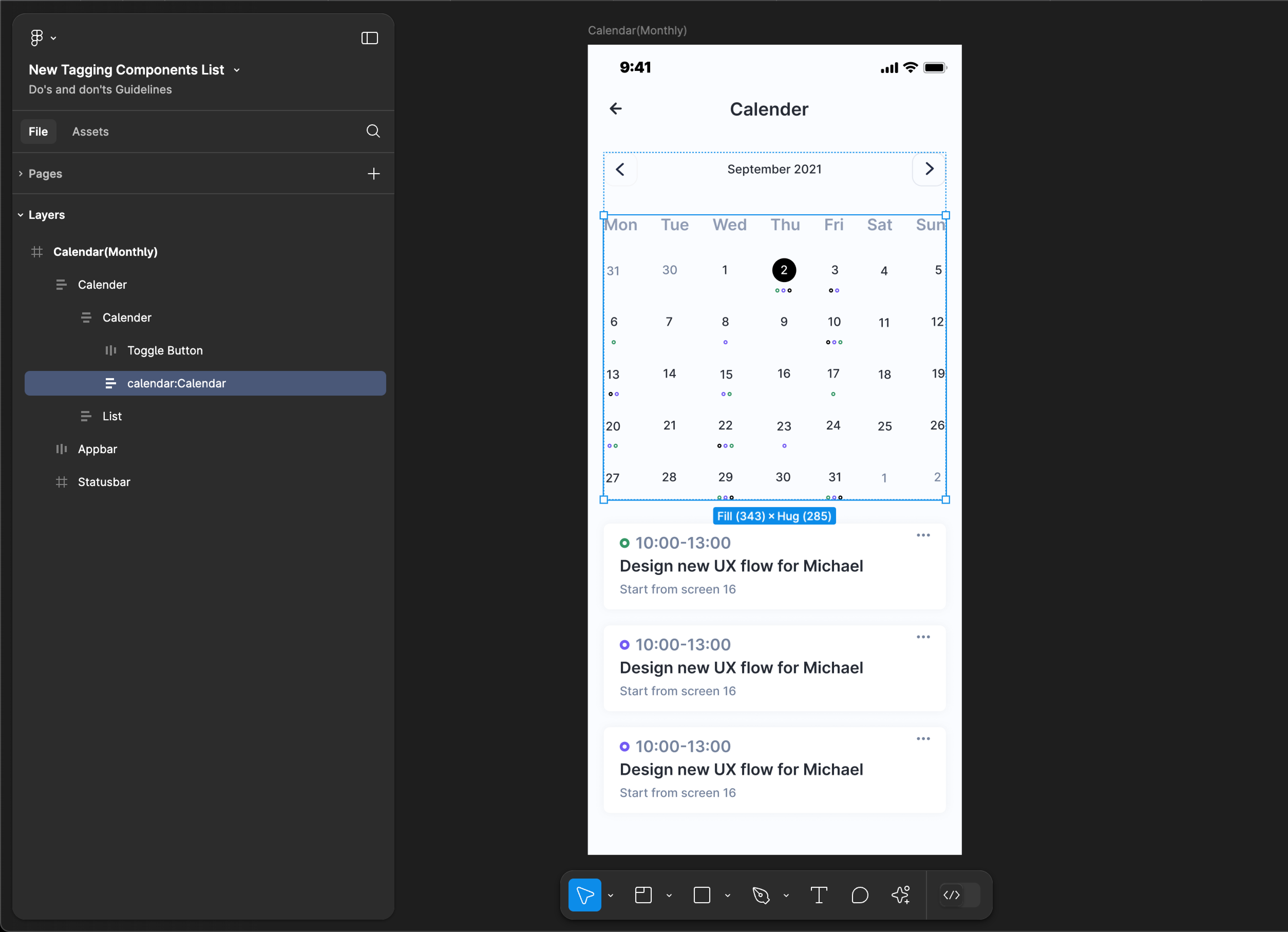
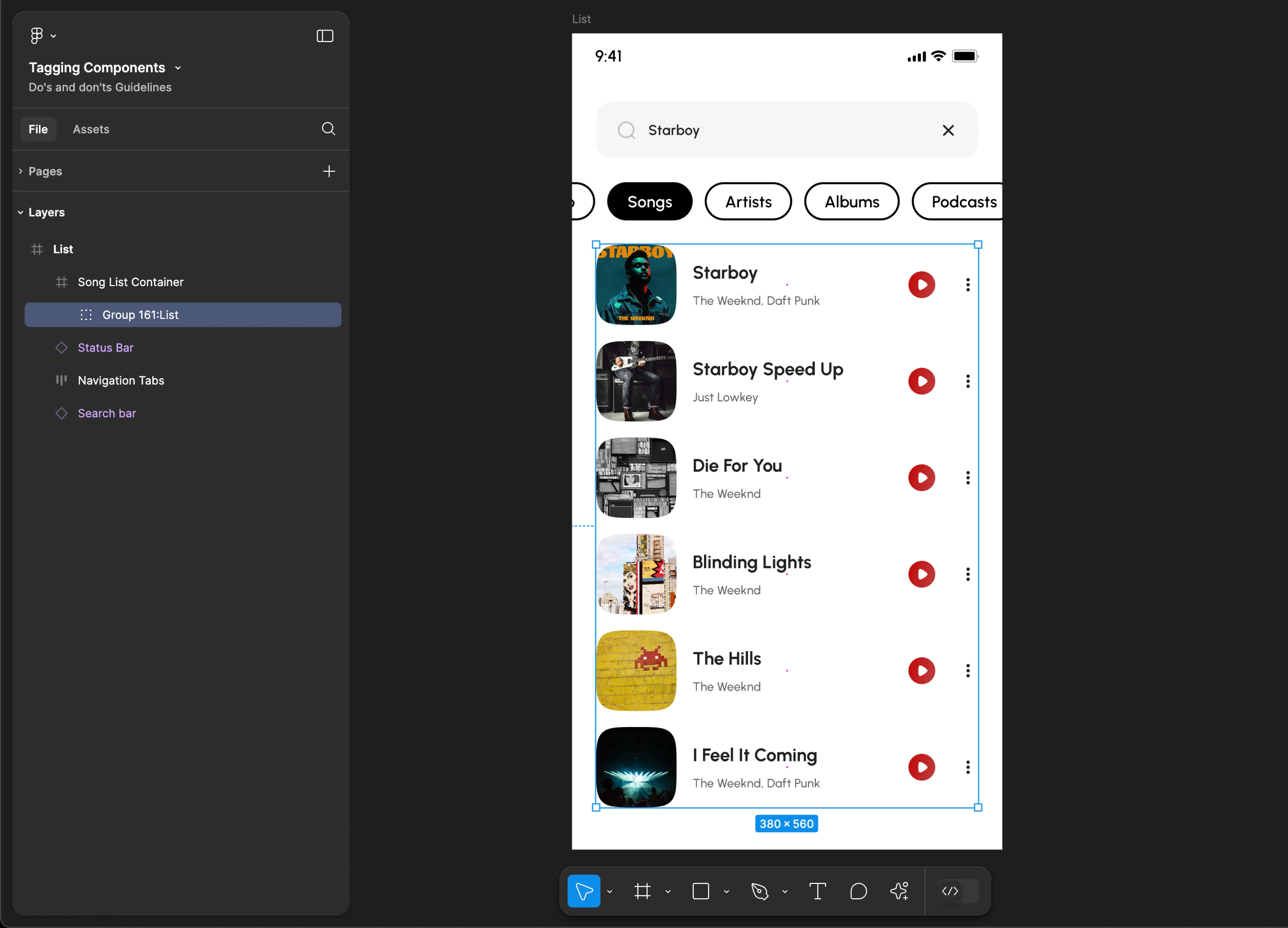
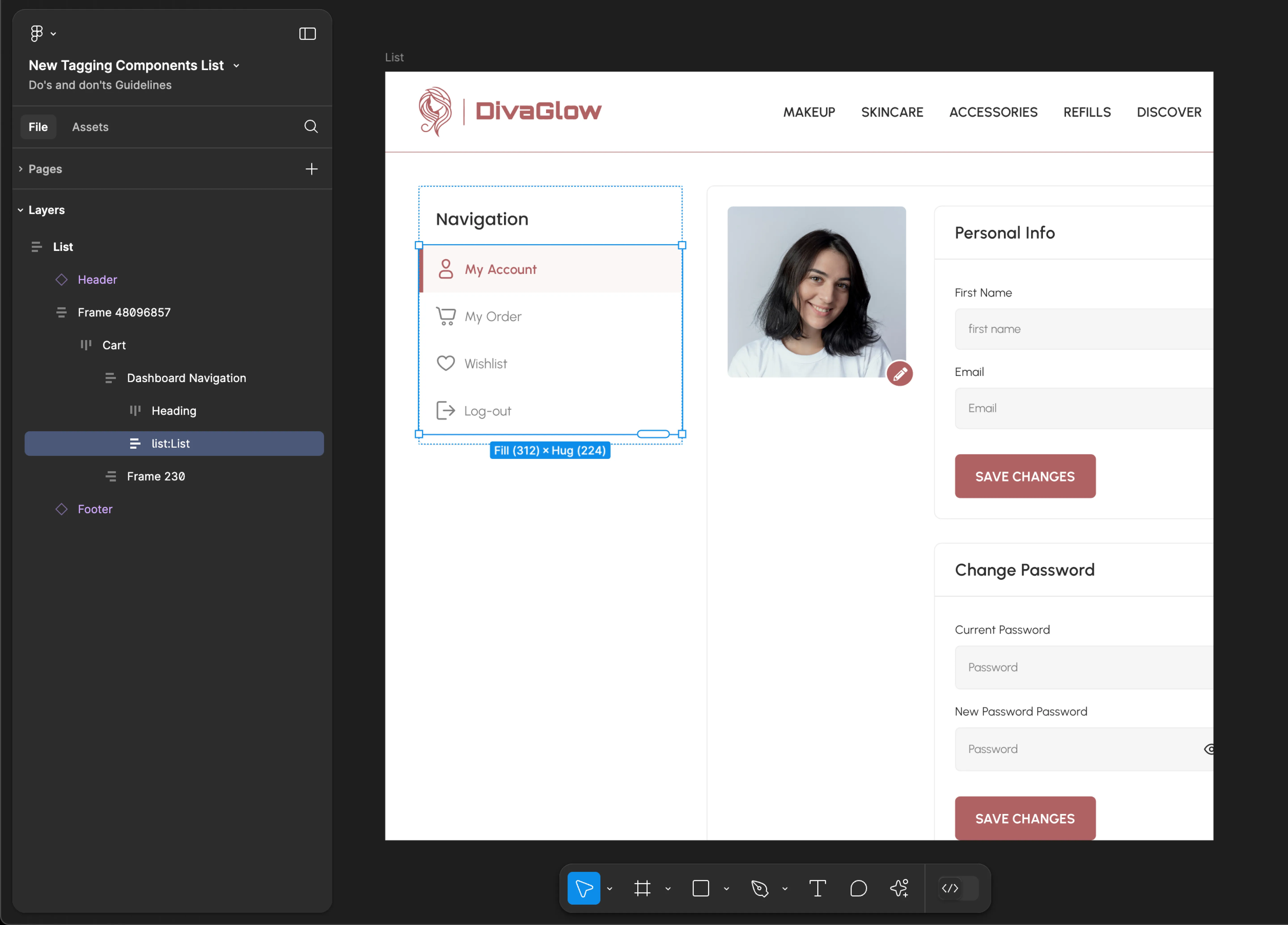
List
- Mobile
- Web
Tag name: List
Format: {Group or Frame name} + “:" + List
Example: Group 161:List
Tag name: List
Format: {Group or Frame name} + “:" + List
Example: list:List
Logo
- Mobile
- Web
Tag name: Logo
Format: {Group or Frame name} + “:" + Logo
Example: Logo Container:Logo
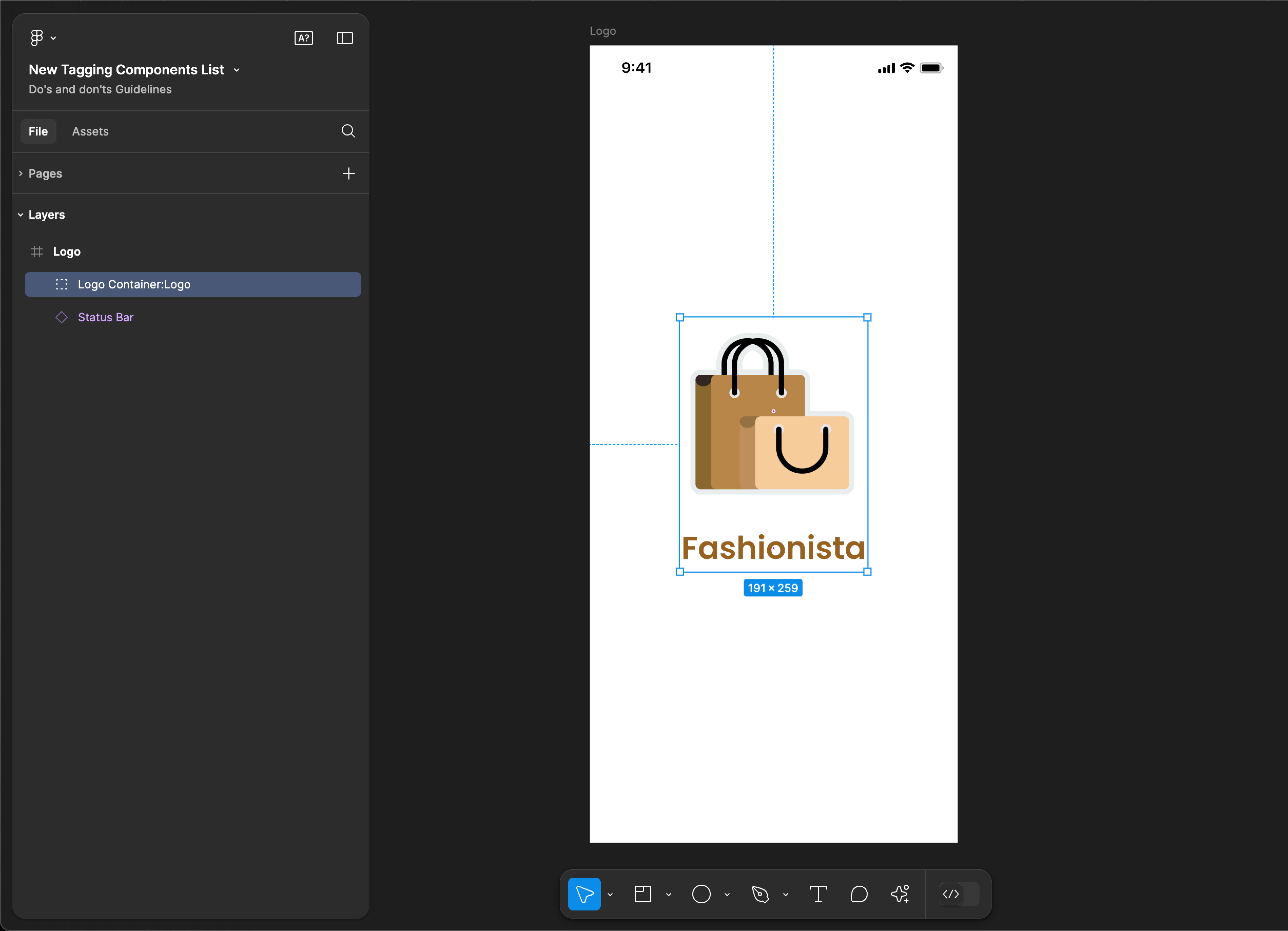
Tag name: Logo
Format: {Group or Frame name} + “:" + Logo
Example: Logo:Logo
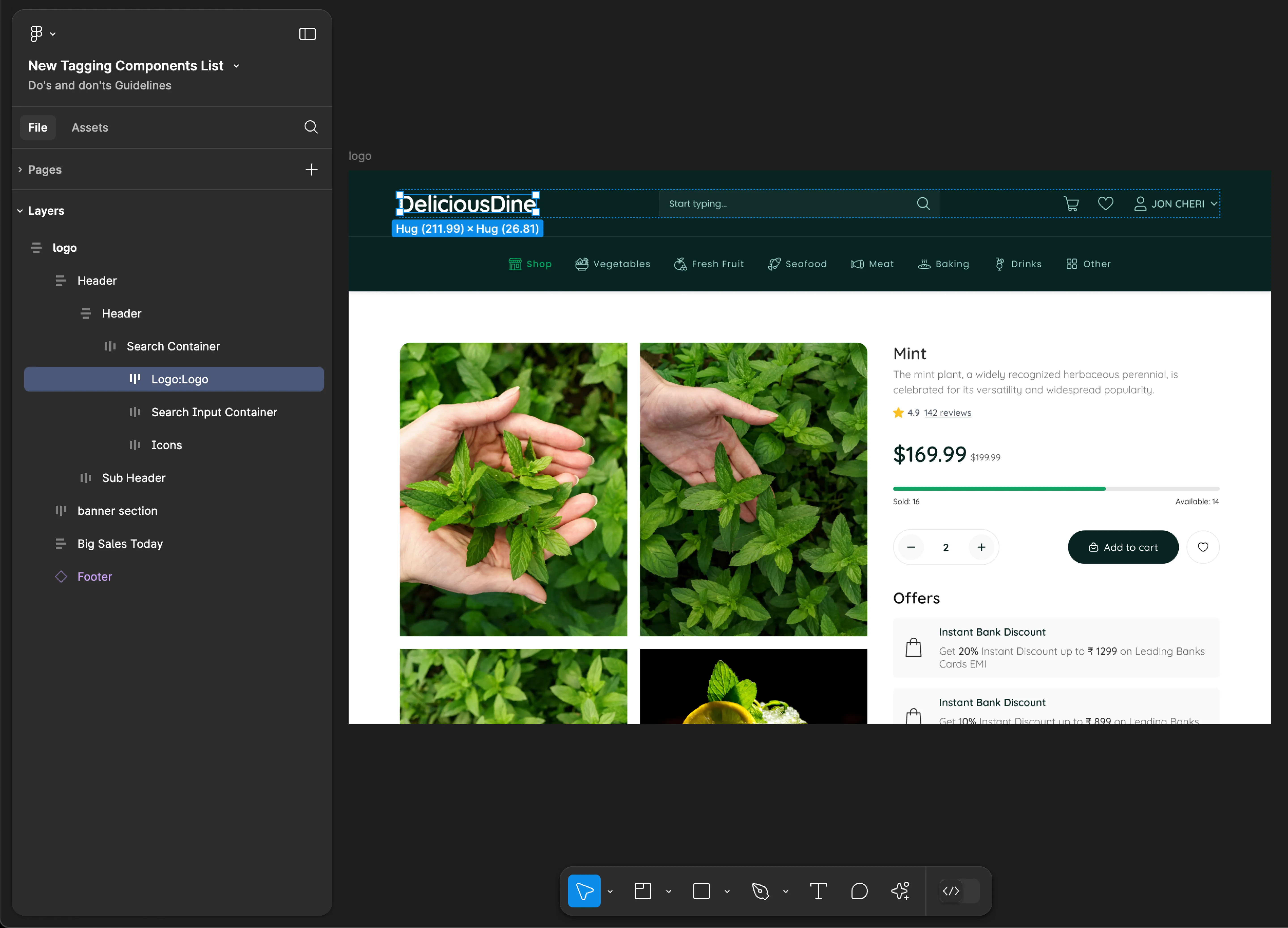
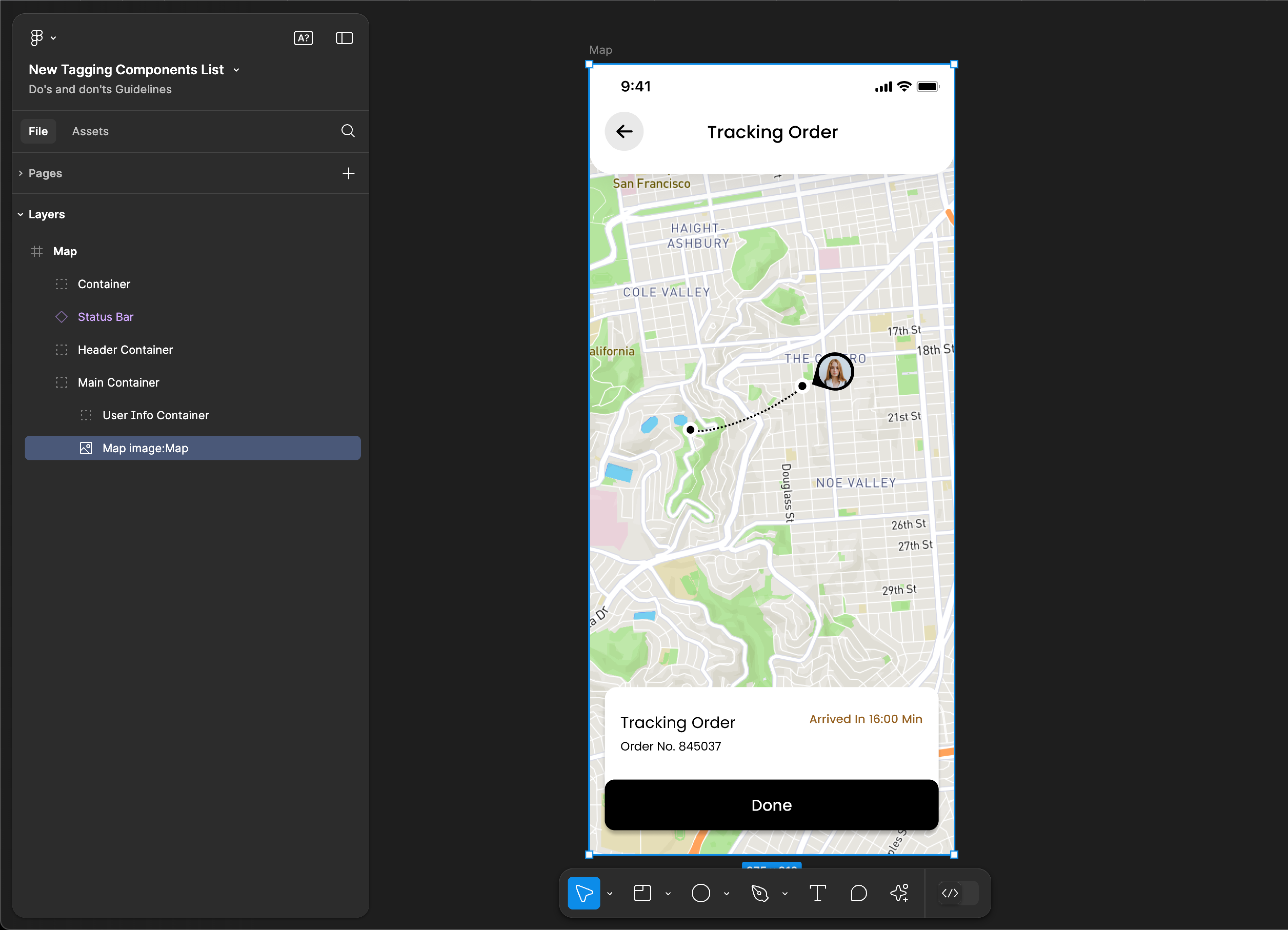
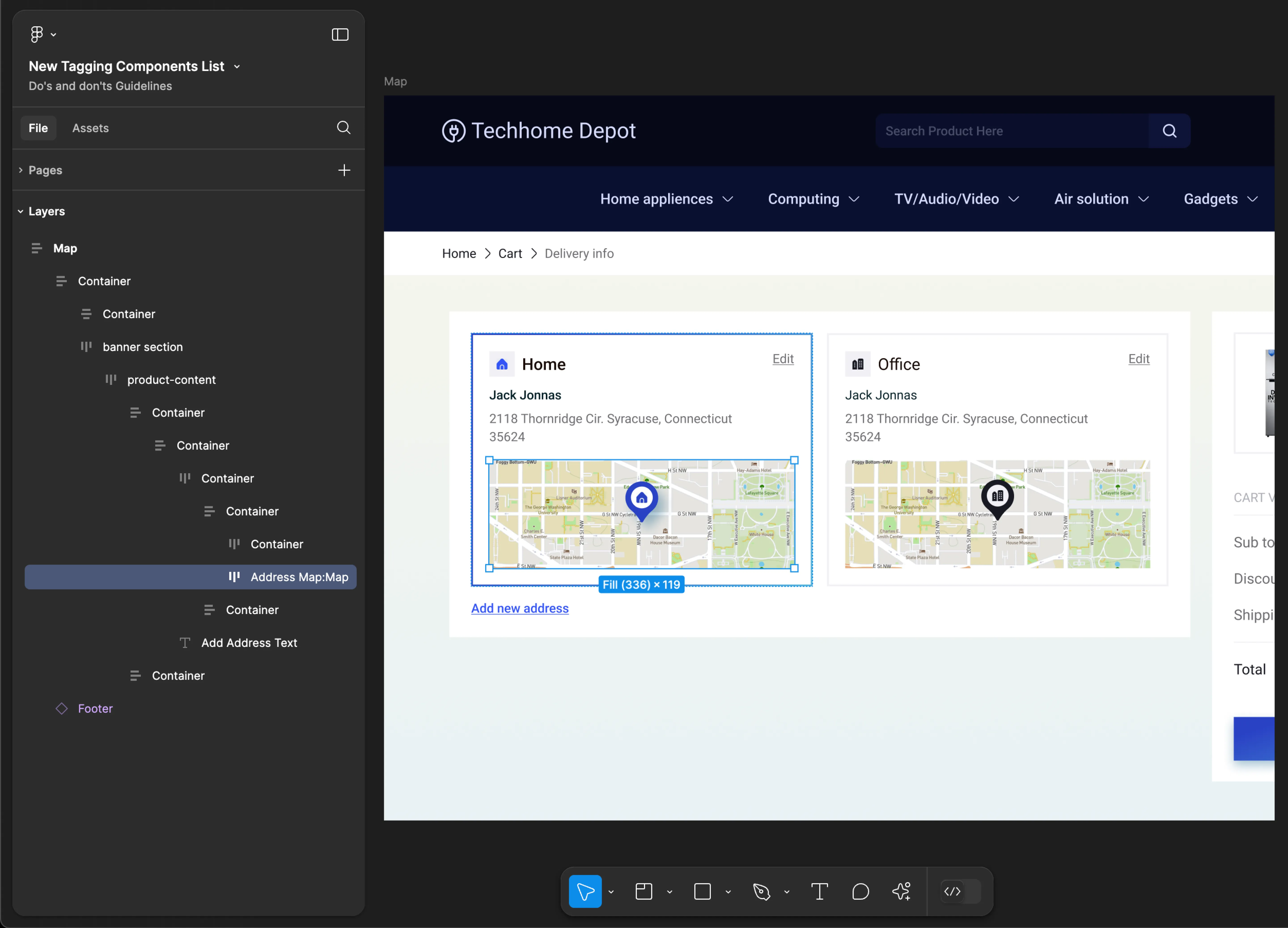
Map
- Mobile
- Web
Tag name: Map
Format: {Group or Frame name} + “:" + Map
Example: Map image:Map
Tag name: Map
Format: {Group or Frame name} + “:" + Map
Example: Address Map:Map
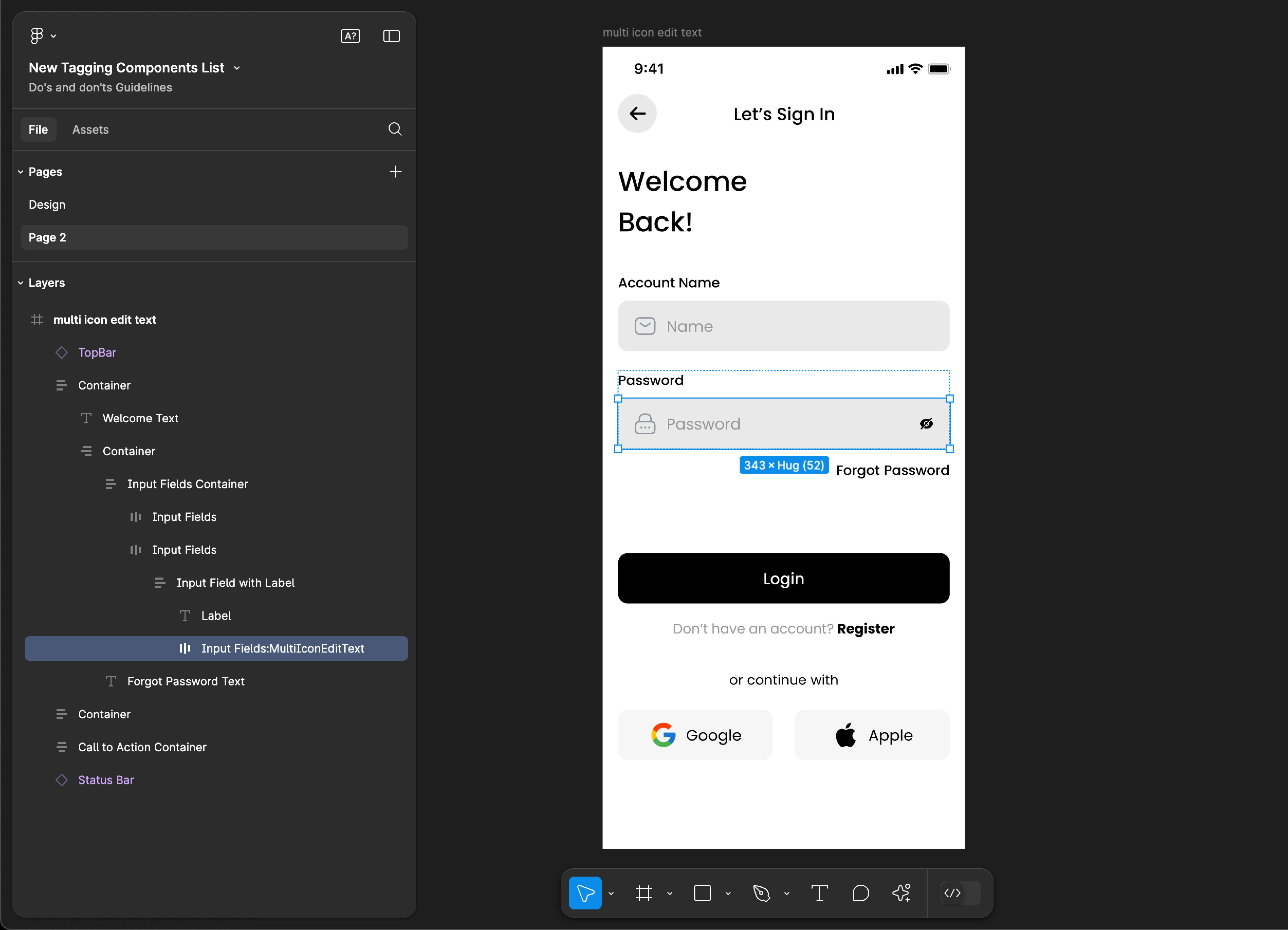
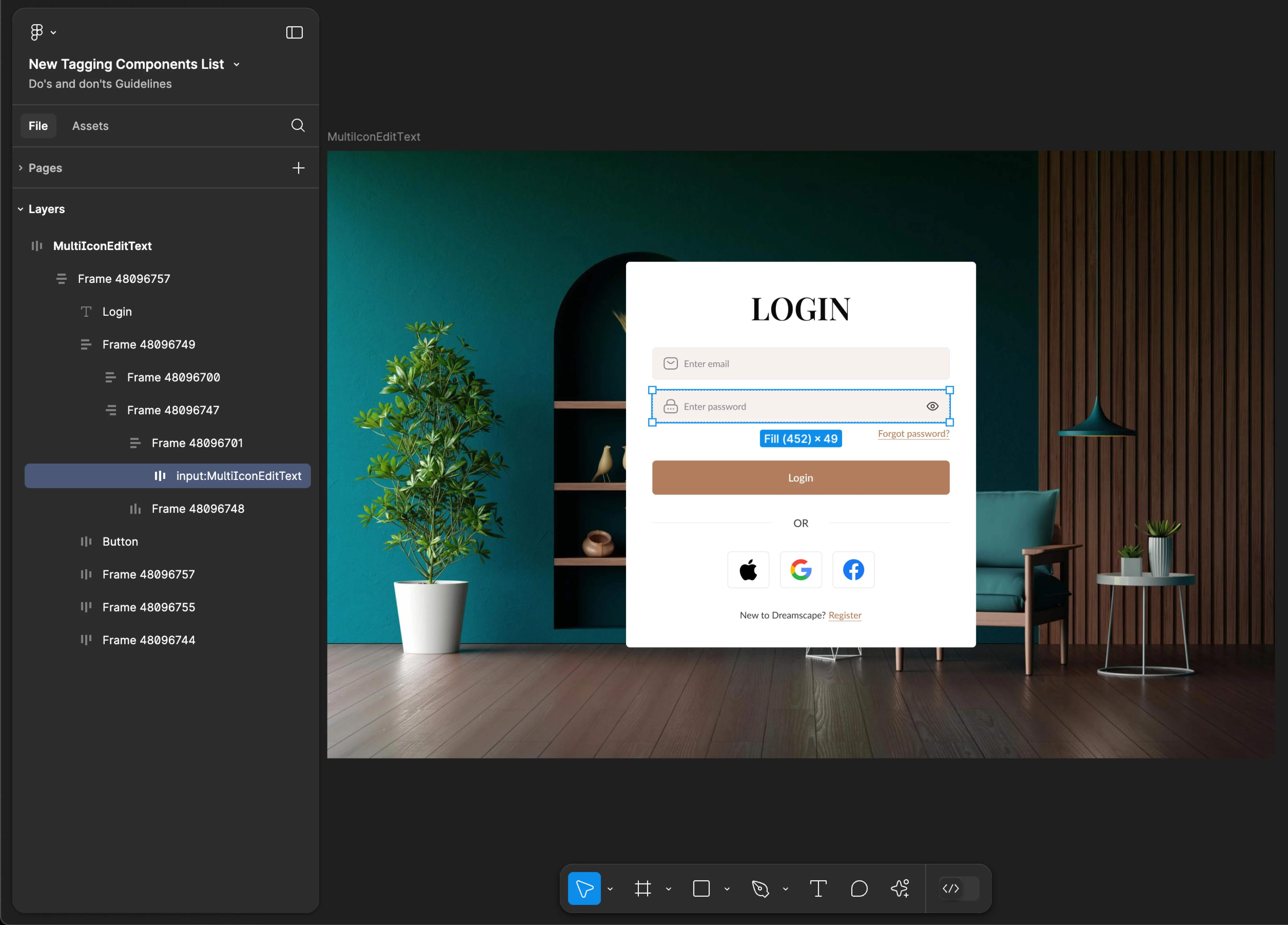
MultiIconEditText
- Mobile
- Web
Tag name: MultiIconEditText
Format: {Group or Frame name} + “:" + MultiIconEditText
Example: Input Fields:MultiIconEditText
Tag name: MultiIconEditText
Format: {Group or Frame name} + “:" + MultiIconEditText
Example: input:MultiIconEditText
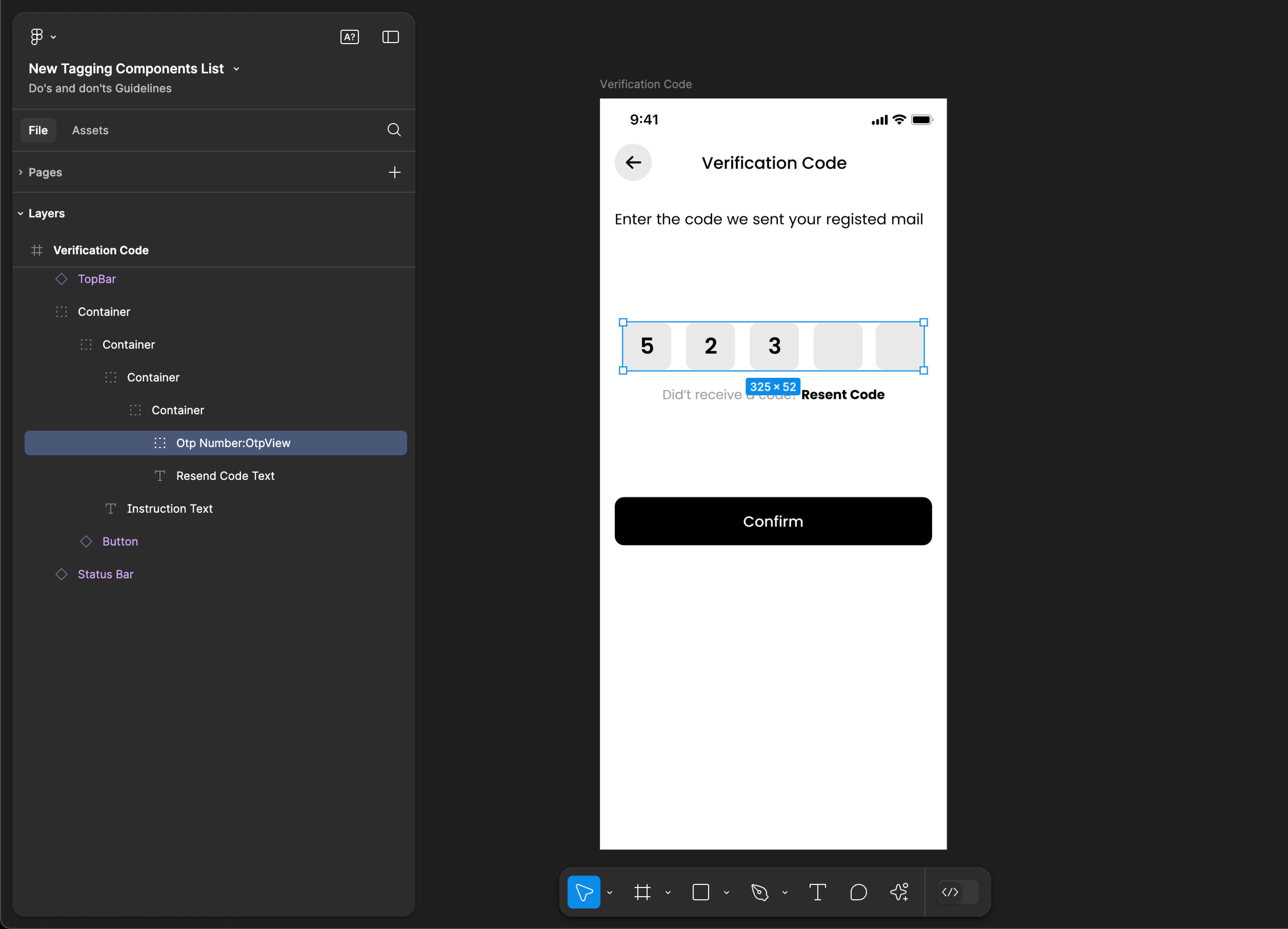
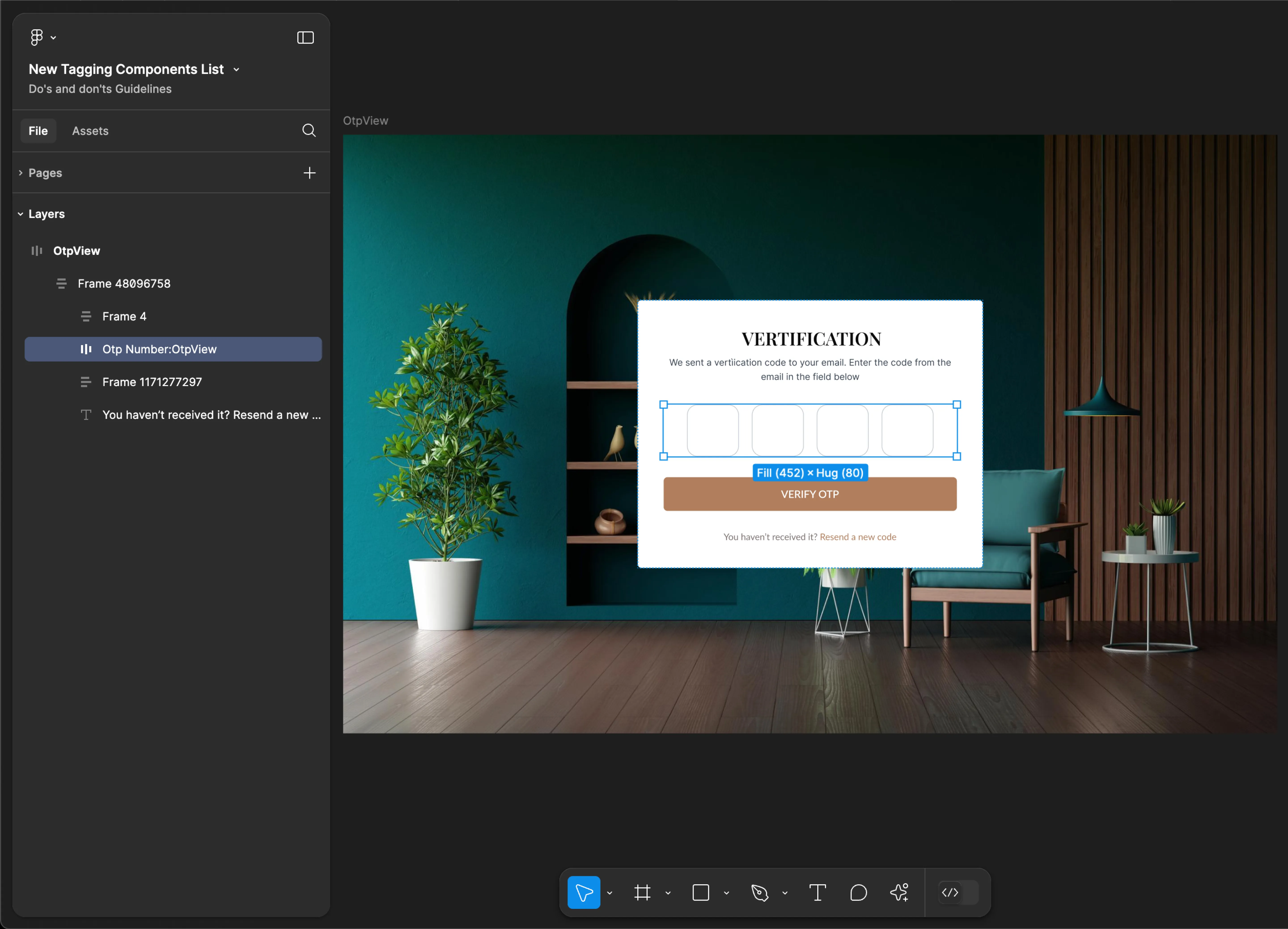
OTPView
- Mobile
- Web
Tag name: OtpView
Format: {Group or Frame name} + “:" + OtpView
Example: Otp Number:OtpView
Tag name: OtpView
Format: {Group or Frame name} + “:" + OtpView
Example: Otp Number:OtpView
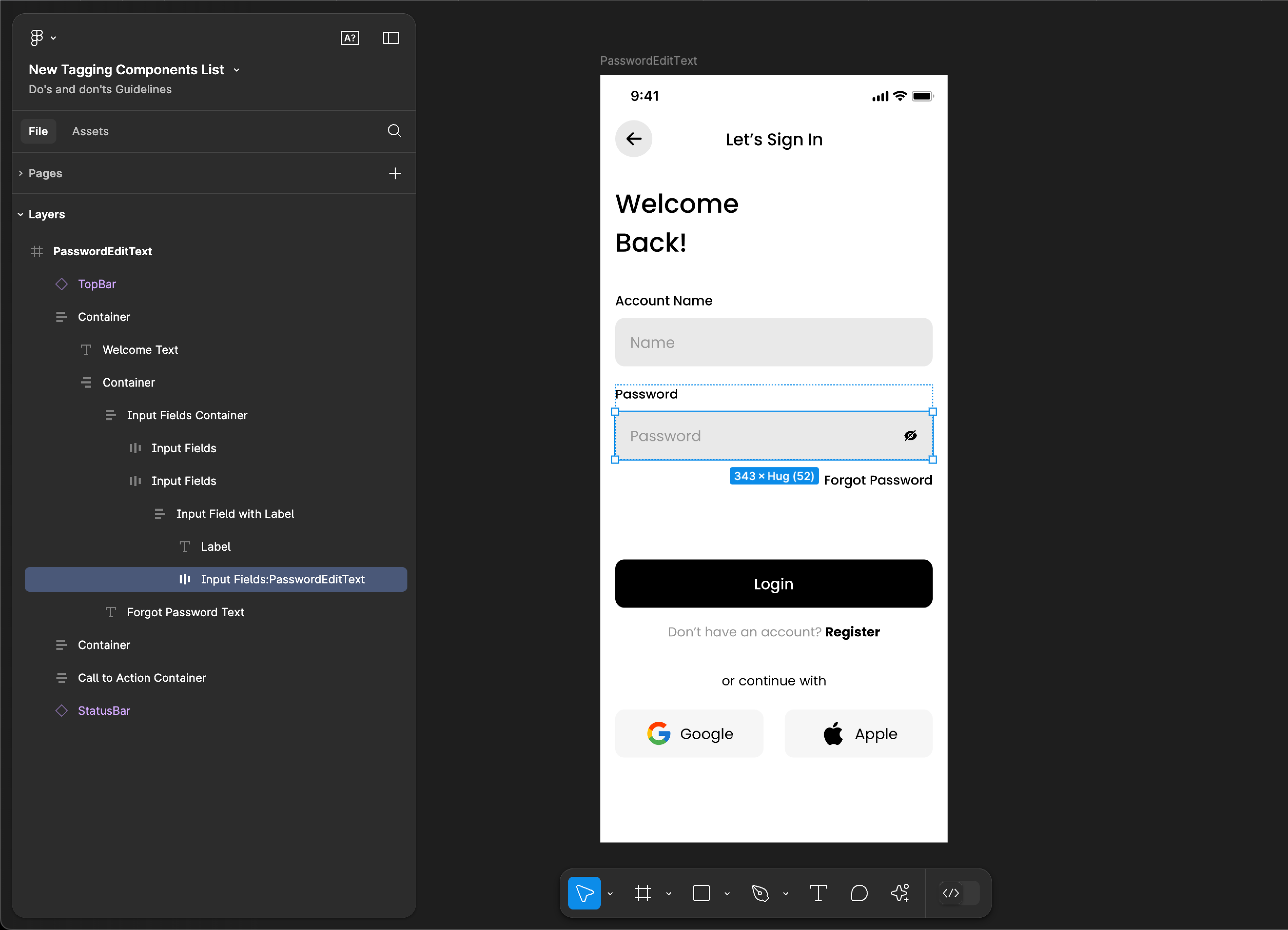
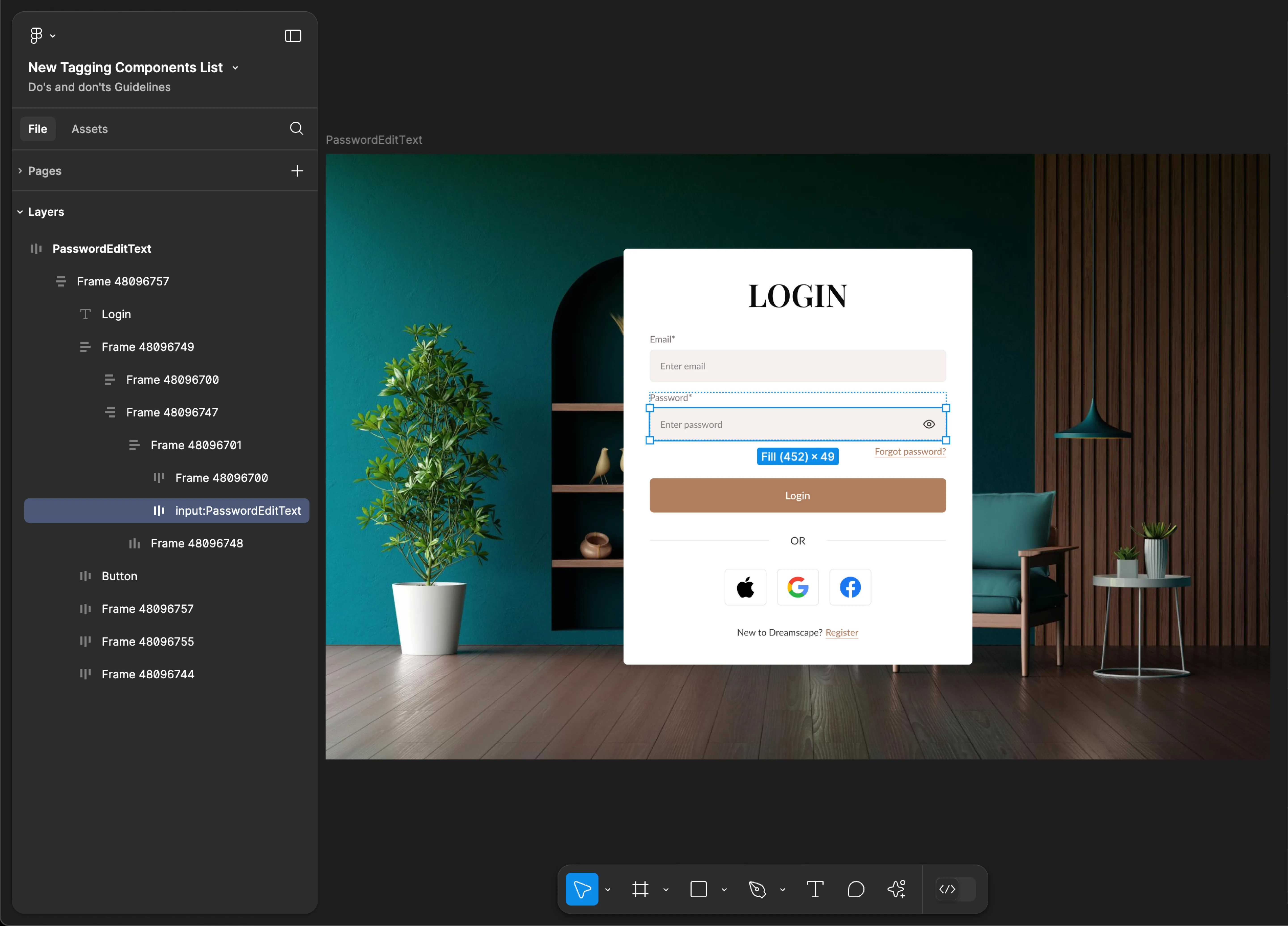
PasswordEditText
- Mobile
- Web
Tag name: PasswordEditText
Format: {Group or Frame name} + “:" + PasswordEditText
Example: Input Fields:PasswordEditText
Tag name: PasswordEditText
Format: {Group or Frame name} + “:" + PasswordEditText
Example: input:PasswordEditText
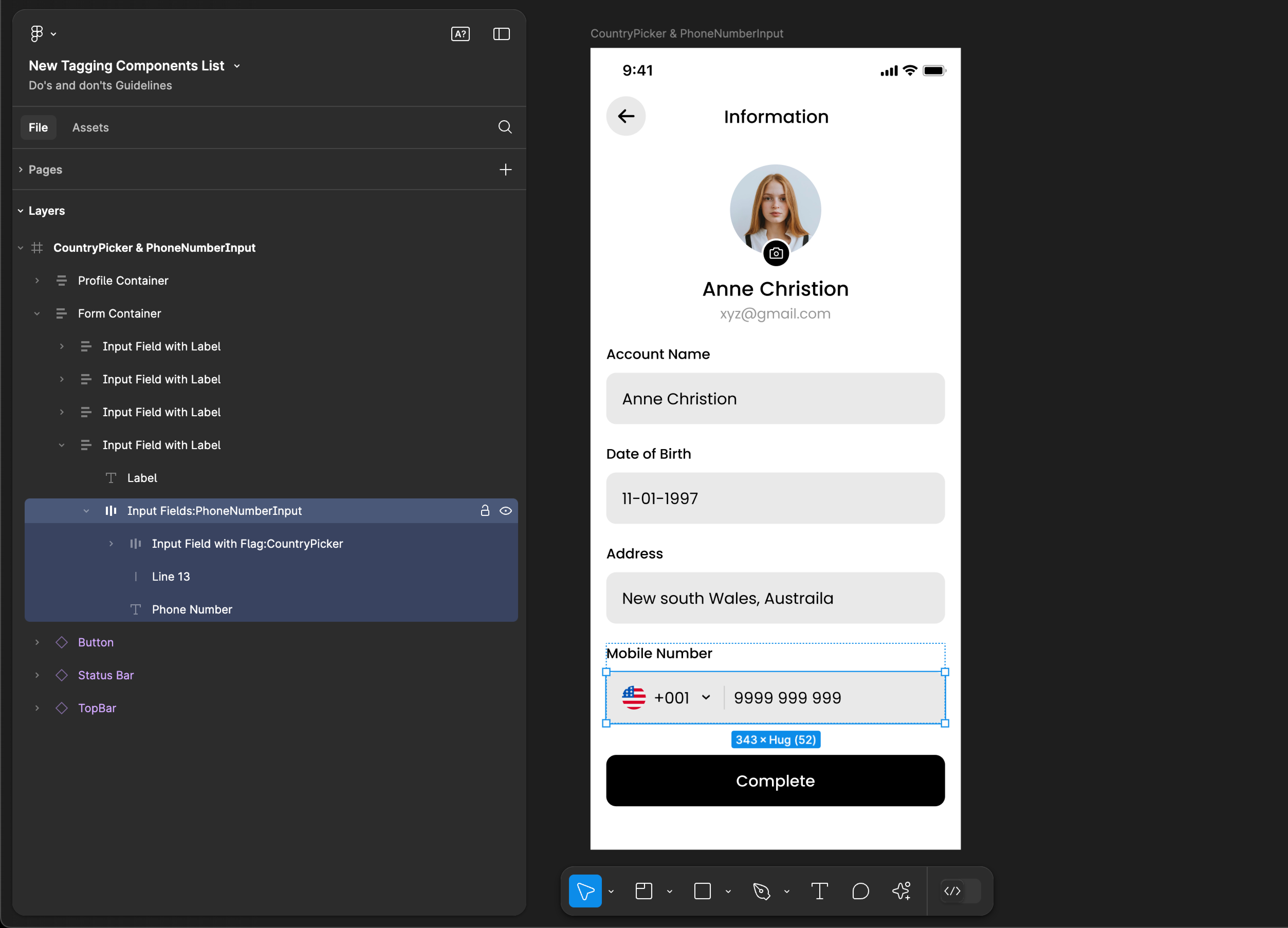
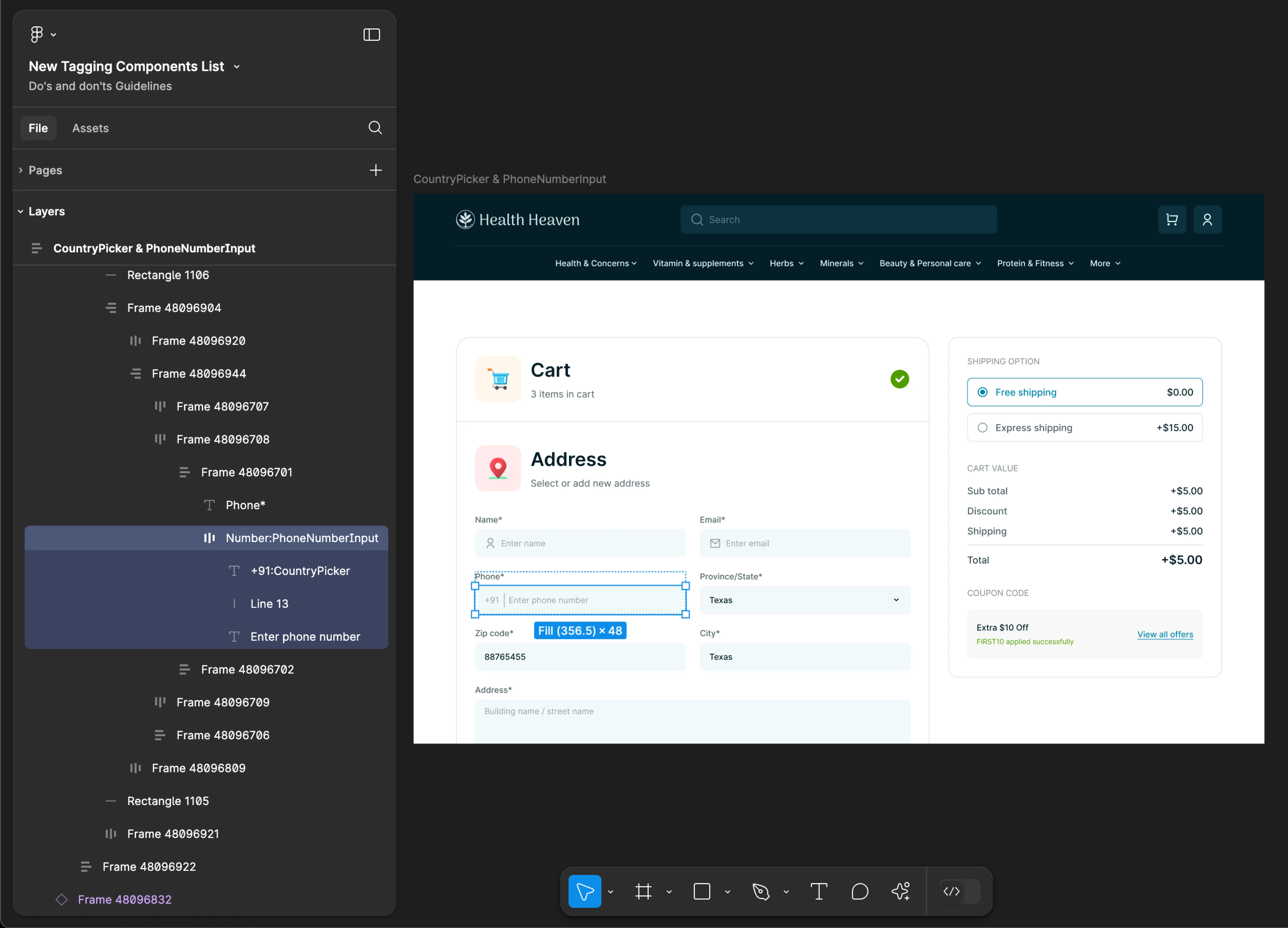
PhoneNumberInput
Use PhoneNumberInput & CountryPicker tags together for accurate component identification. Using only one of these tags may result in inaccuracies and incomplete component recognition.
- Mobile
- Web
Tag name: PhoneNumberInput
Format:
{Group or Frame name} + “:" + PhoneNumberInput
{Group or Frame name} + “:" + CountryPicker
Example:
Input Fields:PhoneNumberInput
Input Field with Flag:CountryPicker
Tag name: PhoneNumberInput
Format:
{Group or Frame name} + “:" + PhoneNumberInput
{Group or Frame name} + “:" + CountryPicker
Example:
Number:PhoneNumberInput
+91:CountryPicker
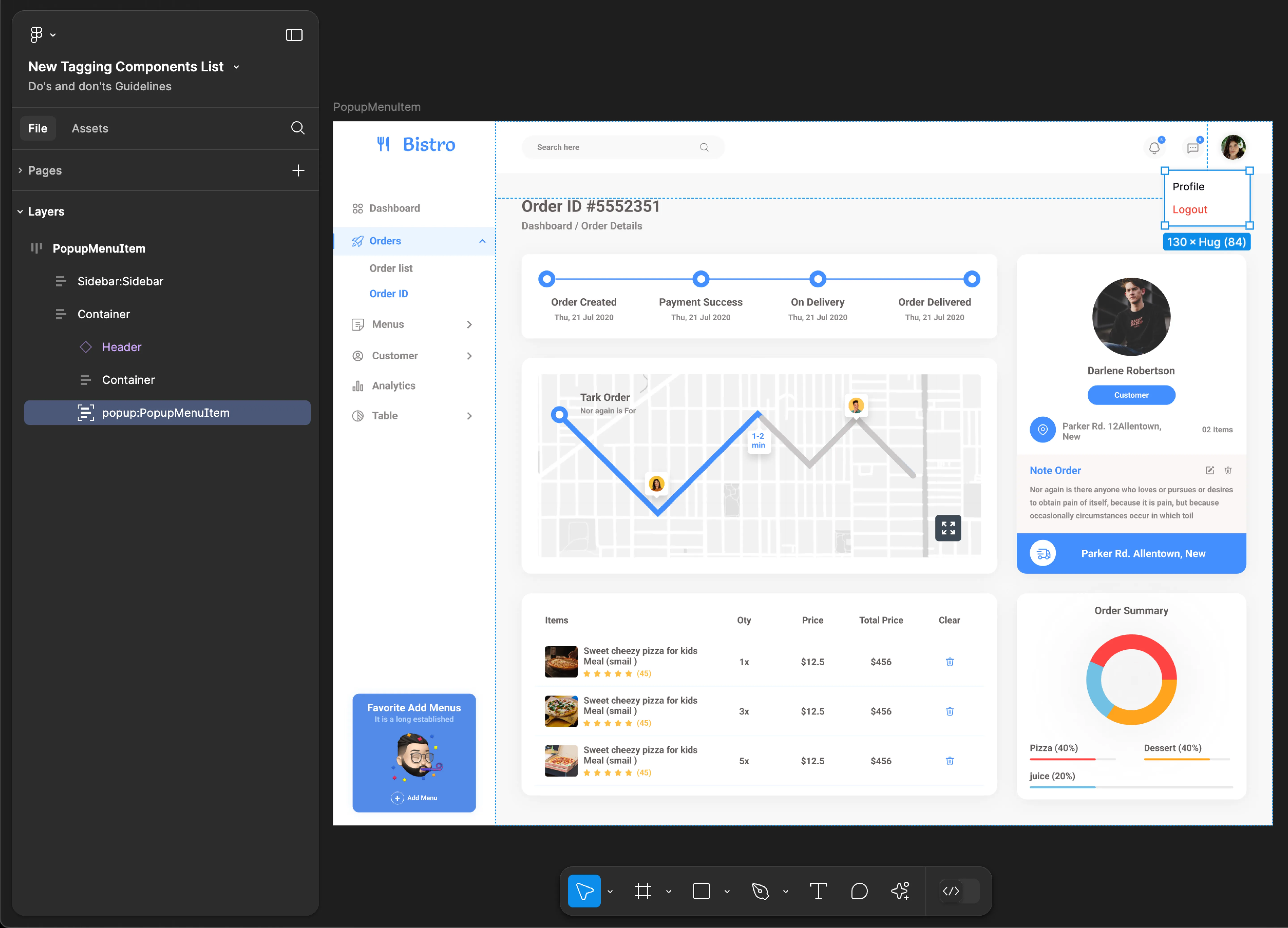
PopupMenuItem
- Mobile
- Web
Tag name: PopupMenuItem
Format: {Group or Frame name} + “:" + PopupMenuItem
Example: popup:PopupMenuItem
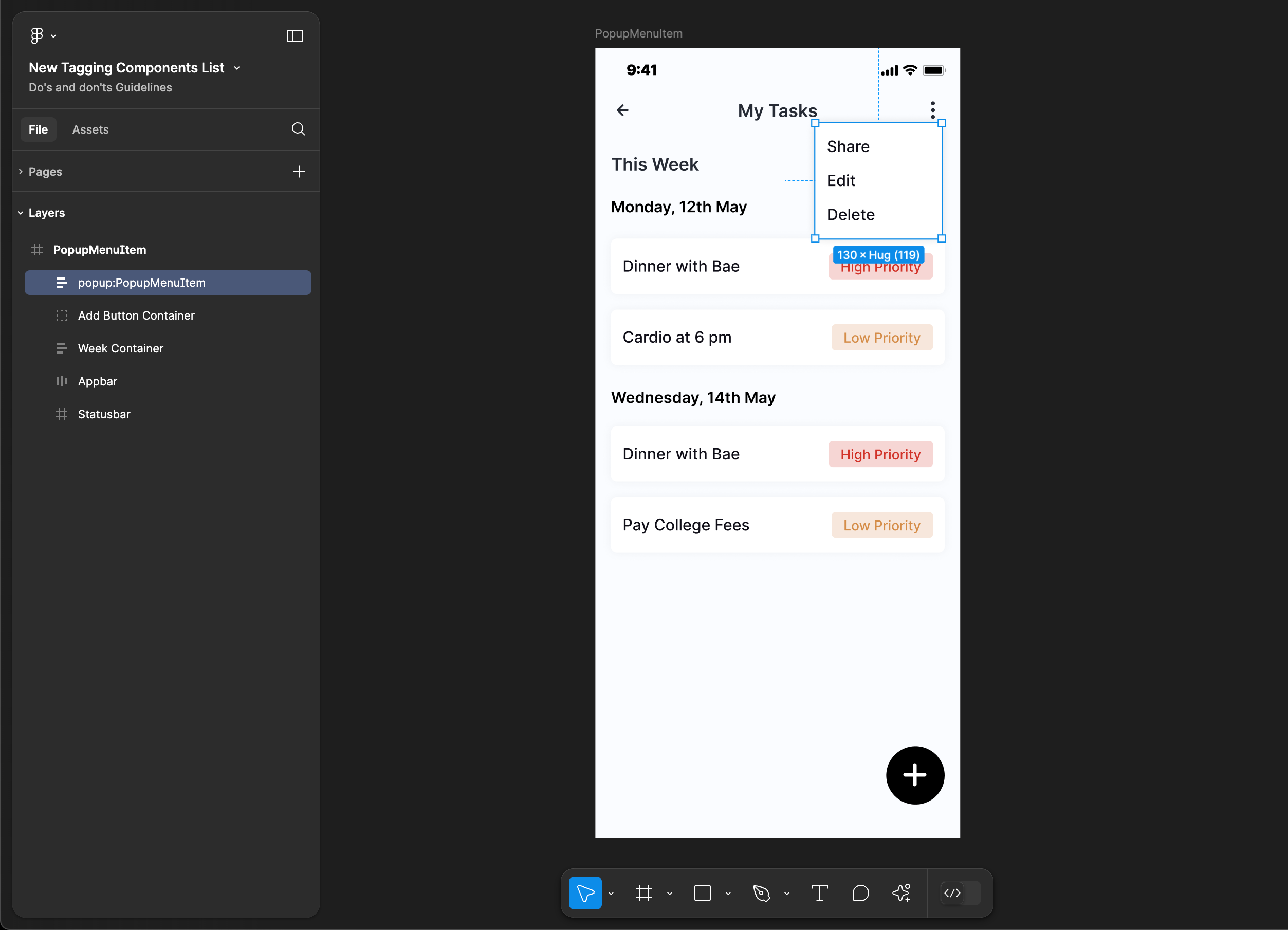
Tag name: PopupMenuItem
Format: {Group or Frame name} + “:" + PopupMenuItem
Example: popup:PopupMenuItem
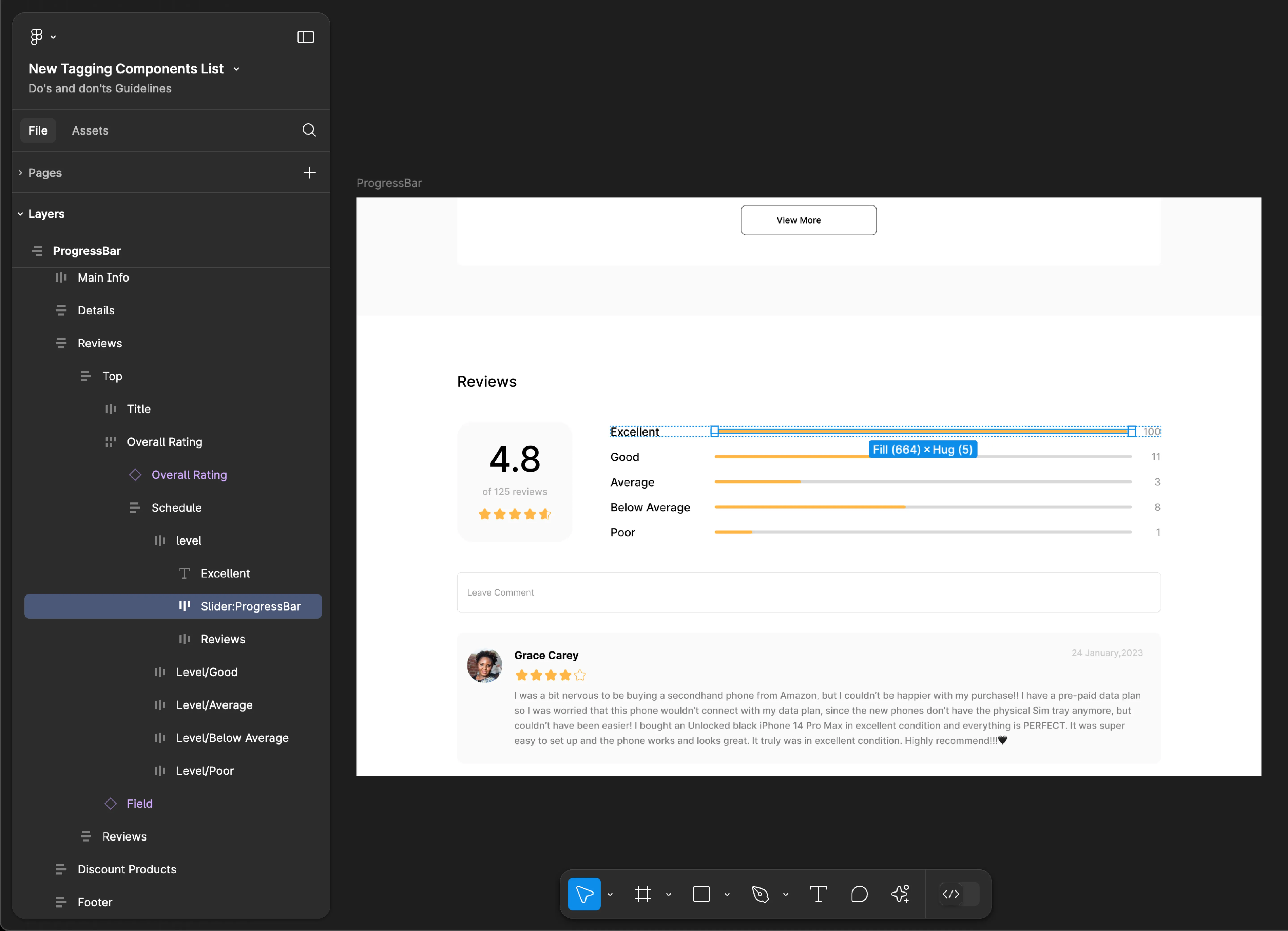
ProgressBar
- Mobile
- Web
Tag name: ProgressBar
Format: {Group or Frame name} + “:" + ProgressBar
Example: Progressbar:ProgressBar
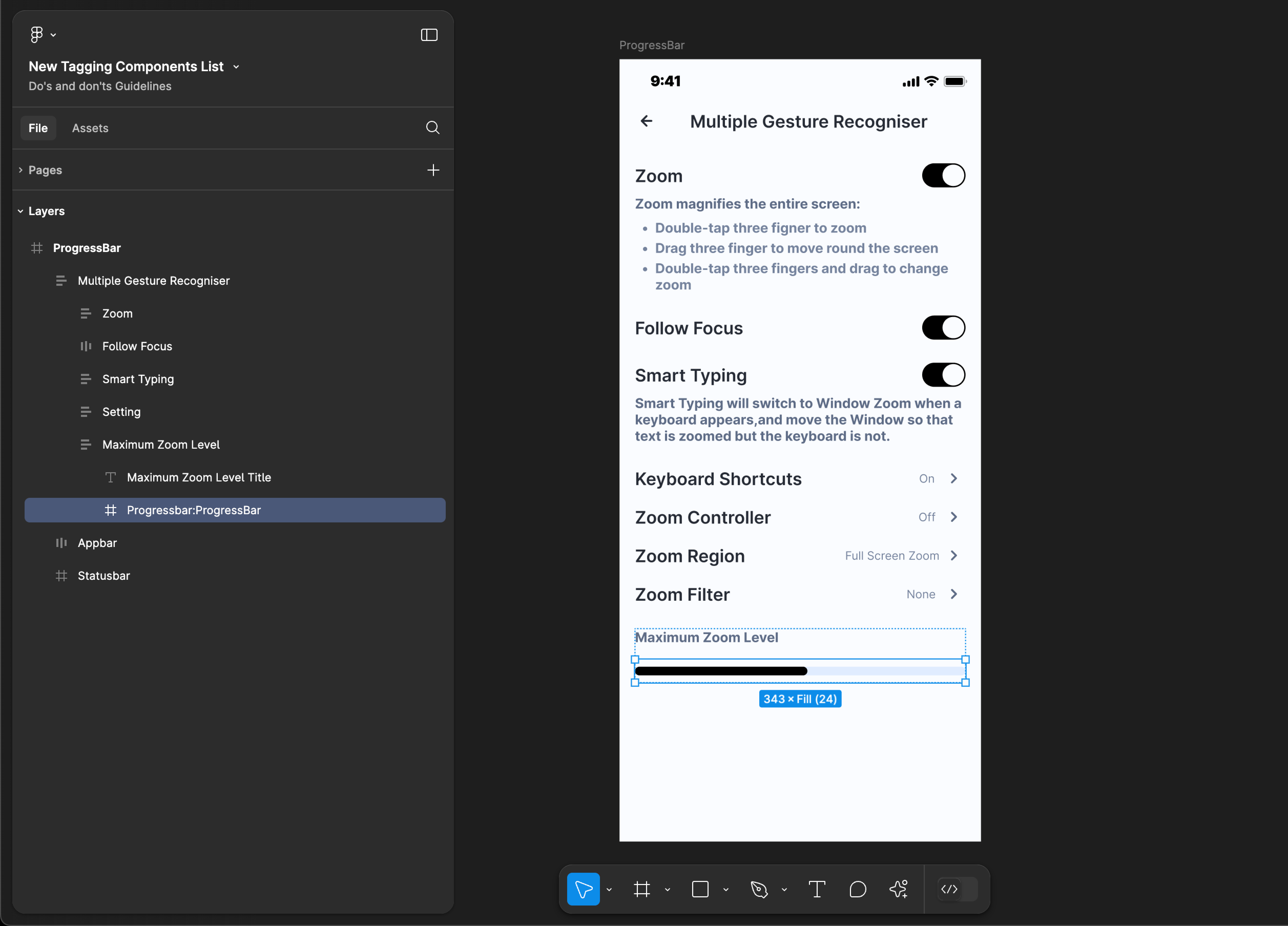
Tag name: ProgressBar
Format: {Group or Frame name} + “:" + ProgressBar
Example: Slider:ProgressBar
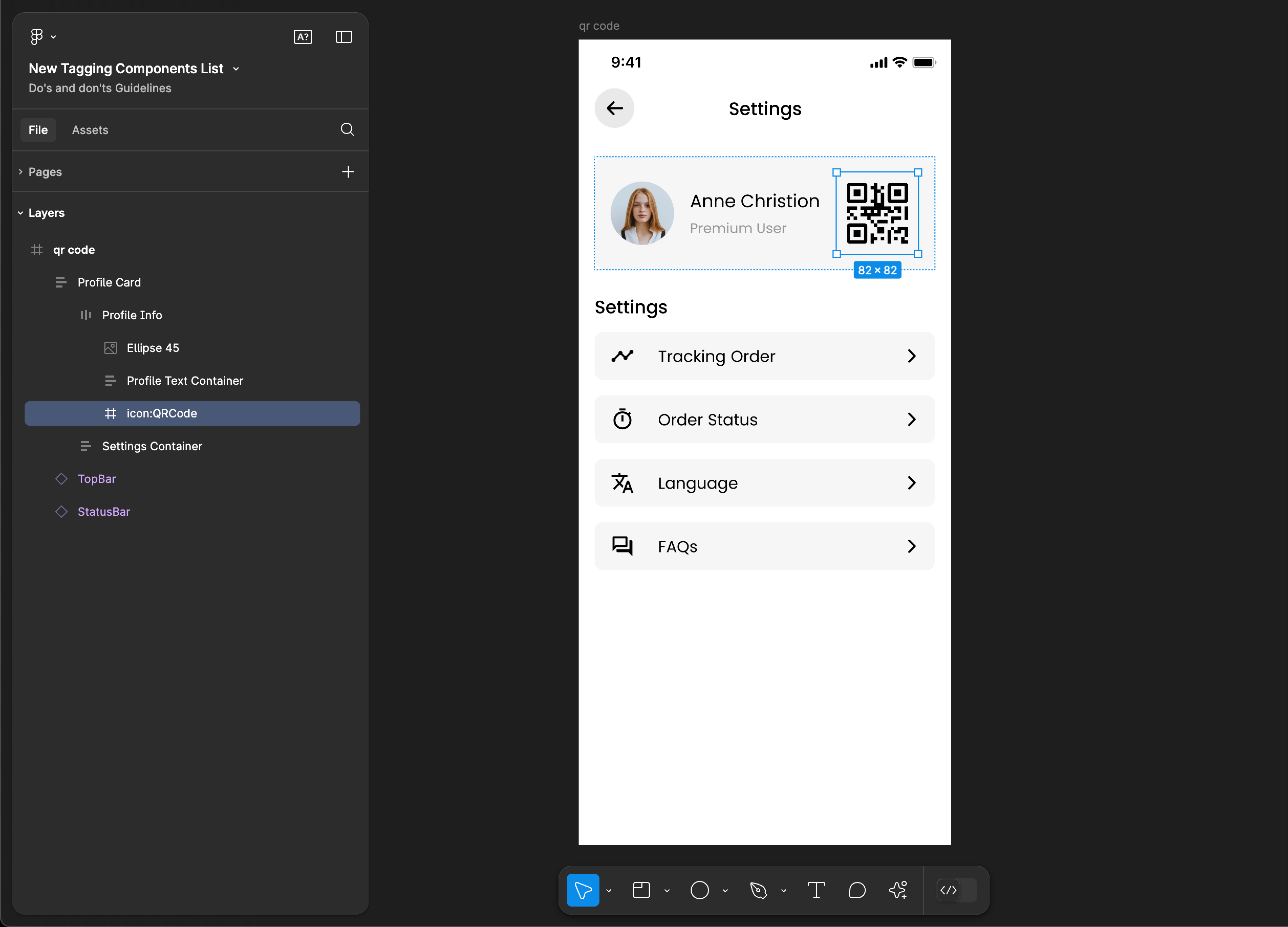
QRCode
QRCode tagging is not supported for web applications.
Tag name: QRCode
Format: {Group or Frame name} + “:" + QRCode
Example: icon:QRCode
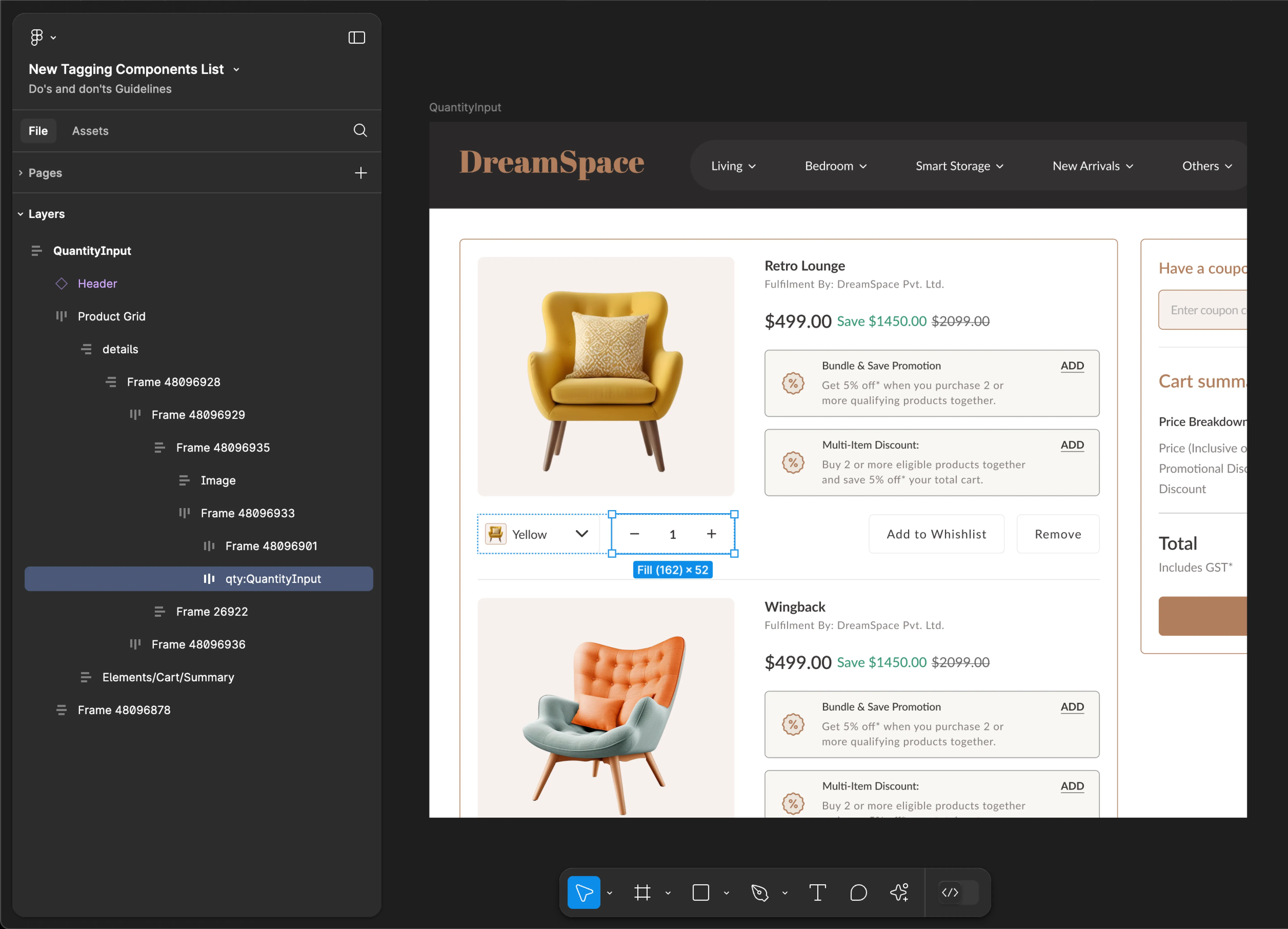
QuantityInput
- Mobile
- Web
Tag name: QuantityInput
Format: {Group or Frame name} + “:" + QuantityInput
Example: Quantity:QuantityInput
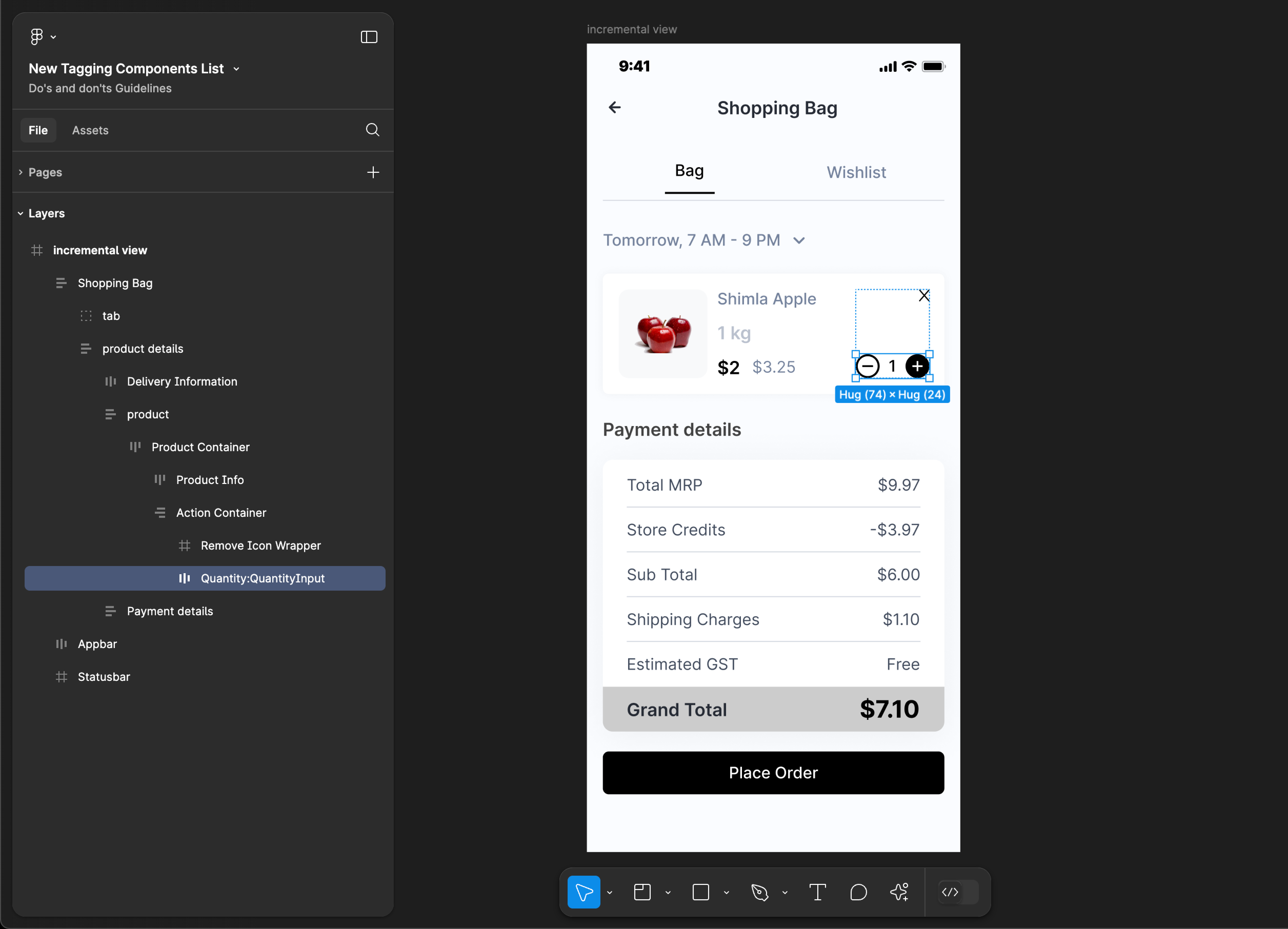
Tag name: QuantityInput
Format: {Group or Frame name} + “:" + QuantityInput
Example: qty:QuantityInput
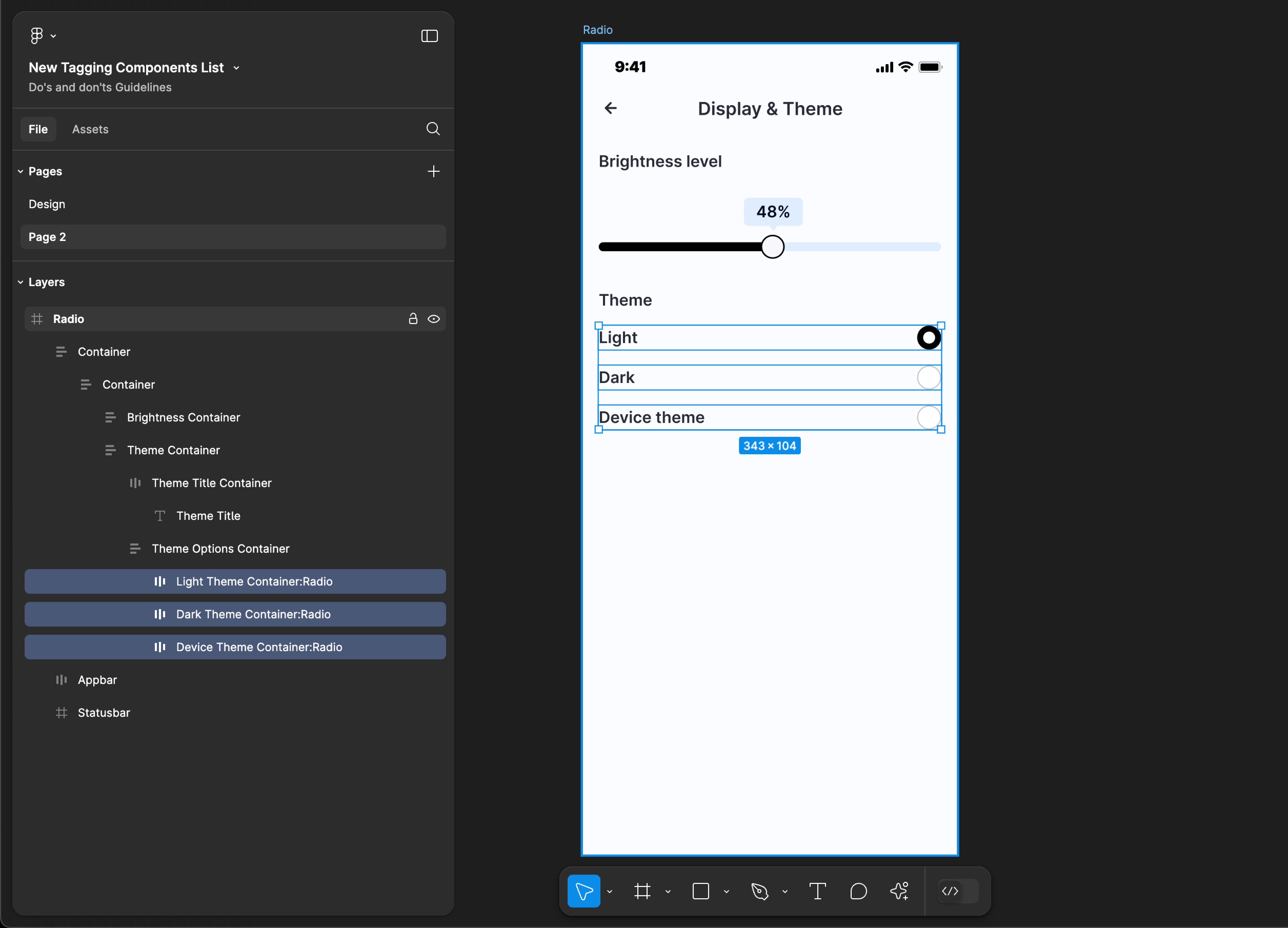
Radio
Radio tagging is not supported for web applications.
Tag name: Radio
Format: {Group or Frame name} + “:" + Radio
Example: Light Theme Container:Radio
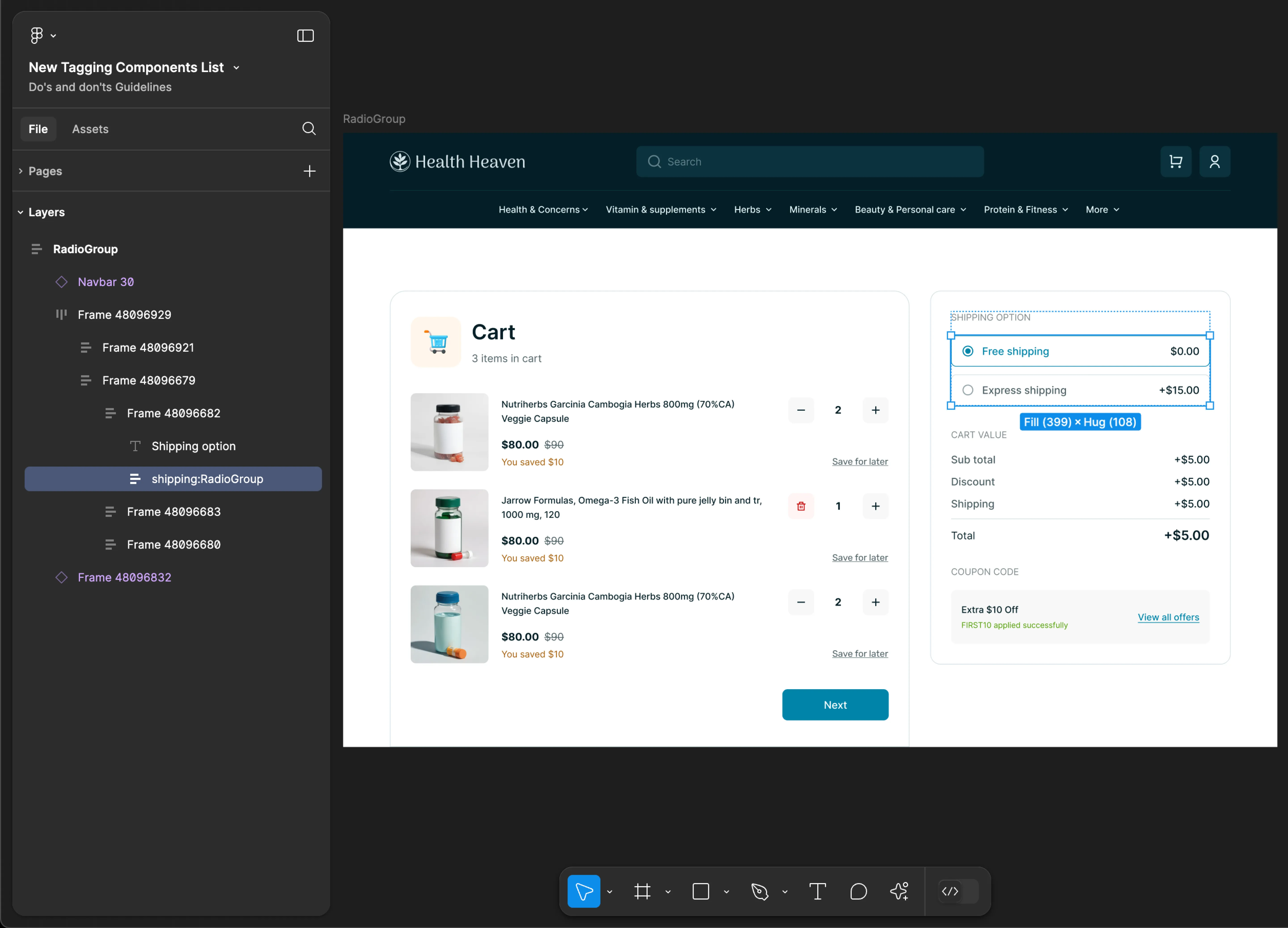
RadioGroup
RadioGroup tagging is not supported for mobile applications.
Tag name: RadioGroup
Format: {Group or Frame name} + “:" + RadioGroup
Example: shipping:RadioGroup
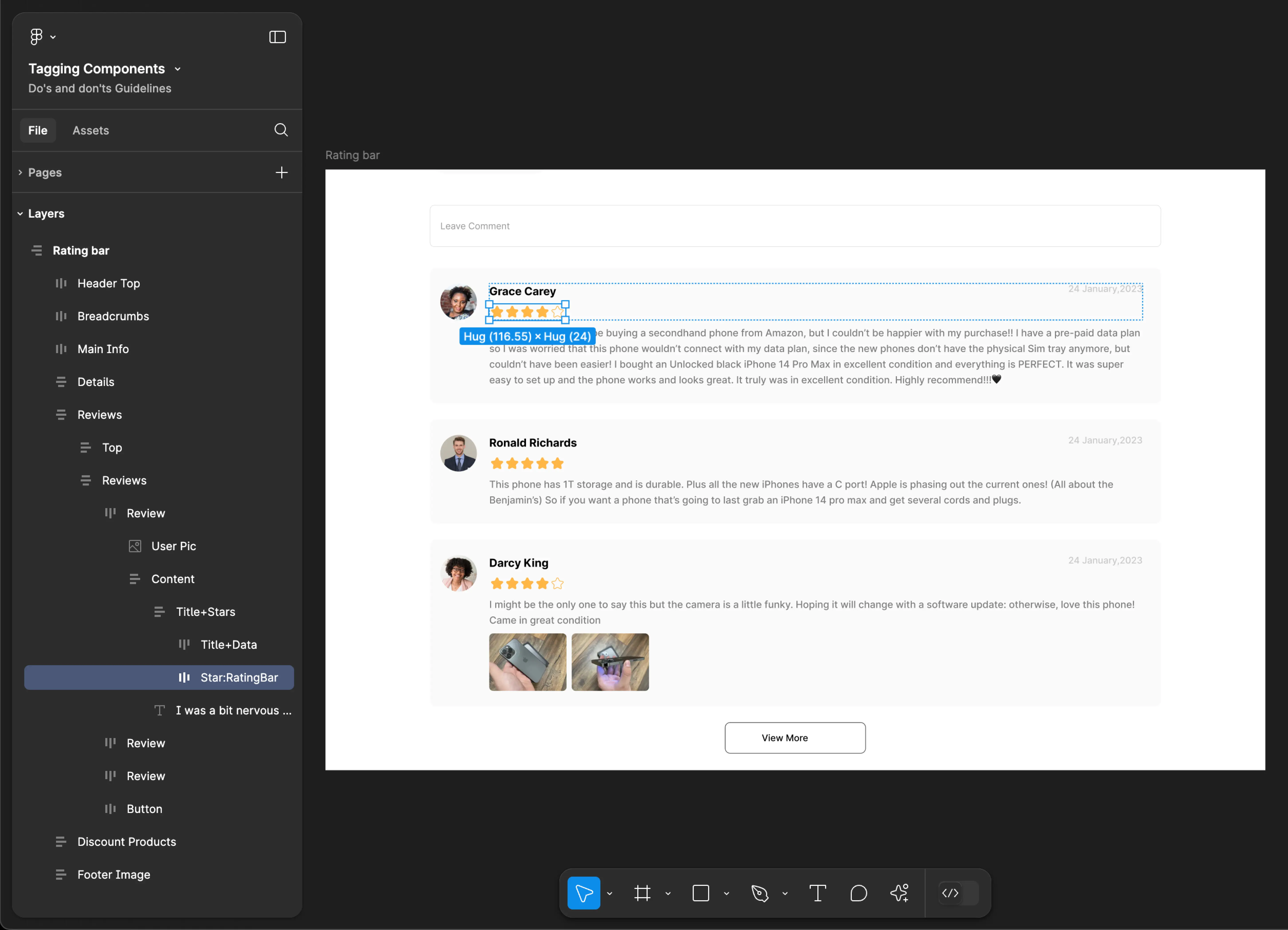
RatingBar
- Mobile
- Web
Tag name: RatingBar
Format: {Group or Frame name} + “:" + RatingBar
Example: Star:RatingBar
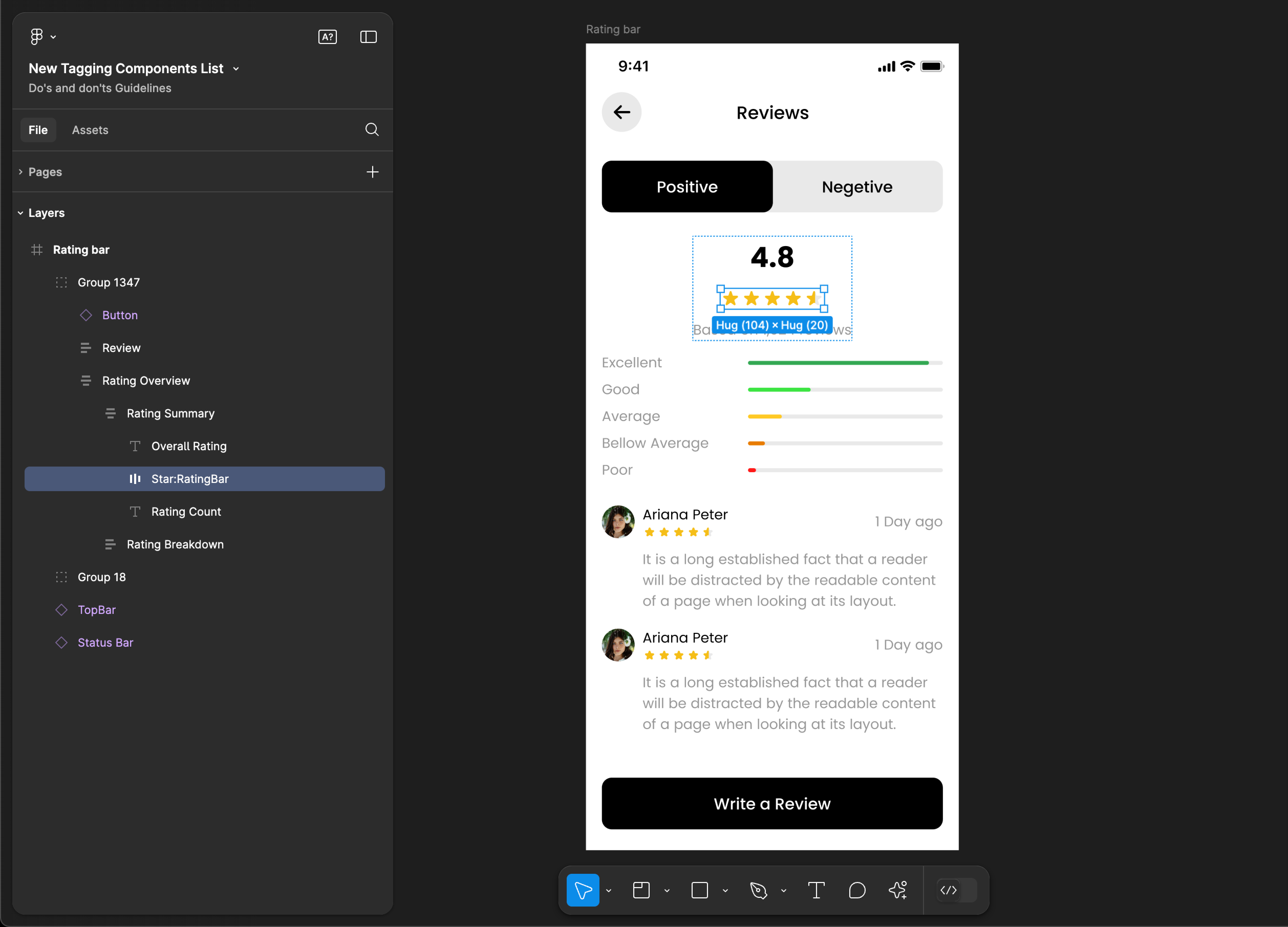
Tag name: RatingBar
Format: {Group or Frame name} + “:" + RatingBar
Example: Star:RatingBar
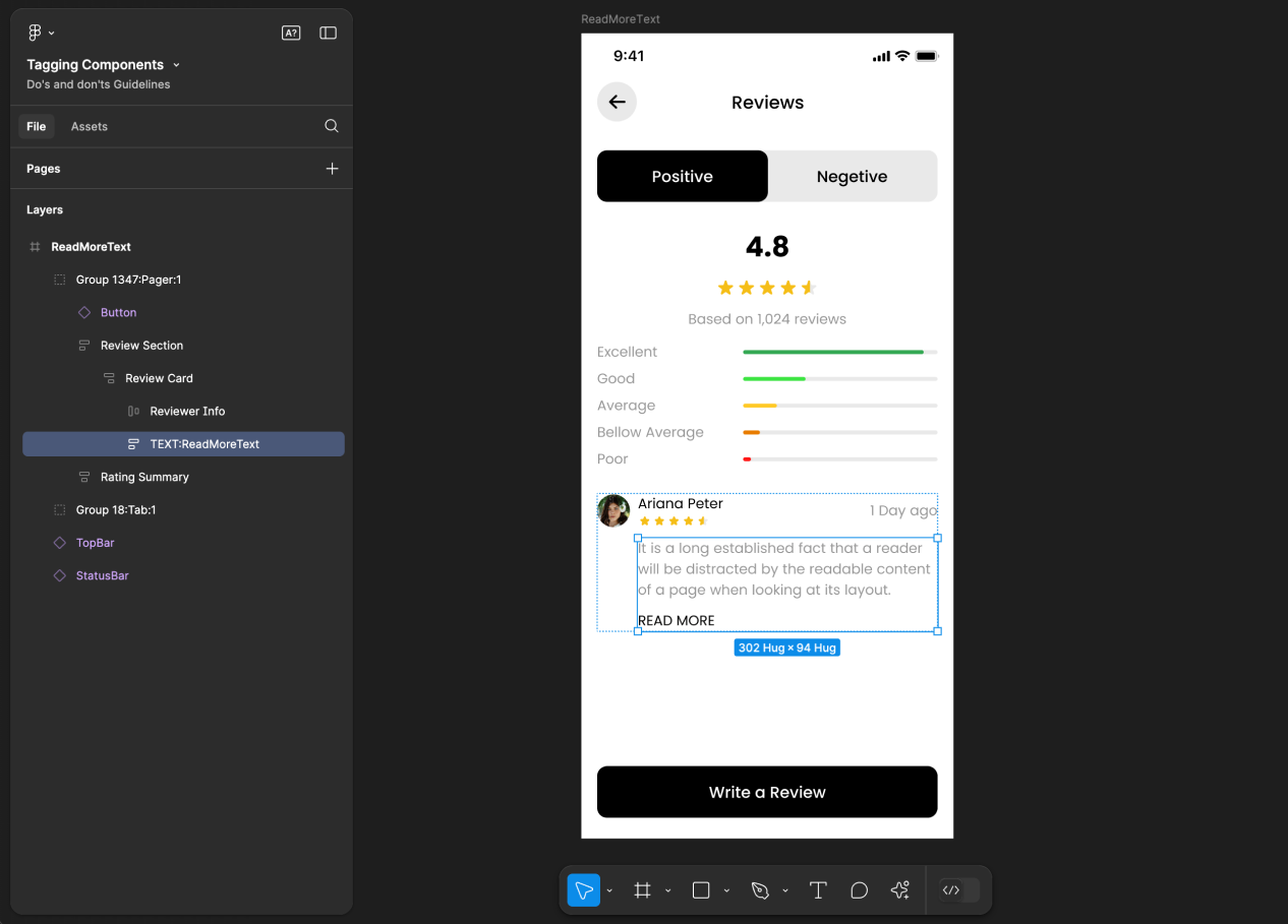
ReadMoreText
ReadMoreText tagging is not supported for web applications.
Tag name: ReadMoreText
Format: {Group or Frame name} + “:" + ReadMoreText
Example: Text:ReadMoreText
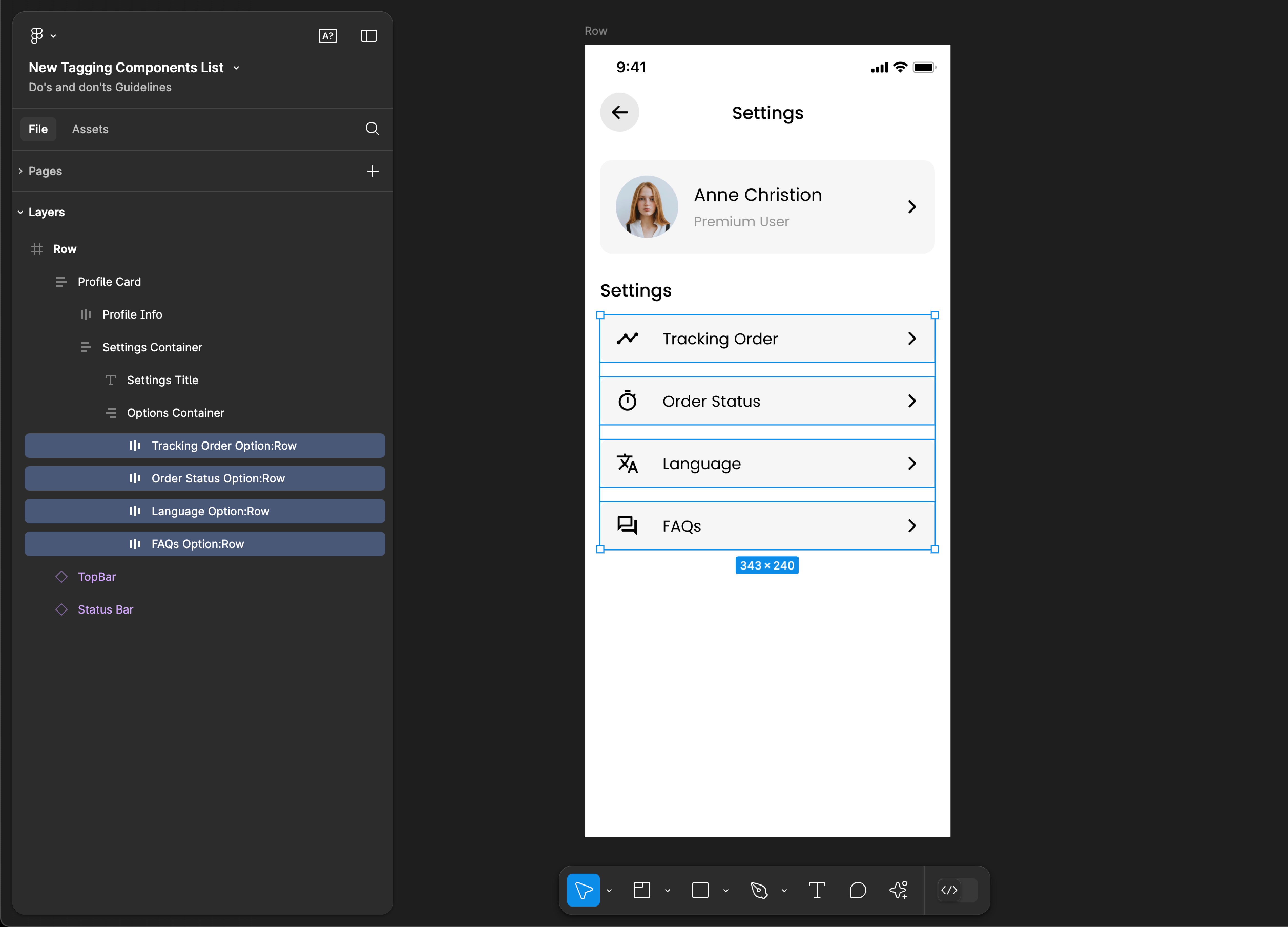
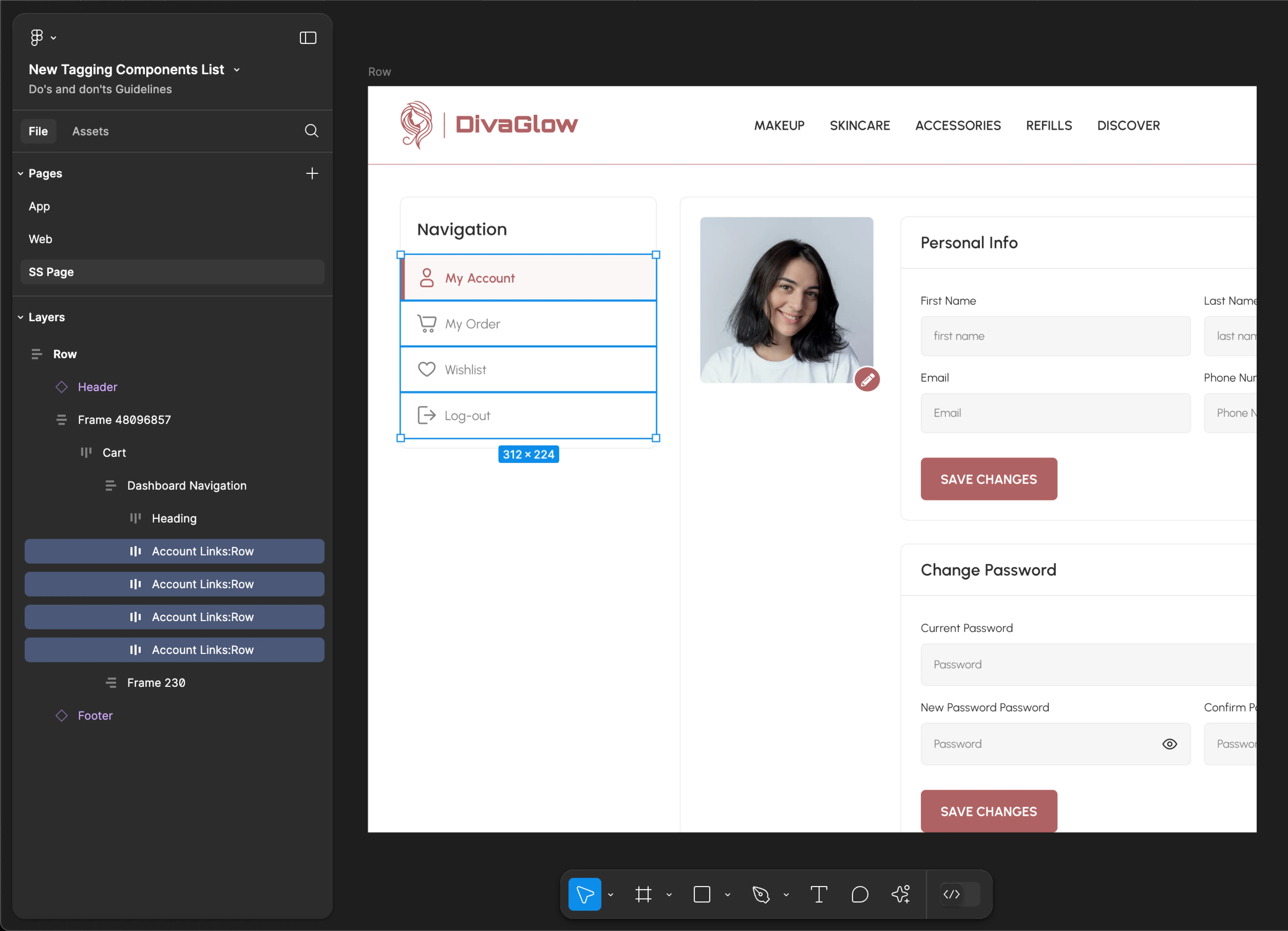
Row
- Mobile
- Web
Tag name: Row
Format: {Group or Frame name} + “:" + Row
Example: Tracking Order Option:Row
Tag name: Row
Format: {Group or Frame name} + “:" + Row
Example: Account Links:Row
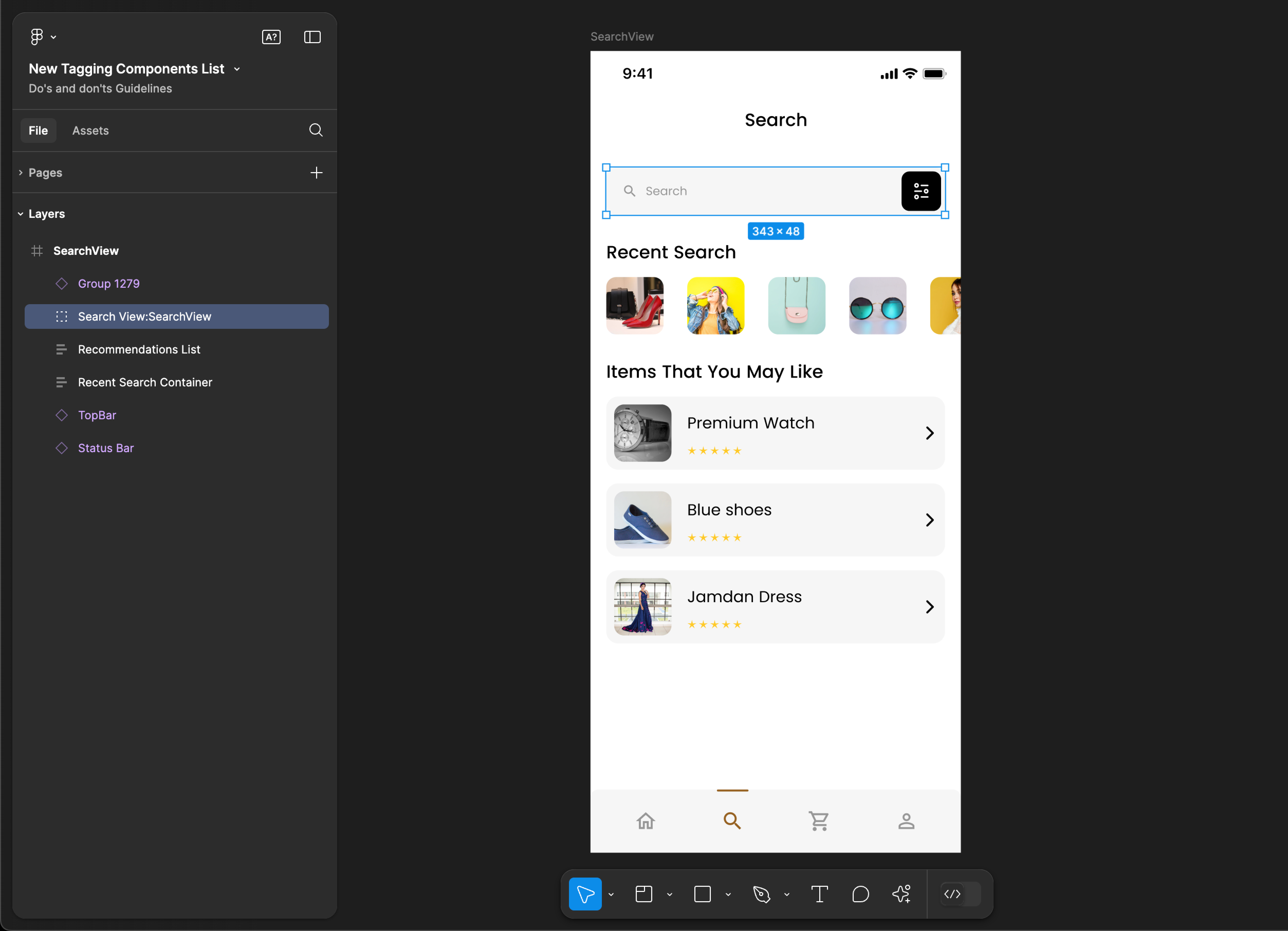
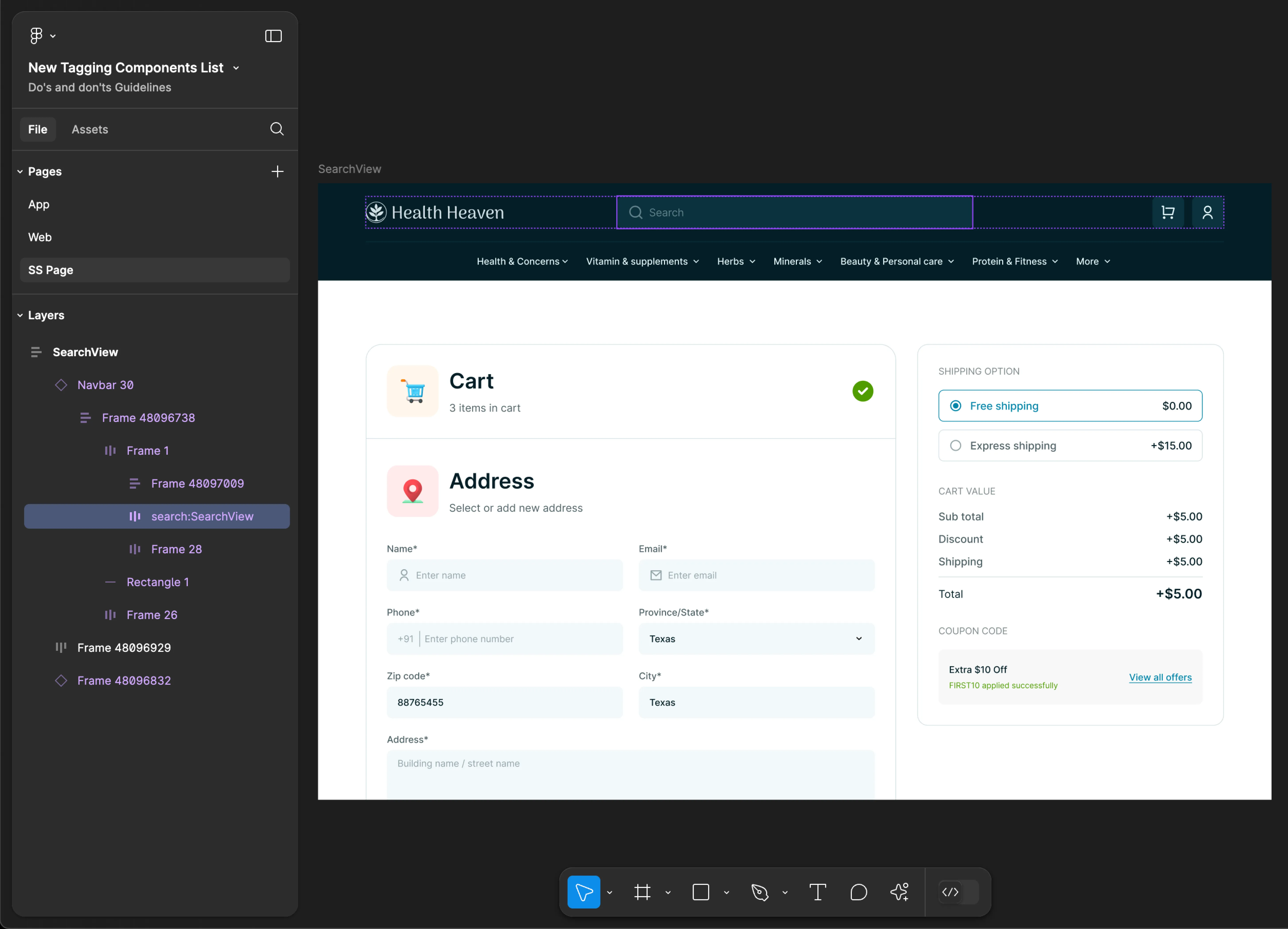
SearchView
- Mobile
- Web
Tag name: SearchView
Format: {Group or Frame name} + “:" + SearchView
Example: Search View:SearchView
Tag name: SearchView
Format: {Group or Frame name} + “:" + SearchView
Example: search:SearchView
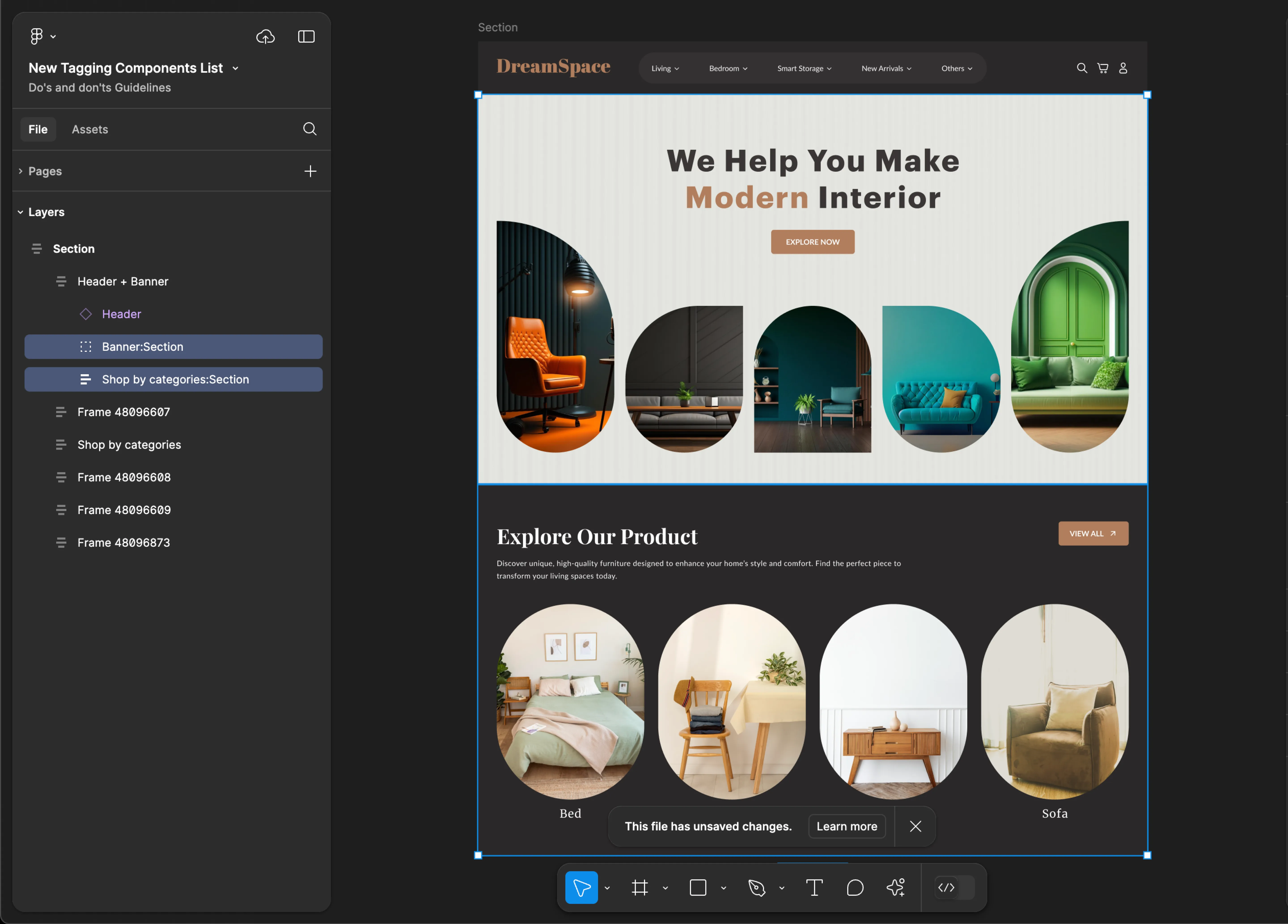
Section
- Mobile
- Web
Tag name: Section
Format: {Group or Frame name} + “:" + Section
Example: Settings Container:Section
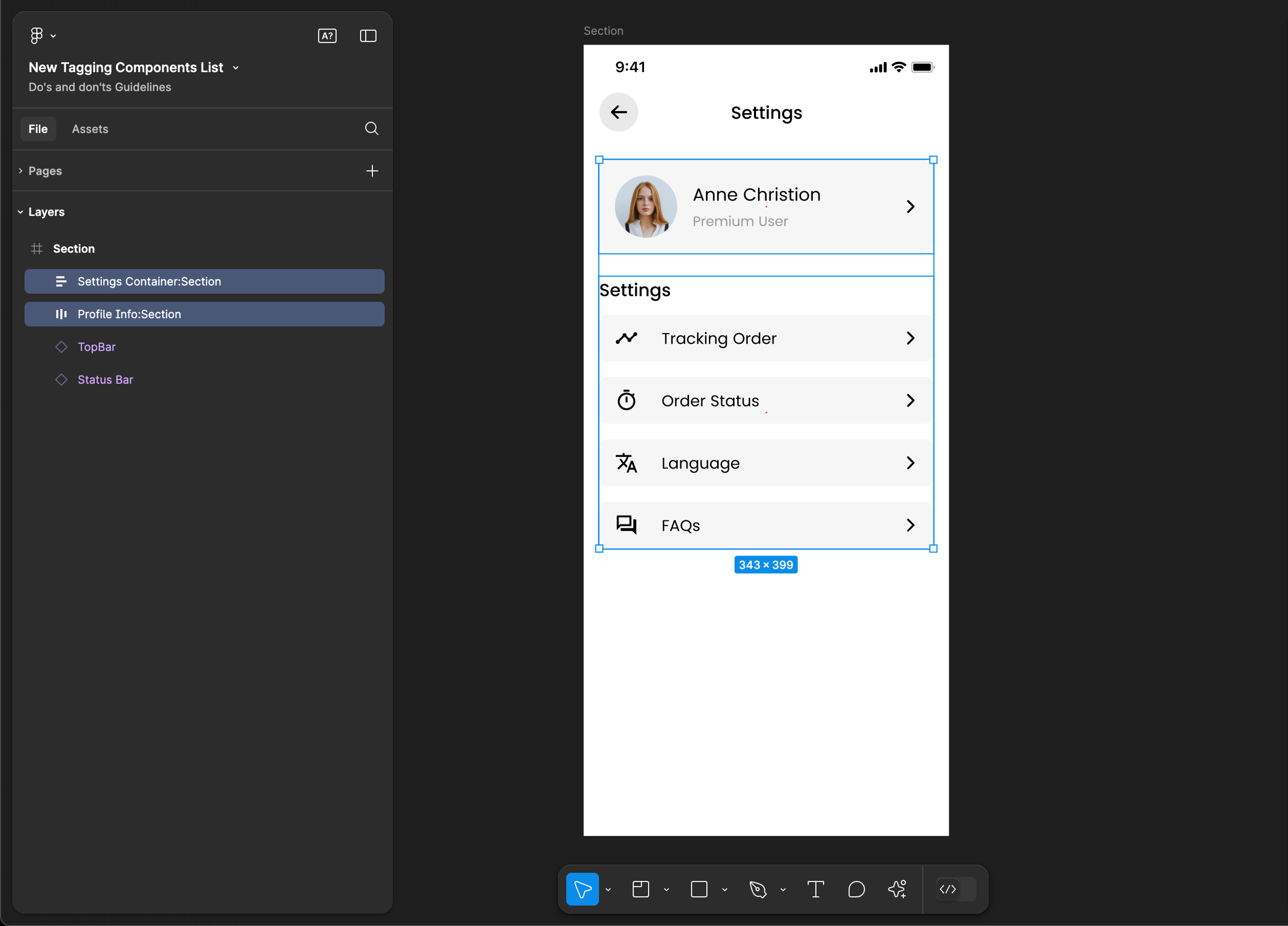
Tag name: Section
Format: {Group or Frame name} + “:" + Section
Example: Banner:Section
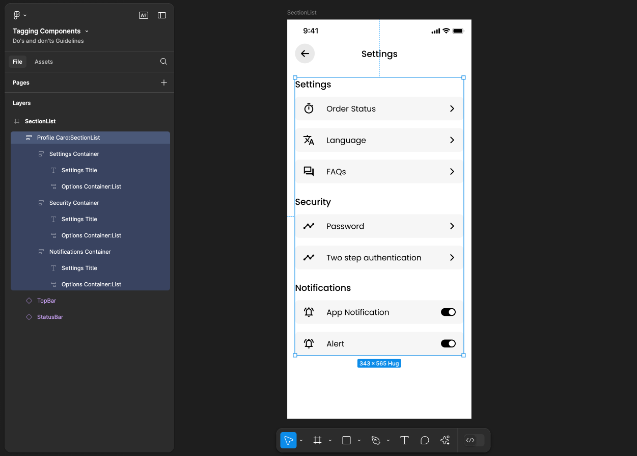
SectionList
SectionList tagging is not supported for web applications.
Tag name: SectionList
Format: {Group or Frame name} + “:" + SectionList
Example: Settings Container:SectionList
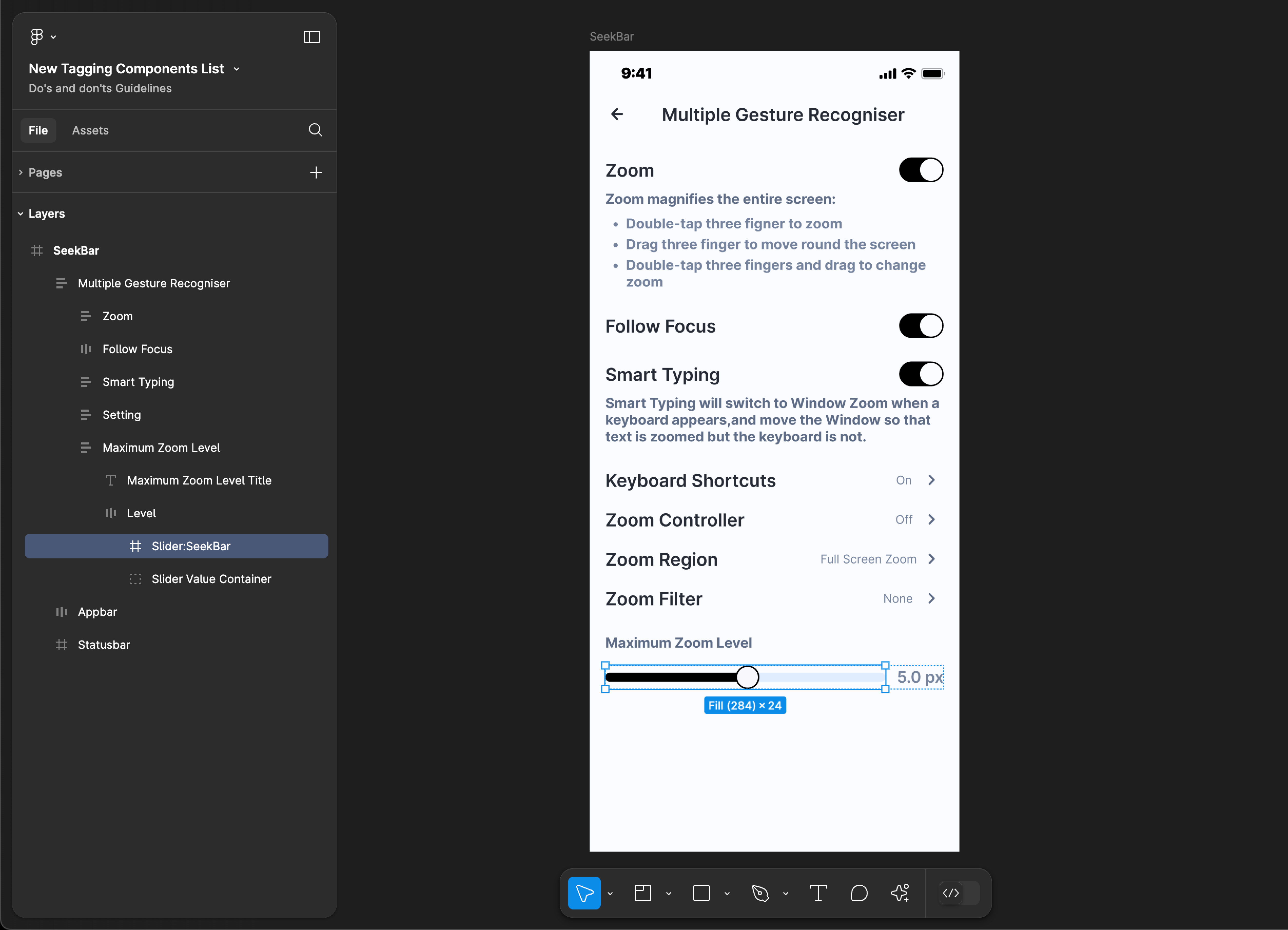
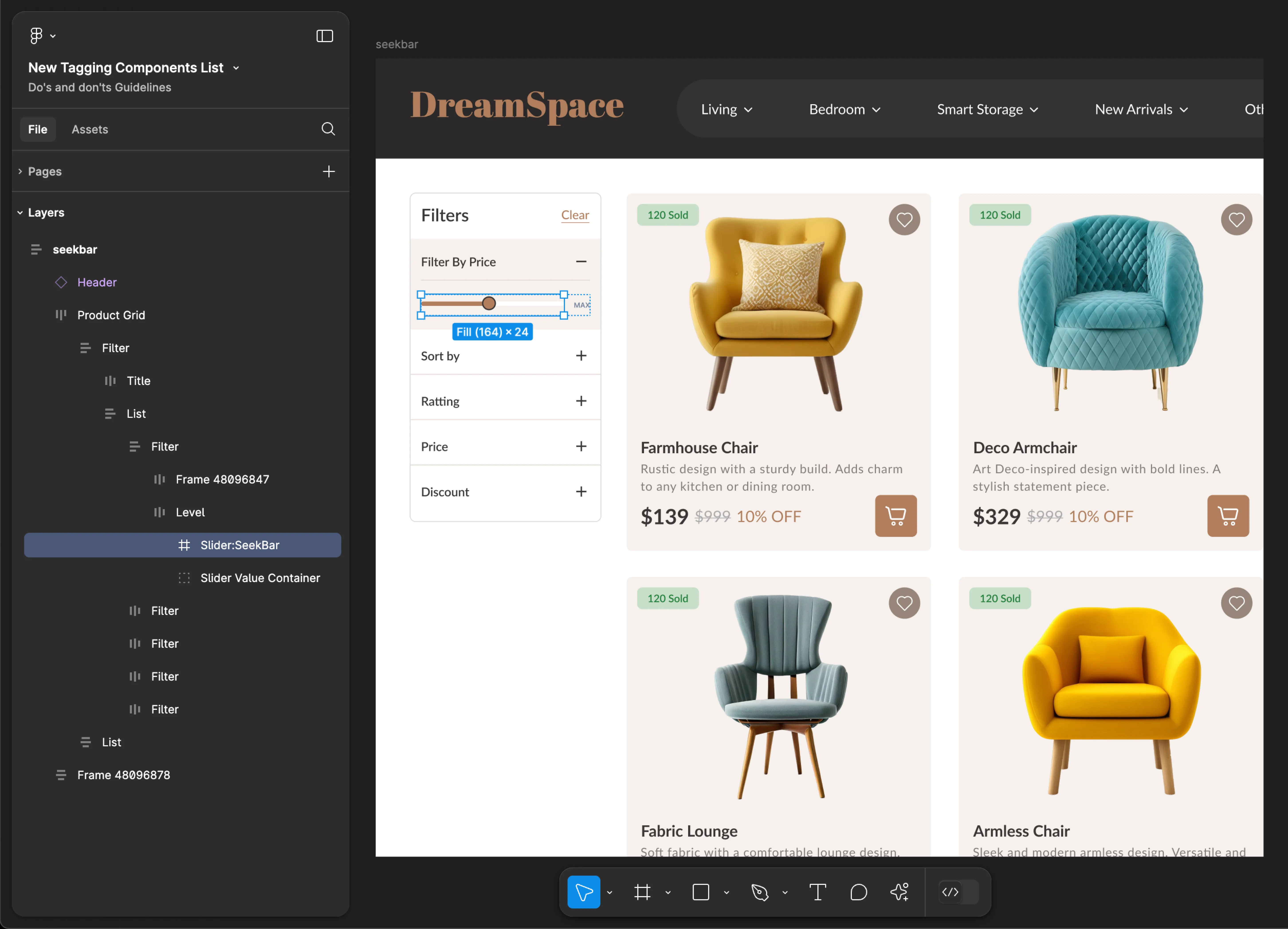
SeekBar
- Mobile
- Web
Tag name: SeekBar
Format: {Group or Frame name} + “:" + SeekBar
Example: Slider:SeekBar
Tag name: SeekBar
Format: {Group or Frame name} + “:" + SeekBar
Example: Slider:SeekBar
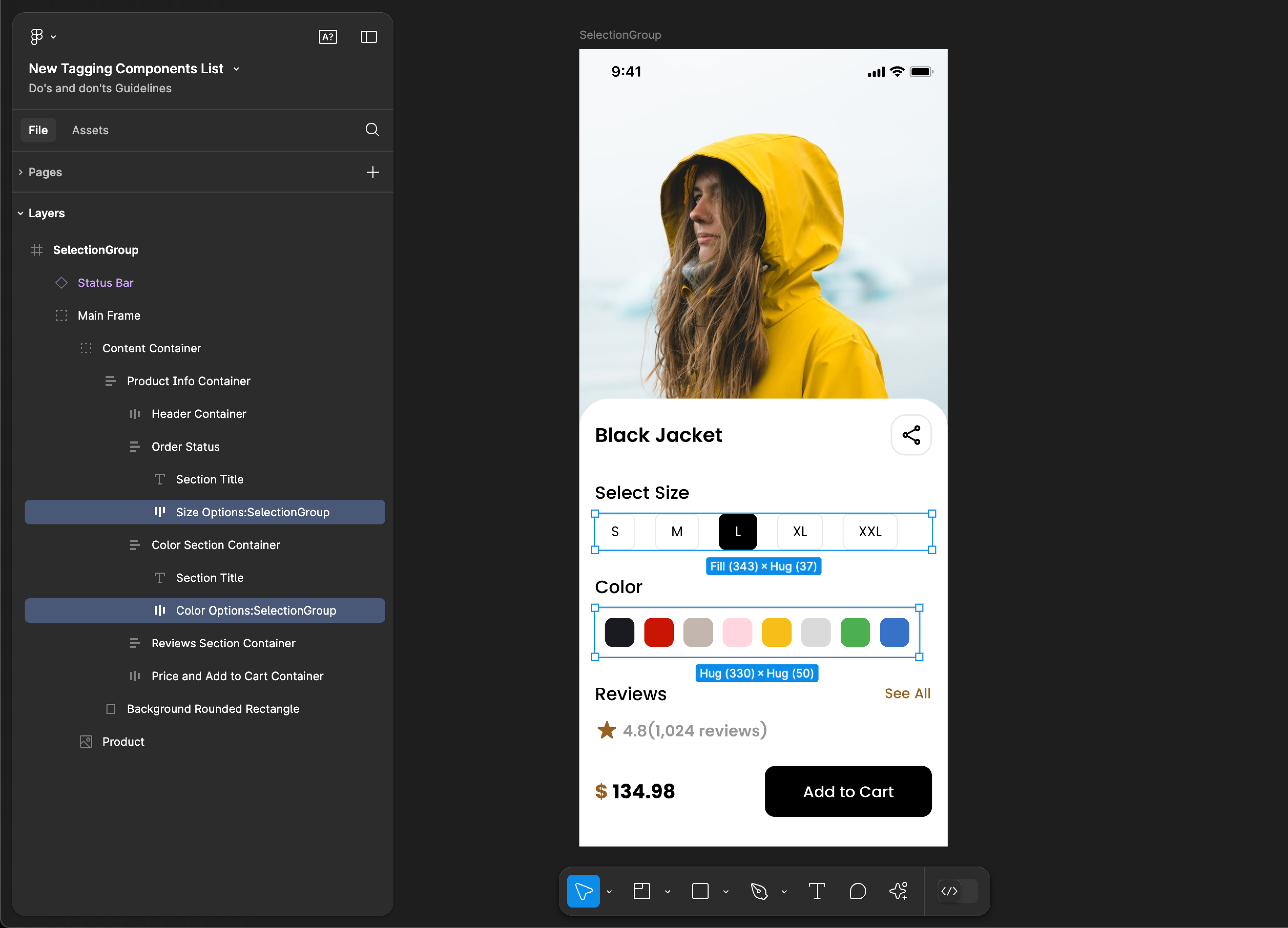
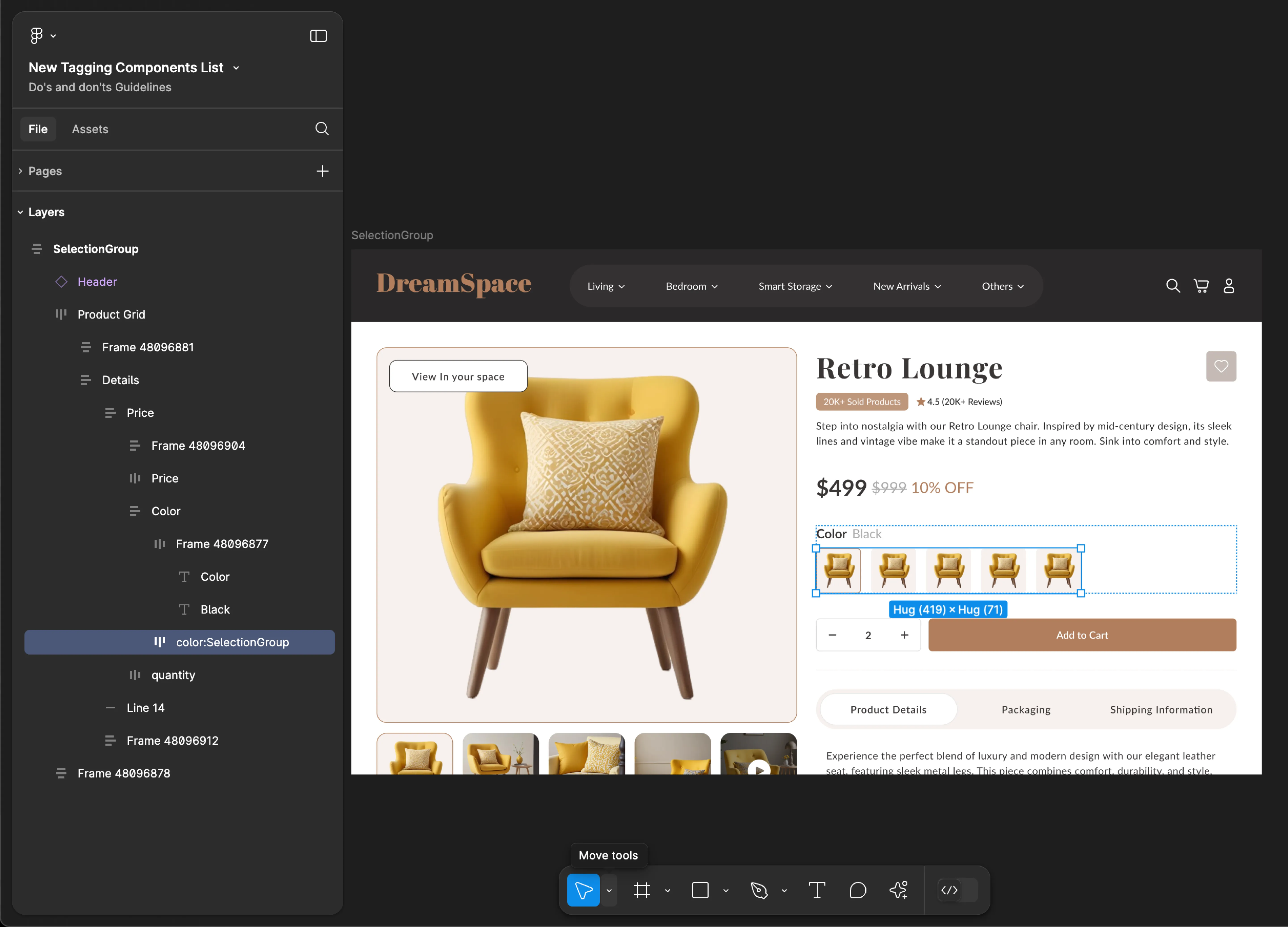
SelectionGroup
- Mobile
- Web
Tag name: SelectionGroup
Format: {Group or Frame name} + “:" + SelectionGroup
Example: Size Options:SelectionGroup
Tag name: SelectionGroup
Format: {Group or Frame name} + “:" + SelectionGroup
Example: color:SelectionGroup
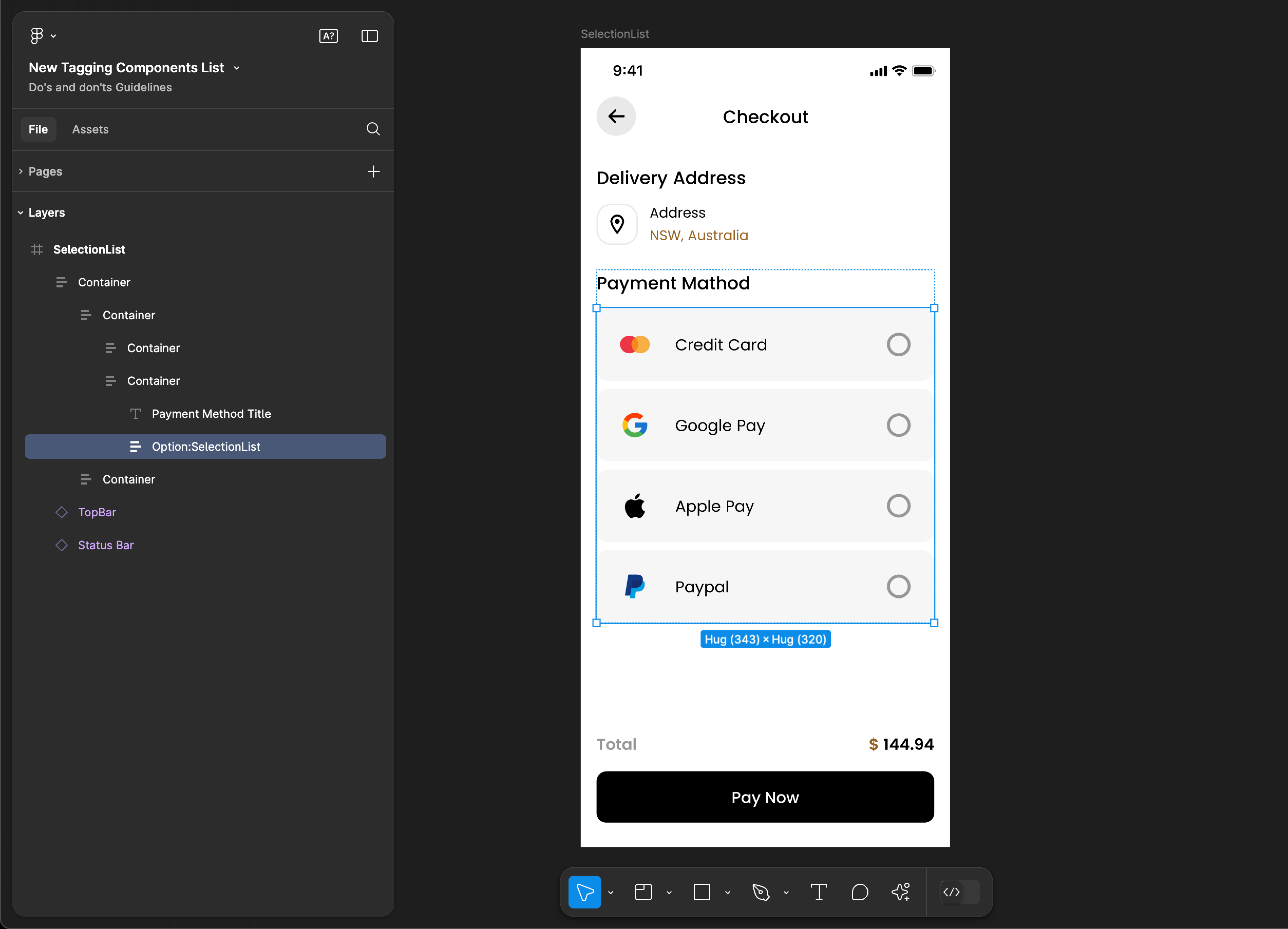
SelectionList
SelectionList tagging is not supported for web applications.
Tag name: SelectionList
Format: {Group or Frame name} + “:" + SelectionList
Example: Option:SelectionList
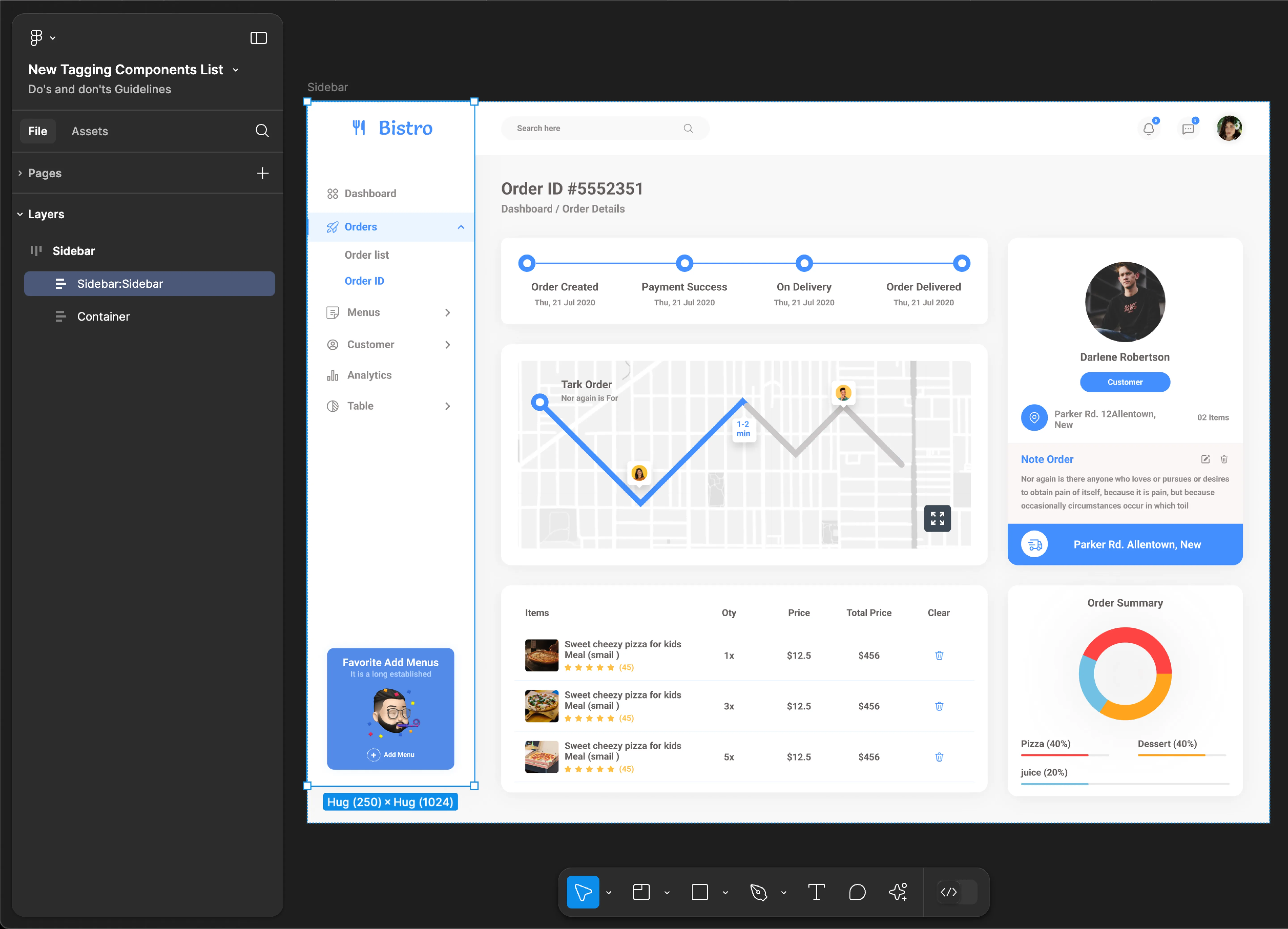
Sidebar
Sidebar tagging is not supported for mobile applications.
Use Sidebar, SidebarMenu, MenuItem & SubMenu tags together for accurate component identification. Using only one of these tags may result in inaccuracies and incomplete component recognition.
Tag name: Sidebar
Format: {Group or Frame name} + “:" + Sidebar
Example: Sidebar:Sidebar
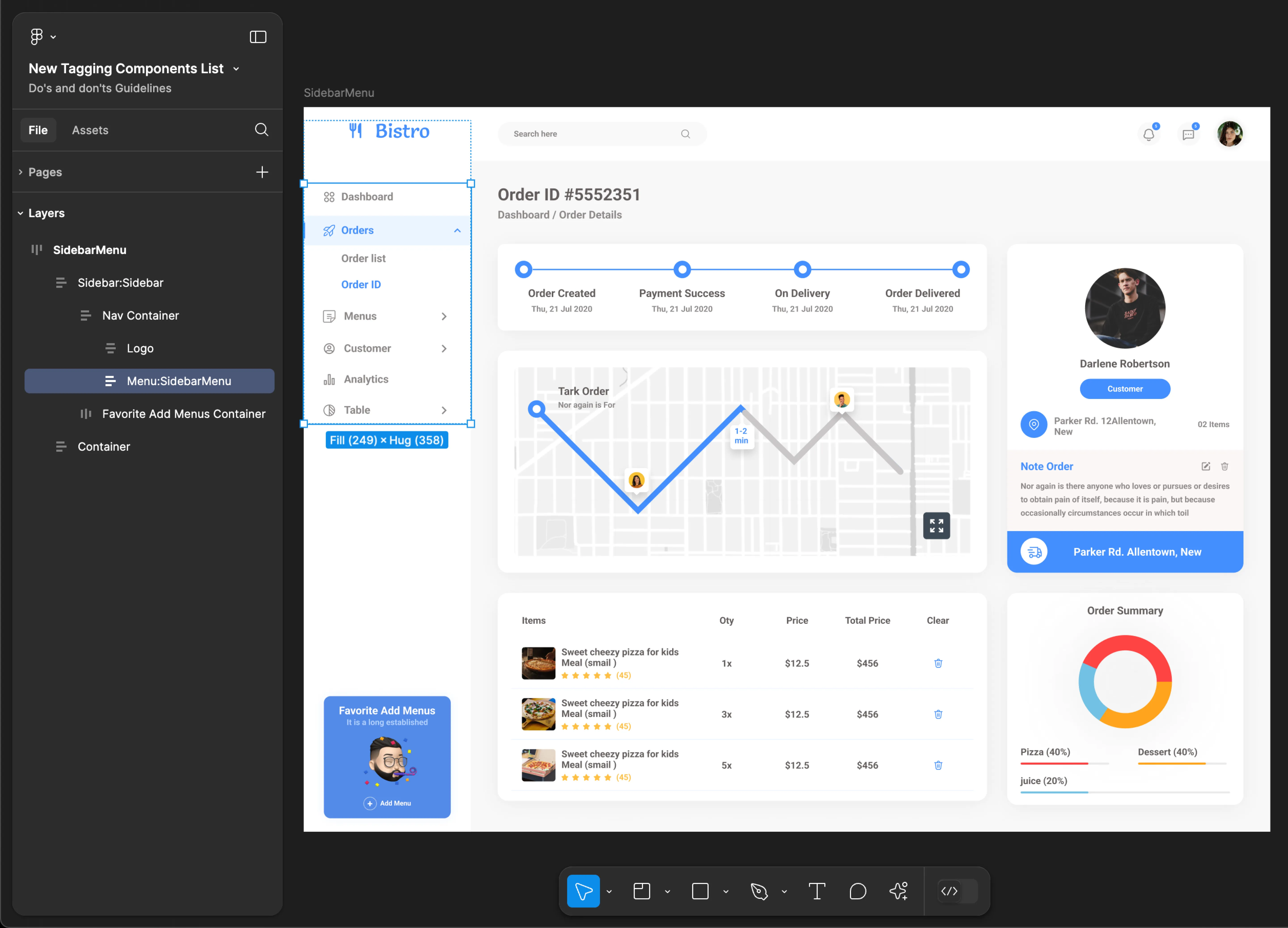
SidebarMenu
SidebarMenu tagging is not supported for mobile applications.
Use Sidebar, SidebarMenu, MenuItem & SubMenu tags together for accurate component identification. Using only one of these tags may result in inaccuracies and incomplete component recognition.
Tag name: SidebarMenu
Format: {Group or Frame name} + “:" + SidebarMenu
Example: Menu:SidebarMenu
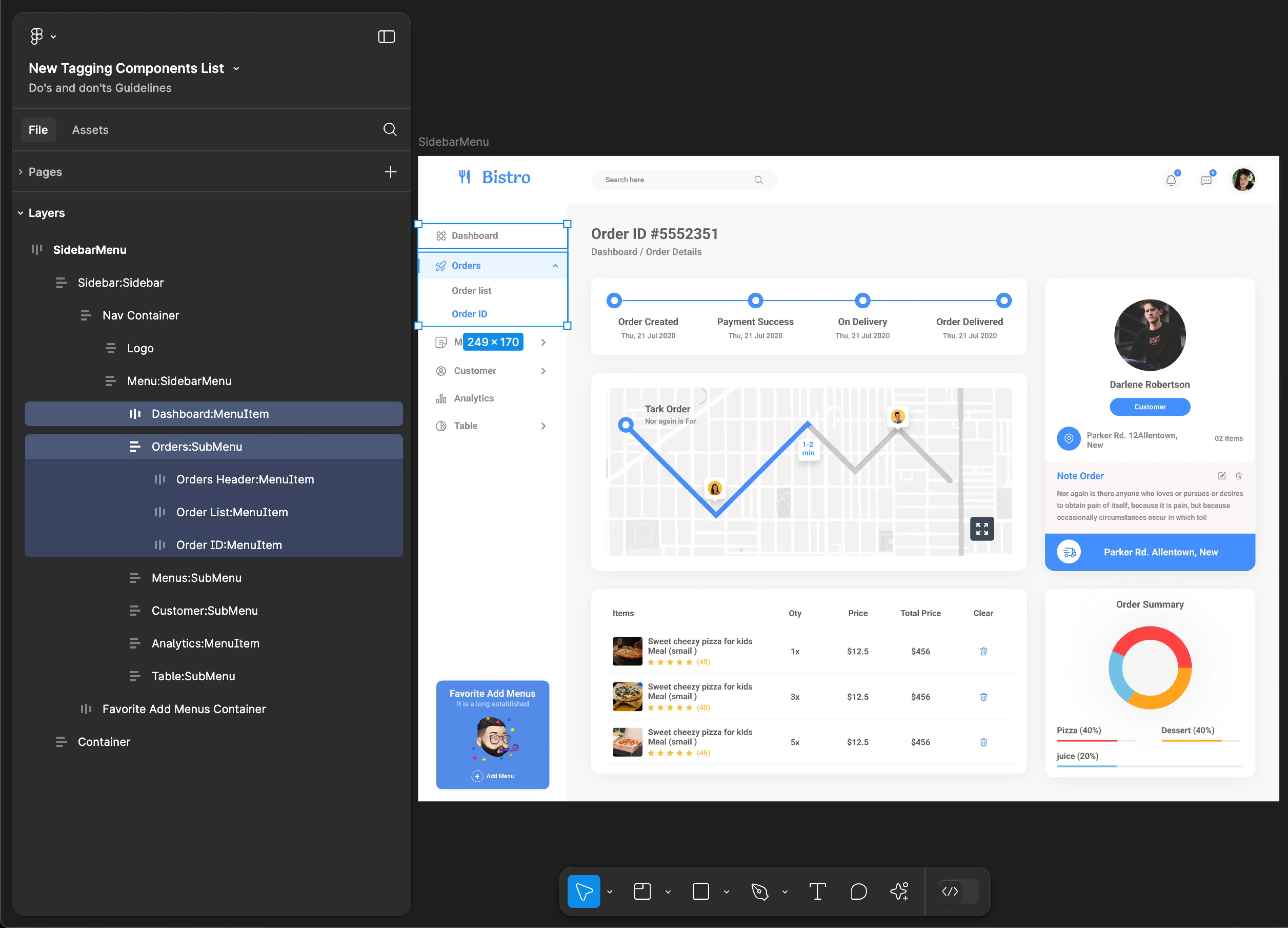
Sidebar MenuItem & SubMenu
Sidebar MenuItem & SubMenu tagging is not supported for mobile applications.
Use Sidebar, SidebarMenu, MenuItem & SubMenu tags together for accurate component identification. Using only one of these tags may result in inaccuracies and incomplete component recognition.
Tag name: MenuItem & SubMenu
Format:
{Group or Frame name} + “:" + MenuItem
{Group or Frame name} + “:" + SubMenu
Example:
Dashboard:MenuItem
Orders:SubMenu
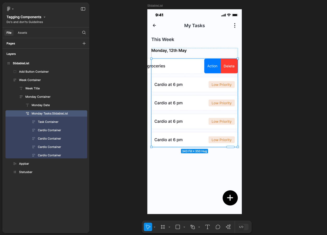
SlidableList
SlidableList tagging is not supported for web applications.
Tag name: SlidableList
Format: {Group or Frame name} + “:" + SlidableList
Example: Monday Tasks:SlidableList
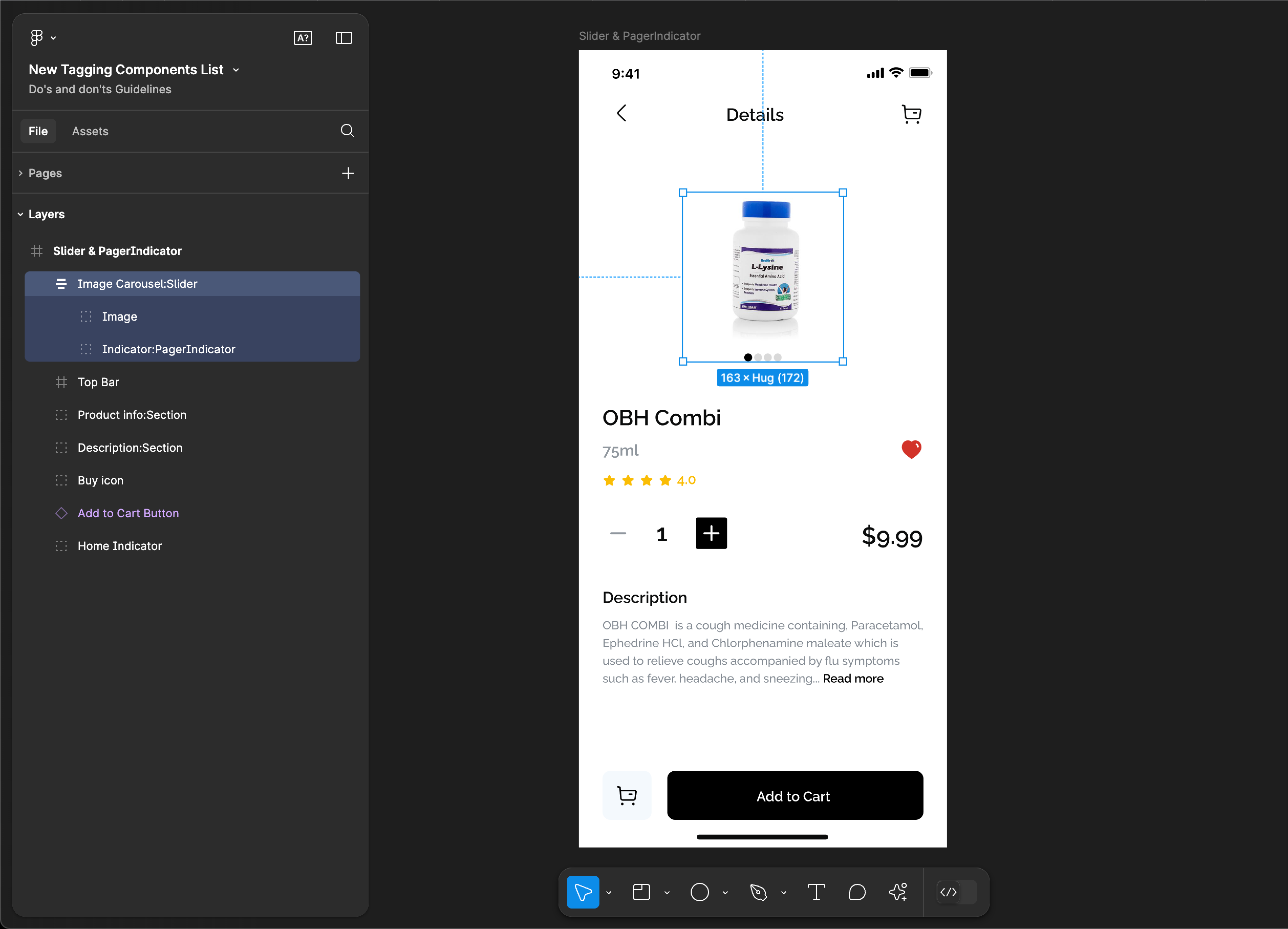
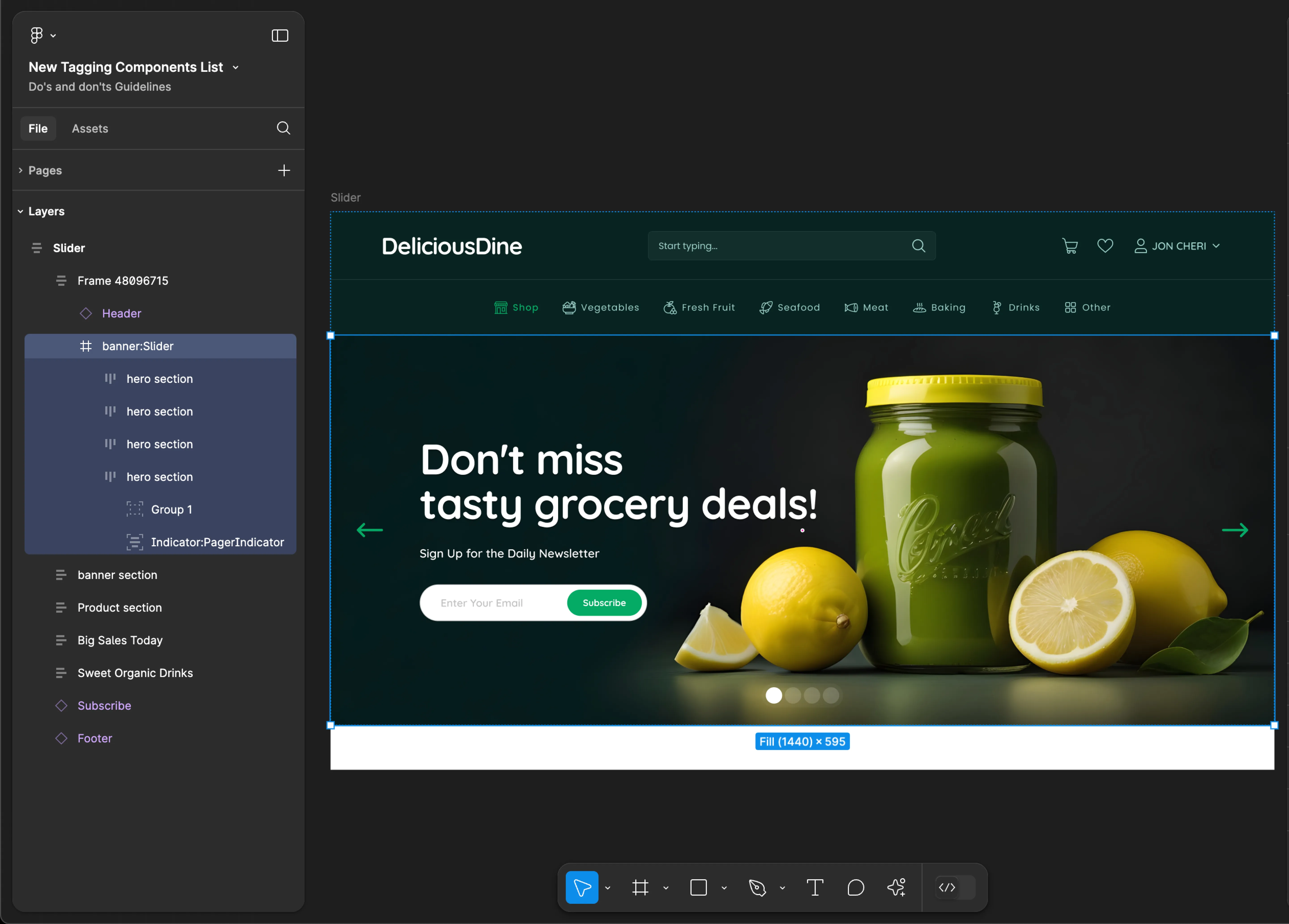
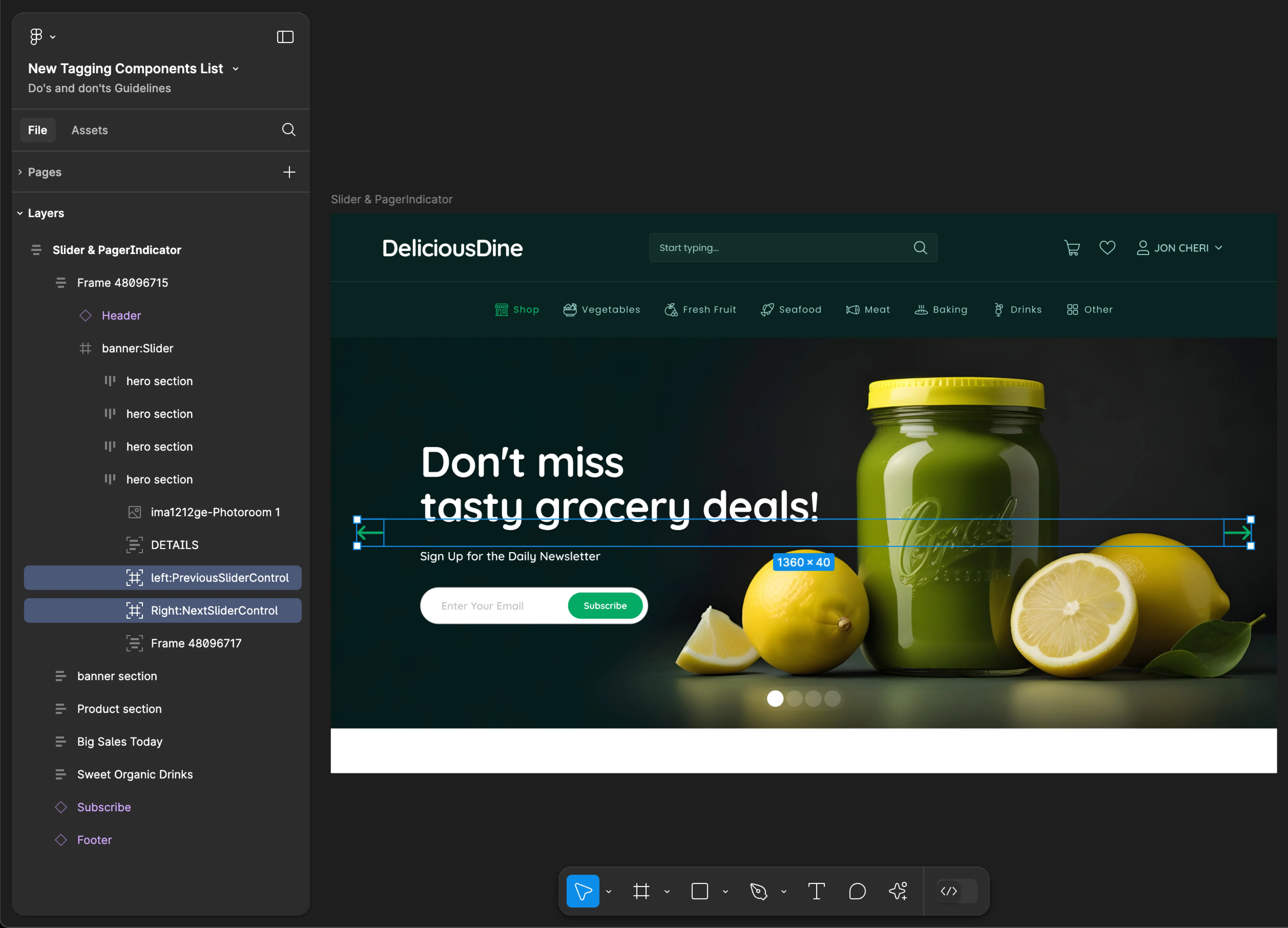
Slider & Page Indicator
- Mobile
- Web
Tag name: Slider
Tag name: PagerIndicator
Format:
{Group or Frame name} + “:" + Slider
{Group or Frame name} + “:" + PagerIndicator
Example:
Image Carousel:Slider
Indicator:PagerIndicator
Tag name: Slider
Tag name: PagerIndicator
Format:
{Group or Frame name} + “:" + Slider
{Group or Frame name} + “:" + PagerIndicator
{Group or Frame name} + “:" + PreviousSliderControl
{Group or Frame name} + “:" + NextSliderControl
Example:
banner:Slider
Indicator:PagerIndicator
left:PreviousSliderControl
Right:NextSliderControl
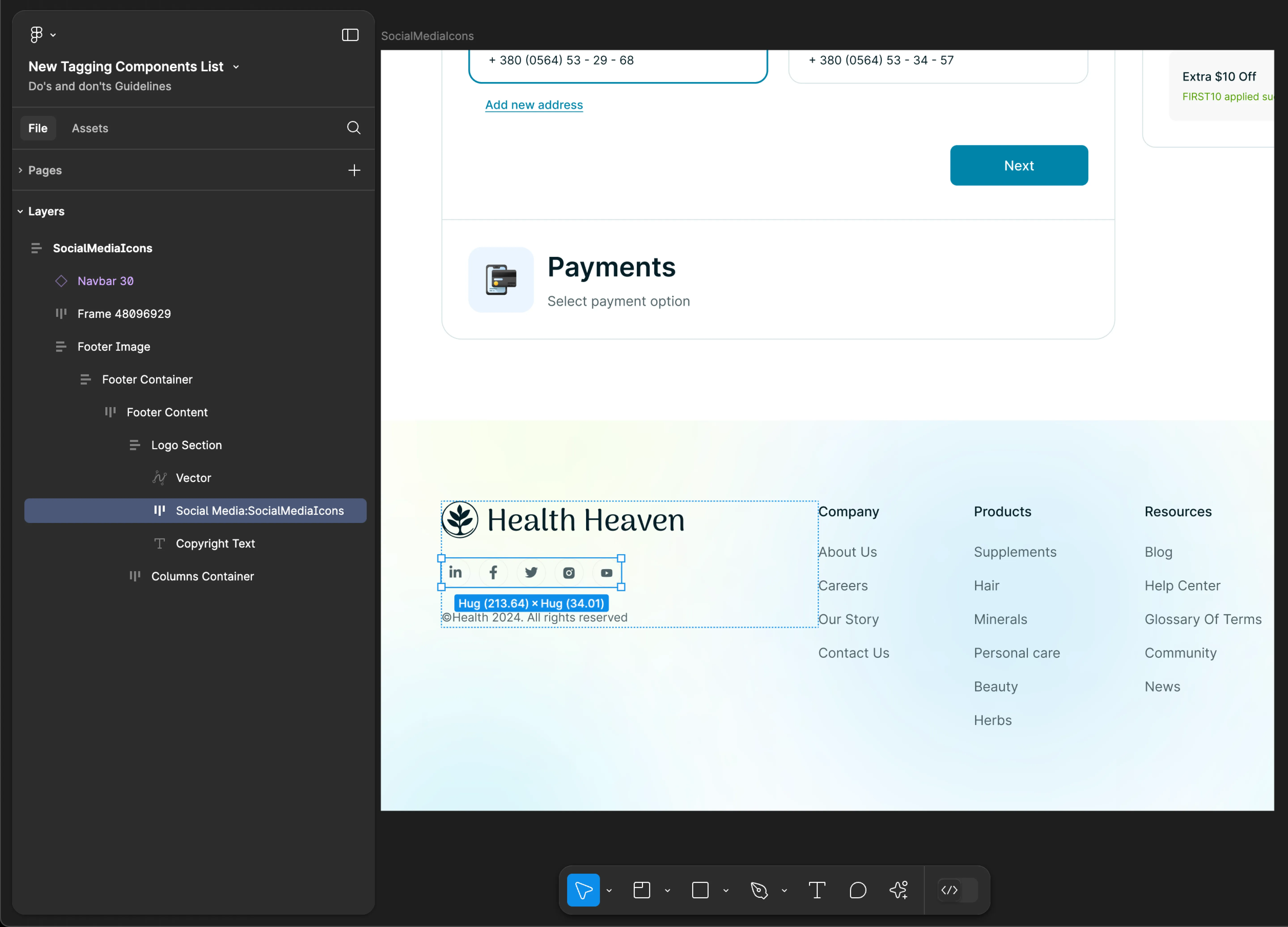
SocialMediaIcons
- Mobile
- Web
Tag name: SocialMediaIcons
Format: {Group or Frame name} + “:" + SocialMediaIcons
Example: icons:SocialMediaIcons
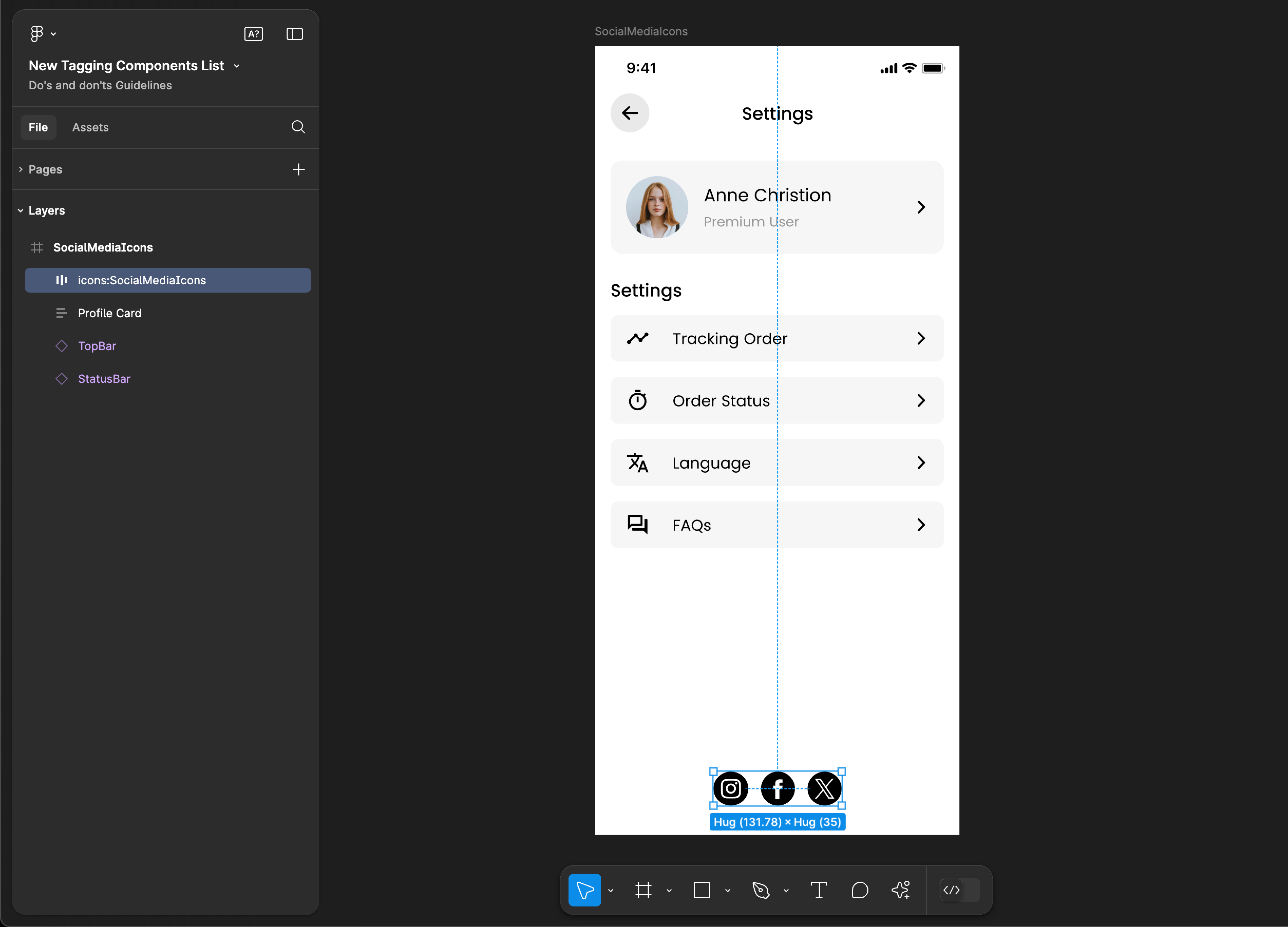
Tag name: SocialMediaIcons
Format: {Group or Frame name} + “:" + SocialMediaIcons
Example: Social Media:SocialMediaIcons
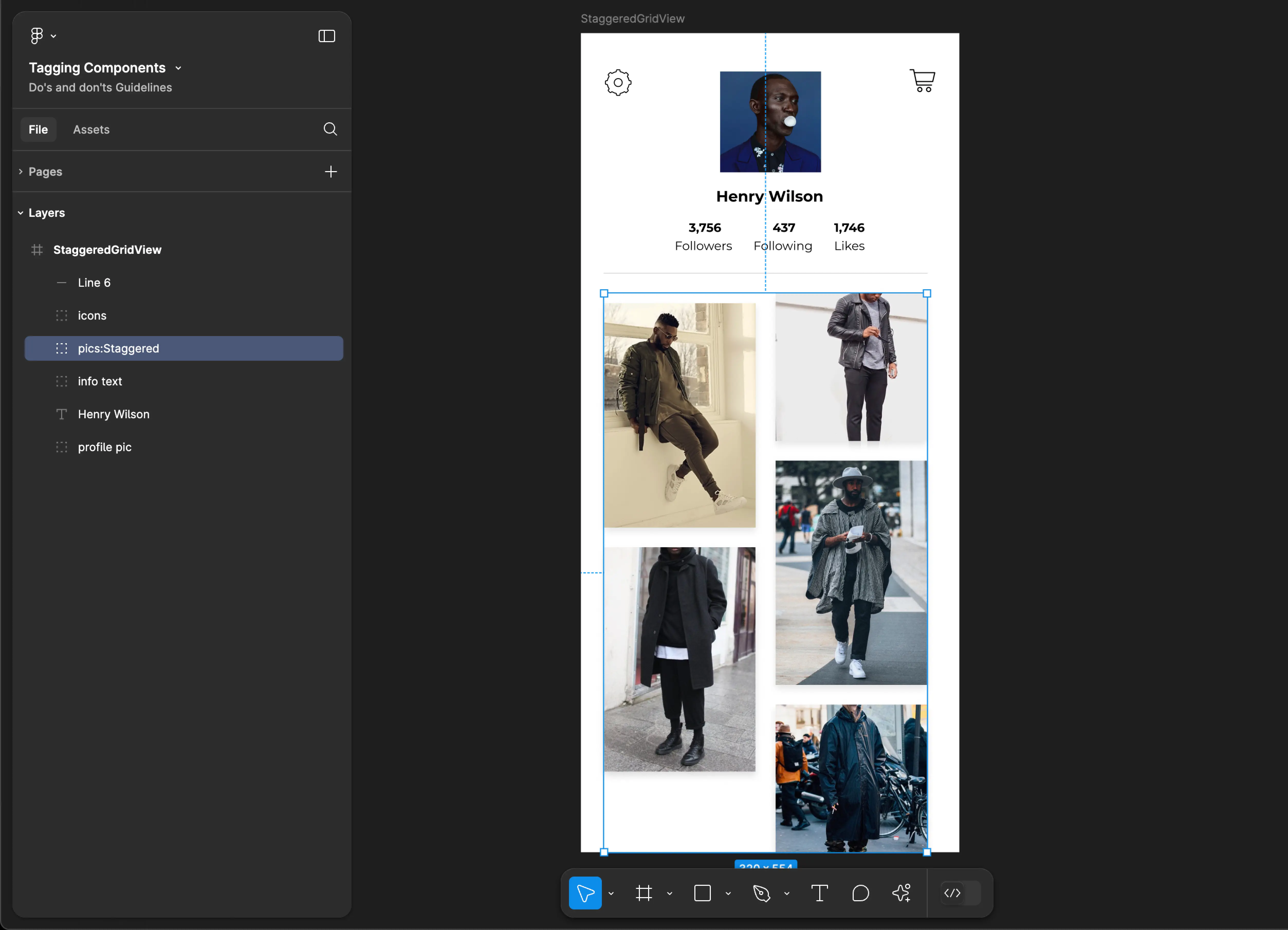
Staggered
Staggered tagging is not supported for web applications.
Tag name: Staggered
Format: {Group or Frame name} + “:" + Staggered
Example: pics:Staggered
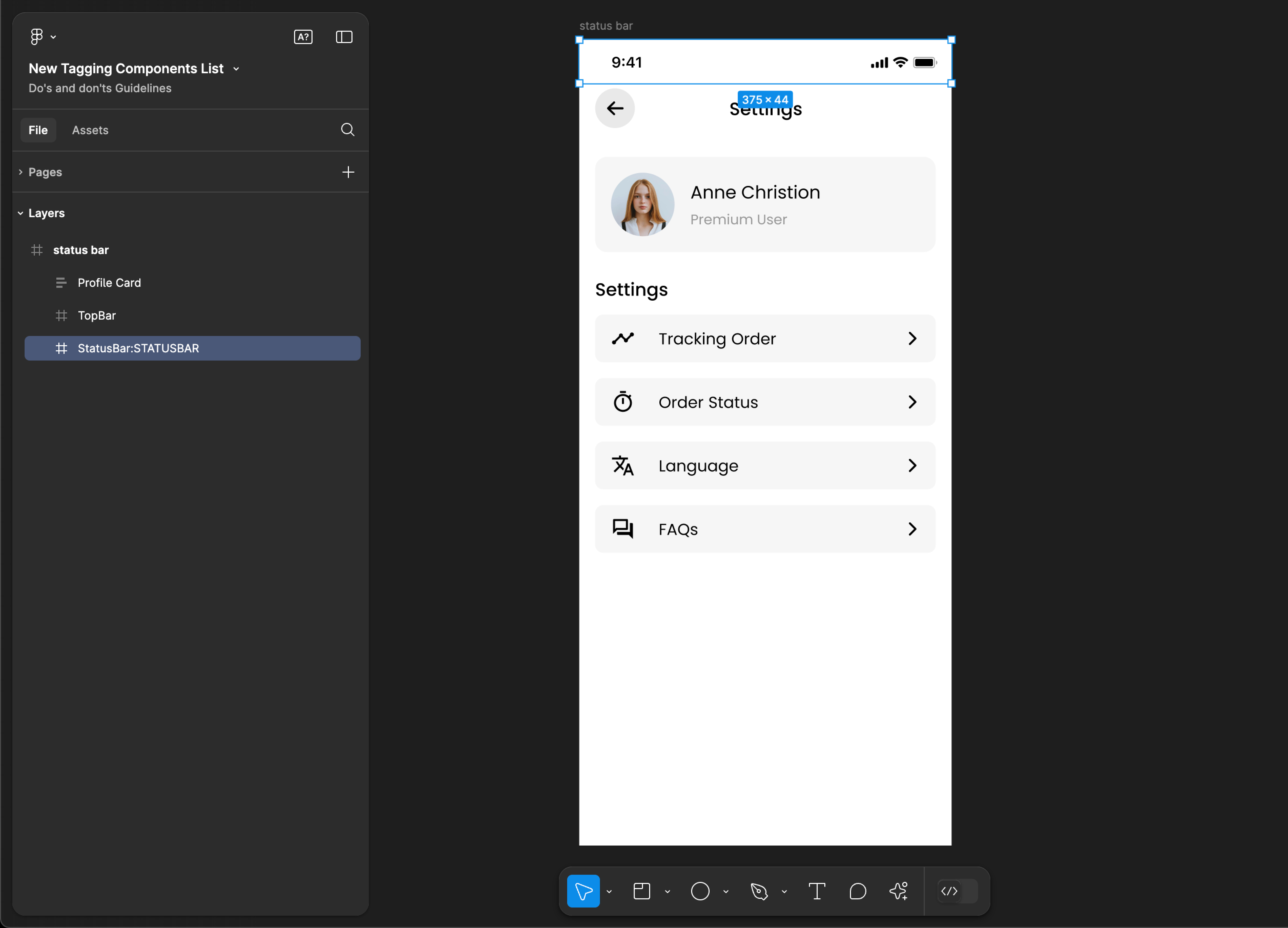
STATUSBAR
STATUSBAR tagging is not supported for web applications.
Tag name: STATUSBAR
Format: {Group or Frame name} + “:" + STATUSBAR
Example: StatusBar:STATUSBAR
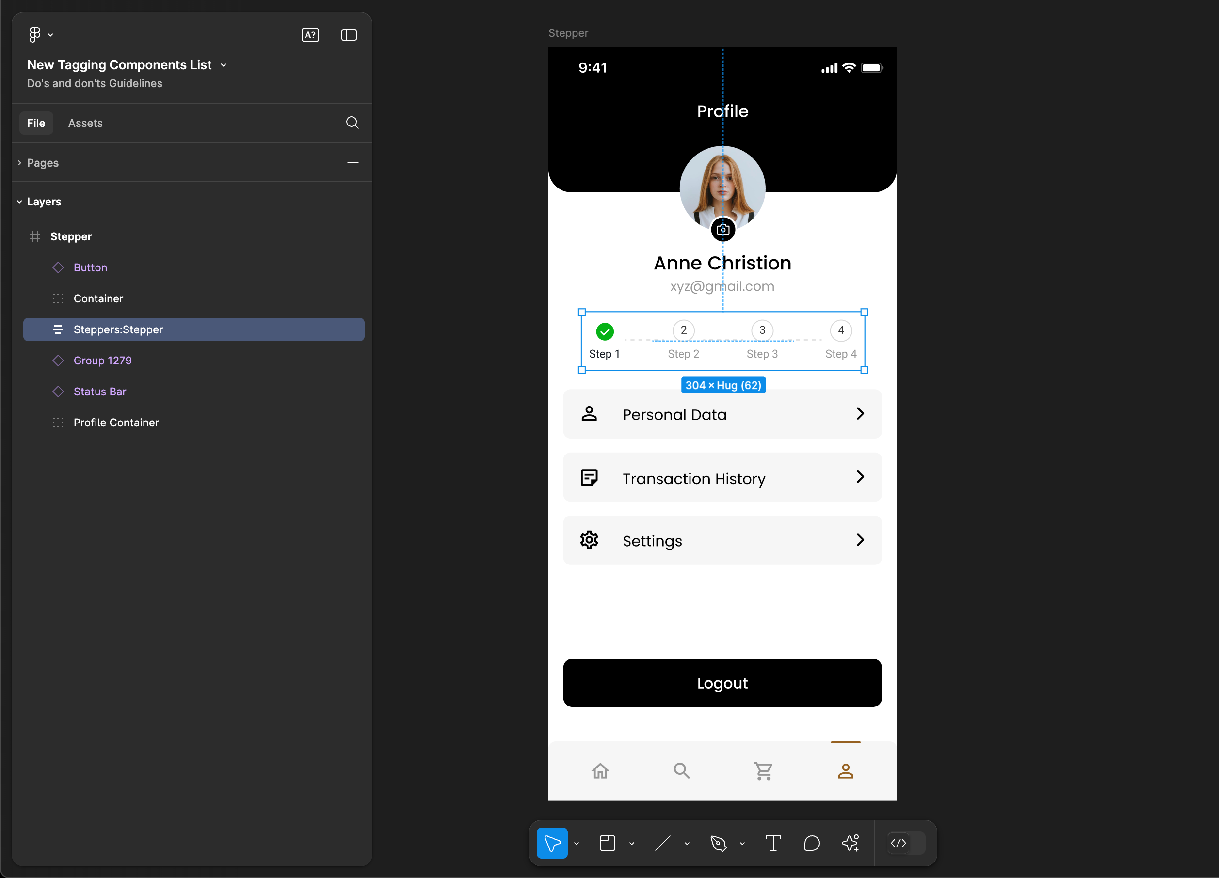
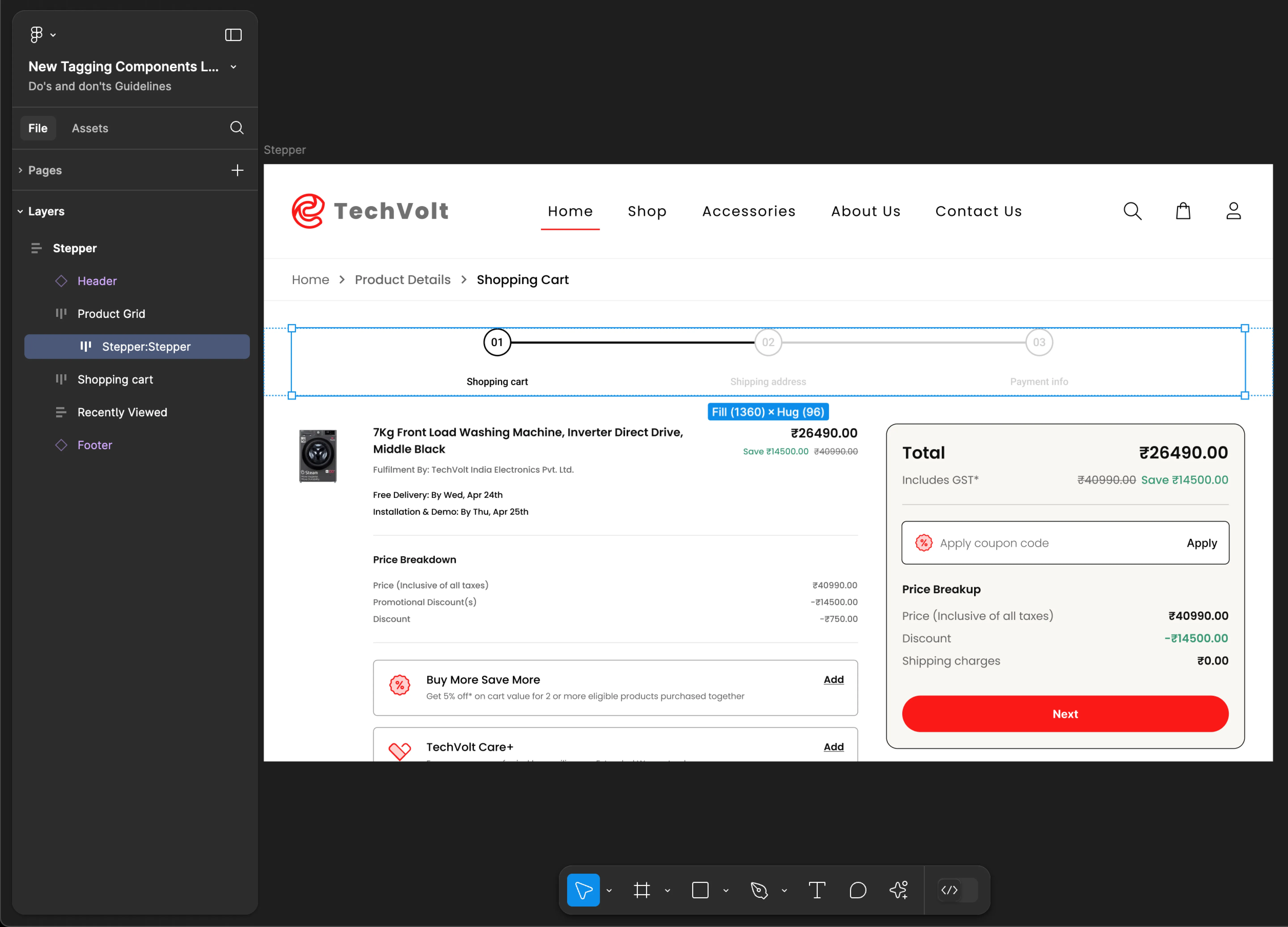
Stepper
- Mobile
- Web
Tag name: Stepper
Format: {Group or Frame name} + “:" + Stepper
Example: Steppers:Stepper
Tag name: Stepper
Format: {Group or Frame name} + “:" + Stepper
Example: Stepper:Stepper
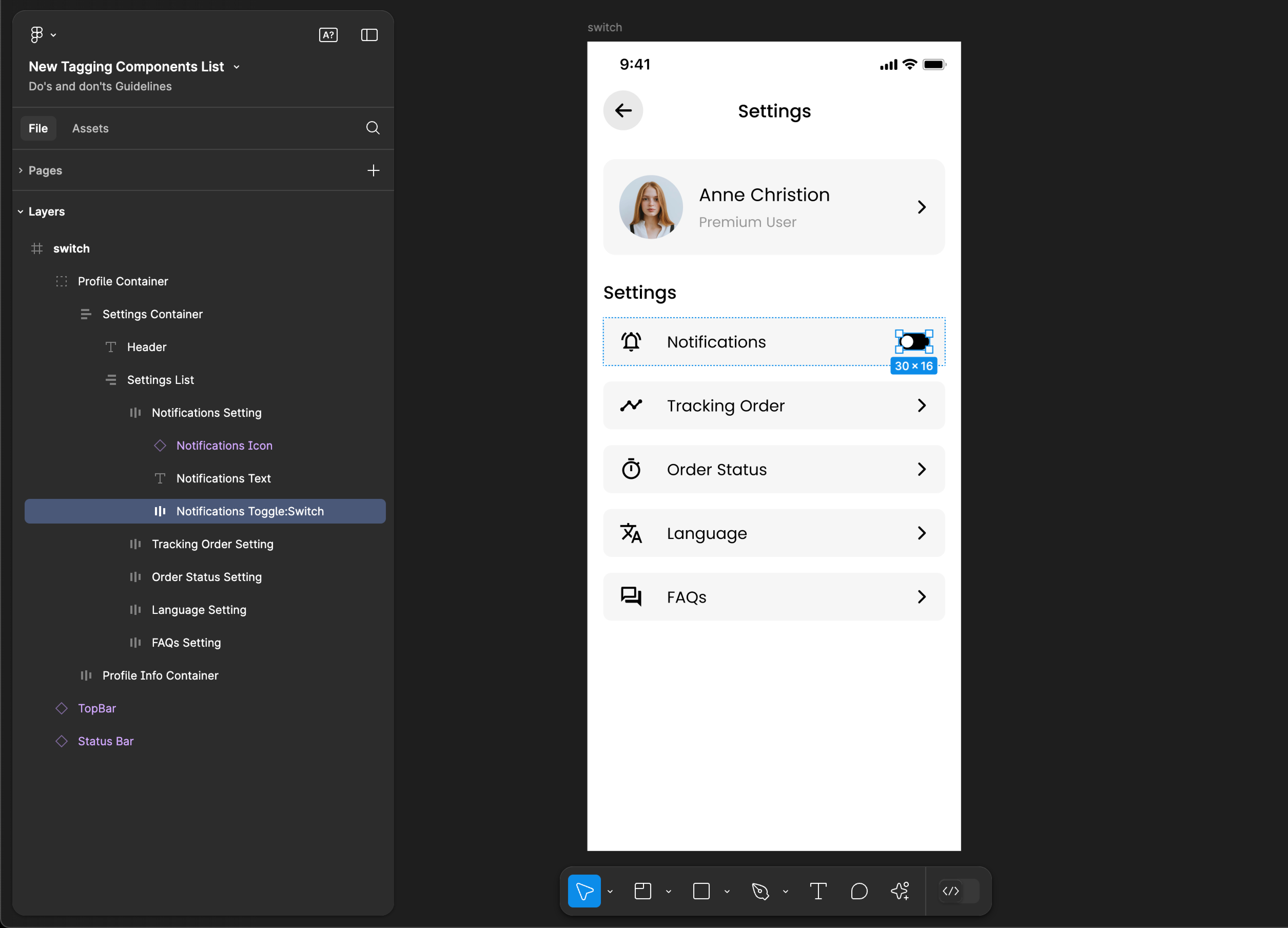
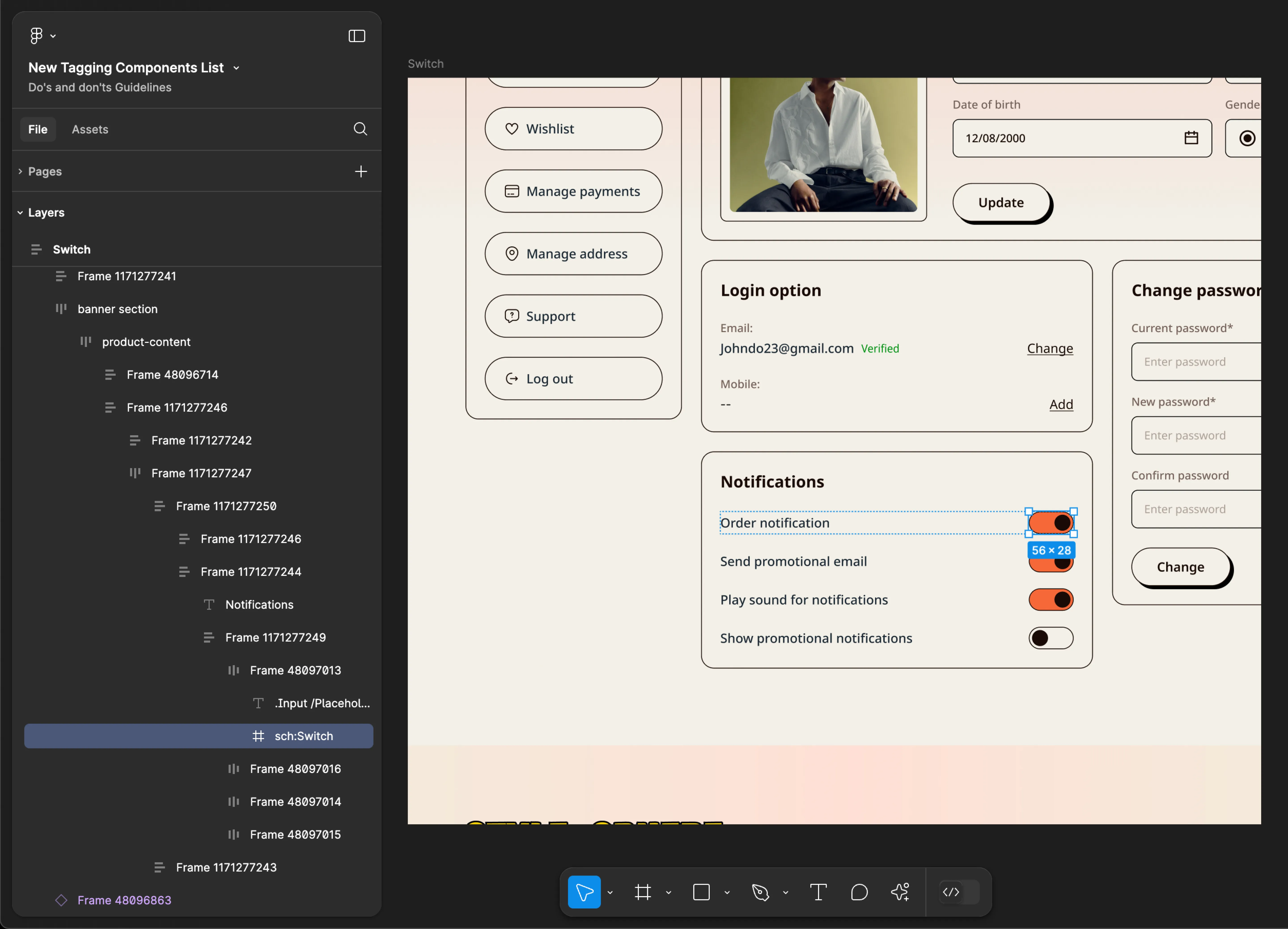
Switch
- Mobile
- Web
Tag name: Switch
Format: {Group or Frame name} + “:" + Switch
Example: Notifications Toggle:Switch
Tag name: Switch
Format: {Group or Frame name} + “:" + Switch
Example: sch:Switch
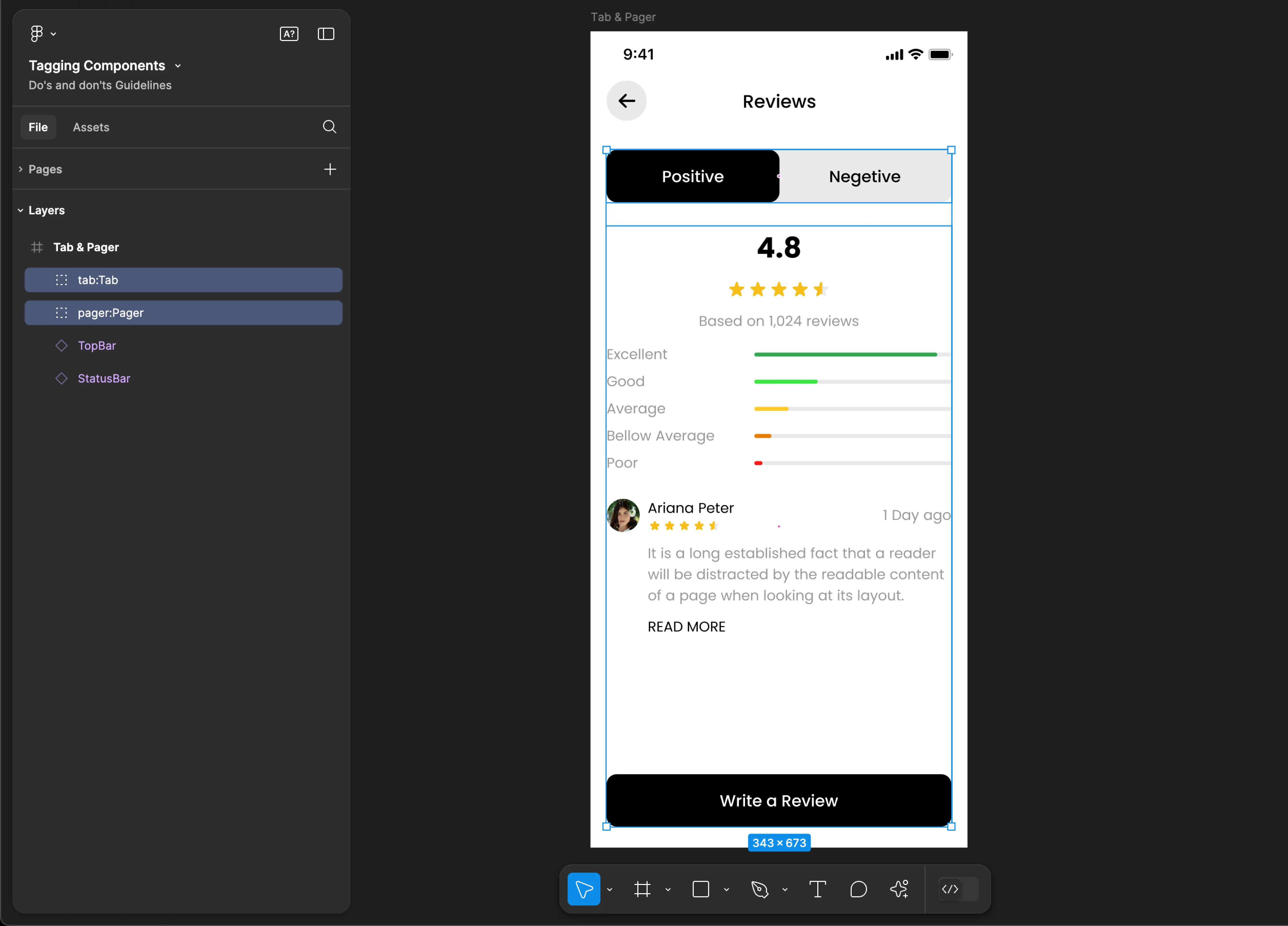
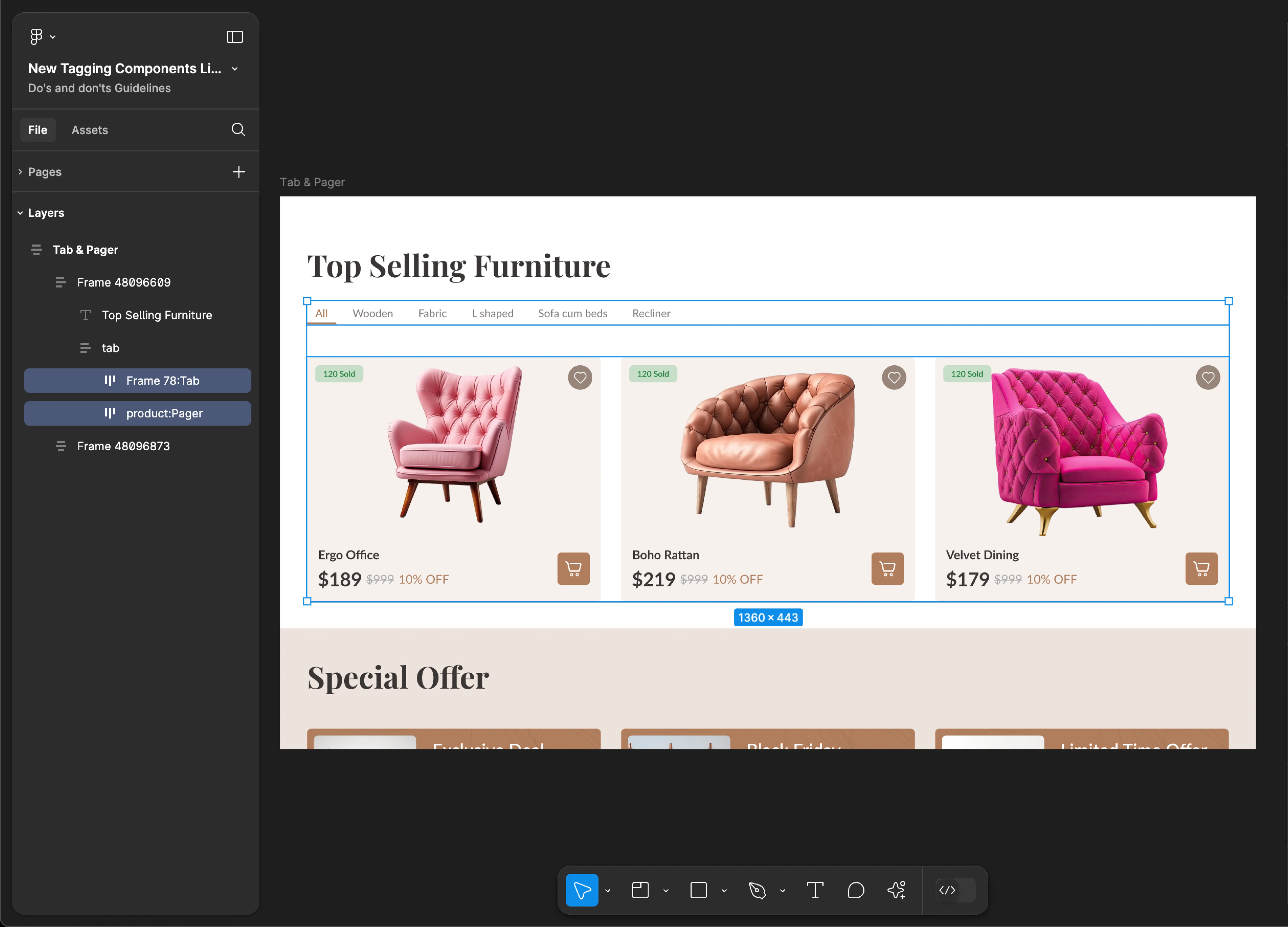
Tab & Pager
Use Tab & Pager tags together for accurate component identification. Using only one of these tags may result in inaccuracies and incomplete component recognition.
- Mobile
- Web
Tag name: Tab
Tag name: Pager
Format:
{Group or Frame name} + “:" + Tab
{Group or Frame name} + “:" + Pager
Example:
tab:Tab
pager:Pager
Tag name: Tab
Tag name: Pager
Format:
{Group or Frame name} + “:" + Tab
{Group or Frame name} + “:" + Pager
Example:
Frame 78:Tab
product:Pager
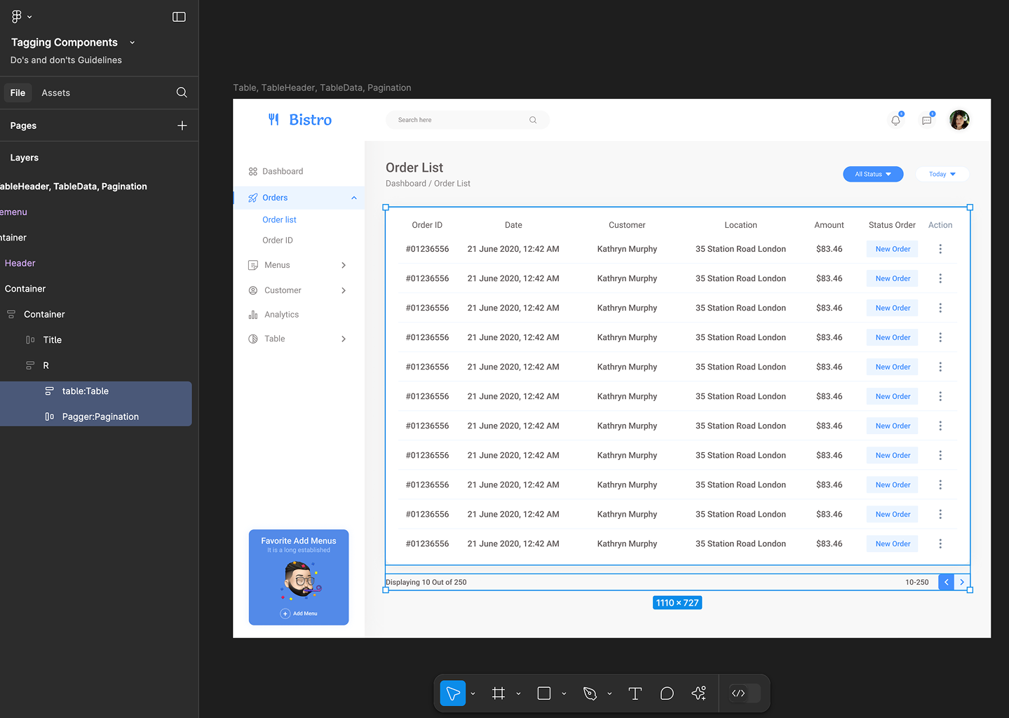
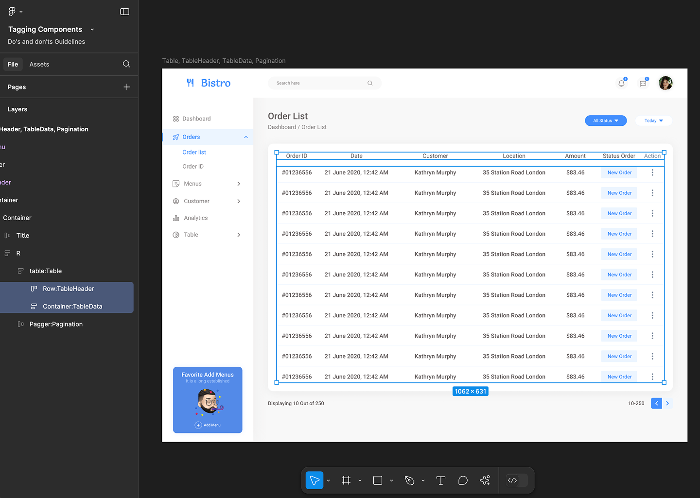
Table, TableHeader & TableData
Table, TableHeader & TableData tagging is not supported for mobile applications.
Before you tag Table, it is suggested to follow the design guidelines for Table to get better design accuracy.
Use Table, TableHeader & TableData tags together for accurate component identification. Using only one of these tags may result in inaccuracies and incomplete component recognition.
Tag name: Table
Format: {Group or Frame name} + ":" + Table
Example: table:Table
Tag name: TableHeader
Format: {Group or Frame name} + ":" + TableHeader
Example: Row:TableHeader
Tag name: TableData
Format: {Group or Frame name} + ":" + TableData
Example: Container:TableData
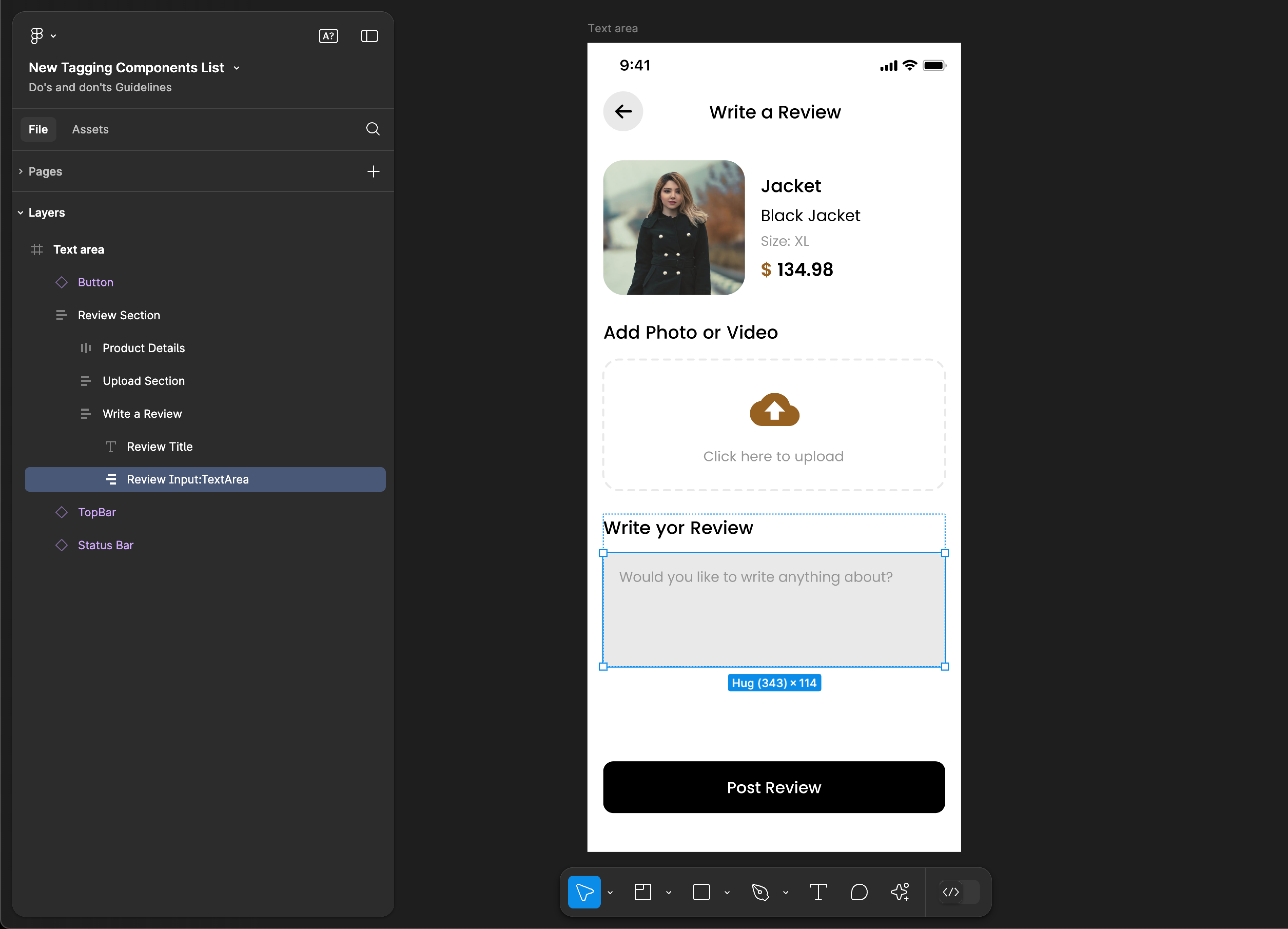
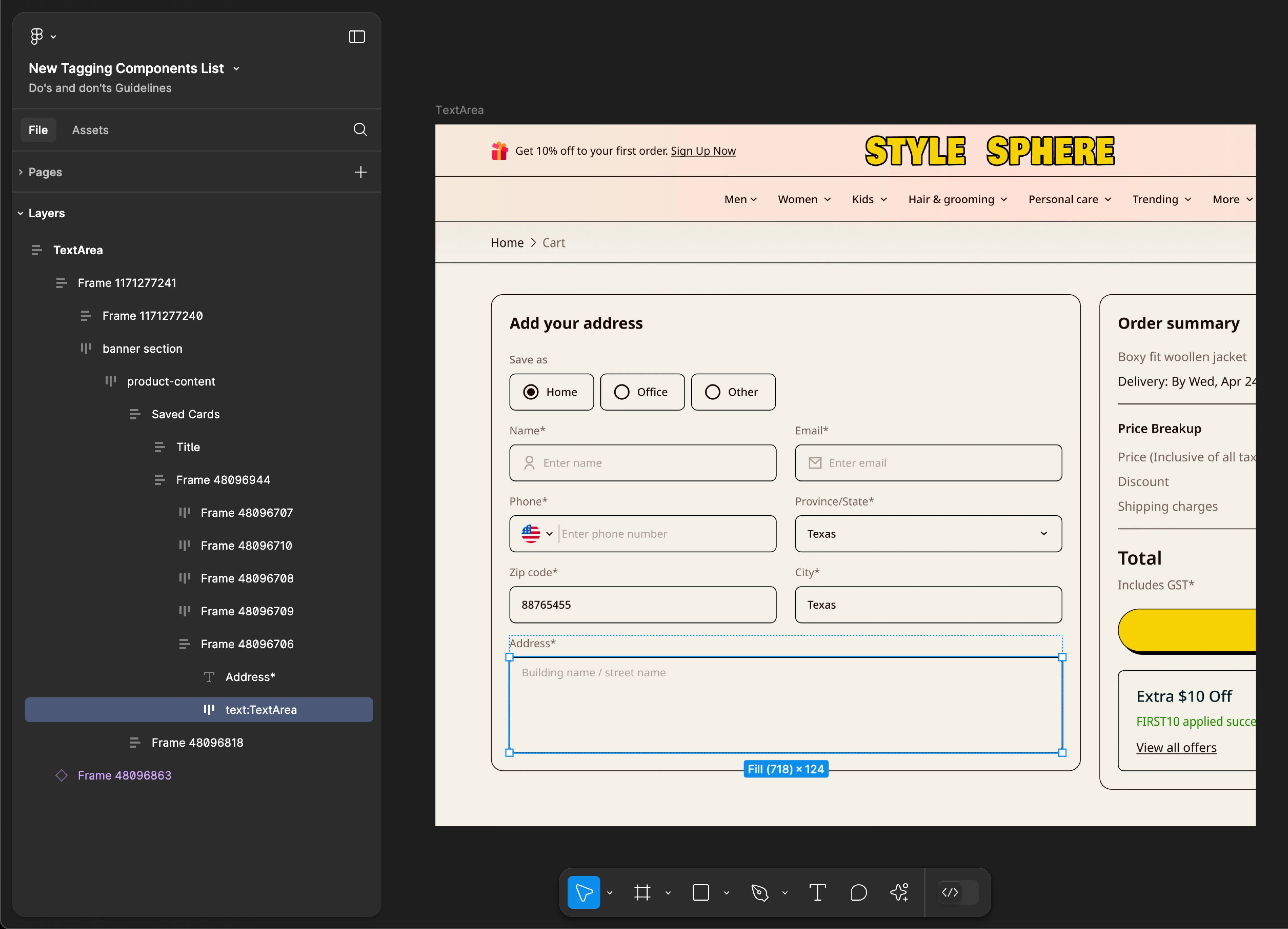
TextArea
- Mobile
- Web
Tag name: TextArea
Format: {Group or Frame name} + “:" + TextArea
Example: Review Input:TextArea
Tag name: TextArea
Format: {Group or Frame name} + “:" + TextArea
Example: text:TextArea
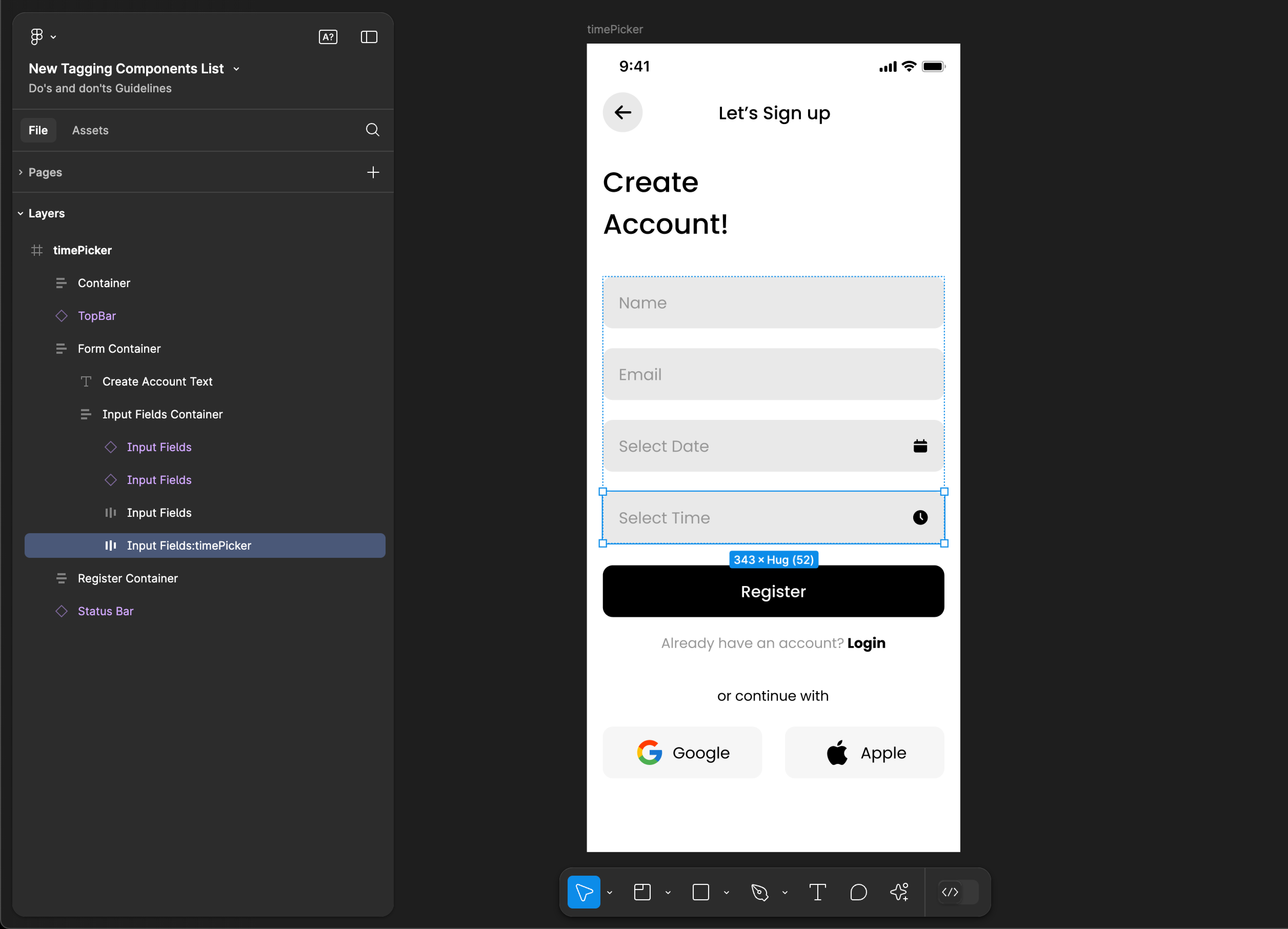
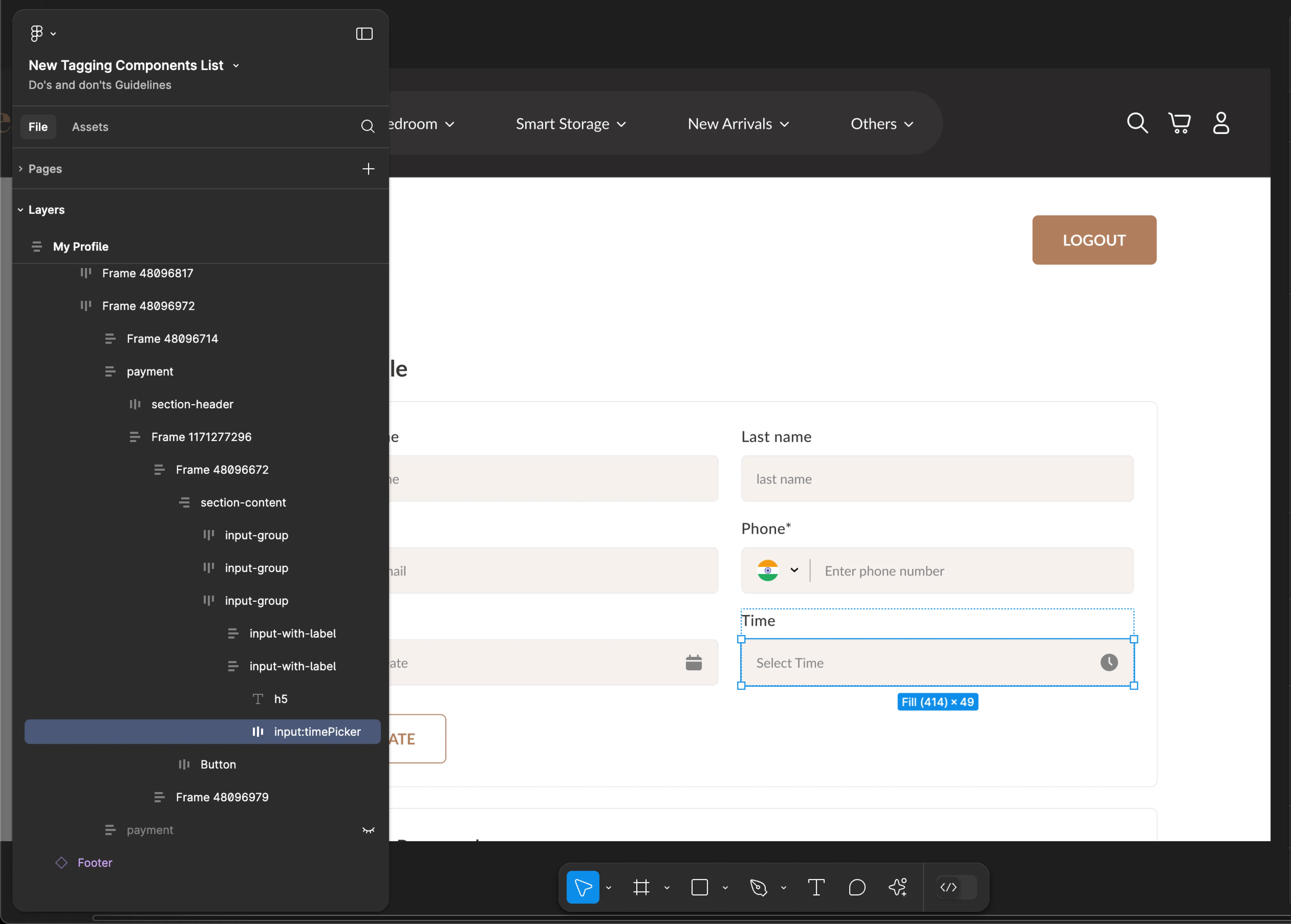
timePicker
- Mobile
- Web
Tag name: timePicker
Format: {Group or Frame name} + “:" + timePicker
Example: Input Fields:timePicker
Tag name: timePicker
Format: {Group or Frame name} + “:" + timePicker
Example: input:timePicker
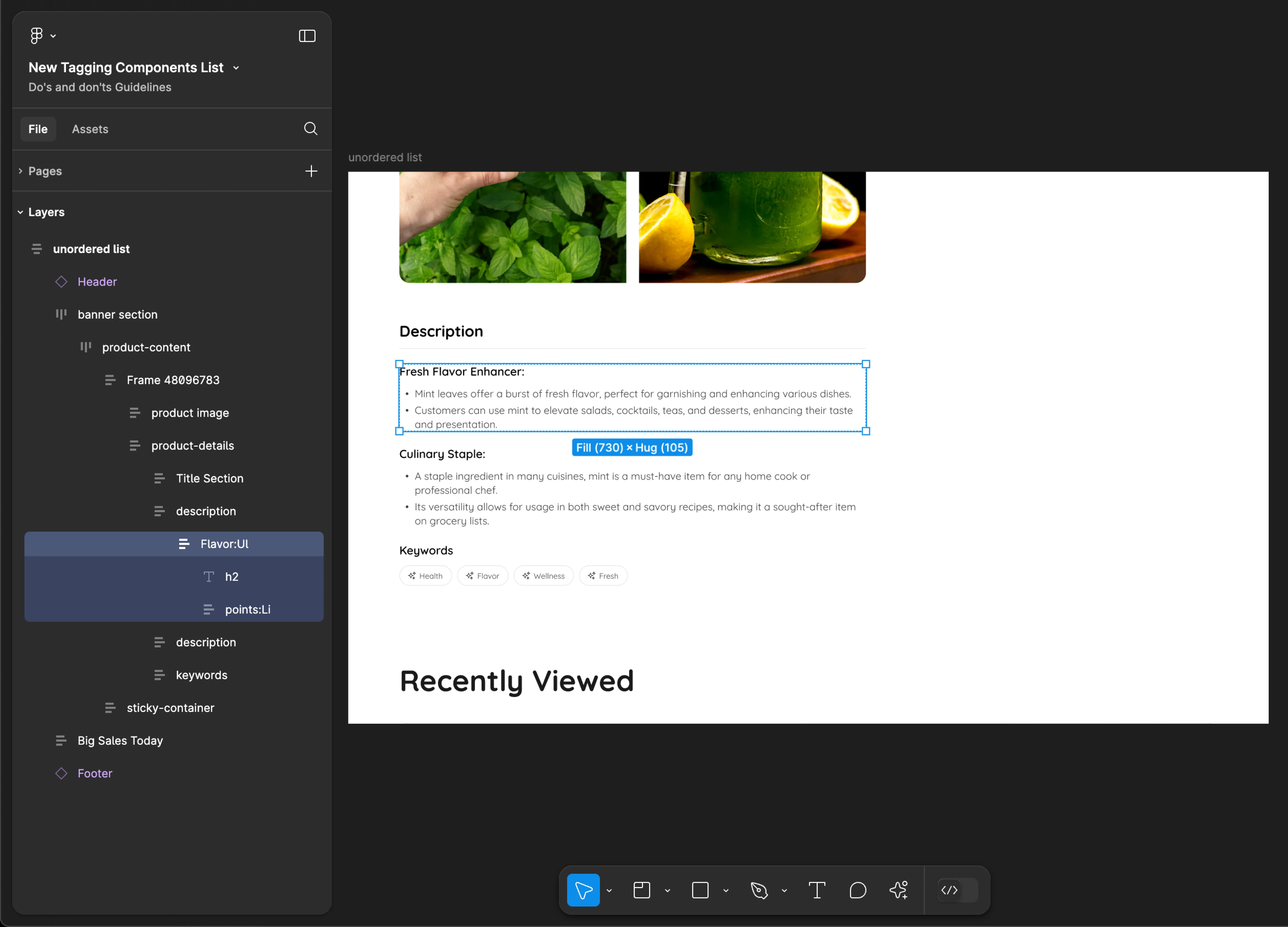
UnorderedList
UnorderedList tagging is not supported for mobile applications.
Tag name: Ul
Format: {Group or Frame name} + “:" + Ul
Example: Flavor:Ul
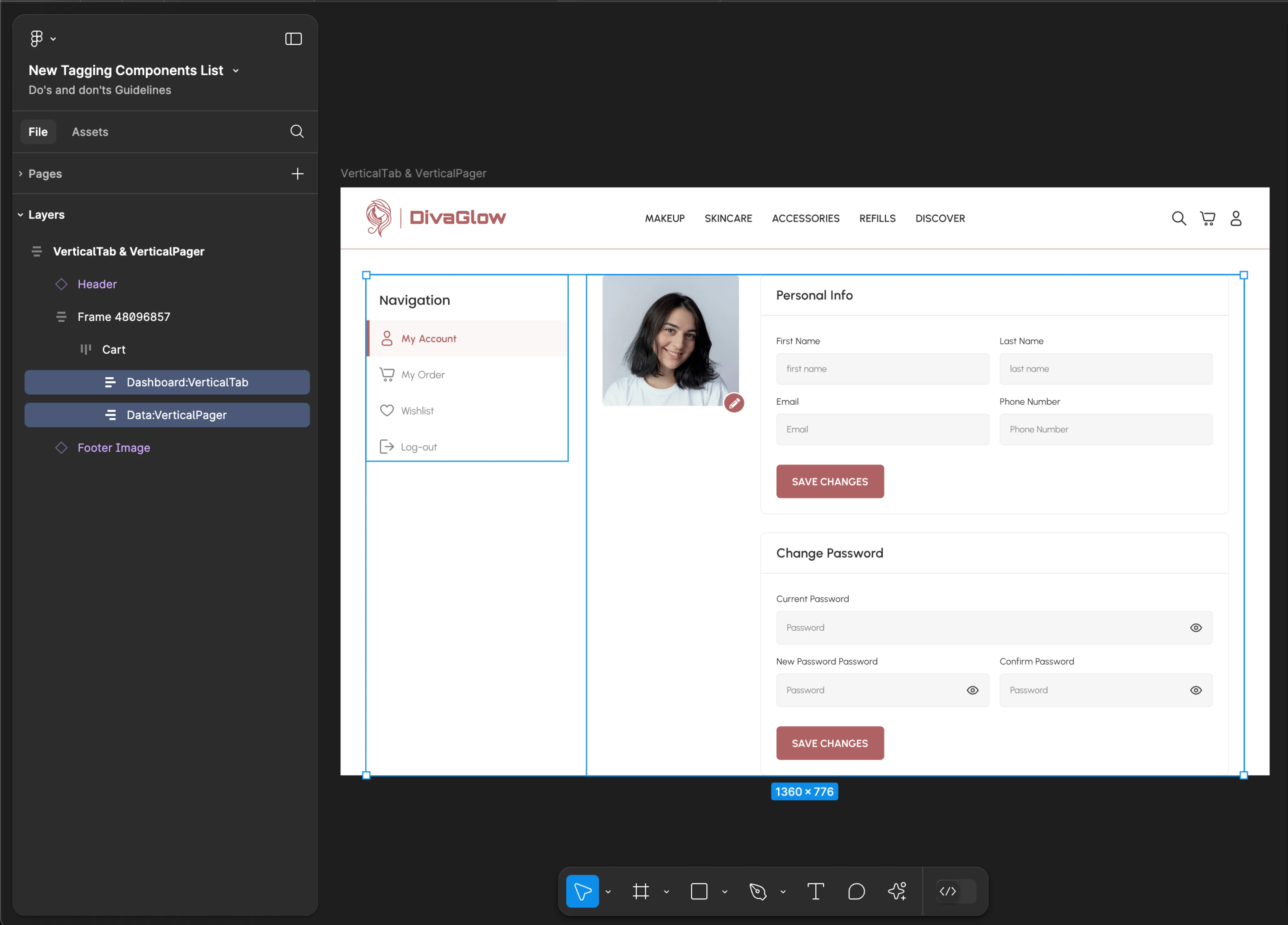
VerticalTab & VerticalPager
VerticalTab & VerticalPager tagging is not supported for mobile applications.
Use VerticalTab & VerticalPager tags together for accurate component identification. Using only one of these tags may result in inaccuracies and incomplete component recognition.
Tag name: VerticalTab & VerticalPager
Format:
{Group or Frame name} + “:" + VerticalTab
{Group or Frame name} + “:" + VerticalPager
Example:
Dashboard:VerticalTab
Data:VerticalPager
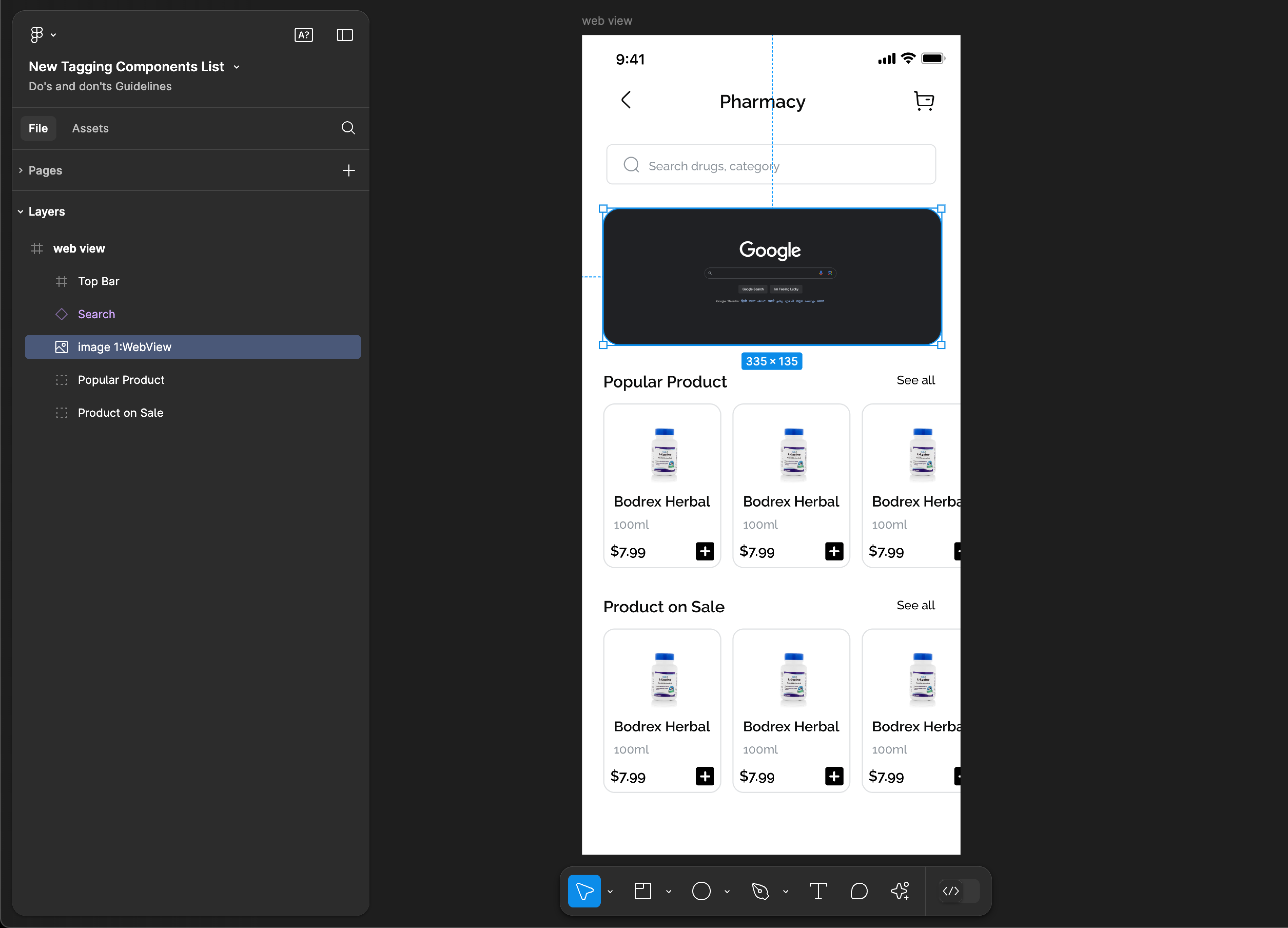
WebView
WebView tagging is not supported for web applications.
Tag name: WebView
Format: {Group or Frame name} + “:" + WebView
Example: image 1:WebView