Input Controls
Input controls are used in the app’s user interface to take user inputs, which makes it interactive to use and are commonly used in screen design. Refer to specific component guidelines while designing it in Figma to get them correctly identified in DhiWise.
While designing any component, use Frame as its background base to easily identify the component.
TextField
Generally, TextField has an optional referencing text on top with a name that says which type of field it is and a field to enter an input below with a hint text for reference inside it.
TextField must be designed using Frame. You may refer to the below TextField's hierarchy.
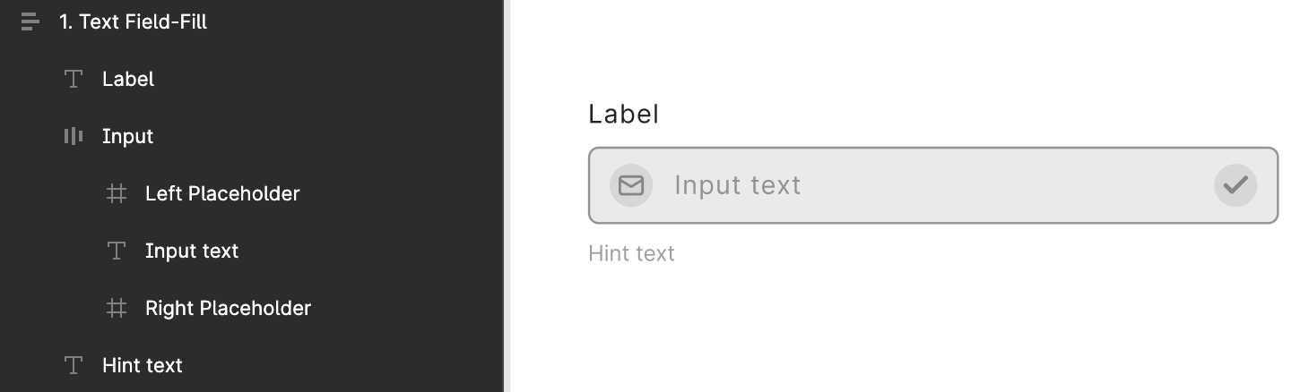
The Rectangle and the Text above it must be placed in a proper hierarchy, with text on top followed by the rectangle with its hint text as shown below.
Also, manage proper layering while designing TextField, to get it identified in your application.
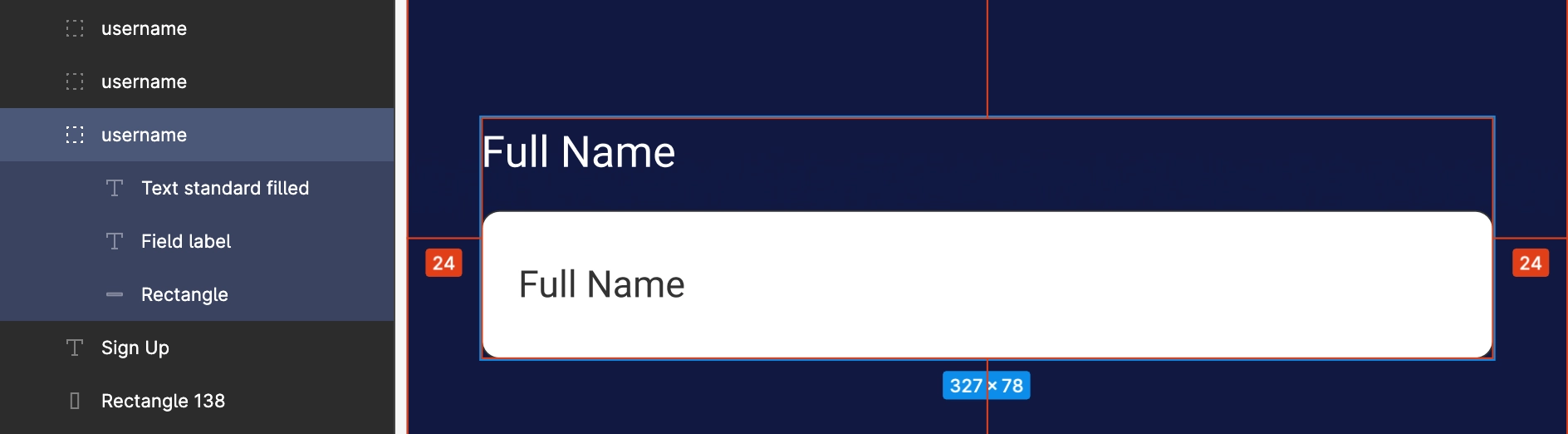
As shown above, Full Name field is managed inside a single group with its main text, hint text, and input field rectangle are all placed inside a single group.
FloatingTextField
FloatingTextField must be designed using Frame.
Outline case
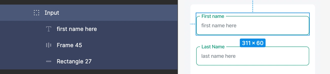
FloatingTextField designed with an outline must have the main text included within the outline, and the hint text for it must be inside the outline, as shown below First name is the main text, and first name here is the hint text.
Filled case
The FloatingTextField with a filled case must have a filled rectangle with the two texts inside, and the filled rectangle should only have the top two corners rounded and normal bottom corners with an outline at the bottom.
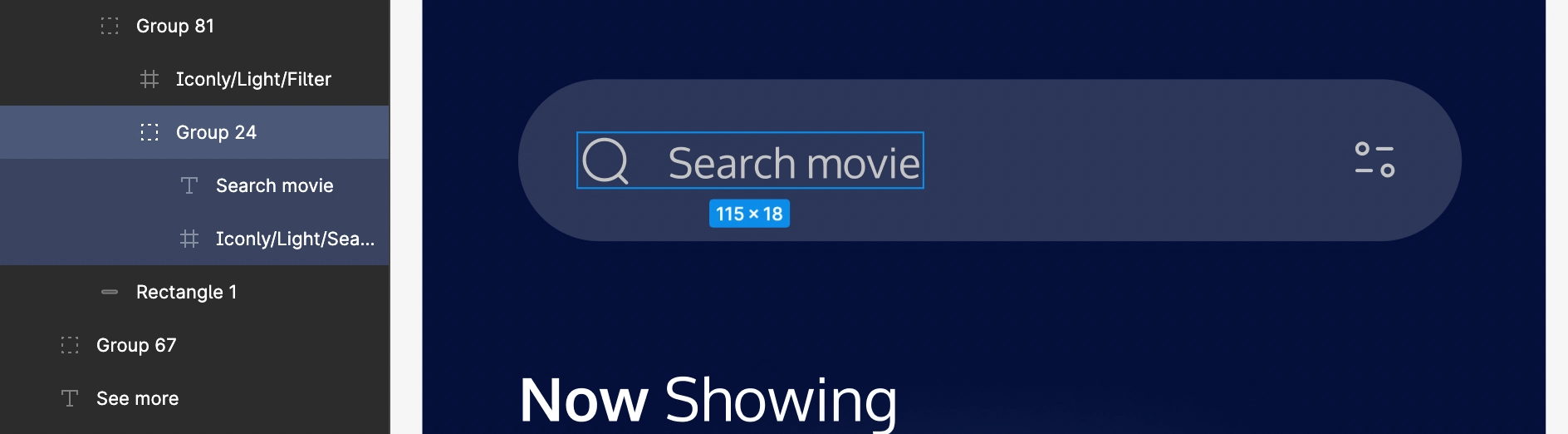
SearchView
For Search view, use Frame as a root element inside which its child element resides.
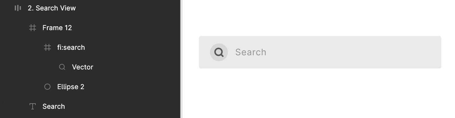
OR it must have a Group with a search icon and a related text inside it.
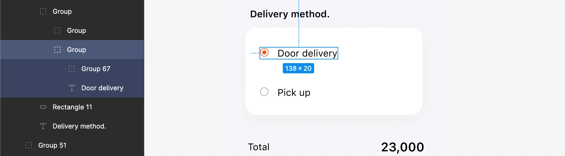
Radio
Circular shape for Radio must be designed using Ellipse only.
If multiple Ellipses exist, place them all in one group for a better design hierarchy.
Use Frame as a root element to design a Radio.
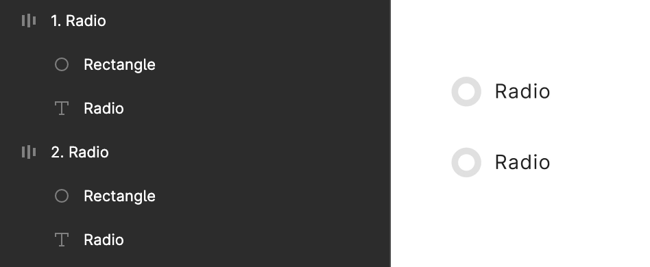
Radio’s Ellipse and Text should be in a proper group as below.
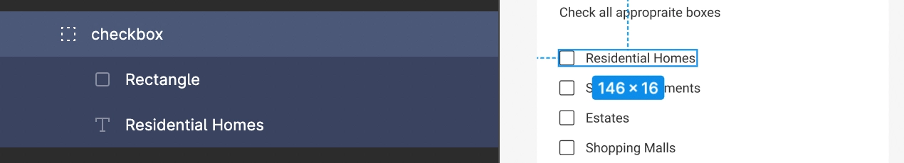
Checkbox
Use Frame as a root element to design a Checkbox.
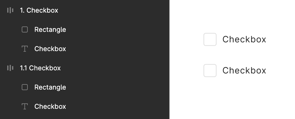
Checkbox’s box must be designed using Rectangle only. Box shape and its Text should be in a single group.
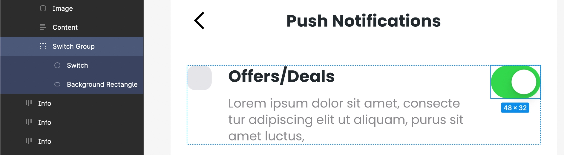
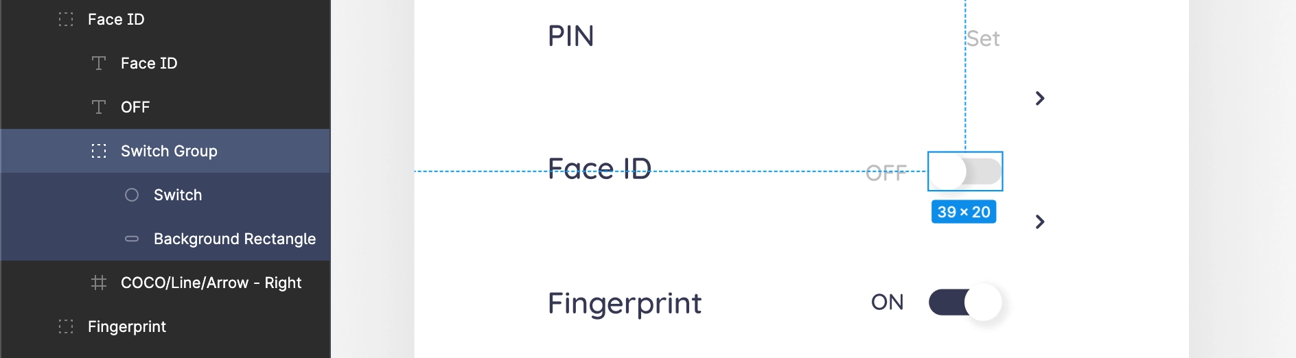
Switch
A Switch is a two-state user interface element used to toggle between ON or OFF states. Typically, it is a button with a thumb slider that the user can drag back and forth to choose an option inside its rectangle background.
Use Frame as a root element to design a Switch, and a Group to maintain its inner children, as shown below.

Switch having a text in its background rectangle is not supported. The color of the Switch and its background rectangle should not be the same.
Inside thumb case
If the button for the switch in the thumb slider is designed inside the background rectangle area, then it should lie in the inner area of that background entirely.
Outside thumb case
If the button for the switch in the thumb slider is designed bigger than the background rectangle area, it should be bigger but must lie on the area of the rectangle background.
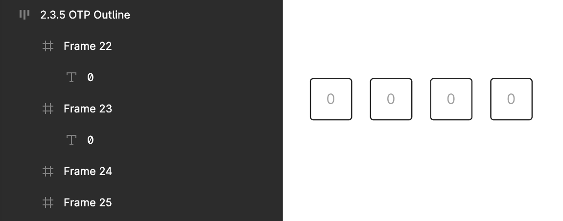
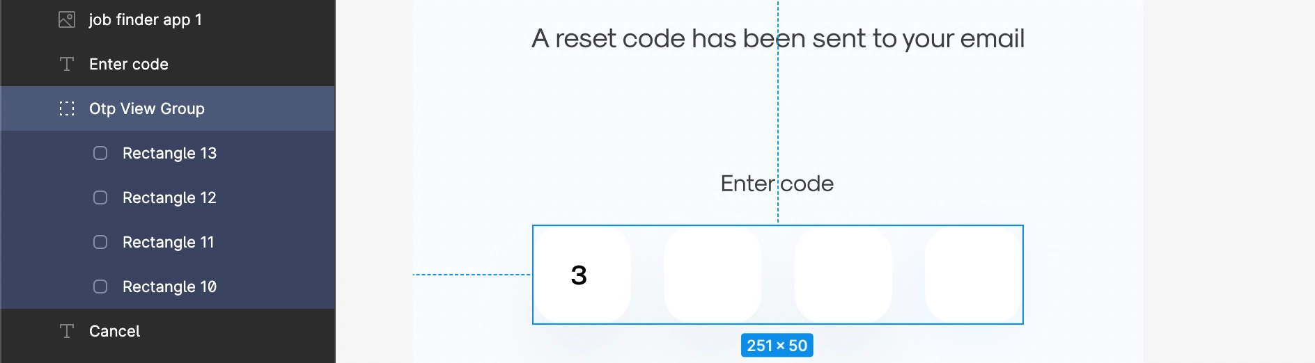
OTPView
OTPView should have at least four and a maximum of six views which are used to enter the value for the OTP code. These views must be aligned with each other and placed in the center of the screen design.
Reference 1: Use Frame to design the views of the OTPView, as shown below.
Reference 2: Below is the OTP View Group with four input views, which are all inside a single group, aligned with each other, and set in the center of the screen.
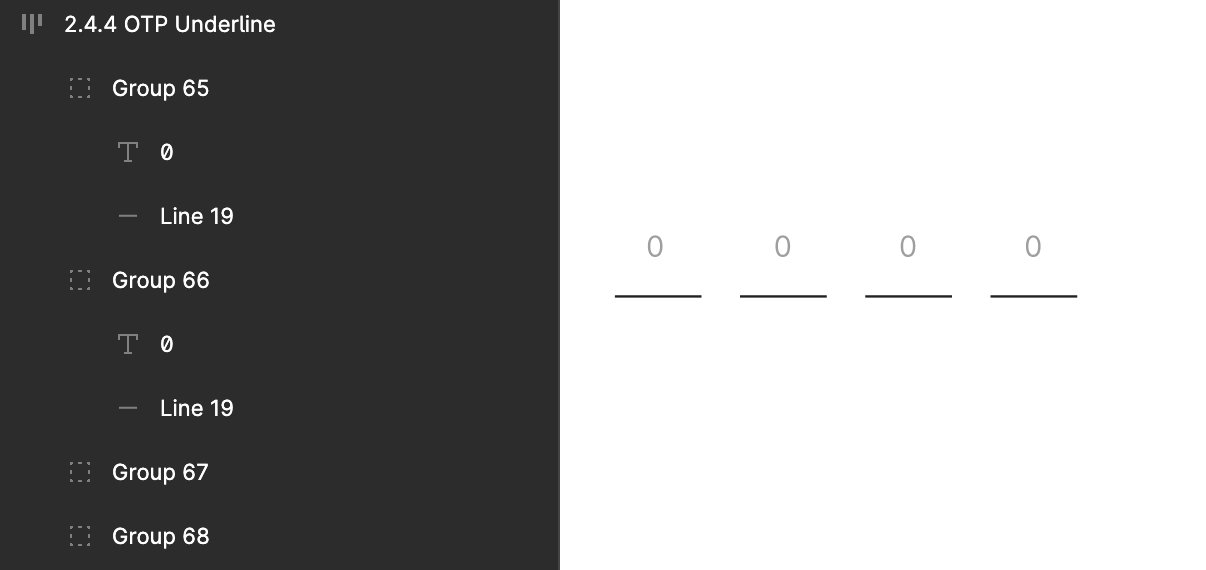
Underline case
Input views must be designed using Line for all the input values of an OTP view, aligned with each other, and placed in the center of the screen inside a single group, as shown below.
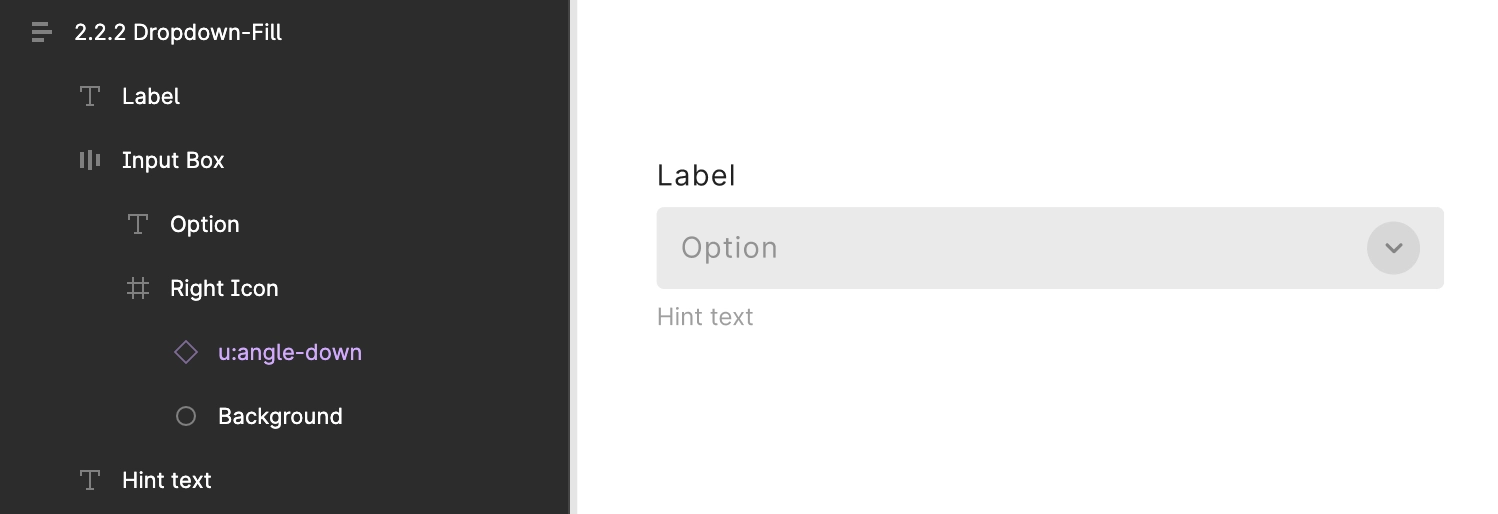
Dropdown
A single group for dropdown with an arrow facing the bottom direction on the right, and the main text or hint text attached with it.
Reference: Below is a dropdown with the main text as City and the hint text as Select City, and an arrow on the right, all inside a single group.
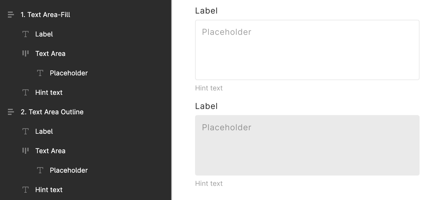
TextArea
TextArea is used to get a text input with multi-line.
For TextArea use Rectangle and Text inside it as a hint text to get it easily identified in DhiWise.
PhoneNumberInput with CountryPicker
PhoneNumberInput identification is not supported for web applications.
A PhoneNumberInput with a picker to select a country from a list of countries or a country code for a phone number input.
While designing the CountryPicker, all its inner components must be inside a Group, and its design should follow all the below criteria;
Use the country flag and a bottom facing arrow, or use a bottom facing arrow and ISO code of the country both placed near to each other, as shown below.
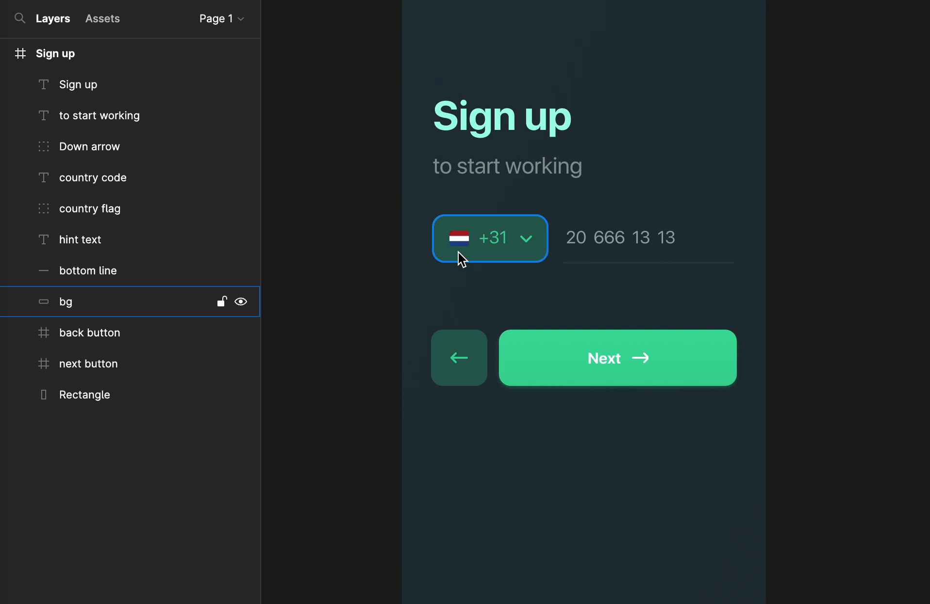
For PhoneNumberInput's Text on right, a placeholder should be added which can be a number or a hint text.
Lastly, wrap the Group with a background color or a line at the bottom of it, or the hint text as shown in above GIF.
Got a question? Ask here.