Display Controls
Display controls are used to display the results related to the data on the screen. They give information like progress, display lists, images, etc. Refer to specific component guidelines while designing it in Figma, to get them correctly identified in DhiWise.
While designing any component, use Frame as its background base to easily identify the component.
List
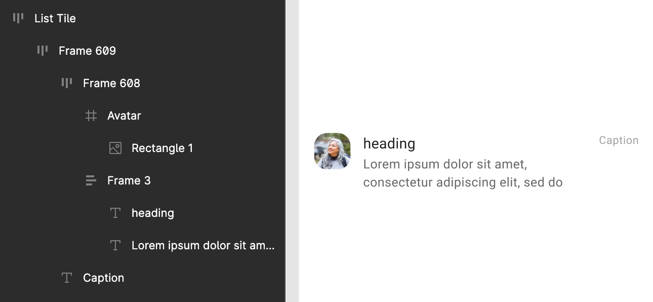
The List should be designed as a leading Frame or Group that contains all the list items inside it as individual similar-looking frames or groups.
All the components for the List item should look common in design and used on the screen.
As seen below, for a single item, the heading and its description are placed in a single Frame while, the Caption and the image below in the other Frame.
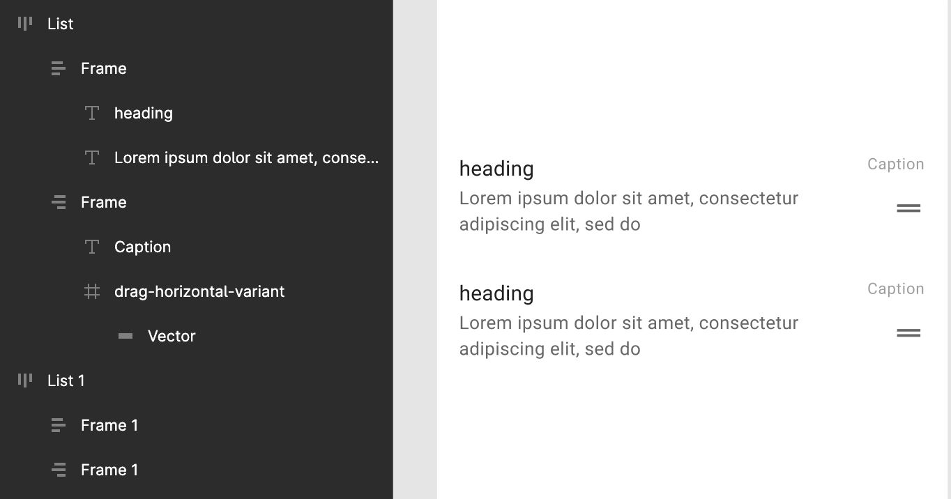
Here, a leading Frame is used inside which all the inner components are placed in different sub-frames for avatar, text and right-most text.
Grid
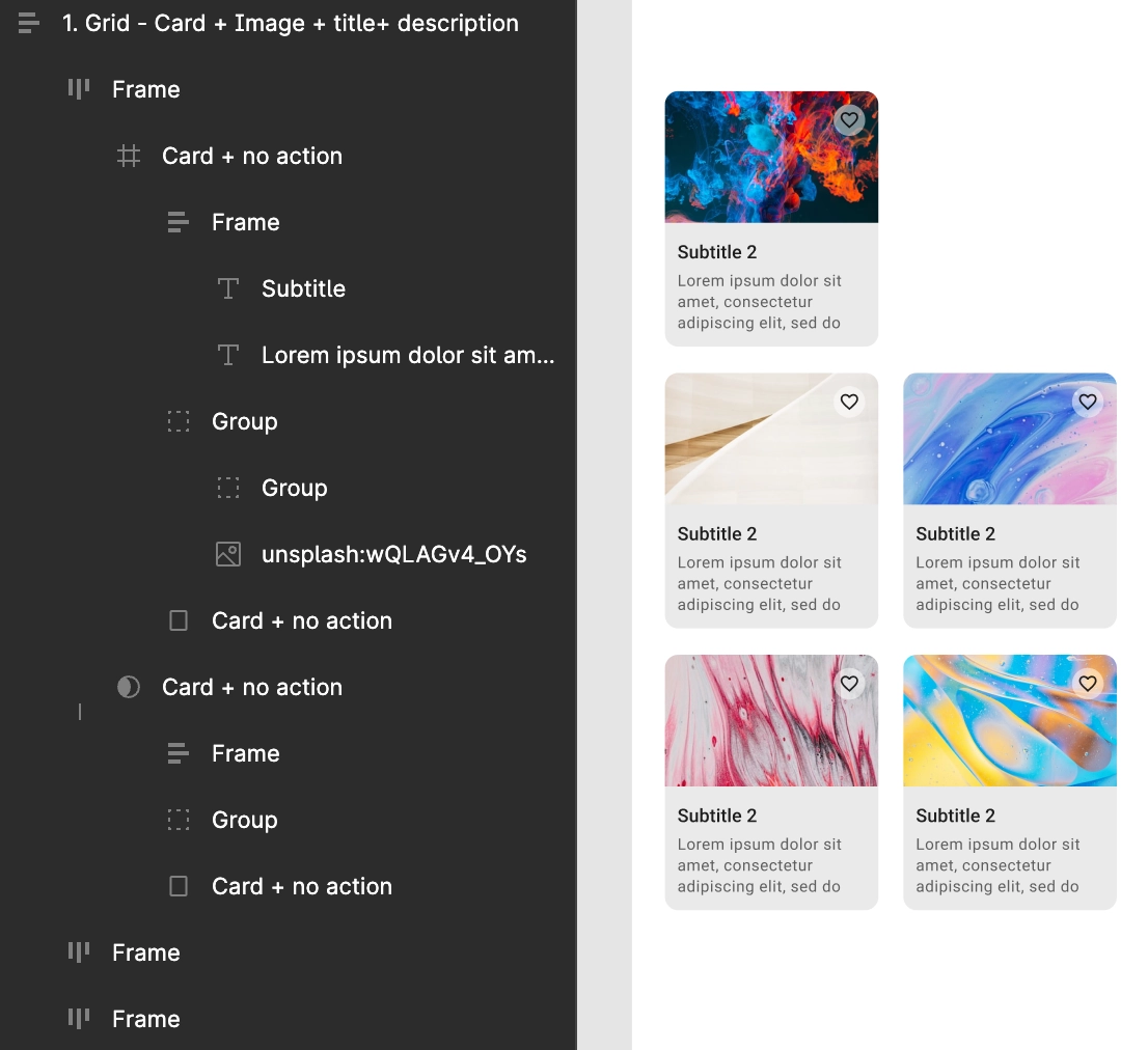
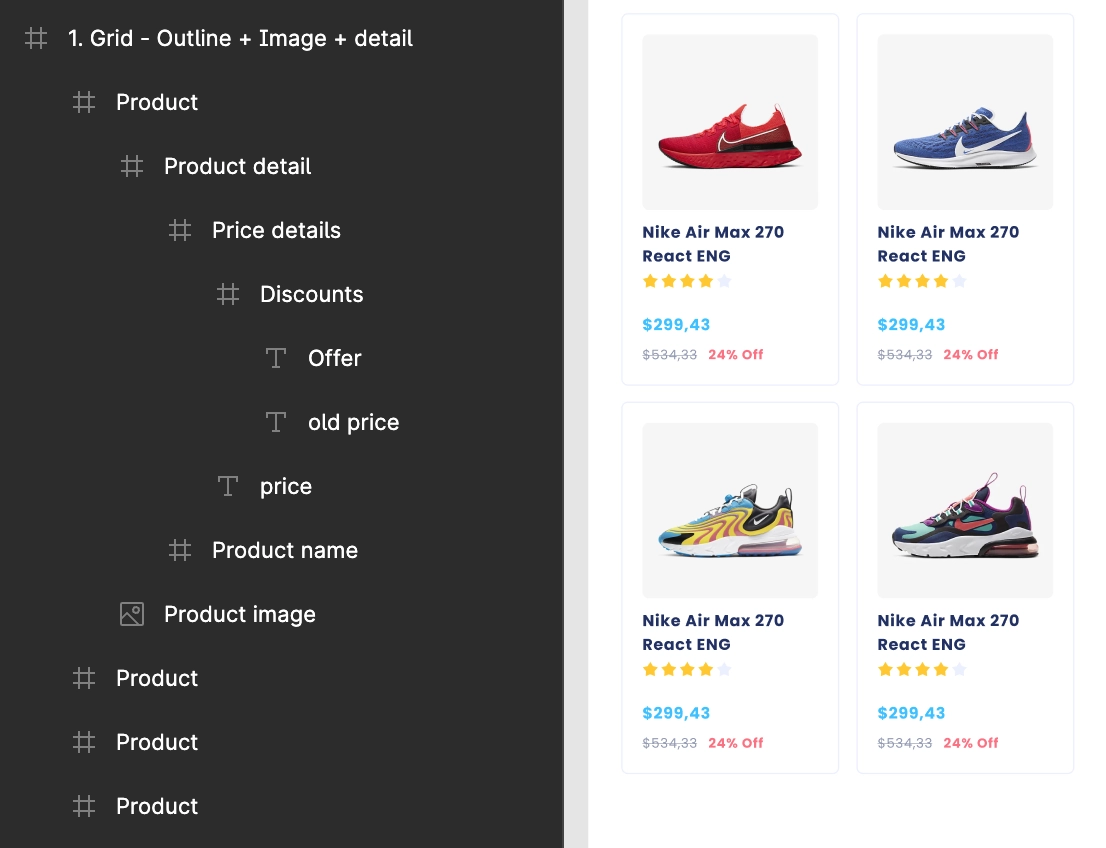
The Grid should be designed as a leading Frame or Group that contains all the Grid items inside it as individual similar-looking frames or groups.
All the components for the Grid item should look common in design and used on the screen.
As seen below, two frames are maintained for the Grid item's Image and its Name and Description.
Here, a leading Frame is used inside which all the inner components are placed in different sub-frames for Product image, name and details.
Staggered Grid
Design must have one or more items for staggered items with different height of each of them, else staggered grid would not be identified.
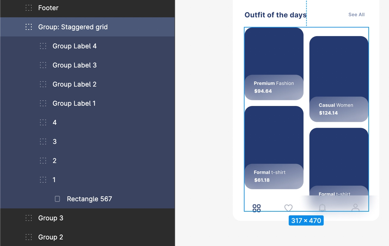
For images in a Staggered grid, as below, place them inside a single Frame or Group.
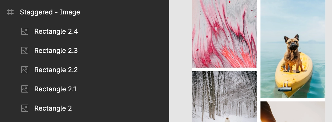
Keep the same design for all the staggered cells.
ChipView
All the chip elements must be inside one group, and each group must have a text with/without an icon on its left or right.
Every chip element should have the same alignment vertically, and the text width must be based on the text wrap according to the text size, so every chip differs from the other.
ExpandableList
List items should be placed in the proper group, which is a common cell in the list.
For expandable list, the design must include an icon that is in collapsed or expand mode.
Expand item must be placed in any part of the screen UI but not at the extreme bottom of the screen.
All the collapsed items should have the same design, as shown below;
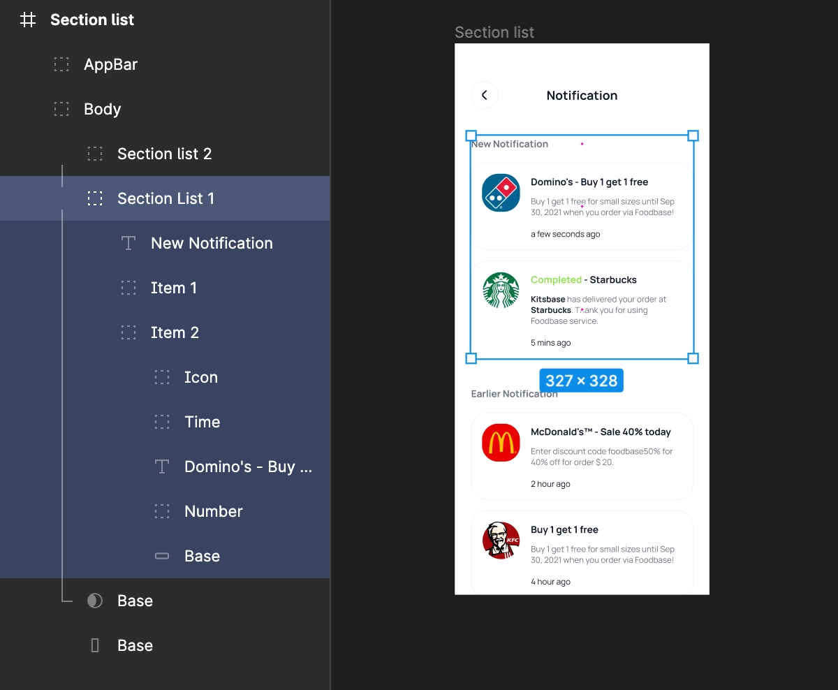
SectionList
A Section list has a header on top of every List and a following List below.
The design of the header should have at least one Text and its design must repeat similarly for every list's header.
For the Lists, at least one List must contain more than one cell inside it and the following cells and Lists must have a similar design hierarchy.
All the lists and their headers should be inside a single Group element.
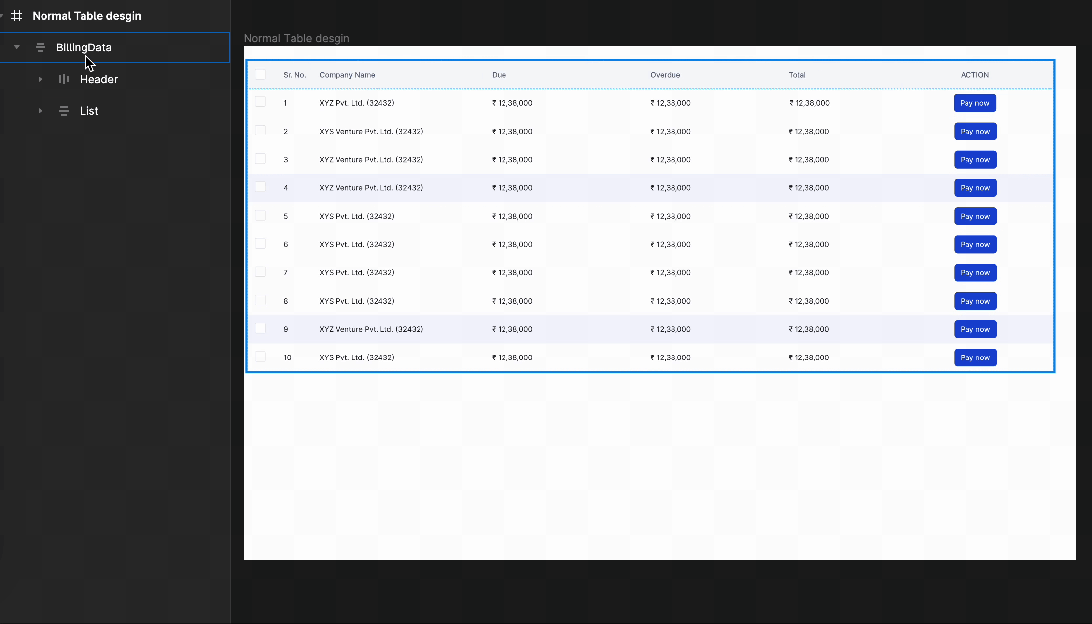
Table
The Table component allows you to display data in an organized manner using rows and columns in a tabular format.
Create a main group to organize Table design and manage two child objects inside it.
First child object should be the Table header,
Second child object should be the Table data containing all the child objects or the cell objects which has similar view. Here, make sure to place this child objects in a row or a horizontal format only.
Place the second child objects or Table data in a row or horizontal format only!
Useful Design Tips:
To get the best results, use the auto layout property to align and distribute table's objects.
Organize the table in a row or linear horizontal format for easy design structuring.
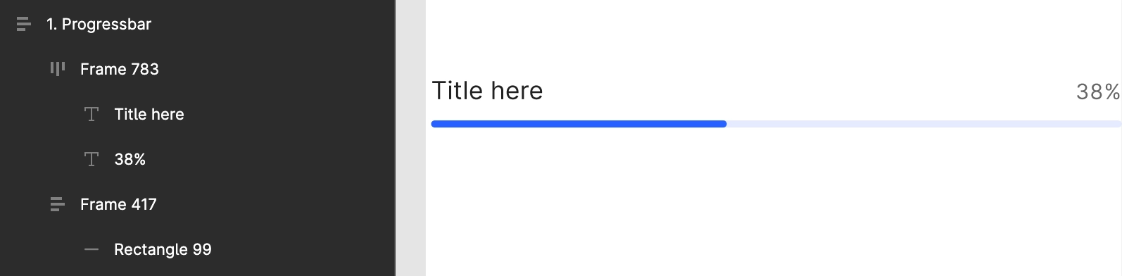
ProgressBar
Normal progress
Use Frame and Rectangle to design a normal progress bar, one to highlight the progress and the other for the progress background, as shown below.
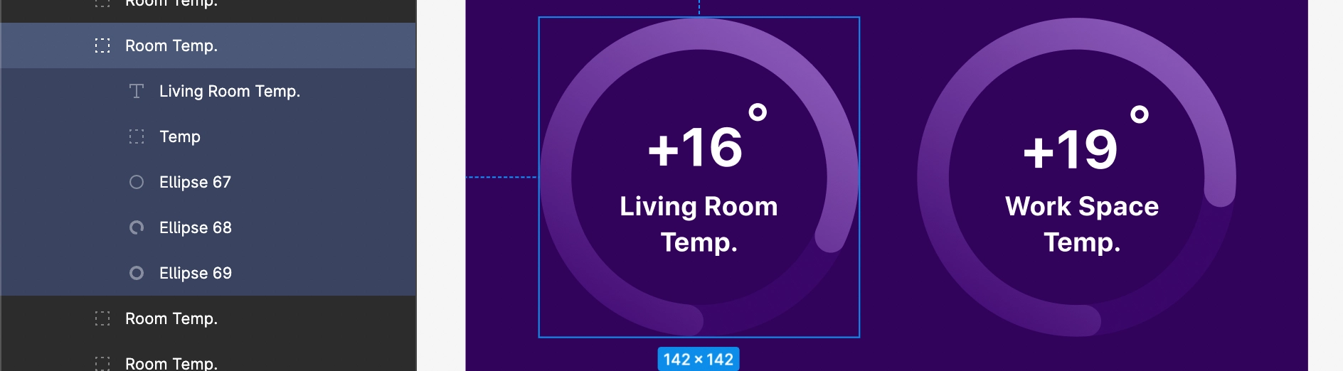
Circular progress
Use only Ellipse while designing circular progress, with the help of Arc tool in Figma.
SeekBar
SeekBar seems almost same as the ProgressBar just it has a thumb on it, which is used to change or show the progress value. The user can touch the thumb and drag left or right to set the current progress level.
While designing SeekBar, it should have a thumb and a Rectangle sliding bar.

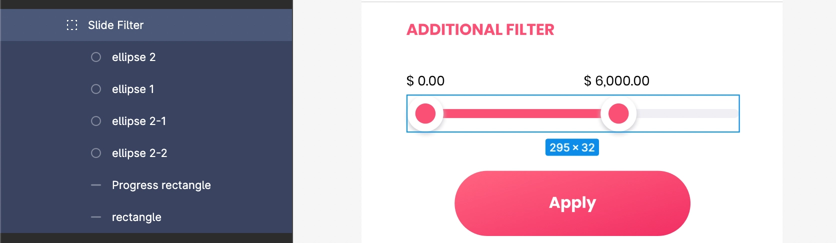
RangeSeekBar
RangeSeekBar is a custom SeekBar with two thumbs to set a specific range of progress.
Follow SeekBar guidelines priorly to design RangeSeekBar.
For its design, add two thumbs in the design using Ellipse and a proper Rectangle for its progress and background area to get it easily identified.
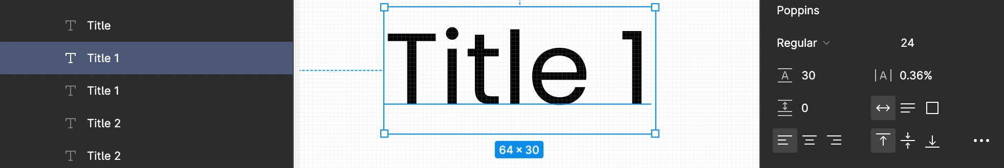
Text
Text element's width must be auto-width while designing it in the Figma file. So it will remain flexible in design.
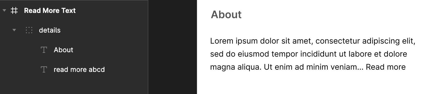
ReadMoreText
This element must be designed using the Text element whose text must contain Read More keywords in its description. Also, the Text can be multi-line with its width set as auto-width in Figma design.
ImageView
To design an image view use Vector, Rectangle , or Ellipse.
Only Vector should be used while designing icons for screen UI.
The vector elements or path of the Image must be in a single group, so its vector path is easily identifiable in the design hierarchy.
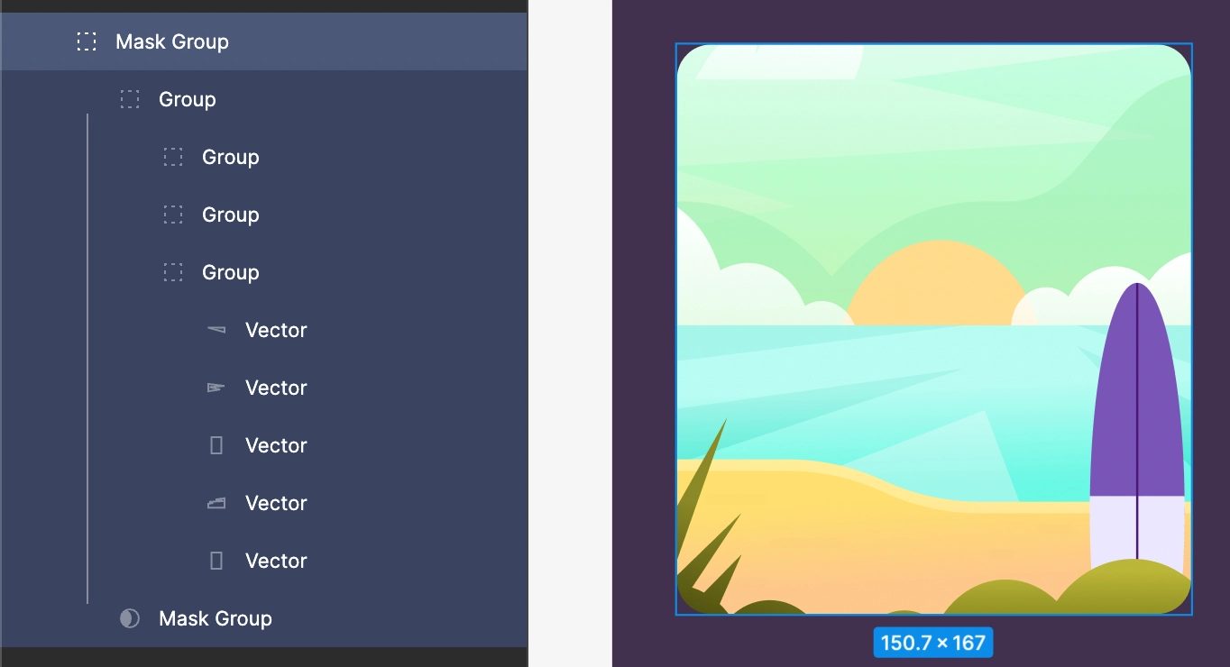
CircleImageView
To design a CircleImageView use Vector, Rectangle , or Ellipse.
Only Vector should be used while designing icons in screen UI and a proper image masking if needed to apply.
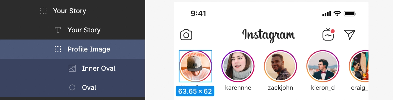
As shown above, the profile picture with the inner vector elements is grouped into one group, and Vector is used for designing the same.
Got a question? Ask here.