Navigation Controls
Navigation controls are implemented to help users interact within the app, which allows the user to navigate across, in, and out of the different areas in the app. Refer to specific component guidelines while designing it in Figma, to get them correctly identified in DhiWise.
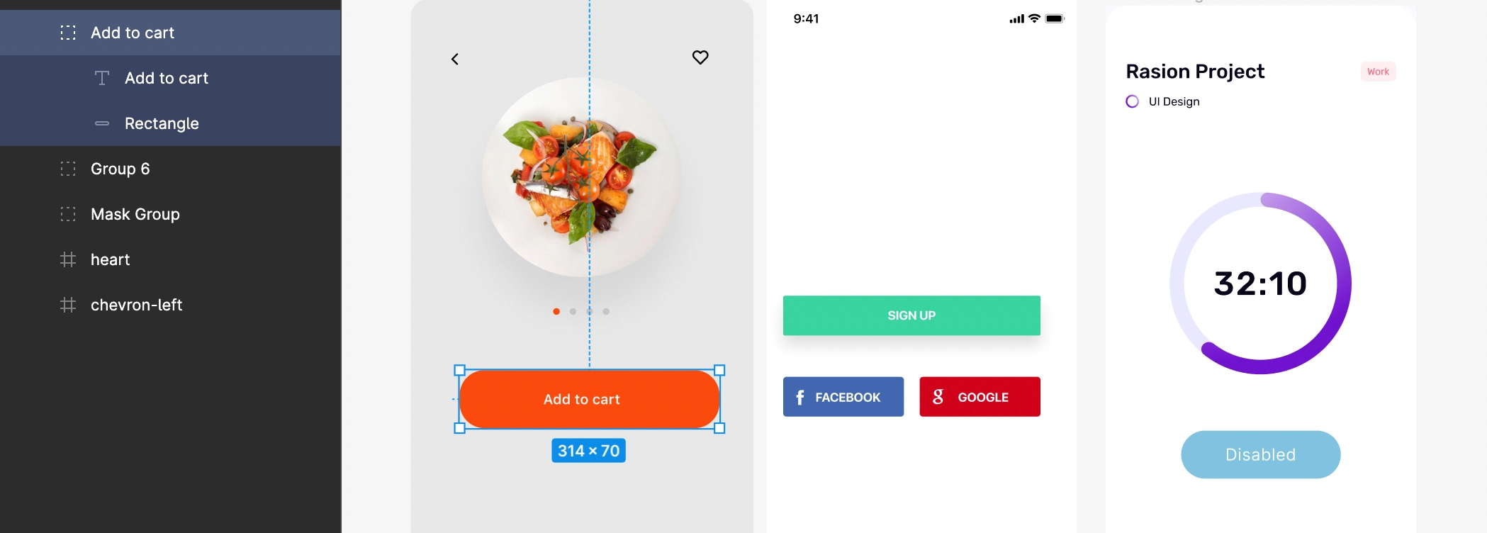
While designing any component, use Frame as its background base to easily identify the component.
Button
Button helps to communicate throughout the application. They are used to navigate across, trigger an event, etc. in the app.
Button’s text should be aligned to center only.
Text assigned to Button is suggested to keep exactly in the center of the Button. Button must be designed using Frame. You may refer to the below Buttons hierarchy.
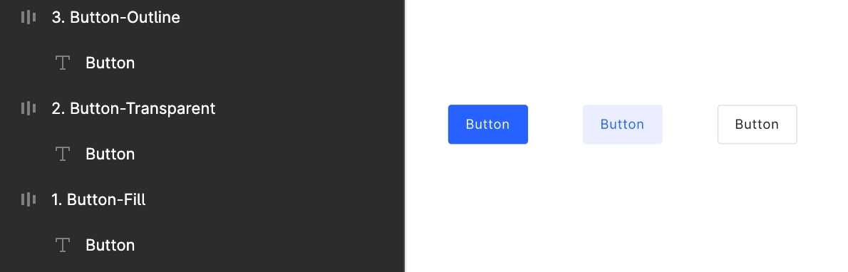
Multiple variants of Button are detected according to their shape and design, like normal rectangle buttons, full-width buttons, buttons with rounded corners, and one which is disabled, as shown below;
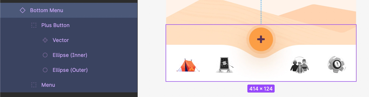
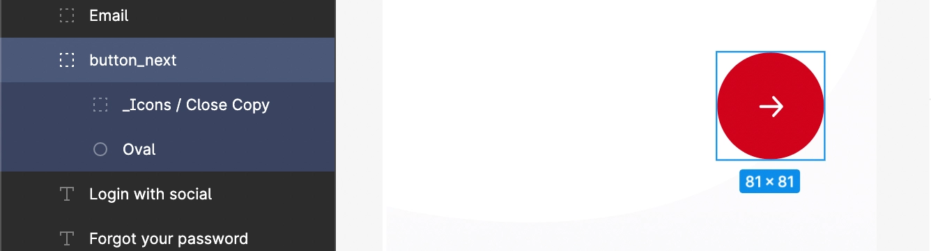
FloatingActionButton
FloatingActionButton (FAB) is circular shaped button that is floating above the UI and is used to trigger simple events.
FAB must be placed on the bottom part of the screen.
Floating action buttons are placed somewhere at the bottom of the screen UI, and it must be designed using the below elements.
| Element | Description |
|---|---|
| Ellipse | To make a circular button, use only ellipse |
| Image | An image with center alignment should be placed on the button |
| Background | The background color is required for Ellipse |
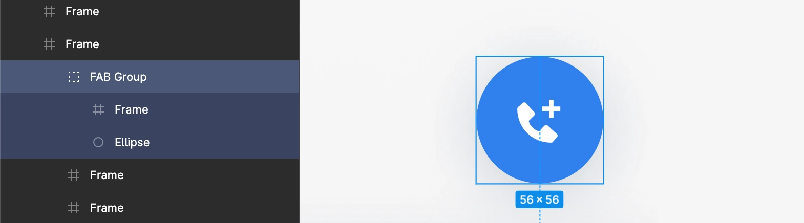
FloatingActionButton which is included in the BottomBar, should be grouped inside that particular bottom bar group.
IconButton
IconButton is one with an icon image on it, sometimes according to their functionality like that in phone call receive and end.
Icon buttons with circular, square, and rectangle with rounded corners shapes are all supported.
IconButton is placed wherever feasible in screen UI, but it must be designed using the below elements;
| Element | Description |
|---|---|
| Ellipse | To make a circular button, use only ellipse |
| Image | An image with center alignment should be placed on the button |
| Background | The background color is required for Ellipse |
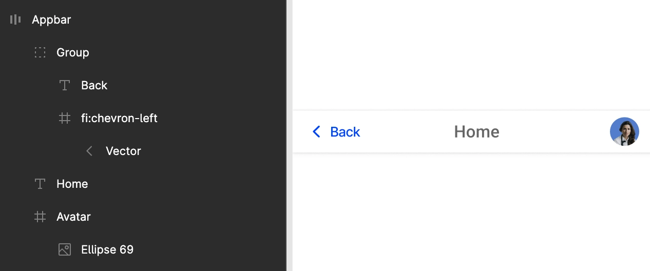
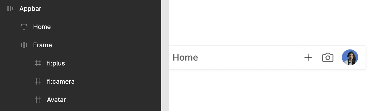
AppBar
AppBar must be placed in the top area of the screen.
It should cover screen’s full-width.
Use Frame while designing the inner child of the AppBar as shown below.
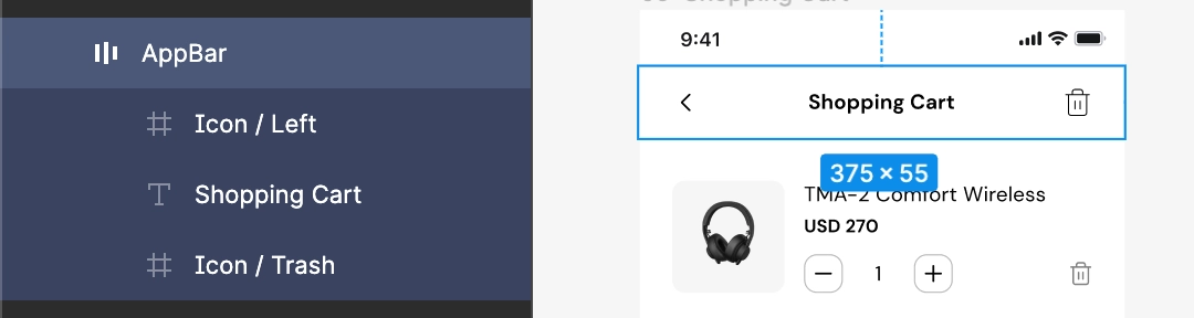
Refer below to some supported types of AppBar.
- Center title
- Actions
- Hamburger

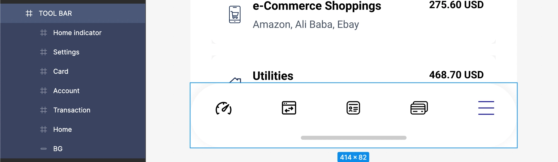
BottomBar
BottomBar should always be designed at the bottom of the screen, with the selected tab's color must be different from the unselected tabs in the group.
All the BottomBar inner components must be designed and placed inside a proper single group. The tabs of the BottomBar are auto-identified and attached with their related tab.
For example, with tabs Home, Transaction, Account, Card and Settings, all tabs must be designed inside a single group, which is named TOOL BAR here.
On click actions are set on all the tabs priorly. All the pages which are required to navigate on the click of each tab are auto-identified and attached to it.
Header
Header is the top element of a webpage.
For its design it should be designed in the top area of the page.
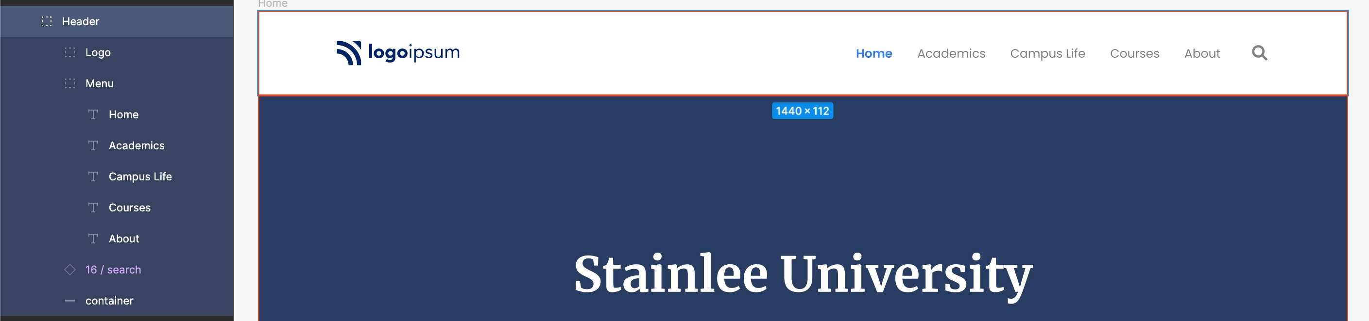
Header’s width should be atleast 60% of the page’s actual total width.
Footer
Footer is an area located at the exact bottom of every page, below the main body content.
There should be at least three Text inside the Footer content.
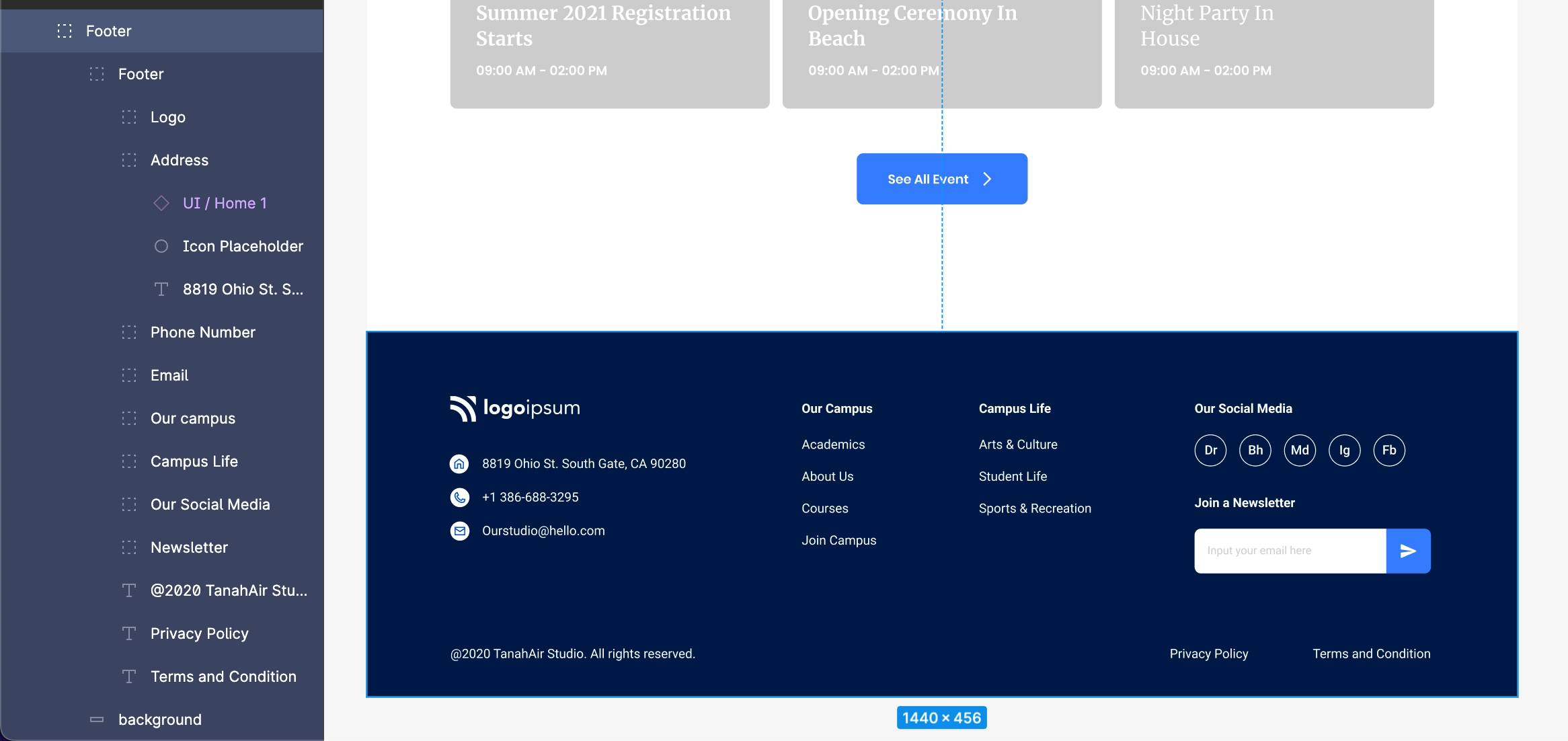
If other pages in the app has the same Footer design, then it is recommended to use the same design for every page.
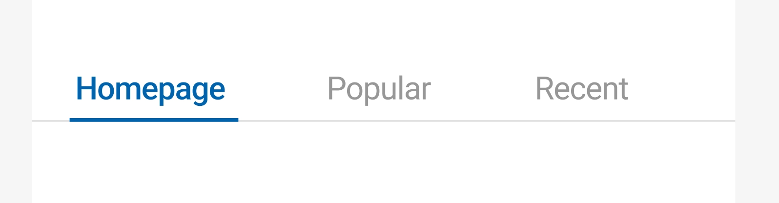
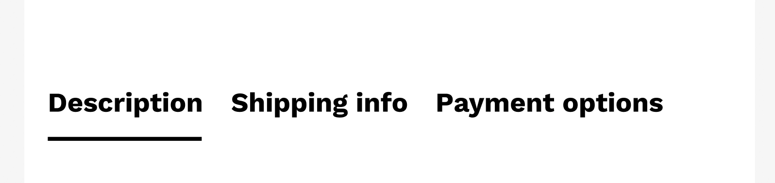
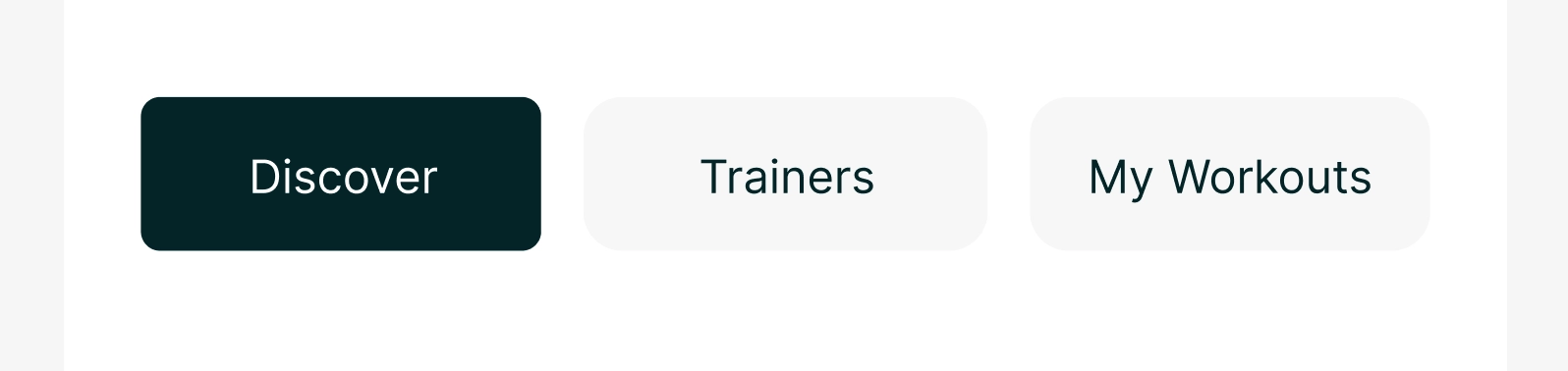
TabBar
Tabs organize and allow navigation between groups of content that are related at the same level of hierarchy.
Use the default Line element provided by Figma to design the Tab selection line.
Text and its selection line must be aligned together and should be in the tab group along with the use of Frame, as shown in the below hierarchy.
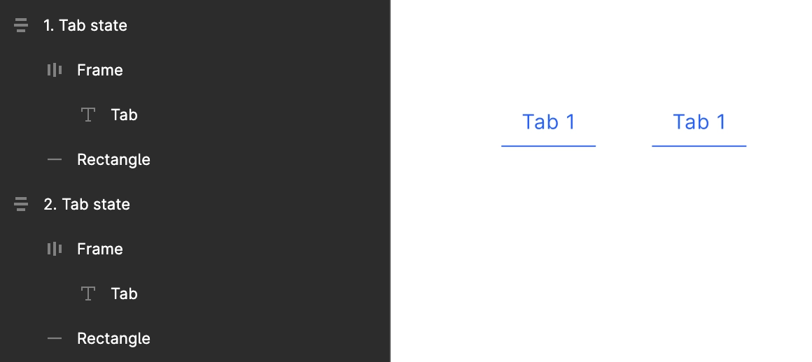
Multiple Tabs with an aligned Line below.
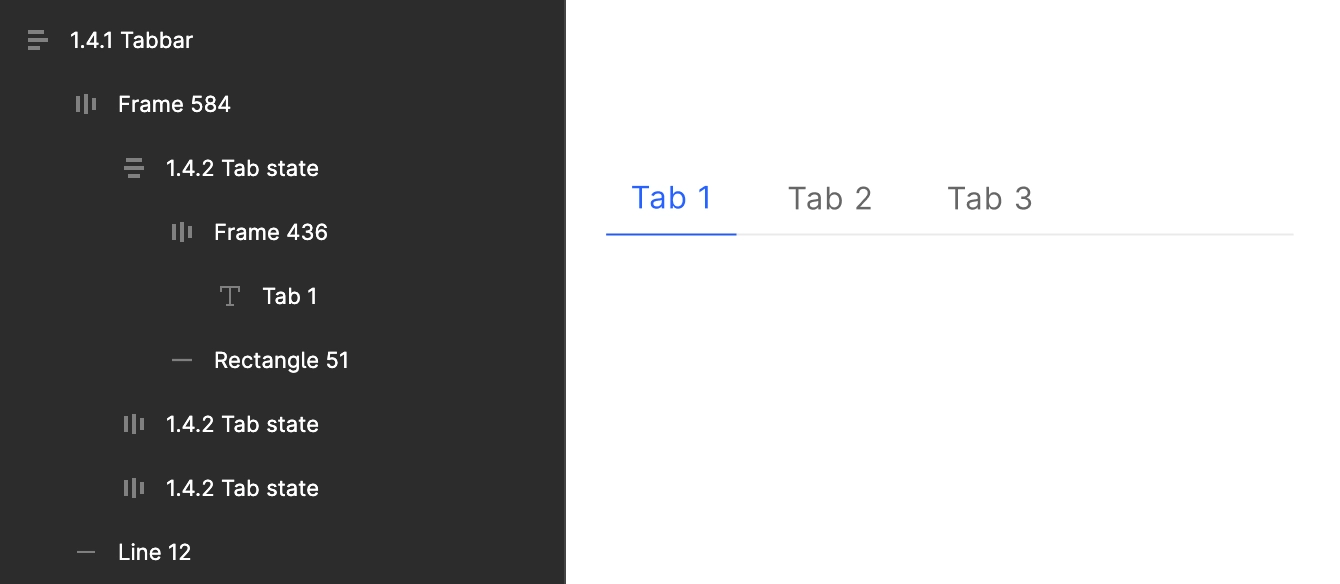
While designing the Tabs, take care of the below design guide for it:
The tab must have two similar screens, one with the first tab selected and the second with the same design but with the second tab selected.
The attached Pager must be designed according to its background and alignment.
Various different supported types of Tabs which are identified in DhiWise are,
Same text and line color while selection
Different text and line color while selection

Same text and line color for all the tabs
Rectangular tabs with a background color and selection color
Rectangular tabs without background color and selection color
Pager
All the elements of the pager should be grouped inside a single group.
If the screen UI has a BottomBar below the Pager area then the group for both the Pager and BottomBar should be separate and not grouped into one.
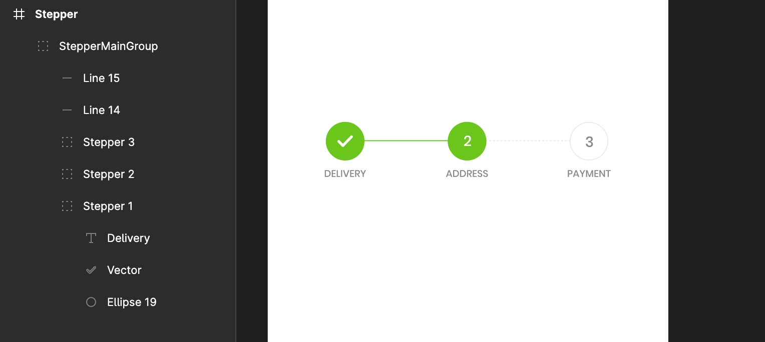
Stepper
Stepper should consist a group of elements with numeric text values arranged in a horizontal manner and wrapped in a main group.
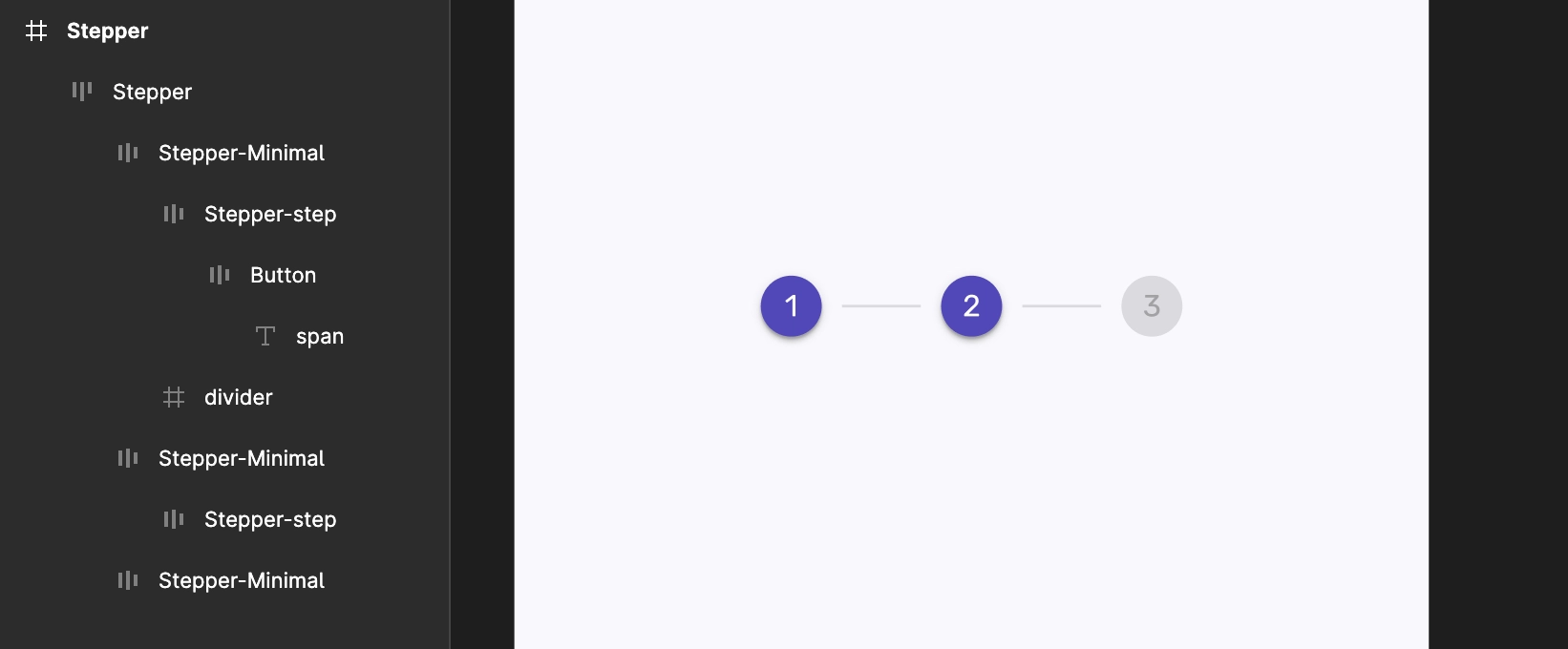
The main group should have either 3 or 5 group elements only.
A line must pass through each group's element.
Ensure that all the groups have the same height and width.
If text is required to be added below all the groups, then add a centred text below each group.
Make sure that there are no extra elements or objects present in the horizontal alignment.
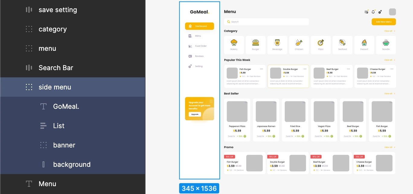
SideBar
SideBar is used to navigate to different sections of your app easily from one place.
SideBar should be designed using Rectangle or Frame.
All the elements designed inside the SideBar frame must be in a column, one below the other, and following the exact alignment as its above element.
Got a question? Ask here.