Design using Frames
DhiWise supports Figma screens designed only on a Frame.
Frame is one of the flexible shapes supported by Figma. Figma refers to frame as the root component for a screen, as it allows you to create a container of your desired viewport size for any device provided in Frame presets. This also helps in complex design as it supports additional functionalities like Auto Layout, Constraints, Layout grids, and Prototyping.
Guidelines while designing a screen
Create a screen on Figma canvas with the Frame tool or choose your relevant viewport from the Frame presets from Properties Panel, as shown below for Mobile screens and Web pages.
Mobile
Screen size for Mobile must have Frame height more than 200px, and width between 200px and 800px.
Web
Screen size for Web must have Frame height more than 200px, and width greater than 992px.

Height and Width
Keep the same height and width for all screens, except the one which includes overflow behaviours like a vertical scroll.
Screen size for Mobile devices: Frame height must be more than 200px, and the width must be between 200px and 800px.
Screen size for Web: Frame height must be more than 200px, and the width must be greater than 992px.
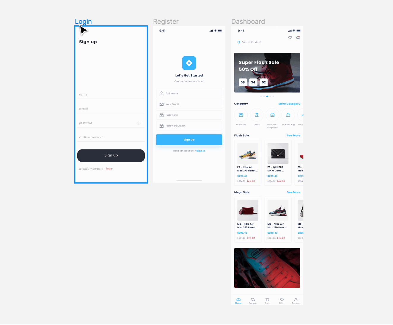
Below, both the Login and Register screens are not scrollable, so they have the same height and width. While Dashboard is a vertically scrollable screen, thus its height is different and it also includes a horizontal scroll for the categories.
Add required scrolling for the vertical and horizontal scroll and even for the inner horizontal scrolls.
Got a question? Ask here.